Showing posts with label J Herbin ink. Show all posts

Sunday, May 31, 2015

J Herbin Vert Pre ink review

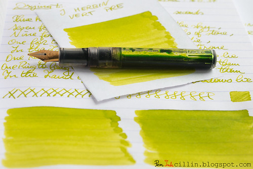
This will probably be my last green ink review for a while, so I present J Herbin Vert Pre, reviewed in my Kaweco Sport Classic with broad nib and eyedropper conversion.

J Herbin Vert Pre shading with Kaweco

Bottle and pricing

Bottle capacity: 30 ml / 1 oz
Price: $11
Price / ml: $0.37

Color and saturation

I'll say this from the get-go: Vert Pre is a type of green very similar to the other J Herbin green ink I reviewed (of which I own a bottle), Vert Olive. The only major difference between them is that Vert Pre is slightly less saturated and lighter than Vert Olive. Otherwise, all features apply to both equally. At this point I could just call it a day and refer you to the Vert Olive review but I'll keep going.

The best way to tell the difference between the two is to imagine Vert Pre as lime green, and Vert Olive as olive green (as the name actually translates).

Below is a better comparison between the two inks, as well as Rohrer & Klingner Alt-Goldgrun, which is somewhat similar to the two, only darker and avocado-ish.
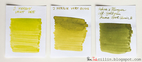
J Herbin Vert Pre vs J Herbin Vert Olive vs Rohrer & Klingner Alt-Goldgrun

Whichever variation you prefer, J Herbin Vert Pre remains in good company and is a beautiful ink on its own.

Shading

J Herbin Vert Pre features very nice shading, almost on par with Vert Olive. It's probably less only due to the fact that it's lighter in color. To benefit the most from the shading I would recommend a broader nib, but only on good, fountain pen-friendly paper.
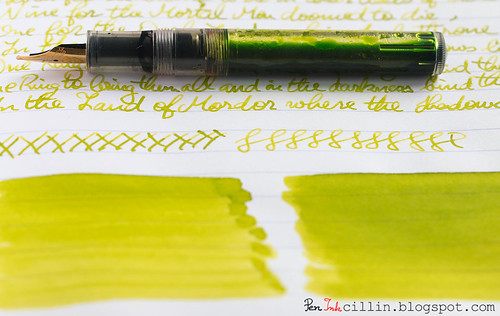
J Herbin Vert Pre text shading with Kaweco

Feathering

Unfortunately I forgot to mention feathering in my copy paper written review, but here it goes. Vert Pre is a wet, watery ink and because of that it feathers a fair amount on cheap paper. It can't be helped, but in this respect it behaves very similarly to Vert Olive, as well as a couple of other J Herbin inks that I didn't particularly enjoy: Diabolo Menthe and Bleu Azur. If you don't use this on cheap paper you'll be fine though, because this is definitely a non-issue on good stuff, such as Clairefontaine or Rhodia.

Bleedthrough

Linked to the above point, being a wet and watery ink, J Herbin Vert Pre will bleed on very cheap paper, especially if both sides are written. In my copy paper review I stated that it only ghosts a little. This is true on the condition that you only use one side of the paper. As soon as you start writing on the reverse, though, things change. The cheap paper acts as a saturated sponge and spreads the ink throughout the fibers, causing it to both feather and bleed significantly.

Flow, lubrication, and smoothness

J Herbin Vert Pre flows really well - flawlessly in fact - through the Kaweco's broad nib. Apart from that, it bears stressing once again that this ink is pretty wet.

Drying time

Drying happens quickly - almost instantly - on cheap paper. On good paper the situation is reversed, and it usually takes around 30 seconds for it to dry completely, accounting of course for the broad nib.

Smearing when dry

None.

Water resistance

As is the case with all the inks in this "series", J Herbin Vert Pre is completely non-water resistant. Keep it far away from any form of moisture.

Conclusion

J Herbin Vert Pre is another hit in J Herbin's "hit & miss series". OK, I made this up but you know what I mean: I didn't enjoy the light blue inks in the family but I adore the greens. It's a gorgeous ink with a unique color and great shading, which flows well and performs nicely on good paper. The only caveat is that I wouldn't recommend it for cheap paper, at least not with a broad nib. Should you buy it? A resolute yes! The only question remains: this or Vert Olive? Personally I'd still pick Vert Olive by a slim margin.

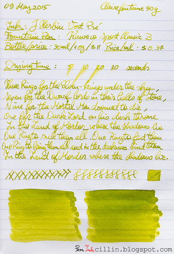
Following are the two handwritten reviews, on photocopy and Clairefontaine 90g paper, respectively.
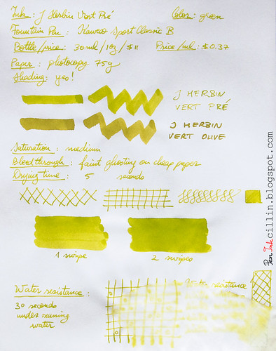
J Herbin Vert Pre on photocopy

J Herbin Vert Pre on Clairefontaine

Monday, April 27, 2015

J Herbin Bleu Azur ink review

My ink sample supply is dwindling fast and I found myself scraping the bottom of the barrel as I reached for the vial of J Herbin Bleu Azur. For a while now I've been reviewing the inks that I thought would be the most interesting, so what's left are, naturally, the runts of the litter. Well, ok, that sounds a little harsh, though maybe not in this particular case.

I popped the sample of J Herbin Bleu Azur in my Kaweco Sport Classic with broad nib and eyedropper conversion and away I went...

J Herbin Bleu Azur with Kaweco

Bottle and pricing

Bottle capacity: 30 ml / 1 oz
Price: $11
Price / ml: $0.37

Quick note here. J Herbin bottles are small and cost a pretty penny, as you can see. Generally the inks are double the cost of brands such as Noodler's and Diamine, and I'm sorry to say that I don't find the value in some of them.

Color and saturation

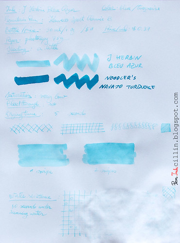
Here's where J Herbin Bleu Azur fails right off the bat for me. It is an extremely light and watery shade of baby blue, with very, very low saturation. I don't see how this ink can be used in day-to-day writing, and I'm sure that the thinner the nib the more faded it looks.

In the photocopy sample (at the end of the review) I compared it to Noodler's Navajo Turquoise, even though these two inks have nothing in common, but it's the closest ink I had a bottle of. Notice how much darker Navajo Turquoise is.

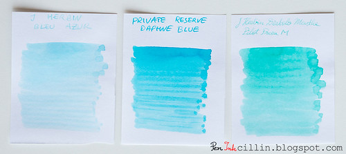
A much better comparison is the one just below. Put J Herbin Bleu Azur next to two other light colored blue/turquoise inks, Private Reserve Daphne Blue and J Herbin Diabolo Menthe, and you'll see how Bleu Azur is still lighter than both. And I didn't even like Diabolo Menthe back when I reviewed it, for similar reasons.

J Herbin Bleu Azur vs Private Reserve Daphne Blue vs J Herbin Diabolo Menthe

In fairness, some people have seen some success with using Bleu Azur as a highlighter ink. I can almost see how that might work.

Shading

As much as I'd like to bash J Herbin Bleu Azur even more than I already have, I will admit that it has a little shading, though insignificant, and unlikely to show unless using a thicker nib or perhaps employing it for highlighter duty.

Feathering

No

Bleedthrough

No. It's too light to show through and it has basically zero penetration power.

Flow, lubrication, and smoothness

I can't say I was impressed by how J Herbin Bleu Azur flowed. Watery inks sometimes feel - paradoxically - dry, as is the case here. As a result, it wasn't much pleasure to write with.

Drying time

As expected, drying times were quite short, even on Clairefontaine 90g paper.

Smearing when dry

None.

Water resistance

Water resistance, as can be seen in the photocopy sample below, is nil, perhaps even negative. Totally expected though, so I won't knock any points off for this.

Conclusion

What more is there to say about J Herbin Bleu Azur that I haven't already? I'm afraid there's nothing here that would make me recommend this ink, unless you're heavily into highlighting stuff in light baby blue. Even if you love such a light, faded blue, you might find better success, at a much lower price, by diluting another blue ink with water. Caveat emptor.

Epilogue

I don't usually do an epilogue to my reviews. In fact this is the first epilogue ever.
Being dissatisfied with J Herbin Bleu Azur, I thought I might improve it by mixing it with another ink. So I added a couple of drops of Noodler's Nikita and hoped for the best. It's usually not advisable to mix different inks in this manner so it wasn't much of a surprise that the result was yet another watery and vile concoction, of the violet persuasion. It proved worse than the original ink and I ended up dumping the whole thing in the sink. Thus I didn't get to use Bleu Azur in the real world, outside the confines of this review. Good riddance.

Following are the two samples on photocopy and Clairefontaine 90g paper, respectively.
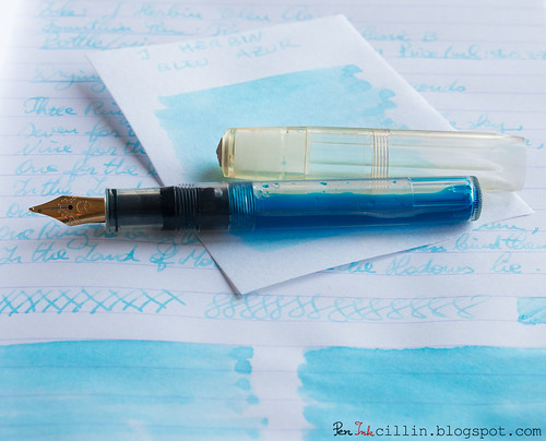
J Herbin Bleu Azur on photocopy

J Herbin Bleu Azur on Clairefontaine

Saturday, July 26, 2014

Ink samples (5x) GIVEAWAY

This past week I reached my first 300 followers, after 170 days on Twitter. I am both happy and humbled by this, since I had no idea what might come out of my Twitter presence. I used to be a social media luddite until recently, but things changed when I realized that instead of viewing social media as another time-wasting internet fad, it's much more lucrative to see it as a tool.

Though I'm not on Facebook (which I don't see as relevant for my blog, especially since I'm not a business), I've come to see Twitter, Instagram, and Pinterest as very powerful tools that can expand one's audience, fans, and connections for a particular subject. In my case, the subject includes inks, fountain pens, calligraphy and handwriting, and stationery in general.

I try not to tweet about subjects that are not relevant to the above. On the other hand, I'm more lenient on Instagram, where I've been known to post pictures of things that I cook for myself or other stuff that I might find interesting. Still, the majority of my focus is on the bread and butter of this blog.

To celebrate my 300-follower milestone, I decided to give away 5 ink samples from my ink collection of 15 inks, to one lucky participant. I'm grateful and humbled by all the attention and support I've been getting since this blog launched, and this is my small way of thanking you, my readers. Unfortunately I can't give more than 1 prize at this point, but hopefully there will be other milestones down the road which I can celebrate with more giveaways.

Also unfortunately, this giveaway will be valid only for US residents (including Alaska and Hawaii), because otherwise the shipping would be prohibitive.


Here's a list of 15 inks that you can pick from. Notice that next to each ink there's a quantity in milliliters. This signifies the maximum amount that I will give out from each ink. Some inks I have more of, others less, hence the disparity.

You can check out my reviews for each ink by following the links.
  1. De Atramentis Black Green (3 ml)
  2. Diamine Green Black (2 ml)
  3. Diamine Orange (3 ml)
  4. J Herbin 1670 Bleu Ocean (3 ml)
  5. J Herbin 1670 Rouge Hematite (2 ml)
  6. J Herbin Vert Olive (2 ml)
  7. Iroshizuku Fuyu-Gaki (2 ml)
  8. Monteverde Brown (2 ml)
  9. Noodler's Heart of Darkness (3 ml)
  10. Noodler's Gruene Cactus Eel (3 ml)
  11. Noodler's Navajo Turquoise (3 ml)
  12. Noodler's Nikita (5 ml)
  13. Noodler's Polar Brown (2 ml)
  14. Waterman Florida Blue (3 ml)
  15. Waterman Havana Brown (2 ml)

How to participate

I chose to use Google Forms to collect your information. I've been suggested ROFLcopter or some such but I don't really trust these 3rd party services and Google Docs is already integrated with Blogger, not to mention incredibly easy to work with, so in the end it was a no-brainer.

Head on to the giveaway form and please fill in the required fields.

I will need a name/nickname/screen name, so I can announce the winner by it. It doesn't have to be your real name, just something that you will recognize when I make the announcement. I will also need a valid email address so I can ask for your mailing address if you win. Not least, you will need to pick 5 inks (no more, no less).

Submissions are open until Saturday, August 9th, 12:00 AM CST. I will most likely announce a winner on Sunday, August 10th.

How to increase your chances to win

There are 2 additional ways in which you can increase your chances to win.
  1. Follow me (@peninkcillin) on Instagram and post a relevant picture with the tag #picgiveaway1. The picture should be related to the subject of this blog (ink / fountain pen / handwriting / stationery).
  2. Follow me (@peninkcillin) on Twitter and re-tweet the giveaway tweet (which will contain the tag #picgiveaway1).

Rules for participating/winning

  • The giveaway is US-only, really sorry about this :(
  • You can pick no more, nor less, than 5 inks.
  • The giveaway won't cost you a thing - I will ship the 5 samples for free.
  • Winners will be drawn at random from the list compiled from the giveaway form  + Instagram + Twitter participants. Submitting entries on Instagram and/or Twitter will increase your chances to win. I will use a popular online random number generator to pick the winner.
  • The draw will take place 2 weeks after the giveaway is announced.
  • You will be disqualified if: your data is incomplete, OR the email address is invalid, OR you are outside the US, OR you re-tweet or post on Instagram without following me, OR you re-tweet the wrong thing, OR the Instagram picture is not according to the guidelines listed above.
  • If I contact you and you don't respond to my request for a mailing address within a week of the drawing, you will be disqualified and another drawing will be held.
  • Once I obtain your mailing address I will ship the 5 samples you picked within 5 business days.
  • I will ship via USPS Domestic Flat Rate so theoretically you should be OK if you are inside the US.

Final words

If you win and write/draw something cool with the inks I sent you, and post it online, feel free to let me know so I can tweet it or otherwise broadcast it.

Good luck and may the ink gods be on your side!

Wednesday, April 16, 2014

J Herbin 1670 Anniversary Bleu Ocean ink review and GIVEAWAY

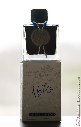
J Herbin 1670 Anniversary Bleu Ocean bottle
Time for another giveaway, courtesy of Jetpens, as well as a review of the ink itself. It is a special ink, one that I wanted to review as soon as I heard it was being produced. It is another "limited edition" ink from J Herbin, 1670 Anniversary Bleu Ocean (or Ocean Blue).

The reason why I put "limited edition" in quotes is because the first such ink bearing the 1670 moniker was supposed, if I'm not mistaken, to be produced in a limited run. Well, due to the popularity of 1670 Anniversary Rouge Hematite, they decided to keep producing it indefinitely. As such, Bleu Ocean could very well follow the same path.

The name "Bleu Ocean" - I am informed by the small flier that comes in the box - "recalls the sea voyages of J Herbin when he was travelling in the far east and discovered the famous gum which will allow him to manufacture wax". I'll come back to wax in a minute.

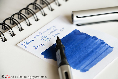
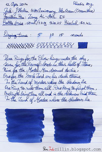
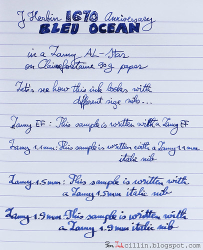
I reviewed this ink in my Lamy AL-Star, mainly with the EF nib but also with my 1.1mm, 1.5mm, and 1.9mm italics.

As a reminder, you might wish to subscribe to my Twitter, @Peninkcillin, if you haven't already.

THE GIVEAWAY
Jetpens is offering a bottle of J Herbin 1670 Anniversary Bleu Ocean exclusively to my readers. Head on to their giveaway page for a chance to win. NOTE: you will need to subscribe (or already be a subscriber) to Jetpens' newsletter before you can submit your entry for the giveaway. For existing subscribers, just enter your email and hit "Submit". If you are not already a subscriber there's a handy "Subscribe to our newsletter" box on the bottom right side. The giveaway runs from the time this review is posted until 04/23 11:59PM PST. Good luck!

Bottle and pricing
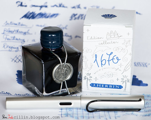
J Herbin 1670 Anniversary bottles are special because they hold a special ink. They look bigger in pictures than in reality. When you hold one in your hands you will realize they are quite dainty. Square is the operative word here but the sharp edges make the bottle look vintage, which goes well with what it's trying to convey: an ink with a very long and rich heritage. If you think about it, which other modern brands were founded more than 300 years ago?

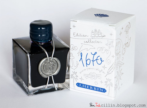
J Herbin 1670 Anniversary Bleu Ocean

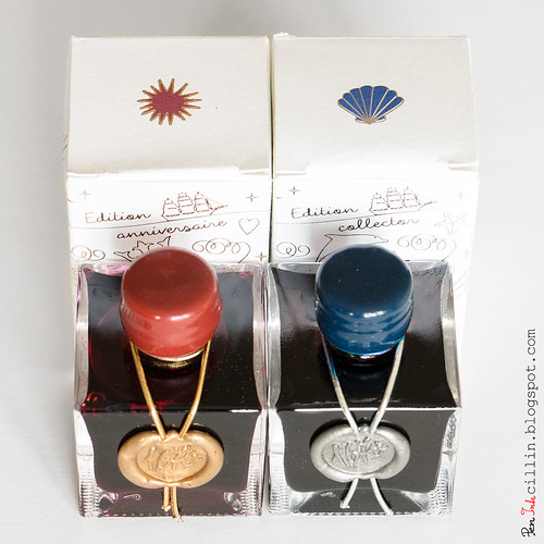
The bottle is adorned by the number 1670 stamped in silver wax, with a silver ribbon around the neck and a blue wax-covered cap. This is a nice change from Rouge Hematite's golden seal and ribbon, and red cap.

I'm not sure how many of you recall, but when Rouge Hematite was originally released, the cap was covered in brittle wax. The wax just crumbled away from light use. J Herbin changed the formula and by the time I got my bottle of Rouge Hematite it was all fixed. The new formula is strong and supple.

As for the new wax cap, it feels more like plastic than wax to me. Perhaps someone can shed more light on this but a telling sign is when my fingers and nails can easily scuff the Rouge Hematite cap but won't leave a trace on the Bleu Ocean one.

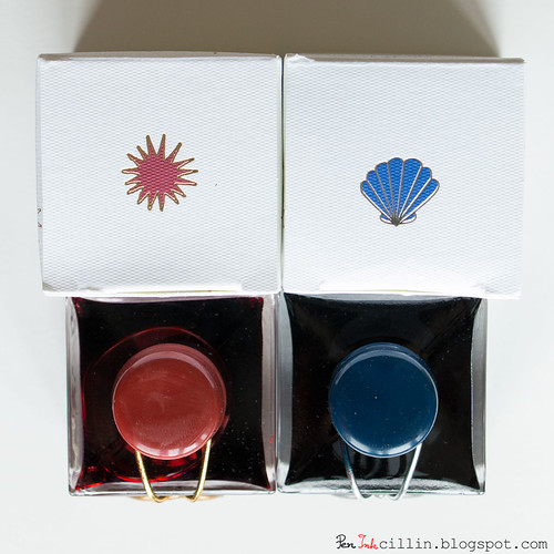
J Herbin 1670 Anniversary Bleu Ocean vs Rouge Hematite

A downside of the bottle's design is that the neck is very narrow. My Lamy AL-Star barely fit. A thicker fountain pen might not fit at all. This might be a case where form trumps function.

The box which holds the bottle is nicely embossed with silver drawings and blue text, as well as a blue seashell logo on the top flap.

J Herbin 1670 Anniversary Bleu Ocean vs Rouge Hematite

A bottle of J Herbin 1670 Anniversary Bleu Ocean is $20.75 at Jetpens. It holds 50ml (1.7oz). At $0.42 per milliliter it's one of the more expensive inks out there.

Color and saturation
Sometimes an ink is more than just a pretty color. Sometimes it speaks to me. This is one of those times. Bleu Ocean reminds me - at the risk of sounding corny - of the blue ocean. I don't say this lightly, because in my childhood I have traveled to exotic countries, across blue oceans, and sometimes I get flashes of that deep blue water. This ink transports me to that time and invokes a certain nostalgia.

Metaphor aside, I really like the color. It's different than any blue ink I have reviewed so far. I've always liked pastel colors and Blue Ocean is a very soothing shade of pastel. As such, it isn't highly saturated, but somewhere above average. It is darker wet, but lightens up when it dries. There's even a hint of violet in it, which adds to its character.

Shading
Rouge Hematite set a very high bar for 1670-branded inks, through its amazing shading properties. You can refer back to my review of Rouge Hematite to see the gorgeous golden highlights in the dark red ink. That's a tough act to follow and unfortunately Blue Ocean doesn't impress in the shading department. It does have some variation but it is quite subtle and you might even overlook it if you use a thin nib. However, if you are gung ho about a dark blue ink with great shading, I can't recommend Diamine Majestic Blue enough.

J Herbin 1670 Anniversary Bleu Ocean swatch

Feathering
Surprisingly, J Herbin Bleu Ocean feathers a little. I'm not sure what the mechanism behind feathering is, though one might expect that more expensive inks will avoid this, but there you go. In fairness, I wouldn't count this against it, for two reasons. First, it only happened on the cheap paper I used. Second, it's visible only if you peer really close to the paper.

Bleedthrough
There isn't any bleedthrough to speak of, although on cheap paper it ghosts a little, but that's to be expected of a darker ink.

Flow, lubrication, and smoothness
J Herbin 1670 Bleu Ocean flows well in the Lamy with all my nibs. Whether it's intentional or not, the flow feels very measured and controlled. It's a bit drier than I prefer, perhaps 6/10 on the scale. On the other hand, it's smooth enough to make it pleasurable to use.

Drying time
On cheap paper drying time is around 5 seconds, but you might get some feathering. On Rhodia it is around 10-15 seconds, foregoing the feathering. Take your pick.

Smearing when dry
None.

Water resistance
Here's another non-resistant ink which shows a little permanence. After 1 minute of exposure to flowing water, the text is still legible, although a lot of the ink has washed off. Some violet undertones are exposed.

Conclusion
J Herbin 1670 Anniversary Bleu Ocean is a mixed bag. On the one hand, I love the presentation, the color and some of its properties. On the other, shading is almost absent, and I can't help but wonder if other blue inks are better value for the money. Either way, Blue Ocean is a pretty unique ink in its own right, as long as it isn't held to the same standards as its red sibling. The question remains: will J Herbin produce future 1670 inks? I'm hoping for a green or brown.

J Herbin 1670 Anniversary Bleu Ocean with Lamy

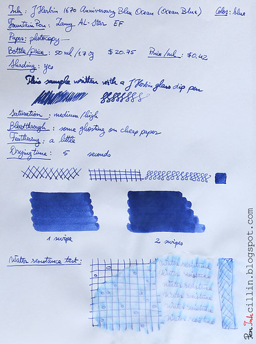
Next are the two samples on photocopy, Rhodia 80g, and Clairefontaine 90g paper, respectively.
J Herbin 1670 Anniversary Bleu Ocean on photocopy

J Herbin 1670 Anniversary Bleu Ocean on Rhodia

J Herbin 1670 Anniversary Bleu Ocean on Clairefontaine

Friday, December 30, 2011

2011 ink of the year

Have you read my 2011 fountain pen of the year article? In that case, a matching, 2011 ink of the year article was to be expected.

The situation is more complicated with inks because there are so many good ones out there and I have reviewed more inks than pens so you might think it's harder to pick a favorite ink. However, I have made up my mind and it wasn't too hard. Now, please remember that these are purely my personal preferences. Yours will vary (guaranteed).

Without further ado, the winner, and 2011 ink of the year, is... Waterman Havana Brown.

Waterman Havana Brown

This is the only Waterman ink I have tried so far but it was love at second sight. I didn't like it immediately but it grew on me quickly. I love how it flows in my TWSBI Diamond 530 and it has some enchanting shading. It tends a bit toward red rather than black but that gives it character and flavor.

Just look at it on Rhodia 80g paper. I this instance I used it in the Kaweco Sport Classic. I used broad nibs in both the Kaweco and TWSBI but it's a shame to use anything less with this ink.

Waterman Havana Brown Rhodia 80g

Waterman Havana is very well behaved, with no bleedthrough, feathering or smearing after it dries. It also dries fairly quickly.

The only thing that would have made this the perfect ink is the lack of water resistance. Yes, I have a thing for waterproof inks but not everyone feels the same. I would have loved to use it for my personal diary but I made a pledge to only use a water- or bulletproof ink in it so I can't use it there.

For me, Waterman Havana Brown has been the most fun-to-use ink in 2011. It you haven't tried it yet, you owe it to yourself to grab a sample. As for me, I hope to test other Waterman inks in 2012.


There's a second ink that I would like to mention. Once again, I bought a full bottle of it and the bottle itself played no small part in convincing me to spend extra on it, as opposed to buying a much cheaper sample. The ink in question is J Herbin 1670 Anniversary Rouge Hematite.

J Herbin 1670 Anniversary ink bottle

The bottle is a small piece of art and since this ink was supposed to be a limited edition, I thought I would snag one before it disappeared from the market. Despite this, J Herbin 1670 is still being produced, a year later.

Never mind all that. This red ink is exquisite. It has the most amazing shading ever! Imagine dark crimson with shades of gold.

J Herbin 1670 Anniversary ink sample

Sadly, I can't use this ink too often. I'm not an artist but sometimes I like to try my hand at some calligraphy with a flex pen or a Pilot Parallel. For those pens, this ink will work wonders because the line variation will allow the shading to reveal itself.

J Herbin Rouge Hematite is expensive. But it could be worth it to you. Even if not, the beautiful bottle will look amazing on your shelf and it's a great conversation piece.


That's about it for 2011. I have had fun with several interesting inks but for 2012 I have many more inks to test, especially since I won't be buying new fountain pens (hopefully). Here's to the future! What was your favorite ink in 2011?

Monday, December 5, 2011

J Herbin Diabolo Menthe ink review

What's in a name? J Herbin Diabolo Menthe is not the only ink that mesmerized me into trying it thanks to its catchy name. Nor will it be the last. Luckily I didn't buy a whole bottle - just a sample. You will find out shortly why I'm so "lucky". I am going under the assumption that Diabolo Menthe can be translated into something like "Devil's Mint", so please correct me if I'm wrong.

This ink ended up being a mixed bag. I liked some things about it but disliked others. I tried it first in my Pilot Prera with medium nib which turned out to be a mistake. I then decided to mix it with another ink and I chose Noodler's Nikita. This turned out to be an even bigger mistake. The mixture, a very ugly, drab, de-saturated purple was loaded in a Pilot Varsity. The resulting ink proved to be unusable as it would barely flow and it produced a very faint line. So I dumped the whole thing in the sink.

So much for stupid experiments. Yeah, I knew that mixing different brands of ink is a big no-no but I was curious to see what would happen.

I really should have used this ink in one of my Pilot Parallel calligraphy pens without mixing it. It might have stood a chance there.

As far as testing Diabolo Menthe in the Prera, here are my observations.

Bottle
Diabolo Menthe comes in J Herbin's typical dainty little bottles that have a 1oz/30ml capacity. At $9.50 a bottle, or $0.32/ml, this ink is about twice as expensive as Noodler's or Diamine inks. Let's see if this one is worth the price.

Color and saturation
I will admit that I love the color of this ink. Notice that I didn't mention at the beginning what color this ink is. While mint is associated with green, this looks to me more like a very light turquoise so I will file it under blue/turquoise.

While bright and vibrant, Diabolo Menthe isn't very saturated. In fact it's quite faint, feeling almost watery, and that's one of the reasons why it fails in a fountain pen with a fine/medium nib like the Pilot Prera. I believe that this ink shouldn't be used for handwriting. It should be great for drawing though. With a brush.

Shading
I haven't noticed any shading, which makes it flat, but you can't expect much from such a light colored ink.

Feathering
Interestingly enough, the thin nib of the Prera preempted any feathering but the dip pen produced the opposite. In the latter case, Diabolo Menthe feathered like a champ, even more than much darker inks I've tested. The only explanation I can find is the watery nature of this ink.

Bleedthrough
Bleed- and show-through is pretty well controlled, with only the section written with the dip pen showing through the cheap photocopy paper.

Flow and lubrication
Strike two for J Herbin Diabolo Menthe comes from its atrocious flow. This ink is one of the dryiest I've tested, certainly up there with Noodler's Burma Road Brown, and all this despite the fact that it looks watery. It was a real chore to pick up the Prera and write with it because this ink would barely flow. The usually smooth nib of the Prera turned into a scratchy nail. You can tell from my sample where the pen struggled to write. I assume lubrication is equally lacking.

Drying time
If there's one good side to this story, is that this ink dries very fast. Well duh, what would you expect? Even on Rhodia 80g it dried under 5 seconds. Hey, it might be good for lefties!

Smearing when dry
None! Light + dry ink = no smearing.

Water resistance
15 seconds under running water washed off all the ink. Not that I was expecting it to be water resistant or anything...

Conclusion
J Herbin Diabolo Menthe might have an exotic-sounding name and a bright, cheerful color but for me it proved very finicky and almost useless in a fountain pen. I can only recommend this ink for art (using a brush) or perhaps with a dip pen or a calligraphy pen which is very free flowing and produces wide lines. Only then can you hope for sufficient flow and a wide enough line to showcase its cutesy appearance. My bottom line is: don't use it in a fountain pen, or at least try a sample first to see if you like it.

Here are the two samples written with J Herbin Diabolo Menthe, on photocopy paper and Rhodia 80g paper, respectively.

J Herbin Diabolo Menthe on photocopy


J Herbin Diabolo Menthe on Rhodia

Thursday, October 20, 2011

J Herbin Gris Nuage ink review

At one point in my short fountain-pen-and-ink-loving career I got the notion that I should get a grey ink to use in my drawing endeavors. I must specify at this point that I'm not an artist by any stretch of the imagination. I just like art, I have a great admiration for the drawing side of art and I like to doodle a lot.

I bought a bunch of grey ink samples and J Herbin Gris Nuage is the first one I tested. It so happens that I also managed to buy a Noodler's Flex Pen during the same period, so I decided to test this ink in the flex pen. That was kind of a bad mistake. I should have used a darker and more saturated ink in the flex pen.

Going forward I will make a small change in my ink reviewing procedure. I'll organize my impressions by "bullet points" to make it easier to locate relevant information. So here goes.

Bottle
Gris Nuage comes, like most J Herbin inks, in those dainty little bottles with a 30ml (1oz) capacity. They cost about $9.50 or $0.32 per milliliter. Quite expensive, compared to Noodler's or Diamine inks. Of course, I got mine in a sample vial so there's no bottle to show.

Saturation
Being a grey ink, the saturation is, well, non-existent.

Shading
Surprisingly, and unless I'm imagining things, it looks like Gris Nuage does have a little bit of shading. I suspect this is partly caused by the flex pen which lays heavier, wetter sections in some of the strokes.

Feathering
This isn't very clearcut but Gris Nuage did show a fair amount of feathering. However, bear in mind that the flex pen was used on cheap photocopier paper. There wasn't any feathering on Rhodia 80g paper.

Bleedthrough
Bleedthrough goes hand in hand with the feathering. Flex pen + cheap paper = show through, especially where the nib flexes. Flex pen + good paper = no show through and the reverse side remains unblemished.

Flow
Unfortunately I can't really say how J Herbin Gris Nuage flows in a "normal" pen but in the Noodler's flex it flowed really well - and wet. That's expected though, but I do have to mention that I adjusted the nib and feed for greater than average flow.

Drying time
The drying time for Gris Nuage proved to be really good, despite the thick lines. It dried in about 10 seconds. The caveat is that this performance was reached on the porous (and cheap) photocopy paper. The situation reversed on Rhodia 80g where after 30 seconds the ink was still slightly wet. However, I agree that flex nibs produce much wetter lines so this might not be indicative of the ink's real drying properties.

Smearing when dry
None!

Water resistance
I wasn't expecting this ink to resist water but strangely enough it doesn't wash off easily. My standard test is 1 minute under flowing water, although in this case I forgot to mark that down on the sample. As you can see, some of it washed off but most remained.

Conclusion
J Herbin Gris Nuage is a grey ink with decent properties, including a surprising amount of water resistance. Personally I wouldn't use it for writing, and I admit that in this case I was wrong to use it in the Noodler's Flex Pen. The reason? It's too light. I do think that it would be ideal for drawing, though a bit expensive. Not being an artist, I can see this as being very suited for drawing backgrounds, clouds, etc, especially considering that it does show some shading when you apply thick swaths of it.


Sunday, June 12, 2011

3rd Goulet Pens haul

The past week has been the "week of the Noodler's flex pen" it seems. Goulet Pens, in particular, was assaulted by orders for the latest batch of Noodler's flex fountain pens and I was one of the lucky ones who managed to get their hands on a Noodler's flex in Lapis Inferno (aka blue with white swirls).

The title of this post is a bit dishonest because I've combined two orders into one post but that's only because the first order only contained ink samples plus a few notebooks (and this is not a blog for notebooks and paper), while the second order had another batch of ink samples, plus the 3 pens.

3rd Goulet Pens haul

Here's what this order contained:

Pens:
  • Noodler's Flex in Lapis Inferno
  • Pilot Parallel 3.8mm
  • Pilot Parallel 6.0mm
Ink samples:
  • Diamine China Blue
  • Diamine Coral
  • Diamine Prussian Blue
  • J. Herbin Bleu Azur
  • J. Herbin Diabolo Menthe
  • J. Herbin Vert Pre
  • Lamy Red
  • Noodler's Baystate Blue
  • Noodler's Bernanke Blue
  • Noodler's Fox Red
  • Noodler's Georgia Peach HL
  • Noodler's GI Green
  • Noodler's Kung Te-Cheng
  • Noodler's Mandalay Maroon
  • Noodler's Manjiro Nakahama Whaleman's Sepia
  • Noodler's Polar Green
  • Noodler's Shah's Rose
  • Noodler's Dragon's Napalm
  • Noodler's Firefly Yellow HL
  • Noodler's Hunter Green
  • Noodler's Year of the Golden Pig HL
  • Private Reserve Daphne Blue
  • Private Reserve Electric DC Blue
  • Private Reserve Invincible Aqua Blue
  • Private Reserve Invincible Black
  • Sailor Jentle Apricot
  • Sailor Jentle Grenade
Just a quick word about the Noodler's flex pen. I like the color and I'm glad I picked it instead of another. It also happened that the blue pens were the second most popular after the clear ones. I believe I have loaded the pen with the wrong ink because I used a very light gray which may not be the best option for a flex nib. Though I wasn't expecting much from this pen, at this point I'm not particularly impressed with its flexible nib. I'll have to play some more with it before I can review it though.

From the looks of it, I'll have enough ink samples to review for the next year. Can't wait to use them all!

Thursday, May 19, 2011

J Herbin 1670 Anniversary Rouge Hematite ink review

Many words have been written about J Herbin's 1670 Anniversary Rouge Hematite (whew what a mouthful!) and now it's my turn to give my impressions on this special ink.

I had set my sights on this ink even before I got into fountain pens. From various reviews I came to the understanding that this is one of the best shading inks out there. Not only that but it was supposed to be produced in limited quantities because it celebrates 340 years of J Herbin's existence. That's an amazing feat on its own, after all, how many companies are still in business after 300 years? Well, J Herbin, a French company, are still at it and they took this opportunity to produce an ink with unique properties and a uniquely designed bottle.

Unfortunately I botched some of the photos I took of the packaging so I only have a decent photo of the actual bottle, leaving the cardboard box out.

j-herbin-1670-anniversary-bottle

As you can see, the bottle has a very interesting design. It is roughly cubic-shaped and made from thick glass. The cap is coated in a red wax-like material, which is real wax if I'm not mistaken. Initial batches of the ink had some issues with this coating which crumbled easily when handled but J Herbin changed the formula and the version I got has no such problems. The cap is slightly flimsy though (it's made from very thin metal) so be careful not to squeeze it too hard.

The bottle itself is tinier than anticipated and feels positively dainty. I was really expecting a larger bottle but it impressed me nonetheless with its delicate appearance. The bottle holds 50ml or about 1.69oz.

The coup de grâce (if I may poach a French expression) is the nicely done golden seal at the front of the bottle, embossed with the 1670 logo. The seals are all applied by hand and there's a video somewhere on the web showing the process but unfortunately I can't find it anymore.

J Herbin 1670 is an expensive ink. The only other fountain pen ink that I know of which is more expensive than 1670 is the range of Iroshizuku inks. Considering the packaging, the limited quantities and the ink's qualities, I would say that the price is justified. The price per milliliter comes to $0.40 (the bottle itself cost me $20) and this is much more expensive than, say, Noodler's inks which generally cost $0.14 per milliliter.

Let me talk for a second about the name. J Herbin 1670 Anniversary Rouge Hematite is the full name and while the "J Herbin 1670 Anniversary" part is self-explanatory, I will offer my own theory about "Rouge Hematite". First, Rouge is French for "red. Second, Hematite almost certainly refers to the strong shading this ink exhibits. Hematite is the mineral from which iron is extracted. Take a look at the rock's color and then look at the samples farther down. Yup, it's a match.

Before the review proper, a word of caution. Some folks have expressed frustration with this ink, claiming that it settles in the bottle and it is hard to use in a fountain pen as a result. Yes, it is true that it settles. The "hematite" component, which seems to be heavier, separates from the red and settles on the bottom of the bottle. Thus, before using the ink, it is mandatory to shake the bottle well for a few minutes. Keep watching the bottom of the bottle until it becomes clear. This is a known fact about 1670 and it is a consequence of how the ink's components are mixed together. Just bear this in mind if you ever want to use this ink.

My humble opinion is that such an ink shouldn't be used merely for writing. Instead, it is much better suited for calligraphy and/or art. The reason is that the powerful shading is more evident with wider swaths of color and a thin nib wouldn't be able to show it off to the best advantage.

Hence, I loaded this ink in an empty Pilot cartridge and used it in my Pilot Parallel calligraphy pen with 2.4mm nib. Please excuse my poor attempts at pseudo-calligraphy but, in my defense, it's the ink that's on trial, not my writing skills.

J Herbin 1670 Rouge Hematite is a saturated red, very similar in color with Noodler's Nikita which I have reviewed previously, especially when wet. When it dries up, it retains more vibrancy than the Nikita.

It hardly bleeds when applied normally with the pen, nor does it feather. It flows very well but then again, the Pilot Parallel pens have very good flow.

Drying times are very slow. It took ages for the ink to dry, even on the more absorbent photocopier paper. This is due in part to the very wet and wide line drawn by the Pilot Parallel. I also timed drying times by writing with the thin side of the nib. Although shorter, it still takes at least 30 seconds for the ink to dry. Considering that I wouldn't use J Herbin 1670 to write, these times are acceptable for drawing.

One side-effect of this ink is that it tends to smear if touched, even after it has dried well. I learned that the hard way after accidentally touching a drawing I had done on a birthday card for my dad.

Surprisingly, there seems to be a small amount of water resistance to J Herbin 1670 Rouge Hematite. After holding the sample about a minute under a running faucet, most of the dark color has washed off but the text is still very much legible. What's left behind is pink instead of red so I'm assuming it's part of the "Rouge" component, rather than the "Hematite".

Moving on to the most exciting feature of J Herbin's 1670, the shading is the most beautiful I have experienced so far in an ink. It is best seen on wider swaths of ink and when the paper is tilted towards the light. This is where the golden tones start shining and it's a wonderful thing to see. It literally makes the ink come alive. Thanks to this, it gives the ink a very warm shade of red. There are, of course, hints of orange in there and visions of a fiery sunset come to mind.

j-herbin-1670-anniversary-ink-review

To wrap up, J Herbin 1670 Anniversary Rouge Hematite is a very delightful red ink with gorgeous golden shading, particularly well suited for artistic endeavors. It is just as usable for loading in a fountain pen for writing, thanks to its vibrant, saturated shade of red. Drying times are slow, especially when the nib is wet but to compensate, it shows a little bit of water resistance. The bottle is a work of art in itself and if you're worried that this ink might disappear forever, there are hints that J Herbin will continue to produce it, albeit in a less interesting bottle. If the price does not scare you, I highly recommend a bottle.

Here are two samples, written on plain photocopier paper and Rhodia 80g.

j-herbin-1670-anniversary-ink-review-photocopier-paper

j-herbin-1670-anniversary-ink-review-rhodia-80g

Wednesday, March 16, 2011

J Herbin Vert Olive ink review

And now for something different...

I'm not sure how many people enjoy unconventional ink colors but I'm a sucker for bright inks. Fountain pen ink to me is more than just a medium for writing by hand. It is also paint, glorious color that I can lay down on paper with my favorite instrument, a fountain pen, to create art, or at least to pretend that I'm an artist.

I'm not certain what drove me to buy this ink but I believe I wanted a more subdued and lighter shade of green than Noodler's Gruene Cactus, one that I wouldn't have to use for writing. In a nutshell, I love Vert Olive. If you want to find out why, read on.

J Herbin Vert Olive ink

Vert Olive, like most other J Herbin inks, comes in a small 30ml bottle and is more expensive than Diamine or Noodler's inks at $0.27 per milliliter. (In comparison, a regular bottle of Noodler's is $0.14 / ml). I guess it's because it comes from France and the French think they're special or something :) Just kidding! More likely, it's because these inks are very high quality and well-deserved of the price.

The bottle is dainty and delicate looking and it has an interesting design in the form of a groove which allows you to rest your pen on it. Unfortunately I didn't think of taking a picture of how this would look but hopefully I'll take one soon. I also like the fact that the ink is clearly marked on both the box and the bottle. The box has a color-coded square on top of the lid, while the bottle has a label in matching color, with the name of the ink. Both have a small drawing of an olive.

Speaking of olives, this is exactly what the color of Vert Olive reminds me of: green olives. In fact, that's what "Vert Olive" means: olive green. Furthermore, one of the first things I drew with this ink was... you've guessed it... a green olive! So if you need to draw lots of green olives, this is the ink for you!

You can certainly use this ink for writing, if that's your preference. It is not light enough that it can't be seen and the amazing shading it has is evident even with a normal fountain pen nib. For my tests I used a Noodler's piston filler fountain pen. My regret is that I didn't buy a Noodler's flex because I'm sure the shading would have shown even better.

(As a parenthesis, the sample photos aren't that great. There's a lot of variation in the lighting, depending on how the paper curved. I apologize for that and hopefully I'll be able to produce something better in the future. All my handwriting samples are done with natural daylight.)

Though J Herbin Vert Olive feels like a pastel shade to me, I find it saturated. It is well behaved in regards to bleedthrough (none, except when thickly applied on low quality paper), feathering (none) and drying time. It dries fairly quickly on photocopier paper but I have yet to test it on better paper.

Flow through the Noodler piston filler was very good but that pen seems to have good flow anyway, once it gets started. The ink is rather wet and I appreciate that because it shows off the nice shading, making the color darker where the ink pools more.

If I were to nitpick, apart from the price, the only negative thing about J Herbin Vert Olive is its water resistance, which is very poor. But then again, I wasn't expecting it to be waterproof, and in some cases this could be an advantage. For example, it is easily washed off. Artists can also use some water to spread it around.

In summary, J Herbin is an ink of French origin with excellent shading and very good characteristics for drawing and art in general. If writing with a bright ink is your thing, then you can certainly do it because it is dark enough to permit it. As a bonus, the shading is evident even with a thin fountain pen nib.

Following, I have two writing samples, one on photocopier paper, the other on a Staples journal with yellowish paper. I will be phasing out the reviews done on that journal because the paper is awful. Until then, this will have to do. Unfortunately I'm not sure that I managed to capture the exact color and shading of this ink and, depending on how your monitor is calibrated, you may see something different than what I see. Between the two samples, I hope you can get an idea about J Herbin Vert Olive's character.

J Herbin Vert Olive ink review on photocopier paper

J Herbin Vert Olive ink review on Staples journal

Thursday, March 10, 2011

2nd Goulet Pens haul

Though I got this second Goulet Pens order a while ago, I figured now would be the right time to blog about it. This blog is new so I'm still out of sync with my pen and ink stuff.

2nd Goulet Pens haul

For the first time I decided to treat myself to some quality paper so I got a couple of notebooks, one from Clairefontaine, the other from Rhodia, both ruled. I still haven't figured out what I'm going to write in them and I haven't even tried them out. I also got a nice Clairefontaine sketch pad with blank 90g paper and I did try this one. In fact I sketch in it regularly, just a little bit almost every day, exclusively with fountain pens. This pad is so awesome that I'm going to get more in the future. Not only is it cheap at a little over $4 but it has 80 pages and the paper is bleed-proof.

As for inks, you will notice the bottle of Noodler's Polar Brown. I wanted an "archival" quality ink and something different than black or blue. Brown is more somber and should be ideal for what I need it: namely to write an account of my life and my family's history.

One of the cool things that Goulet Pens offers is ink samples. Although the ink from these samples is much more expensive if you look at price/milliliter compared to buying a whole bottle, I think it's a great idea to buy these samples first and find out exactly which ink you like before committing to a bottle. Practically, for the price of the average bottle of ink, I can get almost a dozen samples.

As it happens, the first ink from these samples that I have already tried, Noodler's North African Violet, is so nice that I'm seriously considering ordering the whole bottle next time I place an order. Stay tuned for reviews of all these inks. Here they are:

- Diamine Graphite
- Diamine Grey
- Diamine Majestic Blue
- Diamine Sunshine Yellow
- J Herbin Gris Nuage
- Noodler's #41 Brown
- Noodler's Bad Belted Kingfisher
- Noodler's Bad Blue Heron
- Noodler's Burma Road Brown (V-Mail)
- Noodler's North African Violet (V-Mail)
- Noodler's Operation Overlord Orange (V-Mail)
- Noodler's Polar Blue
- Noodler's Yellow

As you can see, I got a bunch of grays and blues. I don't have a bottle of good blue ink yet so I need to try a few first. As for the grays, I might get one to use for backgrounds in my drawings.

I have to say, I'm most excited about the V-Mail series inks and North African Violet has already shown its worth. Back when I placed this order I didn't know much about V-Mail inks or I would have ordered samples of the entire series. Oh well, next time.

Thursday, February 17, 2011

1st Goulet Pens haul

With this post I'm almost up to date with blogging about my fountain pen and ink purchases. I know that I should probably review what I already have but since some of the pens I got at the beginning were filled with inks that I got later, I wanted to outline these purchases first.

Goulet Pens is a wonderful business run by a couple who are passionate about inks and fountain pens: Brian and Rachel Goulet. Their customer service is outstanding and they give a personal touch to each transaction that is almost unmatched in today's corporate-controlled market. What attracted me to Goulet Pens apart from the stories of excellent customer care was the fact that they offer a complete range of Noodler's inks (well, at least the ones that are currently being produced). Since I have quickly become a big fan of Noodler's inks, the Goulet store was the obvious place to shop.

This first haul was a significant one, if not necessarily in terms of cost, then definitely in terms of items.

1st Goulet Pens haul

Going from left to right and top to bottom, I have the following:

A 4.5oz bottle of Noodler's Nikita ink. I wanted a red ink and, after reading a bunch of reviews, this one seemed perfect, especially since it comes with an actual Noodler's fountain pen. The artwork on the bottle is a hoot.

A 3oz bottle of Noodler's Gruene Cactus Eel ink. This would become my "main" green ink. I planned to use this in the Sailor HighAce Neo fountain pen that I discussed in my previous post regarding my 2nd JetPens haul.

A bottle of J Herbin 1670 Anniversary Rouge Hematite ink, or in other words, another red ink. This is my most expensive ink to date and I decided to buy it despite the cost due to its unique bottle and even more unique shading properties. Oh and also because it is supposed to be a limited edition and I didn't want to miss out on it.

A bottle of Diamine Orange ink. I struggled a lot with the many choices one has when deciding what orange ink to buy and all I can say for now is that I don't regret buying this ink one tiny bit. In fact my very next review is likely to be of this ink.

A bottle of J Herbin Vert Olive. I wanted a lighter shade of green that I would use more for shading when drawing. Yeah, I'm not an artist but I sometimes pretend to be one.

A J Herbin glass dip pen. I bought this pen because I thought it would make it easier for me to quickly sample an ink without having to ink up a fountain pen. In this aspect it is very useful. On the other hand its writing qualities aren't much to speak of.

Next is the Noodler's fountain pen which came with the 4.5oz bottle of Noodler's Nikita ink. This is an interesting pen because not many people know about it. Usually Noodler includes Platinum Preppys in their 4.5oz bottles but this is an exception. This fountain pen is also an eyedropper so I promptly filled it with Nikita ink. It also has a "creaper" nib which in Noodlerspeak means that the nib doesn't have a breather hole.

Finally, there's my first true Noodler's fountain pen with a piston filling system. It has a non-flex nib and in retrospect I regret not getting the flex nib for the same price, especially since now they have been (and will continue to be) out of stock for a long time. In the photo it is filled with J Herbin Vert Olive ink.

I won't give any spoilers but suffice to say that after using all of the above for a few weeks, I am nothing but pleased with each and every one of them. To tell the truth, the dip pen is the only thing over which I'm not ecstatic, but given the choice, I would buy it all over again.

Rest assured that I will review each and every one of these purchases going forward, if all goes well. In fact, the next review that I have scheduled is for the Diamine Orange ink, so stay tuned.