Showing posts with label blue/turquoise ink. Show all posts

Tuesday, July 28, 2015

Noodler's Bernanke Blue ink review

This, my friends, will be my last new ink review for a good while. I have reached the last of my ink samples and, after blogging about fountain pens and inks for more than 4 years, I will be taking a break from it all to focus on other, unrelated, projects.

I wish I could say I saved the best ink for last, but alas it's not the case. My opinion of Noodler's Bernanke Blue started out on a very positive note but quickly plummeted as I continued to use it in my Pilot Vanishing Point with broad nib.
Noodler's Bernanke Blue with Pilot VP

Bernanke Blue (leaving aside the attempted political statement) is yet another specialty ink in Noodler's seemingly unending arsenal of "curiosities". This particular ink's strength is the ability to dry extremely quickly on paper. If this ink was conceived as quickly as it dries, I can begin to understand why it is so bad otherwise.

I could just tell you to stop reading at this point and simply skip this ink, but if you're curious to find out why I didn't like it, keep reading.

Bottle and pricing

Bottle capacity: 90 ml / 3 oz
Price: $12.50
Price / ml: $0.14

Color and saturation

The only positive thing about Noodler's Bernanke Blue (it's all downhill from here) is the gorgeous blue color. It's saturated and vibrating, resembling Baystate Blue to an extent, except a bit subdued. When I first started writing with it I thought "Wow, this is going to be an amazing ink!". Sigh. If only.

Here is Bernanke Blue compared to Noodler's Baystate Blue and Private Reserve Electric DC Blue, two blue inks that are fairly similar in vibrancy and saturation.
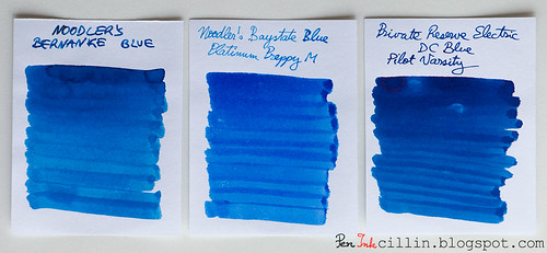
Noodler's Bernanke Blue vs Noodler's BSB vs PR Electric DC Blue

Shading

Despite what you might see in the comparo above, Noodler's Bernanke Blue is flat, without shading, when written with a fountain pen.

Feathering

Here's where the problems start. This ink feathers like crazy on cheap paper. It goes, in fact, a little beyond that, because it feels like writing on blotting paper. It just goes right through the paper and spreads evenly in all directions.

Bleedthrough

If you thought feathering was a problem, wait till you see how it bleeds. I've never seen an ink penetrate cellulose as strongly as Bernanke Blue. It feels almost exactly like one of those alcohol-based felt-tip markers (the Pilot VP's broad nib helps).

The sample below was written on Clairefontaine 90g paper, in other words very good, thick, fountain pen-friendly paper, which has withstood everything I threw at it - until now. This ink penetrated not only through what you see, but in places where I pressed harder it went through the next sheet. I did use a broad nib, which partly contributes to this state of affairs, but still...
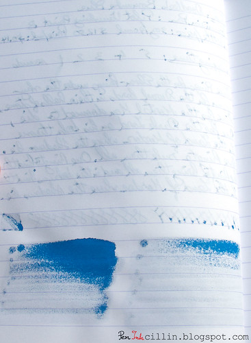
Noodler's Bernanke Blue bleed

Flow, lubrication, and smoothness

While initially Bernanke Blue flowed well and was very smooth, it quickly became apparent that I was having issues with the Pilot Vanishing Point. There were hard starts to be had, as well as a lot of skipping. It got so frustrating that I simply cleaned out the pen despite not being empty, then threw out the remaining ink from the sample vial.

Drying time

The flagship feature of Noodler's Bernanke Blue is its very short drying time. So how did that go? Quite well in fact. On cheap paper it dries virtually immediately, within 1-2 seconds. On Clairefontaine 90g it took about 1 second longer but that's still fairly short. Impressive? Well, it's oh-kay, but unfortunately this one "trick" doesn't make up for all the other drawbacks.

Smearing when dry

None.

Water resistance

Another disaster. In what is quite atypical of Noodler's inks, Bernanke Blue has zero water resistance. My 1 minute test (under flowing water) was probably overkill but as you can see in the sample at the end of the review, in contact with water it obfuscated, dissipated, and blurred to oblivion.

Conclusion

So should you bother with Noodler's Bernanke Blue? A resolute no. Yes, it is a beautiful shade of blue. Yes, it dries fast. No, everything else. The shortcomings of this ink are disastrous and simply not worth it. There are much better blue inks out there that take an extra 1-2 seconds to dry but are so much more bearable in all other aspects.

Following are the two samples on photocopy and Clairefontaine 90g paper, respectively.
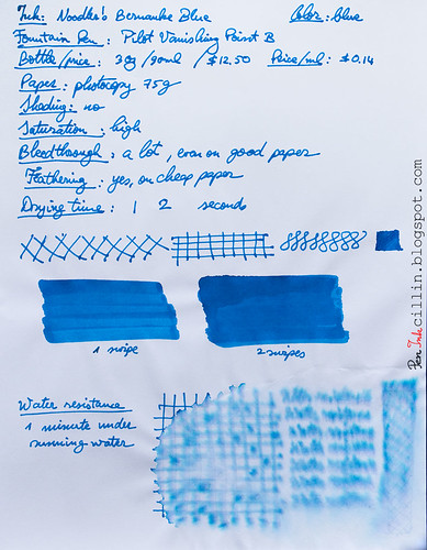
Noodler's Bernanke Blue on photocopy

Noodler's Bernanke Blue on Clairefontaine

Tuesday, June 16, 2015

Diamine China Blue ink review

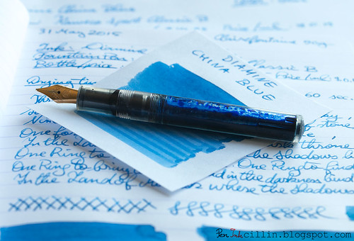
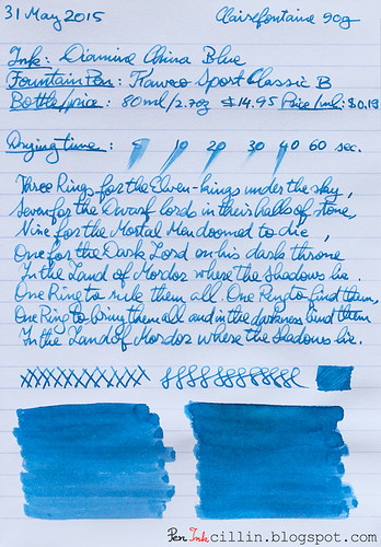
I bought this sample of Diamine China Blue some time ago because I was attracted by the exotic name. It wasn't too bad looking either, judging from other reviews I'd seen. I tested it in my Kaweco Sport Classic with broad nib and eyedropper conversion.

Diamine China Blue with Kaweco

Bottle and pricing

Quick note here. To my dismay, when I was putting this review together, I noticed that Diamine has increased their ink prices across the board, by roughly $2 per bottle. While still relatively inexpensive, I'm a bit saddened that this happened. Here are the new prices then. Notice the price per milliliter jumped by $0.02.

Bottle capacity: 80 ml / 2.7 oz
Price: $14.95
Price / ml: $0.19

Color and saturation

Diamine China Blue is a medium saturated blue, quite similar to denim. It looks darker when freshly written and still wet, but it resembles a faded pair of blue jeans when it dries.

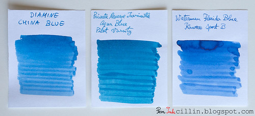
In the comparison below, Diamine China Blue is set against Private Reserve Invincible Aqua Blue, and Waterman Florida Blue. These are the closest colors to China Blue that I could find among my previously reviewed inks, especially PR Aqua Blue (which is discontinued). Notice how China Blue is just a little less vibrant than Waterman Blue and perhaps a fraction warmer in tone.

Diamine China Blue vs PR Invincible Aqua Blue vs Waterman Florida Blue

Shading

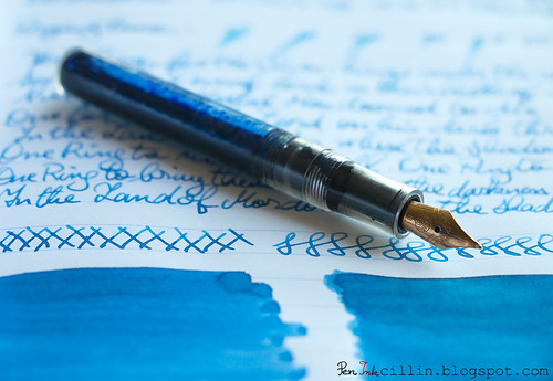
Diamine China Blue shows a fair amount of shading, even though it might not be apparent at first. Your results may vary, of course, but a thicker nib will bring our the color variance nicely.

Diamine China Blue shading

Feathering

I'm a little on the fence here. Diamine China Blue seems to be causing a tiny bit of feathering on cheap paper with the broad nib but I'd wager that doesn't happen with a medium or thinner nib on the same paper. That's definitely not the case on Clairefontaine.

Bleedthrough

While it doesn't outright show through on cheap paper, China Blue exhibits enough ghosting to be iffy on this type of paper, provided you want to use both sides. I still do though, but it's mostly for jotting down random notes, so it doesn't matter to me.

Flow, lubrication, and smoothness

Diamine China Blue is very smooth in the Kaweco Sport. It is also rather wet, which probably contributes a little to the small amounts of feathering and ghosting. As mentioned before, it looks much darker when it is freshly laid on paper but lightens up as it dries. In general I like that in an ink, because it's almost like it has two personalities.

Drying time

On cheap paper Diamine China Blue dries almost instantly, aided perhaps by the good absorption rate. On Clairefontaine it took close to 1 minute to dry completely, although in fairness that's what usually happens with a combination of broad nib and wet ink.

Smearing when dry

None.

Water resistance

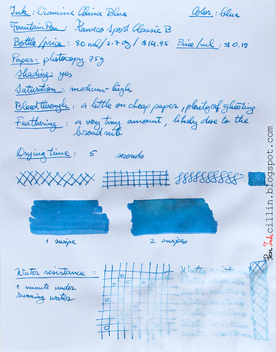
This isn't a water resistant ink and it shows. My standard test which exposes the ink to water for 1 minute didn't wipe it out completely, and there are still faint traces of it on paper, but I wouldn't expose it to moisture.

Conclusion

Diamine China Blue is a fairly run-of-the-mill blue ink, well behaved overall, with no single feature standing out but that's just fine because it makes for a reliable ink. The blue color is pleasing, dependent on your tastes of course, and you can definitely use it in an official capacity. Just make sure to use it on higher quality paper because it doesn't play very nice with the cheap stuff. Personally I'm not big on blue inks, especially since I prefer even more personality (read deeper shading and unique tone) but I can still recommend China Blue without any reservations.

Below are the two samples on photocopy and Clairefontaine 90g paper, respectively.
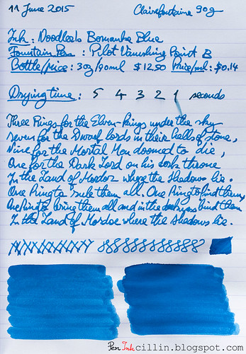
Diamine China Blue on photocopy

Diamine China Blue on Clairefontaine

Monday, April 27, 2015

J Herbin Bleu Azur ink review

My ink sample supply is dwindling fast and I found myself scraping the bottom of the barrel as I reached for the vial of J Herbin Bleu Azur. For a while now I've been reviewing the inks that I thought would be the most interesting, so what's left are, naturally, the runts of the litter. Well, ok, that sounds a little harsh, though maybe not in this particular case.

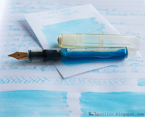
I popped the sample of J Herbin Bleu Azur in my Kaweco Sport Classic with broad nib and eyedropper conversion and away I went...

J Herbin Bleu Azur with Kaweco

Bottle and pricing

Bottle capacity: 30 ml / 1 oz
Price: $11
Price / ml: $0.37

Quick note here. J Herbin bottles are small and cost a pretty penny, as you can see. Generally the inks are double the cost of brands such as Noodler's and Diamine, and I'm sorry to say that I don't find the value in some of them.

Color and saturation

Here's where J Herbin Bleu Azur fails right off the bat for me. It is an extremely light and watery shade of baby blue, with very, very low saturation. I don't see how this ink can be used in day-to-day writing, and I'm sure that the thinner the nib the more faded it looks.

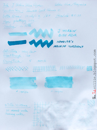
In the photocopy sample (at the end of the review) I compared it to Noodler's Navajo Turquoise, even though these two inks have nothing in common, but it's the closest ink I had a bottle of. Notice how much darker Navajo Turquoise is.

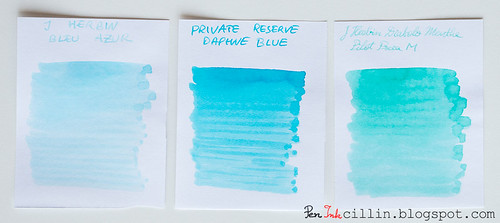
A much better comparison is the one just below. Put J Herbin Bleu Azur next to two other light colored blue/turquoise inks, Private Reserve Daphne Blue and J Herbin Diabolo Menthe, and you'll see how Bleu Azur is still lighter than both. And I didn't even like Diabolo Menthe back when I reviewed it, for similar reasons.

J Herbin Bleu Azur vs Private Reserve Daphne Blue vs J Herbin Diabolo Menthe

In fairness, some people have seen some success with using Bleu Azur as a highlighter ink. I can almost see how that might work.

Shading

As much as I'd like to bash J Herbin Bleu Azur even more than I already have, I will admit that it has a little shading, though insignificant, and unlikely to show unless using a thicker nib or perhaps employing it for highlighter duty.

Feathering

No

Bleedthrough

No. It's too light to show through and it has basically zero penetration power.

Flow, lubrication, and smoothness

I can't say I was impressed by how J Herbin Bleu Azur flowed. Watery inks sometimes feel - paradoxically - dry, as is the case here. As a result, it wasn't much pleasure to write with.

Drying time

As expected, drying times were quite short, even on Clairefontaine 90g paper.

Smearing when dry

None.

Water resistance

Water resistance, as can be seen in the photocopy sample below, is nil, perhaps even negative. Totally expected though, so I won't knock any points off for this.

Conclusion

What more is there to say about J Herbin Bleu Azur that I haven't already? I'm afraid there's nothing here that would make me recommend this ink, unless you're heavily into highlighting stuff in light baby blue. Even if you love such a light, faded blue, you might find better success, at a much lower price, by diluting another blue ink with water. Caveat emptor.

Epilogue

I don't usually do an epilogue to my reviews. In fact this is the first epilogue ever.
Being dissatisfied with J Herbin Bleu Azur, I thought I might improve it by mixing it with another ink. So I added a couple of drops of Noodler's Nikita and hoped for the best. It's usually not advisable to mix different inks in this manner so it wasn't much of a surprise that the result was yet another watery and vile concoction, of the violet persuasion. It proved worse than the original ink and I ended up dumping the whole thing in the sink. Thus I didn't get to use Bleu Azur in the real world, outside the confines of this review. Good riddance.

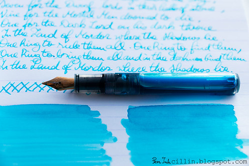
Following are the two samples on photocopy and Clairefontaine 90g paper, respectively.
J Herbin Bleu Azur on photocopy

J Herbin Bleu Azur on Clairefontaine

Tuesday, March 31, 2015

Private Reserve Daphne Blue ink review

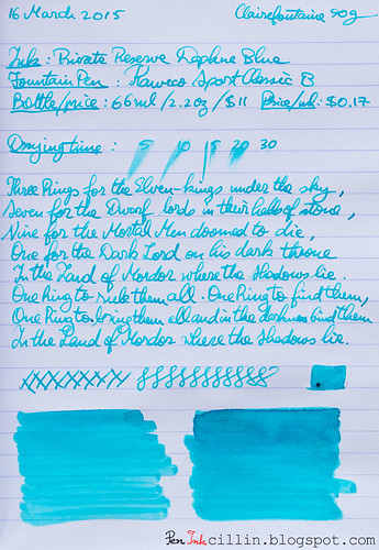
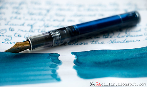
I haven't reviewed a bright blue ink in, like, forever, so I was almost taken aback to realize that I actually had some Private Reserve Daphne Blue among my samples. Here it goes then: PR Daphne Blue reviewed in the Kaweco Sport Classic with broad nib and eyedropper conversion.

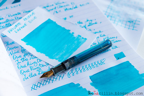
Private Reserve Daphne Blue shading

Bottle and pricing

Bottle capacity: 66 ml / 2.2 oz
Price: $11
Price / ml: $0.17

Color and saturation

Private Reserve tries to be cute with the name "Daphne Blue" and I'd say it succeeds because this ink is light blue, bright and cheerful as a warm summer day. You could just as easily call it cerulean/sky blue, or baby blue. Or a light shade of turquoise. It fits all these descriptions.

Private Reserve Daphne Blue shading

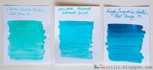
To get an even better idea, here it is next to two similar inks: J Herbin Diabolo Menthe and Noodler's Navajo Turquoise.

Private Reserve Daphne Blue vs J Herbin Diabolo Menthe vs Noodler's Navajo Turquoise

What's immediately obvious from this comparison is that Diabolo Menthe leans towards green, while Navajo Turquoise is a darker shade of turquoise than Daphne Blue.

Shading

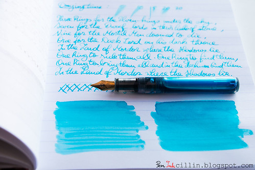
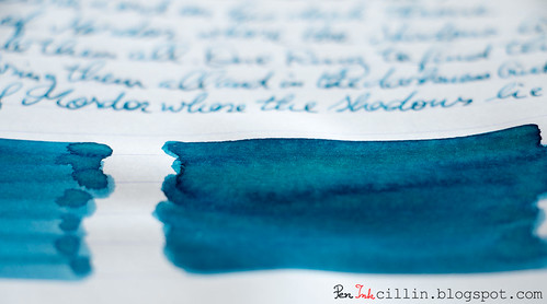
Whenever an ink shows color variation I'm a happy camper. Light inks sometimes don't do that, but Daphne Blue shades nicely. Of course, the broad nib brings this better into perspective.

Private Reserve Daphne Blue text

Feathering

I haven't noticed any.

Bleedthrough

No, although a broad nib on cheap, spongy paper tends to at least produce some ghosting. Luckily this is pretty well controlled in this case due to the lightness of the ink.

Flow, lubrication, and smoothness

While it flows very well in the Kaweco, I noticed a tiny amount of dryness, but it's hard to pinpoint. I could chalk it to "measured flow" and I wouldn't be half wrong. So it flows very satisfactorily and it's smooth to boot.

Drying time

Nothing out of the ordinary here. As expected, it takes its sweet time on good paper, up to 30 seconds or so (especially with the broad nib). On cheap paper it dries in a few seconds.

Smearing when dry

None.

Water resistance

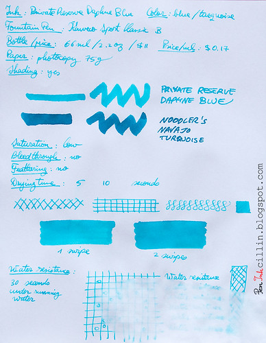
Water resistance is exactly as I was expecting, despite knowing nothing about this ink prior to testing it. It's non-existent. You can see from the bottom (copy paper) sample how it reacted to only 30 seconds under water.

Conclusion

Private Reserve Daphne Blue has all the markings of a great ink, provided you're on board with the baby blue color. It's very well behaved on all fronts, with the exception of water resistance but that wasn't an advertised feature in any case. If you like turquoise inks, there's nothing that would prevent me from recommending it, with the caveat that it might be a bit light for certain uses. Otherwise, a solid ink.

Private Reserve Daphne Blue shading

Following are the two samples on photocopy and Clairefontaine 90g paper, respectively.
Private Reserve Daphne Blue on photocopy

Private Reserve Daphne Blue on Clairefontaine

Thursday, October 16, 2014

Parker Quink Blue Black ink review

Parker is a consecrated name in the fountain pen world but it's the first time I'm testing an ink from this brand, and I'm kicking it off with Parker Quink "Permanent" Blue Black. You'll find the reasons for the quotes shortly.

Saying that Parker doesn't have a wide range of inks is a bit of an understatement. Currently it seems that it only sells 3: a black and two blues. I bought a sample of Blue Black a long time ago - and its time to be tested finally came. I loaded it in my Kaweco Sport Classic with broad nib and eyedropper conversion.

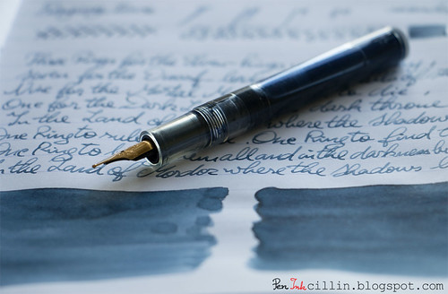
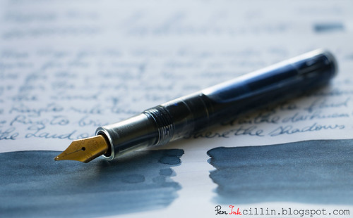
Parker Quink Blue Black shading with Kaweco

Bottle and pricing

Bottle capacity: 60 ml / 2 oz
Price: $10.30
Price / ml: $0.17

Color and saturation

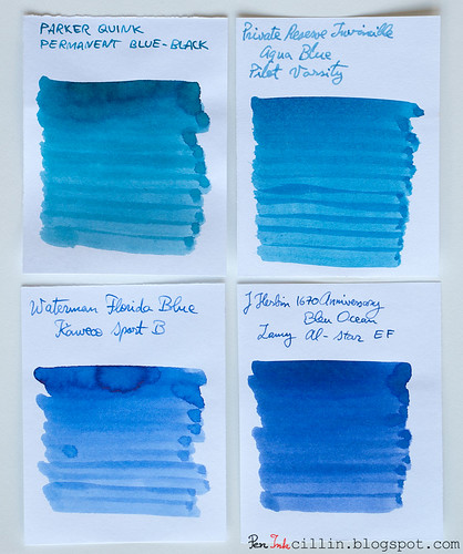
The "Blue Black" in the name is somewhat of a misnomer, because this ink veers more towards turquoise than black. Depending on the light, you can catch faint hints of green in it. It's not very saturated or vibrant, being rather dull. It also changes color as it dries. Wet, it looks more like a true blue, but once it dries it acquires the green/turquoise tint. I don't know why they call it "Blue Black" either, unless the "black" refers to its dullness.

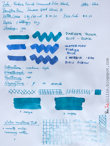
I made a comparison with 3 other blue inks: Private Reserve Invincible Aqua Blue, Waterman Florida Blue, and J Herbin 1670 Anniversary Bleu Ocean. As you can see, the Waterman and J Herbin inks are the "truest" blues of the bunch, while the PR ink is most similar to Parker Blue Black, but even PR Aqua Blue is more neutral than the Parker ink.

Parker Quink Blue Black vs PR Invincible Aqua Blue vs Waterman Florida Blue vs J Herbin 1670 Bleu Ocean

Shading

Parker Quink Blue Black has a little shading going on, thankfully. It's not much, but a broad nib will bring it out, as will a wide stroke with a q-tip.

Parker Quink Blue Black shading

In the right light you might even notice some sheen, which is always nice to have, but probably won't be evident in normal use.

Feathering

None.

Bleedthrough

Insignificant.

Flow, lubrication, and smoothness

I'm pleased that Parker Quink Blue Black flows very well, perhaps a bit wet. It runs nicely in the Kaweco.

Drying time

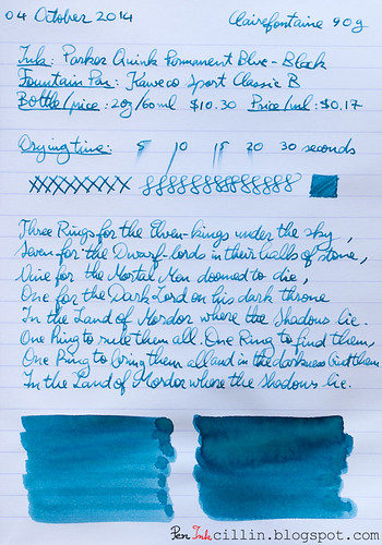
The drying time is lengthy on Clairefontaine 90g paper, but I think the broad nib is at fault here. It's much quicker on cheap copy paper.

Smearing when dry

None.

Water resistance

Here's the thing. Parker Quink Permanent Blue Black has the word "permanent" in its full name. That would imply at least a modicum of water resistance. Even the official specs say that it is water resistant. If so, why did it perform a lot worse in my water resistance test than Diamine Prussian Blue, an ink which is definitely not water resistant? This ink has no water resistance whatsoever, I'm sorry to say.

Conclusion

I'm afraid that I can't recommend Parker Quink Permanent Blue Black because there's nothing that makes it better than other blue inks. I suppose you could go for it if you're adamant about using Parker inks in Parker fountain pens but even then there are much better options and besides, this thing about using the same brand of pen and ink is mostly myth. The color doesn't sing to me either, although, to be fair, it has some decent shading in the right light. It also looks to me like Parker is doing some false advertising (unless my sample was from a bad batch) in regards to the water resistance of this ink. Final verdict: thumbs down.

Here are the two sample on photocopy paper and Clairefontaine 90g, respectively.

Parker Quink Blue Black on photocopy

Parker Quink Blue Black on Clairefontaine

Wednesday, September 24, 2014

Diamine Prussian Blue ink review

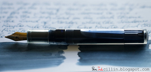
Slowly but surely I am moving into the less voted-for inks in my ink sample survey. This time it's Diamine Prussian Blue and I loaded it into my Kaweco Sport Classic with broad nib and eyedropper conversion.

Diamine Prussian Blue shading

Bottle and pricing

Bottle capacity: 80 ml / 2.7 oz
Price: $12.95
Price / ml: $0.16

Color and saturation

Diamine Prussian Blue is, well, a blue ink. However, the saturation is so low that it can be easily mistaken for a grey. Essentially it's a very dull and subdued slate blue, which is just fine with me. You might not like it ink at first, or at all. It didn't "sing" to me the first couple of days I used it, but then it started to grow on me.

Prussian Blue's muted tone actually makes a lot of sense in a formal environment, such as an office. Is it the best ink for official documents? Perhaps not, based on how light it is. But for less official papers it's pretty good, and the color is not the only thing that helps.

Diamine Prussian Blue shading

So what exactly is "Prussian Blue"? Interestingly, it's one of the first modern pigments. Does the ink resemble its namesake? I would say yes, allowing for differences in saturation.

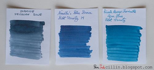
Below I tried to compare Prussian Blue with two other muted inks I tested in the past, Noodler's Polar Blue (forgive the mistake in the photo) and Private Reserve Invincible Aqua Blue, though the three aren't very similar.

Diamine Prussian Blue vs Noodler's Polar Blue vs PR Invincible Aqua Blue

Shading

You might be forgiven to think that Diamine Prussian Blue doesn't shade. Light inks don't always feature a lot of variation and it's almost the case here. However, this ink does have a little bit of shading, probably made more discernible by the broad nib.

Diamine Prussian Blue shading

Feathering

No.

Bleedthrough

Being a light-colored and de-saturated ink, Prussian Blue doesn't bleed, even on cheap paper.

Flow, lubrication, and smoothness

One very pleasant trait that Diamine Prussian Blue manifests is how easily and smoothly it flows in the Kaweco. It doesn't gush, and it has a very measured flow, yet it's wet enough (around a 6.5-7/10) that it satisfies my requirements.

Drying time

On cheap paper it dries almost instantly, but on Clairefontaine 90g (a thick, glossy, high quality paper) it is more stubborn and might require up to 30 seconds to dry completely with the broad nib.

Smearing when dry

A resolute no!

Water resistance

Color me surprised, but Diamine Prussian Blue is more resistant to water than it lets on. No where is it advertised as being water resistant but my standard test by which I let water run on a sample for 30s - 1m clearly shows that the ink remains perfectly legible. Granted, the top layer has washed off but what remains is more than enough.

Conclusion

While the slate-blue / blue-grey of Diamine Prussian Blue might not appeal to everyone, I would give it a try if I were looking for a more formal shade of blue. It could grow on you too. It's a very well-behaved ink which flows smoothly, has just enough shading to make it interesting, and on top of everything, plays well with water.

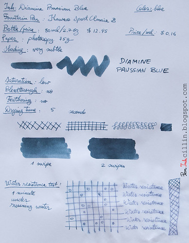
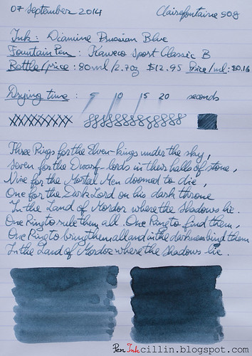
Here are the two samples on photocopy, and Clairefontaine 90g paper, respectively.
Diamine Prussian Blue on photocopy

Diamine Prussian Blue on Clairefontaine

Monday, August 25, 2014

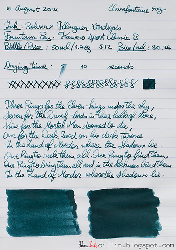
Rohrer & Klingner Verdigris ink review

You voted for it, so the next ink in my ink sample survey is Rohrer & Klingner Verdigris. I tested the sample (in fact I'm still using it as we speak) in my Kaweco Sport Classic with broad nib.

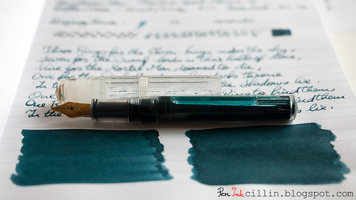
Rohrer & Klingner Verdigris shading

Bottle and pricing

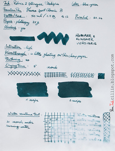
A bottle of Rohrer & Klingner Verdigris holds 50ml / 1.7oz and retails for $12. That's $0.24 per milliliter, quite pricy.

Color and saturation

I've barely started this review and I have already arrived at the crux of why I don't like this ink. It's not the only reason, but I dislike the color. While it's considered a blue ink, there's not a lot of blue in it, I'm afraid. It veers more towards green, but the greenish shade of copper oxide, which, in fact, is where the term "verdigris" comes from. Either way, my eyes just can't see any blue in this ink.

To compound the problem, under fluorescent light R & K Verdigris looks like a dirty, dull gray. I've been using it daily at work over the past couple of weeks, under such lighting, and that's how it is.

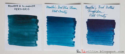
I've compared it to two of the only inks I've tested which bear a passing resemblance to it: Noodler's Bad Blue Heron and Noodler's Bad Belted Kingfisher. You can clearly tell which inks are blue and which isn't.

Rohrer & Klingner Verdigris vs Noodler's Bad Blue Heron vs Bad Belted Kingfisher

As far as saturation goes, it's pretty high.

Shading

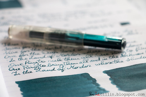
To be fair, Rohrer & Klingner Verdigris redeems itself just a little by showing some decent (but not outstanding) shading. It's best seen in the q-tip samples but also a bit in the writing samples, although the latter suffer from another problem which I'm going to mention shortly.

Rohrer & Klingner Verdigris shading


Feathering

None.

Bleedthrough

It ghosts a little on cheap paper and the reverse side remains writable, though barely so.

Flow, lubrication, and smoothness

Here's the second (and perhaps biggest) reason why I dislike Rohrer & Klingner Verdigris. Just like it's brand-mate Fernambuk, Verdigris is a dry ink. It flows poorly in the Kaweco, and also inconsistently. You can see that in my writing samples. Some lines are thick and wet, others thin and dry. In my book that's a big no-no.

Drying time

Thanks to its dryness, Rohrer & Klingner Verdigris dries very quickly, even on smooth Clairefontaine paper. Small comfort though.

Smearing when dry

None.

Water resistance

This is not a water resistant ink. After 30 seconds under running water most of it has washed off.

Conclusion

There's nothing positive I can say about Rohrer & Klingner Verdigris. There must have been a reason that determined me to buy a sample but I can't think of it for the life of me. Perhaps it looked better in other samples I saw online. In person, the color doesn't appeal to me (though I'm sure plenty of folk will love it) and the dryness and inconsistent flow are deal-breakers. I'd say buy it - only if you dare.

Here are the two writing samples on photocopy and Clairefontaine 90g paper, respectively.
Rohrer & Klingner Verdigris on photocopy

Rohrer & Klingner Verdigris on Clairefontaine

Tuesday, May 27, 2014

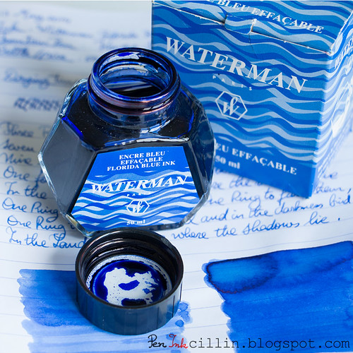
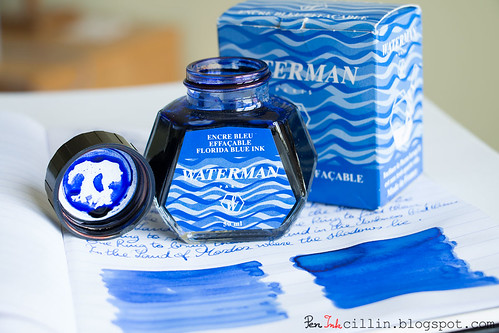
Waterman Florida Blue ink review

I don't often review full ink bottles anymore, but when I do, it's mostly because Jetpens were so kind to send me one. Today's review is for Waterman Florida Blue, an ink that is somewhat extinct, which is probably another reason why there's no giveaway this time. Jetpens told me that the only thing that has actually changed is the name, box and bottle graphics, while the ink formula remains the same. The new version is, thus, Waterman Serenity Blue. Now between you and me, I think I prefer the old graphics to the new.

Waterman Blue ink bottle

Before I start the review, let me just plug my Twitter feed shamelessly, yet again: @Peninkcillin. I can assure you that I don't tweet incessantly and when I do it's pen/ink related.

If you haven't seen this post, and you are interested in future ink reviews, I highly recommend you take a look: Ink sample survey. Voting has already been successful but if you haven't expressed your opinion on what ink you would like to see reviewed next, it's not too late.

Moving on to the subject my review, I loaded it up in my Kaweco Sport Classic fountain pen, with a simple eyedropper conversion. I've been using it daily for the past 2-3 weeks, at work.

Bottle and pricing
While this ink doesn't go by Florida Blue anymore, the new version, Serenity Blue, costs $8.64 for a 50 ml / 1.7 oz bottle, or $0.17 per milliliter. Very affordable.

Color and saturation
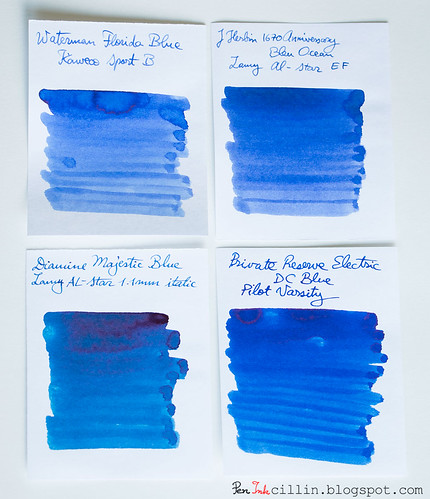
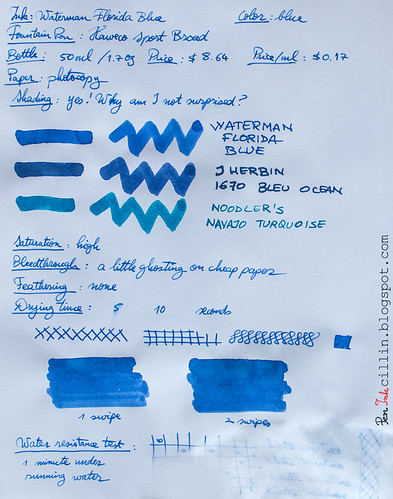
Waterman Florida Blue is fairly highly saturated though not to the extreme. I have compared it side-by-side with 3 other blue inks which I have tested in the past, which are similar: J Herbin 1670 Anniversary Bleu Ocean, Diamine Majestic Blue, and Private Reserve Electric DC Blue.

Waterman Blue 4-ink comparo

It is a neutrally bright ink, leaning towards the cheerful side, with slight hints of violet.

Ironically, Florida Blue seems to be most similar to my last review, J Herbin 1670 Bleu Ocean. Out of the two, based only on color, I would pick Florida Blue. However, of all four I would pick Diamine Majestic Blue.

Shading
It's stablemate, Havana Brown, had some great shading, so I wasn't surprised to see that Florida Blue also shades, though not as intense.

Feathering
I didn't see any.

Bleedthrough
It doesn't bleed as much as you would think but there is some ghosting on cheap photocopy paper. All within parameters.

Flow, lubrication, and smoothness
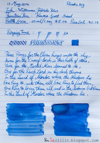
I am very happy with Florida Blue's flow and smoothness. The pen starts up wet every time and it writes very smoothly. It's certainly not the wettest or smoothest ink I've encountered but it's up there with some of the best.

Drying time
As with many other inks, drying times vary depending on the quality of the paper. It dries fast on cheap paper and much slower on high-quality, glossy paper.

Smearing when dry
None.

Water resistance
Water resistance certainly isn't in the books for Waterman Florida Blue. 1 minute exposure under running water wiped out most of it.

Conclusion
While this isn't the best Waterman ink, or even the best blue ink I've tested, I would definitely consider Florida Blue (or rather Serenity Blue) if I were looking for a classic, safe blue ink. It is middle of the pack but the wet flow and smoothness, as well as the price, make it stand out.

Waterman Blue ink bottle

Here are the two samples on photocopy and Rhodia 80g, respectively.

Waterman Blue on photocopy

Waterman Blue on Rhodia

Wednesday, April 16, 2014

J Herbin 1670 Anniversary Bleu Ocean ink review and GIVEAWAY

J Herbin 1670 Anniversary Bleu Ocean bottle
Time for another giveaway, courtesy of Jetpens, as well as a review of the ink itself. It is a special ink, one that I wanted to review as soon as I heard it was being produced. It is another "limited edition" ink from J Herbin, 1670 Anniversary Bleu Ocean (or Ocean Blue).

The reason why I put "limited edition" in quotes is because the first such ink bearing the 1670 moniker was supposed, if I'm not mistaken, to be produced in a limited run. Well, due to the popularity of 1670 Anniversary Rouge Hematite, they decided to keep producing it indefinitely. As such, Bleu Ocean could very well follow the same path.

The name "Bleu Ocean" - I am informed by the small flier that comes in the box - "recalls the sea voyages of J Herbin when he was travelling in the far east and discovered the famous gum which will allow him to manufacture wax". I'll come back to wax in a minute.

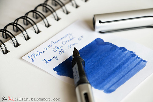
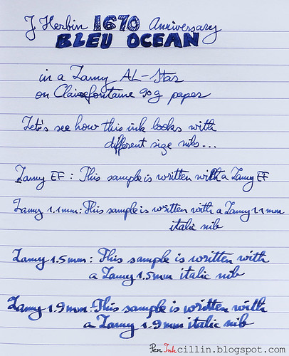
I reviewed this ink in my Lamy AL-Star, mainly with the EF nib but also with my 1.1mm, 1.5mm, and 1.9mm italics.

As a reminder, you might wish to subscribe to my Twitter, @Peninkcillin, if you haven't already.

THE GIVEAWAY
Jetpens is offering a bottle of J Herbin 1670 Anniversary Bleu Ocean exclusively to my readers. Head on to their giveaway page for a chance to win. NOTE: you will need to subscribe (or already be a subscriber) to Jetpens' newsletter before you can submit your entry for the giveaway. For existing subscribers, just enter your email and hit "Submit". If you are not already a subscriber there's a handy "Subscribe to our newsletter" box on the bottom right side. The giveaway runs from the time this review is posted until 04/23 11:59PM PST. Good luck!

Bottle and pricing
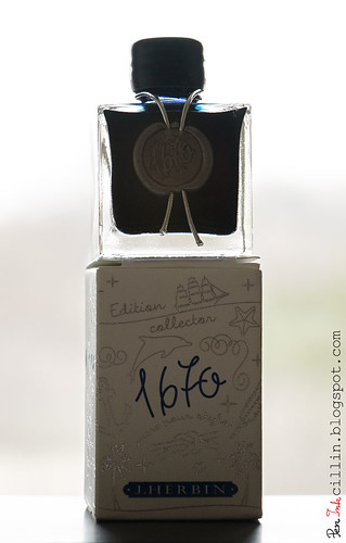
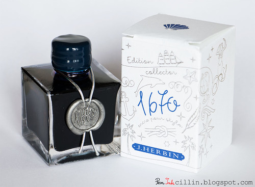
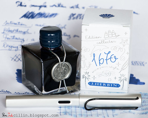
J Herbin 1670 Anniversary bottles are special because they hold a special ink. They look bigger in pictures than in reality. When you hold one in your hands you will realize they are quite dainty. Square is the operative word here but the sharp edges make the bottle look vintage, which goes well with what it's trying to convey: an ink with a very long and rich heritage. If you think about it, which other modern brands were founded more than 300 years ago?

J Herbin 1670 Anniversary Bleu Ocean

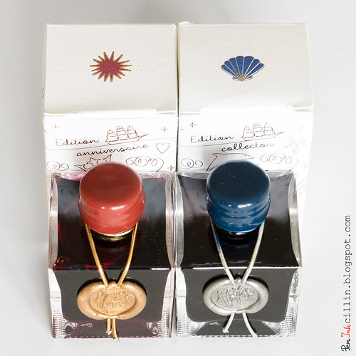
The bottle is adorned by the number 1670 stamped in silver wax, with a silver ribbon around the neck and a blue wax-covered cap. This is a nice change from Rouge Hematite's golden seal and ribbon, and red cap.

I'm not sure how many of you recall, but when Rouge Hematite was originally released, the cap was covered in brittle wax. The wax just crumbled away from light use. J Herbin changed the formula and by the time I got my bottle of Rouge Hematite it was all fixed. The new formula is strong and supple.

As for the new wax cap, it feels more like plastic than wax to me. Perhaps someone can shed more light on this but a telling sign is when my fingers and nails can easily scuff the Rouge Hematite cap but won't leave a trace on the Bleu Ocean one.

J Herbin 1670 Anniversary Bleu Ocean vs Rouge Hematite

A downside of the bottle's design is that the neck is very narrow. My Lamy AL-Star barely fit. A thicker fountain pen might not fit at all. This might be a case where form trumps function.

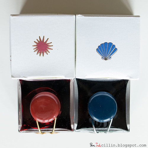
The box which holds the bottle is nicely embossed with silver drawings and blue text, as well as a blue seashell logo on the top flap.

J Herbin 1670 Anniversary Bleu Ocean vs Rouge Hematite

A bottle of J Herbin 1670 Anniversary Bleu Ocean is $20.75 at Jetpens. It holds 50ml (1.7oz). At $0.42 per milliliter it's one of the more expensive inks out there.

Color and saturation
Sometimes an ink is more than just a pretty color. Sometimes it speaks to me. This is one of those times. Bleu Ocean reminds me - at the risk of sounding corny - of the blue ocean. I don't say this lightly, because in my childhood I have traveled to exotic countries, across blue oceans, and sometimes I get flashes of that deep blue water. This ink transports me to that time and invokes a certain nostalgia.

Metaphor aside, I really like the color. It's different than any blue ink I have reviewed so far. I've always liked pastel colors and Blue Ocean is a very soothing shade of pastel. As such, it isn't highly saturated, but somewhere above average. It is darker wet, but lightens up when it dries. There's even a hint of violet in it, which adds to its character.

Shading
Rouge Hematite set a very high bar for 1670-branded inks, through its amazing shading properties. You can refer back to my review of Rouge Hematite to see the gorgeous golden highlights in the dark red ink. That's a tough act to follow and unfortunately Blue Ocean doesn't impress in the shading department. It does have some variation but it is quite subtle and you might even overlook it if you use a thin nib. However, if you are gung ho about a dark blue ink with great shading, I can't recommend Diamine Majestic Blue enough.

J Herbin 1670 Anniversary Bleu Ocean swatch

Feathering
Surprisingly, J Herbin Bleu Ocean feathers a little. I'm not sure what the mechanism behind feathering is, though one might expect that more expensive inks will avoid this, but there you go. In fairness, I wouldn't count this against it, for two reasons. First, it only happened on the cheap paper I used. Second, it's visible only if you peer really close to the paper.

Bleedthrough
There isn't any bleedthrough to speak of, although on cheap paper it ghosts a little, but that's to be expected of a darker ink.

Flow, lubrication, and smoothness
J Herbin 1670 Bleu Ocean flows well in the Lamy with all my nibs. Whether it's intentional or not, the flow feels very measured and controlled. It's a bit drier than I prefer, perhaps 6/10 on the scale. On the other hand, it's smooth enough to make it pleasurable to use.

Drying time
On cheap paper drying time is around 5 seconds, but you might get some feathering. On Rhodia it is around 10-15 seconds, foregoing the feathering. Take your pick.

Smearing when dry
None.

Water resistance
Here's another non-resistant ink which shows a little permanence. After 1 minute of exposure to flowing water, the text is still legible, although a lot of the ink has washed off. Some violet undertones are exposed.

Conclusion
J Herbin 1670 Anniversary Bleu Ocean is a mixed bag. On the one hand, I love the presentation, the color and some of its properties. On the other, shading is almost absent, and I can't help but wonder if other blue inks are better value for the money. Either way, Blue Ocean is a pretty unique ink in its own right, as long as it isn't held to the same standards as its red sibling. The question remains: will J Herbin produce future 1670 inks? I'm hoping for a green or brown.

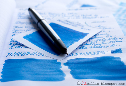
J Herbin 1670 Anniversary Bleu Ocean with Lamy

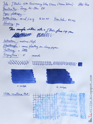
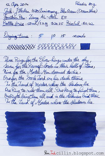
Next are the two samples on photocopy, Rhodia 80g, and Clairefontaine 90g paper, respectively.
J Herbin 1670 Anniversary Bleu Ocean on photocopy

J Herbin 1670 Anniversary Bleu Ocean on Rhodia

J Herbin 1670 Anniversary Bleu Ocean on Clairefontaine