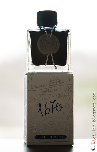
Time for another giveaway, courtesy of Jetpens, as well as a review of the ink itself. It is a special ink, one that I wanted to review as soon as I heard it was being produced. It is another "limited edition" ink from J Herbin, 1670 Anniversary Bleu Ocean (or Ocean Blue).
The reason why I put "limited edition" in quotes is because the first such ink bearing the 1670 moniker was supposed, if I'm not mistaken, to be produced in a limited run. Well, due to the popularity of 1670 Anniversary Rouge Hematite, they decided to keep producing it indefinitely. As such, Bleu Ocean could very well follow the same path.
The name "Bleu Ocean" - I am informed by the small flier that comes in the box - "recalls the sea voyages of J Herbin when he was travelling in the far east and discovered the famous gum which will allow him to manufacture wax". I'll come back to wax in a minute.
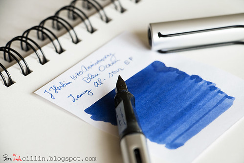
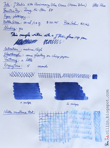
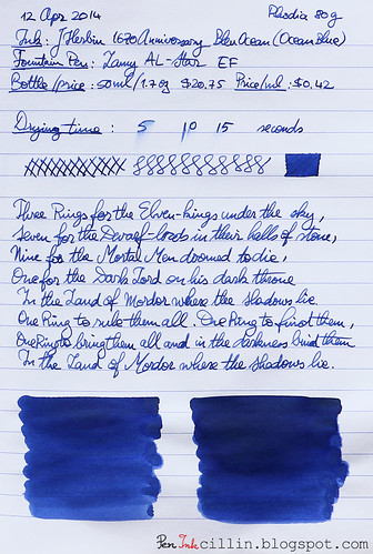
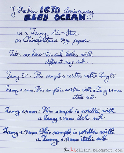
I reviewed this ink in my Lamy AL-Star, mainly with the EF nib but also with my 1.1mm, 1.5mm, and 1.9mm italics.
As a reminder, you might wish to subscribe to my Twitter, @Peninkcillin, if you haven't already.
THE GIVEAWAY
Jetpens is offering a bottle of J Herbin 1670 Anniversary Bleu Ocean exclusively to my readers. Head on to their giveaway page for a chance to win. NOTE: you will need to subscribe (or already be a subscriber) to Jetpens' newsletter before you can submit your entry for the giveaway. For existing subscribers, just enter your email and hit "Submit". If you are not already a subscriber there's a handy "Subscribe to our newsletter" box on the bottom right side. The giveaway runs from the time this review is posted until 04/23 11:59PM PST. Good luck!
Bottle and pricing
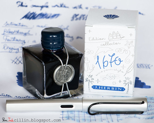
J Herbin 1670 Anniversary bottles are special because they hold a special ink. They look bigger in pictures than in reality. When you hold one in your hands you will realize they are quite dainty. Square is the operative word here but the sharp edges make the bottle look vintage, which goes well with what it's trying to convey: an ink with a very long and rich heritage. If you think about it, which other modern brands were founded more than 300 years ago?
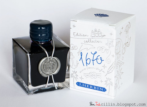
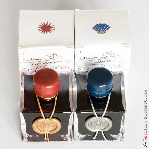
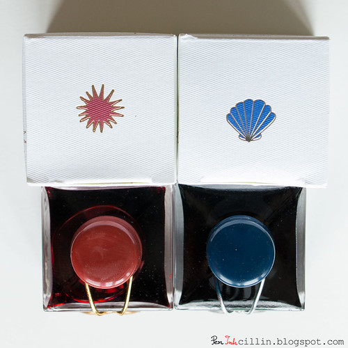
The bottle is adorned by the number 1670 stamped in silver wax, with a silver ribbon around the neck and a blue wax-covered cap. This is a nice change from Rouge Hematite's golden seal and ribbon, and red cap.
I'm not sure how many of you recall, but when Rouge Hematite was originally released, the cap was covered in brittle wax. The wax just crumbled away from light use. J Herbin changed the formula and by the time I got my bottle of Rouge Hematite it was all fixed. The new formula is strong and supple.
As for the new wax cap, it feels more like plastic than wax to me. Perhaps someone can shed more light on this but a telling sign is when my fingers and nails can easily scuff the Rouge Hematite cap but won't leave a trace on the Bleu Ocean one.
A downside of the bottle's design is that the neck is very narrow. My Lamy AL-Star barely fit. A thicker fountain pen might not fit at all. This might be a case where form trumps function.
The box which holds the bottle is nicely embossed with silver drawings and blue text, as well as a blue seashell logo on the top flap.
A bottle of J Herbin 1670 Anniversary Bleu Ocean is $20.75 at Jetpens. It holds 50ml (1.7oz). At $0.42 per milliliter it's one of the more expensive inks out there.
Color and saturation
Sometimes an ink is more than just a pretty color. Sometimes it speaks to me. This is one of those times. Bleu Ocean reminds me - at the risk of sounding corny - of the blue ocean. I don't say this lightly, because in my childhood I have traveled to exotic countries, across blue oceans, and sometimes I get flashes of that deep blue water. This ink transports me to that time and invokes a certain nostalgia.
Metaphor aside, I really like the color. It's different than any blue ink I have reviewed so far. I've always liked pastel colors and Blue Ocean is a very soothing shade of pastel. As such, it isn't highly saturated, but somewhere above average. It is darker wet, but lightens up when it dries. There's even a hint of violet in it, which adds to its character.
Shading
Rouge Hematite set a very high bar for 1670-branded inks, through its amazing shading properties. You can refer back to my review of Rouge Hematite to see the gorgeous golden highlights in the dark red ink. That's a tough act to follow and unfortunately Blue Ocean doesn't impress in the shading department. It does have some variation but it is quite subtle and you might even overlook it if you use a thin nib. However, if you are gung ho about a dark blue ink with great shading, I can't recommend Diamine Majestic Blue enough.
Feathering
Surprisingly, J Herbin Bleu Ocean feathers a little. I'm not sure what the mechanism behind feathering is, though one might expect that more expensive inks will avoid this, but there you go. In fairness, I wouldn't count this against it, for two reasons. First, it only happened on the cheap paper I used. Second, it's visible only if you peer really close to the paper.
Bleedthrough
There isn't any bleedthrough to speak of, although on cheap paper it ghosts a little, but that's to be expected of a darker ink.
Flow, lubrication, and smoothness
J Herbin 1670 Bleu Ocean flows well in the Lamy with all my nibs. Whether it's intentional or not, the flow feels very measured and controlled. It's a bit drier than I prefer, perhaps 6/10 on the scale. On the other hand, it's smooth enough to make it pleasurable to use.
Drying time
On cheap paper drying time is around 5 seconds, but you might get some feathering. On Rhodia it is around 10-15 seconds, foregoing the feathering. Take your pick.
Smearing when dry
None.
Water resistance
Here's another non-resistant ink which shows a little permanence. After 1 minute of exposure to flowing water, the text is still legible, although a lot of the ink has washed off. Some violet undertones are exposed.
Conclusion
J Herbin 1670 Anniversary Bleu Ocean is a mixed bag. On the one hand, I love the presentation, the color and some of its properties. On the other, shading is almost absent, and I can't help but wonder if other blue inks are better value for the money. Either way, Blue Ocean is a pretty unique ink in its own right, as long as it isn't held to the same standards as its red sibling. The question remains: will J Herbin produce future 1670 inks? I'm hoping for a green or brown.
Next are the two samples on photocopy, Rhodia 80g, and Clairefontaine 90g paper, respectively.

Very nice! I second your wishes for a green 1670 edition... if they can get the gold shading from the Rouge Hematite in there too, even better.
ReplyDeleteThank you for the review :)
A great review. However, there are very few blue inks that really make me want to get a full bottle. This isn't one of them. Based on your review, and for the price, I really see nothing extraordinary about it. :-(
ReplyDeleteOoo yeah, gold flakes in that green! I hope it's not just wishful thinking.
ReplyDeleteIt's a very nice color. Granted, there are other nice blues out there but this is one of the nicer (non-turquoise) blues I've seen. I feel like there are too many blues. Iroshizuku has some nice ones but there are so many, it's overwhelming to pick one for reviewing.
ReplyDeleteThere aren't a lot of blue inks that excite me but this one is an exception. In my Lamy Studio, M nib, it lays down a nice wet line with almost a silverish sheen. It looks great in my JinHao X450 M (a *very* wet writer) and my Nemosine Demonstrator F, too. Expensive but worth it.
ReplyDeleteI'm more excited about the new gray 1670 Anniversary they announced. Apparently it has gold flakes. That should be interesting.
ReplyDeleteAs many ink samples as I have (many many), I have no gray inks. But gray with flecks of gold? That is mightily tempting. AND it's J Herbin ink which has become my preferred brand when it comes to splurging on a full bottle of something.
ReplyDeleteHere's a link that talks a little about the new ink
ReplyDeletehttp://penpaperinkletter.com/new-j-herbin-1670-anniversary-series-ink-just-announced-gris-orage-aka-stormy-gray/