There are several different patterns available for the trim piece around the mid-section of these pens, as well as gold and purple finishes, but I opted for the plain versions because I wasn't sure I would like the patterns. Looking more carefully at the photos on Goulet Pens I believe that some of them, such as the silver dots, are quite interesting.
The Pilot Metropolitan must be a new model because I can't remember hearing about it a year ago. It certainly wasn't available when I got into fountain pens, around 2010-11, because instead of the much more expensive Pilot Prera, I might have looked into one of these instead. As it stands, the Pilot Metropolitan is a very affordable entry-level fountain pen which the Goulets sell for a modest $15. Let's dig in and find out what you get for 3 Lincolns.
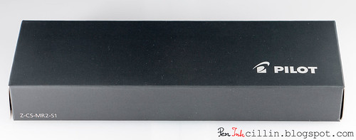
Packaging
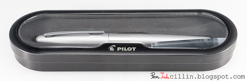
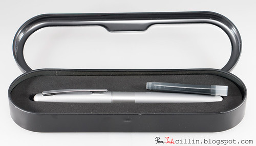
The Pilot Metropolitan comes in a simple but neat exterior cardboard sleeve. Inside is the inner display case which is made of some sort of thin metal or tin, with a plastic window through which the pen and a blue ink cartridge can be seen.
This is quite a lot of decent quality packaging for a $15 pen. I actually prefer it to that of the Pilot Vanishing Point. This case looks sturdier and the metal is superior to the VP's fake-leather-covered-cardboard.
Here's what the case looks with the lid open. Pilot also includes a blue ink cartridge to get you started.
Body, construction, and dimensions
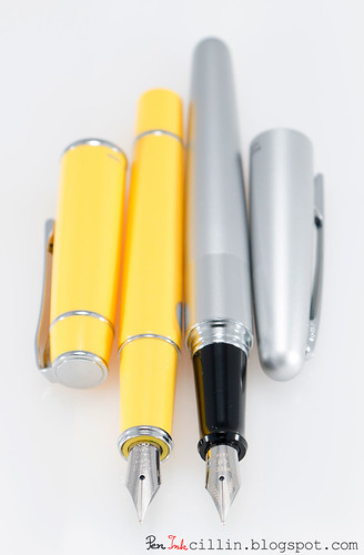
The Pilot Metropolitan is a sleek, metal-bodied fountain pen, with a slim cigar-shaped body. It tapers to a rounded point at both ends and there's no finial to speak of.
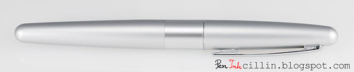
The silver version comes with a brushed metal finish, while the wide trim band around the middle is polished aluminum. The middle band can also be one of several patterns, such as dots, python, zig-zag and so on.
Regardless of color and finish, all Metropolitan pens sport a polished chrome clip which seems to be tension-loaded. It's very plain and I can't say I like it but it serves its purpose.
Moving on, uncapping the pen reveals the glossy black plastic section and the nib.
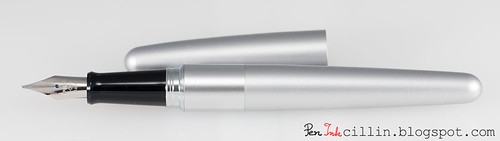
The cap is of the slip-on type and snaps close with a solid click. You can post the cap but it doesn't feel very secure unless you press it down hard. I prefer to use the Metropolitan un-posted because the balance feels better for me. Posted, it's a little top heavy.
Seeing the nib, immediately hinted that this would be a good writer. Why? Because at first sight the nib looked very similar to the Prera's. And the Prera is a very good writer. So are the nibs identical? I will reveal that shortly.
Unscrewing the barrel from the section reveals the filling mechanism. It's a squeeze converter.
Now, I have some reservations regarding squeeze converters. They're rather imprecise when filling, you can't see the contents, ink capacity is low and, well, basically they're not the most elegant filling system out there. But considering the price of this pen, I'm actually glad that they even included a converter. Other manufacturers won't even dream of going beyond the courtesy lone cartridge for price points below $40-50. So I see this as a big plus.
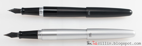
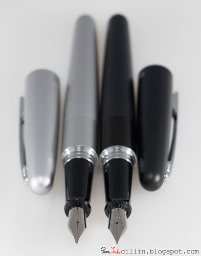
Here are the two pens I reviewed, next to each other. The black has a fine nib, while the silver sports a medium.
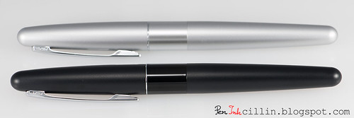
The black pen has a similar brushed finish, but the black band is glossier than the silver.
Dimensions for the Pilot Metropolitan are as follows:
Length capped: 13.7 cm / 5.4 in
Length un-capped: 13 cm / 5 in
Length posted: 15.5 cm / 6 in
Weight (capped, with converter): 26.4 g / 0.93 oz
Weight (un-capped, with converter): 17.1 g / 0.6 oz
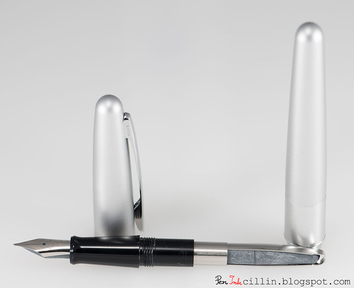
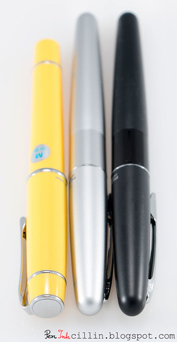
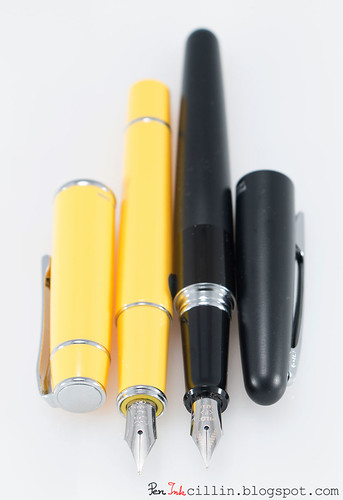
Here are the two Metropolitans compared to the Prera. They are longer but slimmer. I prefer the Prera's shape though, but that's a more premium pen.
In operation, the Metropolitan is well balanced without posting the cap. While I would prefer a slightly thicker body, it is by no means uncomfortable. The glossy section is a bit slippery but the fingers won't slide too low because they are stopped by the flared end.
The nib
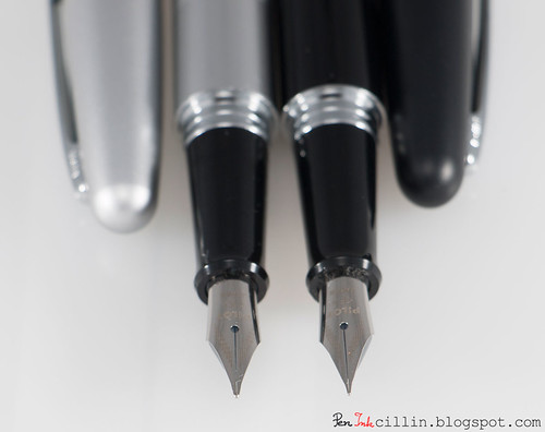
As mentioned, as soon as I saw the Metropolitan's nib, I knew it would be good, because it looked very similar to the Prera's. So I took both pens apart (the medium-nibbed Metropolitan and the medium Prera) and here's what I saw.
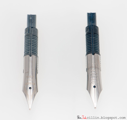
As I suspected, both nib and feed are identical. The only difference is in the pattern which appears on the nib. The Metropolitan has a small dashed design, while the Prera lacks this, instead featuring the words "Super Quality". Well, I'm happy to report that both nibs are "super quality".
Here's the underside of the two feeds. Again, they are identical, except for the fact that the Metropolitan's is a lighter color.
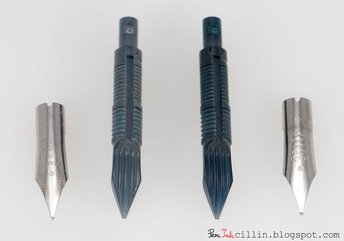
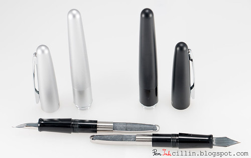
Next is a series of photos comparing the fine nib from the black Metropolitan with the medium nib from the silver Metropolitan, and the medium nib from the Prera.
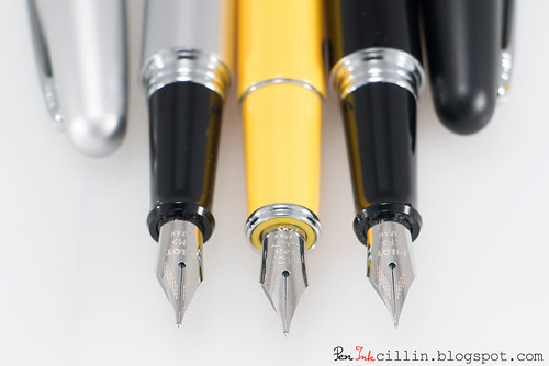
You can tell just by looking at these photos how much thinner the fine nib is compared to the medium.
But do they write?
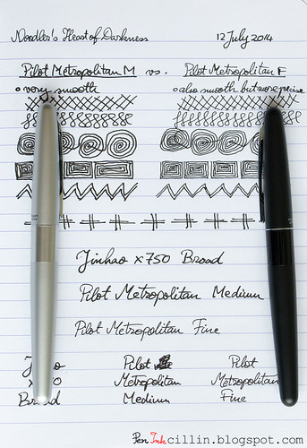
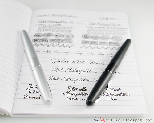
Expectations can be low for inexpensive pens and high for expensive ones. My expectations for the Metropolitan were pretty high to start with but I'm happy to say that they were exceeded. I loaded both pens with Noodler's Heart of Darkness and also used a Jinhao X750 with a broad nib for comparison, filled with the same ink.
The medium nib in particular impressed me in no small measure. It writes better than the Prera. I suspect I was lucky to get a particularly good sample. This is without doubt the smoothest medium nib I have used. It writes like a dream, creamy smooth on any type of paper. It's so smooth, and the flow so satisfying that it resembles a Pilot V5 Rollerball. Scratch that, it's even smoother than the V5.
The medium nib's flow is well on the wet side with Noodler's HOD, but be rest assured that it doesn't gush. Since I like wet-flowing nibs, it is very enjoyable to use.
The fine nib has a different character. It is very smooth and the flow is consistent. It starts right away and never skips. Yet, due to the nature of the nib, it is not quite as smooth or as wet as the medium. Don't get me wrong, if the medium gets a 10/10 for smoothness, I'd give the fine a 8.5-9/10. Same for wetness.
The fine nib's strength lies in its precision. It lays a very thin and sharp line, which I'm sure would be perfect for Japanese or Chinese characters. If you like F/EF nibs, this is the nib for you. Myself, I prefer a thicker nib, that's why I favor the medium, but the fine is just as good, depending how you lean.
Both nibs require very little pressure to write.
Here's the writing sample on Clairefontaine 90g, showing a comparison between the Pilot Metropolitan M and F, as well as the Jinhao X750 B, followed by a couple more glamour shots.
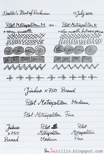
Notice how much tighter the spiral designs are with the F. Both pens pair incredibly well with Noodler's Heart of Darkness.
Final words
The Pilot Metropolitan is an inexpensive but definitely not cheap fountain pen. $15 gets you a stylish metal body with good balance and decent ergonomics, and even a squeeze converter which is pretty rare at this price point. But more importantly, this entry-level fountain pen comes with an incredible nib which puts more expensive pens to shame.
I can't recommend the Metropolitan strongly enough but it's up to you to decide which nib size you prefer. While both are amazing, my own bias makes me lean towards the medium. Whichever way you go, there's only a big heap of win, so if my review convinced you, head on to Goulet Pens and take a look.

I own two Pilot Metropolitans (gold zigzag and violet leopard), both M nibs, and I love them both. I too prefer medium wet nibs and these pens suit me to a T. They're very reliable smooth writers, start every time, have lovely wet flows, and are just generally pleasurable to write with. I heartedly second your recommendation of these pens.
ReplyDeleteAnd I'm glad the excellent behavior in mine was not a fluke :) But it seems Pilot has got these nibs down to a science.
ReplyDeleteI have 3 Metropolitans, one fine, one medium, and one with a Pilot Plumix nib. They all write beautifully, much better than my Lamy Safaris. I love these pens!
ReplyDeletePenInkcillin, this has to be your best review yet. You covered all of the bases nicely. Yet, we disagree completely on the medium vs. fine nib. My preference is definitely for fine/extra fine nibs compared to medium. That, however, is not why I disagree. Like you, I have both and both were purchased from The Goulet Pen Company. I purchased the medium soon after it came out, based on the excellent reviews. It was so bad that after one fill was used, I packed it away. For every reason you give for liking it, I had the opposite experience. It was not especially smooth writing, it skipped, and it was a hard starter. Recently, reviews started coming in for the fine nib iteration and, again, they were excellent. I was placing an order from the Goulets and because the pens are so inexpensive, I had them throw one into my package. I was not expecting very much but, wow, was I surprised. I filled my Metropolitan fine with Waterman Havana (now known as Waterman Absolute Brown) and was absolutely blown away. The nib writes more like an extra fine than a fine, which is a plus for me. The smoothness of the nib is definitely 10/10, especially considering its very fine nature. No skips, no drying out, and smooth writing on papers other than Clairefontaine 90g. Writing on the Clairefontaine 90g is just an amazing experience with the fine nib Metropolitan.
ReplyDeleteAs for posting, which I usually do, I find the pens (medium and fine both) very nicely balanced. They are just as nicely balanced unposted. Where I definitely agree with you is that posted, the cap should be placed quite firmly or it might not stay on.
Other points we agree on are the build quality, presentation, and the inclusion of both a converter and a cartridge. All are wonderful and amazing additions to a $15.00 pen.
While I would give the medium nib Metropolitain a 4 or 5 out of 10, the fine nib one is definitely a 10 out of 10 for me. Of course, fountain pens and the various accoutrements that accompany them are very much 'your mileage may vary' (YMMV) so we shall just have to agree to disagree on some aspects of this pen. ;-)
Again, thank you for a very comprehensive review of this pen and the comparison of the fine vs. medium nibs (even though we're not on the same page there).
These two definitely write better than my Lamy AL-Star EF.
ReplyDeleteBased on my fine nib, I have to agree with you that the Metropolitan is an excellent value. Now, of course, I'm going to go nuts wondering what the third pen is. LOL. I purchased a third inexpensive Pilot (not from the Goulets, as they do not carry it) but haven't had a chance to ink it up, yet. I'm looking forward to that review of yours. :-)
ReplyDeleteOoo, don't tell me yet what it is! Maybe it's the same thing I'm reviewing!
ReplyDeleteGreat review. I remain a huge Metro fan and it's still my most gifted pen then initiate those wanting to jump into fountain pens.
ReplyDeleteThanks Bob! It's funny how popular this pen is and I only heard about it recently.
ReplyDeleteGreat review...I love these pens, too. (Pentulant)
ReplyDeleteThanks Christine!
ReplyDeleteThank you for the great review. I have two Metropolitans, one medium and one fine. I love them both - great writers. I ended up buying one for a friend at work and he loves it as well.
ReplyDeleteAs per most (I think) Japanese nibs: My Metropolitan fine point lays down a thinner line than my Lamy extra fine!
I have five Metros, two running medium nibs and three running fine. They are a staple as I take extensive notes and I now use fountain pens to create visual notes for my students. Only my Prera is more fun to use, but hey, it is also $40 bucks more. As I mentioned once before, I worry that Pilot may realize what they have done and decide to raise the price.
ReplyDeleteOh definitely. Japanese fine nibs are much thinner than European ones. The Metro F is waaaay thinner than my Lamy EF which is actually thicker than the Metro M!
ReplyDeleteHaha yeah, let's keep this to ourselves!
ReplyDeleteI have Montblanc pen that's so attractive writing...
ReplyDeleteI had always wanted a fountain pen, but the once in muy country are so expensive, more than 100$ some, so i didnt had the opportunity to buy one, i say the metro m a few days ago and i loves the way it looked, thanks for the review it really helped me to take my final desision on buying this pen =)
ReplyDeleteGlad I could get another addicted to fountain pens!
ReplyDeleteIt's a amazing blog for a good information. It's seem that many people reading your blog because you are sharing a wonderful post on your blog. Thanks for sharing useful information.
ReplyDeleteonline pen shop
purchase pens online
I just bought one of these. I'm excited because I've read that Japanese fine nibs are finer than usual Fine nibs. I sketch a lot with fountain pens so hopefully I'll be getting major use out of this :B
ReplyDeleteMy personal opinion is that Japanese fine nibs should be what a "standard" fine nib is. In general, Asian nibs (Chinese, Japanese...) are finer than European ones because Asian characters are a lot more intricate than the Roman alphabet, requiring more precise instruments to render.
ReplyDeleteThat's super fascinating, makes sense. Just got it today...pretty solid pen that lays down great lines, but it writes like a fine medium. Had a plastic smell to it but it's so smooth, smoother than the Penmanship, which is scratchy. Overall, really happy I got this pen. The best part is it came with a converter! What a deal :D
ReplyDeleteAn actual converter or the pump one you see in my pictures? Mine didn't have the plastic smell...
ReplyDeleteIt's the same one. I don't really mind because I manually fill them with a syringe anyway...
ReplyDelete