What's in a name? J Herbin Diabolo Menthe is not the only ink that mesmerized me into trying it thanks to its catchy name. Nor will it be the last. Luckily I didn't buy a whole bottle - just a sample. You will find out shortly why I'm so "lucky". I am going under the assumption that Diabolo Menthe can be translated into something like "Devil's Mint", so please correct me if I'm wrong.
This ink ended up being a mixed bag. I liked some things about it but disliked others. I tried it first in my Pilot Prera with medium nib which turned out to be a mistake. I then decided to mix it with another ink and I chose Noodler's Nikita. This turned out to be an even bigger mistake. The mixture, a very ugly, drab, de-saturated purple was loaded in a Pilot Varsity. The resulting ink proved to be unusable as it would barely flow and it produced a very faint line. So I dumped the whole thing in the sink.
So much for stupid experiments. Yeah, I knew that mixing different brands of ink is a big no-no but I was curious to see what would happen.
I really should have used this ink in one of my Pilot Parallel calligraphy pens without mixing it. It might have stood a chance there.
As far as testing Diabolo Menthe in the Prera, here are my observations.
Bottle
Diabolo Menthe comes in J Herbin's typical dainty little bottles that have a 1oz/30ml capacity. At $9.50 a bottle, or $0.32/ml, this ink is about twice as expensive as Noodler's or Diamine inks. Let's see if this one is worth the price.
Color and saturation
I will admit that I love the color of this ink. Notice that I didn't mention at the beginning what color this ink is. While mint is associated with green, this looks to me more like a very light turquoise so I will file it under blue/turquoise.
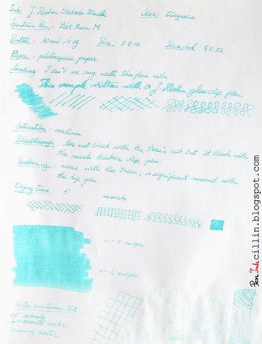
While bright and vibrant, Diabolo Menthe isn't very saturated. In fact it's quite faint, feeling almost watery, and that's one of the reasons why it fails in a fountain pen with a fine/medium nib like the Pilot Prera. I believe that this ink shouldn't be used for handwriting. It should be great for drawing though. With a brush.
Shading
I haven't noticed any shading, which makes it flat, but you can't expect much from such a light colored ink.
Feathering
Interestingly enough, the thin nib of the Prera preempted any feathering but the dip pen produced the opposite. In the latter case, Diabolo Menthe feathered like a champ, even more than much darker inks I've tested. The only explanation I can find is the watery nature of this ink.
Bleedthrough
Bleed- and show-through is pretty well controlled, with only the section written with the dip pen showing through the cheap photocopy paper.
Flow and lubrication
Strike two for J Herbin Diabolo Menthe comes from its atrocious flow. This ink is one of the dryiest I've tested, certainly up there with Noodler's Burma Road Brown, and all this despite the fact that it looks watery. It was a real chore to pick up the Prera and write with it because this ink would barely flow. The usually smooth nib of the Prera turned into a scratchy nail. You can tell from my sample where the pen struggled to write. I assume lubrication is equally lacking.
Drying time
If there's one good side to this story, is that this ink dries very fast. Well duh, what would you expect? Even on Rhodia 80g it dried under 5 seconds. Hey, it might be good for lefties!
Smearing when dry
None! Light + dry ink = no smearing.
Water resistance
15 seconds under running water washed off all the ink. Not that I was expecting it to be water resistant or anything...
Conclusion
J Herbin Diabolo Menthe might have an exotic-sounding name and a bright, cheerful color but for me it proved very finicky and almost useless in a fountain pen. I can only recommend this ink for art (using a brush) or perhaps with a dip pen or a calligraphy pen which is very free flowing and produces wide lines. Only then can you hope for sufficient flow and a wide enough line to showcase its cutesy appearance. My bottom line is: don't use it in a fountain pen, or at least try a sample first to see if you like it.
Here are the two samples written with J Herbin Diabolo Menthe, on photocopy paper and Rhodia 80g paper, respectively.


Thanks for the review. The color isn't one that excites me and based on your review it isn't one that I would purchase, not even as a sample.
ReplyDeleteYeah, it depends what you need it for. Handwriting - nah. Art - might be very interesting.
ReplyDeleteThank you for the honest review! I think this color is so odd...I was almost tempted to try a sample--but I can't handle inks that are this light.
ReplyDeleteThanks! It's light but also quite cheerful, definitely not a dull color. It all depends on your tastes, of course.
ReplyDelete