I'm not sure how many people enjoy unconventional ink colors but I'm a sucker for bright inks. Fountain pen ink to me is more than just a medium for writing by hand. It is also paint, glorious color that I can lay down on paper with my favorite instrument, a fountain pen, to create art, or at least to pretend that I'm an artist.
I'm not certain what drove me to buy this ink but I believe I wanted a more subdued and lighter shade of green than Noodler's Gruene Cactus, one that I wouldn't have to use for writing. In a nutshell, I love Vert Olive. If you want to find out why, read on.
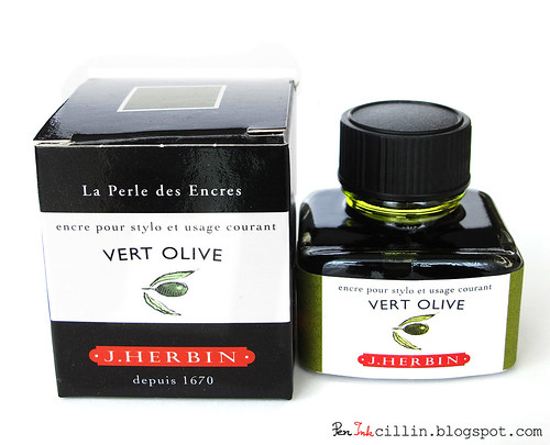
Vert Olive, like most other J Herbin inks, comes in a small 30ml bottle and is more expensive than Diamine or Noodler's inks at $0.27 per milliliter. (In comparison, a regular bottle of Noodler's is $0.14 / ml). I guess it's because it comes from France and the French think they're special or something :) Just kidding! More likely, it's because these inks are very high quality and well-deserved of the price.
The bottle is dainty and delicate looking and it has an interesting design in the form of a groove which allows you to rest your pen on it. Unfortunately I didn't think of taking a picture of how this would look but hopefully I'll take one soon. I also like the fact that the ink is clearly marked on both the box and the bottle. The box has a color-coded square on top of the lid, while the bottle has a label in matching color, with the name of the ink. Both have a small drawing of an olive.
Speaking of olives, this is exactly what the color of Vert Olive reminds me of: green olives. In fact, that's what "Vert Olive" means: olive green. Furthermore, one of the first things I drew with this ink was... you've guessed it... a green olive! So if you need to draw lots of green olives, this is the ink for you!
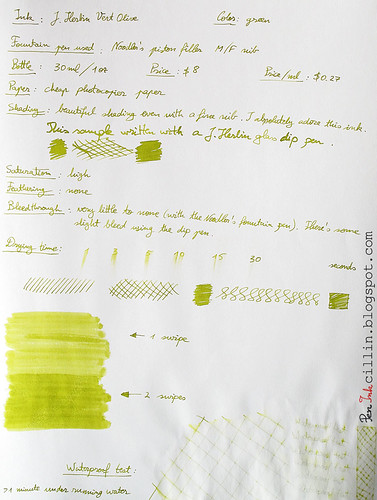
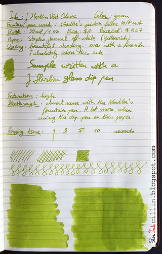
You can certainly use this ink for writing, if that's your preference. It is not light enough that it can't be seen and the amazing shading it has is evident even with a normal fountain pen nib. For my tests I used a Noodler's piston filler fountain pen. My regret is that I didn't buy a Noodler's flex because I'm sure the shading would have shown even better.
(As a parenthesis, the sample photos aren't that great. There's a lot of variation in the lighting, depending on how the paper curved. I apologize for that and hopefully I'll be able to produce something better in the future. All my handwriting samples are done with natural daylight.)
Though J Herbin Vert Olive feels like a pastel shade to me, I find it saturated. It is well behaved in regards to bleedthrough (none, except when thickly applied on low quality paper), feathering (none) and drying time. It dries fairly quickly on photocopier paper but I have yet to test it on better paper.
Flow through the Noodler piston filler was very good but that pen seems to have good flow anyway, once it gets started. The ink is rather wet and I appreciate that because it shows off the nice shading, making the color darker where the ink pools more.
If I were to nitpick, apart from the price, the only negative thing about J Herbin Vert Olive is its water resistance, which is very poor. But then again, I wasn't expecting it to be waterproof, and in some cases this could be an advantage. For example, it is easily washed off. Artists can also use some water to spread it around.
In summary, J Herbin is an ink of French origin with excellent shading and very good characteristics for drawing and art in general. If writing with a bright ink is your thing, then you can certainly do it because it is dark enough to permit it. As a bonus, the shading is evident even with a thin fountain pen nib.
Following, I have two writing samples, one on photocopier paper, the other on a Staples journal with yellowish paper. I will be phasing out the reviews done on that journal because the paper is awful. Until then, this will have to do. Unfortunately I'm not sure that I managed to capture the exact color and shading of this ink and, depending on how your monitor is calibrated, you may see something different than what I see. Between the two samples, I hope you can get an idea about J Herbin Vert Olive's character.

Wow, that is a really beautiful green. I am a really big fan of green ink, but I have never tried an olive-hued one! I've been thinking about getting out the ol' fountain pen and cleaning it out and using it again.
ReplyDeleteThanks for the review!
Nice Review! It looks like a very nice green, but I personally would prefer it a bit darker. My only potential beef with this ink though is it's lack of waterproof qualities...
ReplyDelete@Andy you could try getting a sample to see if you like it. It is rather expensive... and they have other equally beautiful shades. And then there's Diamine with their range of bright colors...
ReplyDelete@The Classicist thanks! I can see how many people would consider this too bright. That's why I think it would be better suited for drawing. As for water resistance... it looks like bright inks from Herbin and Diamine are not very resistant. Check out my review of Diamine Orange. Just a little exposure to water wipes out any trace of the ink.
I've had Vert Olive for a while, and I *do* use it for writing...granted, no one else sees my writing at work...but I enjoy it. Based on your review, I think I will be purchasing Gruene Cactus.
ReplyDeleteOh! And have you tried Army Green? That is another in my regular rotation. Who knew I'd be such a fan of green ink?
ReplyDeleteJust be aware that Gruene Cactus is a dark green but if you like that, then go for it! What pen are you using for the Vert Olive?
ReplyDeleteNo, haven't tried Army Green. It's not really on my list right now but perhaps later when I've exhausted the inks that attract me the most.
ReplyDeleteI really like this ink. I think it might look nice on an off white paper.
ReplyDeleteI just bought a bottle of Vert Olive. I haven't decided what I'm going to do with it but I was intrigued with the color. It is my favorite color. I have sweaters that color. I have fresh water pearl earrings and a matching necklace that color. Now I just to have figure out which brand of fountain pen would be most simpatico with Vert Olive. I tested it out in an old cheap calligraphy pen from my art school days (many decades ago). It isn't a great pen (nib too stiff for me) but it gave me an idea of what a lovely ink it is. I look forward to finding the right pen for this marvelous color.
ReplyDeleteIt's a lovely ink, provided you use it in the right pen, with the right paper. It's got a lot of shading but it's also watery but that's fine if you like that.
ReplyDelete