Showing posts with label green ink. Show all posts

Tuesday, October 13, 2015

Noodler's Gruene Cactus Eel ink review 2015 edition

In the off-chance this review sounds familiar to you, let me tell you that I have, in fact reviewed Noodler's Gruene Cactus Eel way back in 2011 at the beginnings of this blog, which puts it more than 4 1/2 years back. The current review isn't about an updated ink formula, or a new bottle I purchased. It's simply an update to the original review, to put it in line with my current (2015) format for ink reviews, as far as the writing samples are concerned.

My ink reviews have understandably evolved since I started this blog and I've decided to re-do some of the inks for which I bought whole bottles. Since the reviews are essentially the same, I will just add some updated impressions, and showcase the 2015 edition of the writing samples.

Without further ado, here are my impressions of Noodler's Gruene Cactus Eel, in 2015. This time the ink went into my flagship fountain pen, the Pilot Vanishing Point with broad nib, and it's a good match, as you'll read below.

Noodler's Gruene Cactus Eel shading

Right off the bat, I was impressed with how smoothly Gruene Cactus Eel felt in the Pilot VP. Whether it's the broad nib or the better-than-average lubricating properties of the ink, it makes for very smooth writing indeed.

While in my initial review I was pretty ambivalent about the shade of green, this time I felt a much greater attraction to it and I really enjoy it now. The broad nib also helps bring out the excellent shading, which is always a plus. I have a vague suspicion that sitting in a bottle for > 4 years helped "mature" the ink, though I don't know how accurate that is.

I've been using Gruene Cactus Eel in the Pilot Vanishing Point for almost a couple of months now, refilling the converter as I run out, and I like it so much that I don't really feel like trying another ink for the moment. I've also noticed that it doesn't really dry out in the Pilot VP, nor does it skip. I've had skipping issues with other inks in the VP, to the point where I was afraid that there was something wrong with the nib unit, but Gruene Cactus Eel belies that.

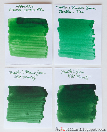
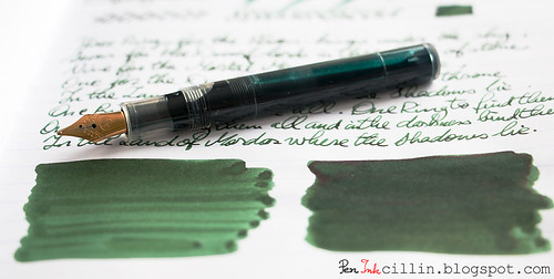
This time I managed to do a comparison with other green inks I've tested over the years, so here's Noodler's Gruene Cactus Eel compared to Noodler's Hunter Green, Noodler's Marine Green, and Noodler's Green.

Noodler's Gruene Cactus Eel vs Hunter Green vs Marine Green vs Green

You'll notice how the latter 2 are more "foresty", while Gruene Cactus does, indeed, resemble a cactus, being lighter. I still prefer the darker greens, but the shading is excellent for all 3 inks mentioned.

My 2015 conclusion is that I enjoy Noodler's Gruene Cactus Eel a lot more the second time around, but I'm sure the pen also makes a huge difference. The water resistance is still a sore point but whacha gonna do now.

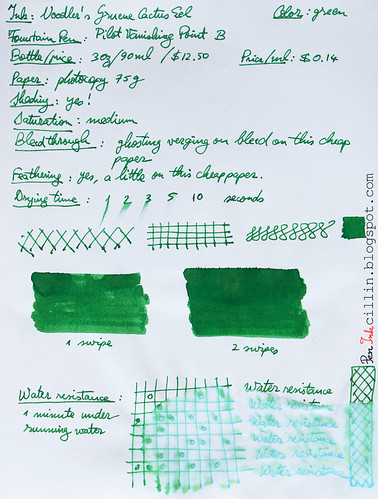
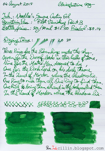
So here are the updated writing samples on photocopy, and Clairefontaine 90g paper, respectively.

Noodler's Gruene Cactus Eel on photocopy

Noodler's Gruene Cactus Eel on Clairefontaine

Sunday, May 31, 2015

J Herbin Vert Pre ink review

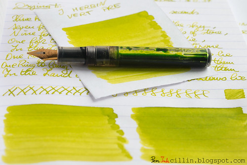
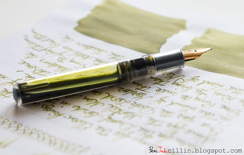
This will probably be my last green ink review for a while, so I present J Herbin Vert Pre, reviewed in my Kaweco Sport Classic with broad nib and eyedropper conversion.

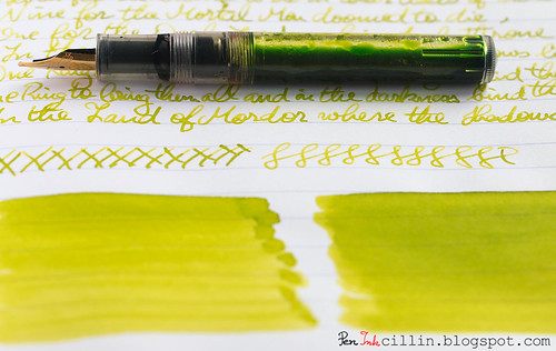
J Herbin Vert Pre shading with Kaweco

Bottle and pricing

Bottle capacity: 30 ml / 1 oz
Price: $11
Price / ml: $0.37

Color and saturation

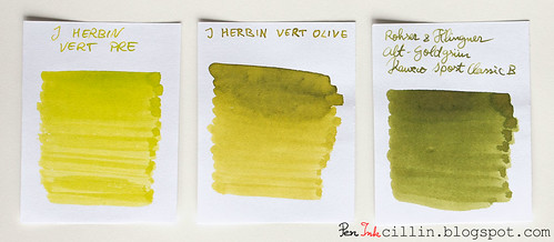
I'll say this from the get-go: Vert Pre is a type of green very similar to the other J Herbin green ink I reviewed (of which I own a bottle), Vert Olive. The only major difference between them is that Vert Pre is slightly less saturated and lighter than Vert Olive. Otherwise, all features apply to both equally. At this point I could just call it a day and refer you to the Vert Olive review but I'll keep going.

The best way to tell the difference between the two is to imagine Vert Pre as lime green, and Vert Olive as olive green (as the name actually translates).

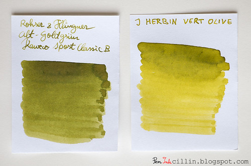
Below is a better comparison between the two inks, as well as Rohrer & Klingner Alt-Goldgrun, which is somewhat similar to the two, only darker and avocado-ish.

J Herbin Vert Pre vs J Herbin Vert Olive vs Rohrer & Klingner Alt-Goldgrun

Whichever variation you prefer, J Herbin Vert Pre remains in good company and is a beautiful ink on its own.

Shading

J Herbin Vert Pre features very nice shading, almost on par with Vert Olive. It's probably less only due to the fact that it's lighter in color. To benefit the most from the shading I would recommend a broader nib, but only on good, fountain pen-friendly paper.

J Herbin Vert Pre text shading with Kaweco

Feathering

Unfortunately I forgot to mention feathering in my copy paper written review, but here it goes. Vert Pre is a wet, watery ink and because of that it feathers a fair amount on cheap paper. It can't be helped, but in this respect it behaves very similarly to Vert Olive, as well as a couple of other J Herbin inks that I didn't particularly enjoy: Diabolo Menthe and Bleu Azur. If you don't use this on cheap paper you'll be fine though, because this is definitely a non-issue on good stuff, such as Clairefontaine or Rhodia.

Bleedthrough

Linked to the above point, being a wet and watery ink, J Herbin Vert Pre will bleed on very cheap paper, especially if both sides are written. In my copy paper review I stated that it only ghosts a little. This is true on the condition that you only use one side of the paper. As soon as you start writing on the reverse, though, things change. The cheap paper acts as a saturated sponge and spreads the ink throughout the fibers, causing it to both feather and bleed significantly.

Flow, lubrication, and smoothness

J Herbin Vert Pre flows really well - flawlessly in fact - through the Kaweco's broad nib. Apart from that, it bears stressing once again that this ink is pretty wet.

Drying time

Drying happens quickly - almost instantly - on cheap paper. On good paper the situation is reversed, and it usually takes around 30 seconds for it to dry completely, accounting of course for the broad nib.

Smearing when dry

None.

Water resistance

As is the case with all the inks in this "series", J Herbin Vert Pre is completely non-water resistant. Keep it far away from any form of moisture.

Conclusion

J Herbin Vert Pre is another hit in J Herbin's "hit & miss series". OK, I made this up but you know what I mean: I didn't enjoy the light blue inks in the family but I adore the greens. It's a gorgeous ink with a unique color and great shading, which flows well and performs nicely on good paper. The only caveat is that I wouldn't recommend it for cheap paper, at least not with a broad nib. Should you buy it? A resolute yes! The only question remains: this or Vert Olive? Personally I'd still pick Vert Olive by a slim margin.

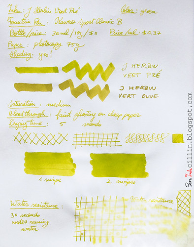
Following are the two handwritten reviews, on photocopy and Clairefontaine 90g paper, respectively.

J Herbin Vert Pre on photocopy

J Herbin Vert Pre on Clairefontaine

Monday, February 9, 2015

Diamine Evergreen ink review

Diamine Evergreen is one of the more special greens that have passed through my hands in recent memory. I tested the sample in my Kaweco Sport Classic with broad nib. I can tell you right away that I like this ink but read on to find out more details.

Diamine Evergreen shading with Kaweco

Bottle and pricing

Bottle capacity: 80 ml / 2.7 oz
Price: $12.95
Price / ml: $0.16

Color and saturation

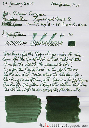
Right off the bat, Diamine Evergreen starts strong with an interesting and rather unique shade of green. I have tested plenty of green inks but I can still be surprised. I'm of the opinion that Diamine Evergreen should have been called Diamine Avocado because that's exactly the shade of green - avocado - that comes to mind. It is dark, organic, and not too saturated, making it well suited for official use.

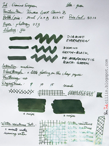
In the photocopy sample (at the bottom) I compared Evergreen to Diamine Green Black and De Atramentis Black Green, both of which I own a bottle, and both of which are also dark, somber inks. There is some resemblance between these three inks but Diamine Evergreen immediately stands out as - at the risk of repeating myself - the more organic of the bunch, and that imparts it more character in my opinion.

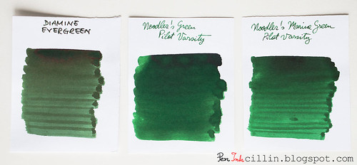
I've also done a comparison with Noodler's Green and Noodler's Marine Green, two of the darker inks I've tested but these are both more saturated as well as brighter and they don't resemble Evergreen much.

Diamine Evergreen vs Noodler's Green vs Noodler's Marine Green

Shading

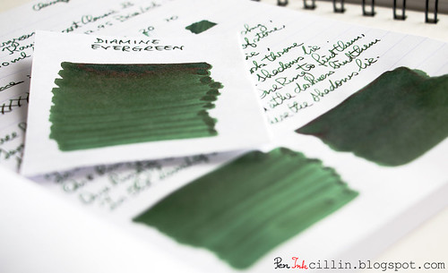
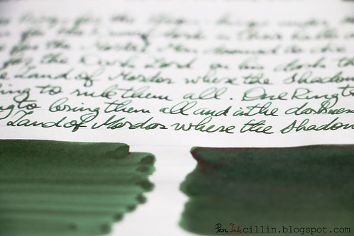
Diamine Evergreen does a great job in the color variation department. The broad nib helps with that, but I have a feeling medium and even fine nibs will exhibit plenty of shading. In addition to the shading, if you look closely you will see an almost reddish sheen in the dark sections where the ink had a chance to dry in a thicker layer.

Diamine Evergreen shading

Diamine Evergreen shading

Feathering

None.

Bleedthrough

As expected, there's a little ghosting on very cheap paper but otherwise there's no bleeding and both sides of the paper can be used without fear.

Flow, lubrication, and smoothness

Diamine Evergreen is a wet ink. It flows really well through the Kaweco Sport. At times it feels a little too wet. If the paper is particularly spongy, it soaks right into it. For me that's fine because I love wet inks, but if you don't, you could always try it in a pen with a dry nib or one that has flow issues.

Drying time

On absorbent paper it dries within normal parameters, around 10 seconds or so, but on glossy paper it can take up to 30 seconds. Fairly average drying times for how wet it is.

Smearing when dry

None.

Water resistance

Diamine Evergreen is not meant to be water resistant but when I put it under running water for 1 minute it didn't wash off completely, so I guess you might stand a chance to recover some of your writings if they get drenched in water.

Conclusion

It looks like I started 2015 on a positive ink-reviewing note because I really like Diamine Evergreen. From the exquisite color to the great shading, to the wet flow, there's much to like about it and nothing really to critique. As such, I highly recommend Diamine Evergreen, especially if you are looking to emulate the appearance of "avocado".

Following are the two samples on photocopy, and Clairefontaine 90g paper, respectively.

Diamine Evergreen on photocopy

Diamine Evergreen on Clairefontaine

Tuesday, January 27, 2015

2014 ink of the year

I know this post is a month late and a few bucks short but better late than never. In my defense, I'm back from a long vacation and it's hard to get the old routine back on track.

Without further ado, I present you my top 3 favorite inks tested in 2014, along with 3 runners-up.

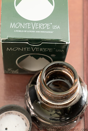
#1 Monteverde Brown

Monteverde Brown is absolutely the ink I enjoyed most in 2014. I just love brown inks and this is the definitive brown.

Monteverde Brown open bottle

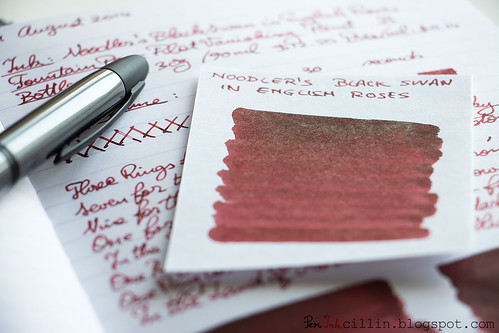
#2 Noodler's Black Swan in English Roses

Noodler's Black Swan in English Roses is a close second. I love its burgundy/brown color and beautiful shading.

Noodler's Black Swan in English Roses sheen

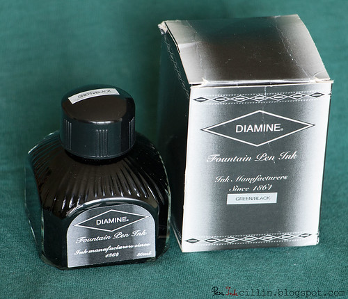
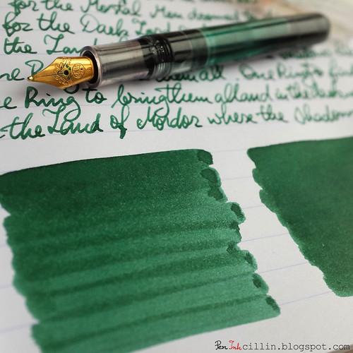
#3 Diamine Green Black

Diamine Green Black is the ink which resembles the color "British racing green" the most. If I were to pick a green ink out of all the ones I've tested (not just in 2014), this would be it.

Diamine Green Black bottle

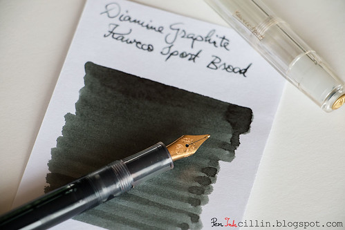
Runner Up #1 - Diamine Graphite

Normally I'm not a fan of gray inks because they're too boring, but Diamine Graphite changed my mind. It proves that a gray ink can be engineered well enough to make it useful in a professional setting and look good at the same time.

Diamine Graphite and Kaweco Sport

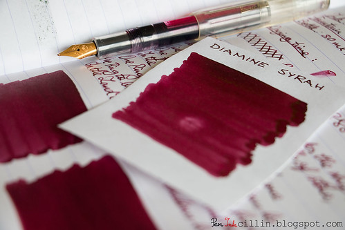
Runner Up #2 - Diamine Syrah

Diamine Syrah is an ink I love to hate. The color and shading are gorgeous and hard to beat. However, it likes to stain plastic and smears on glossy paper.

Diamine Syrah shading

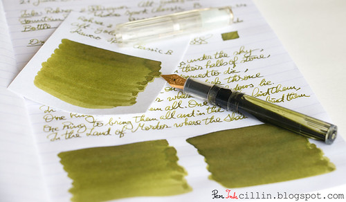
Runner Up #3 - Rohrer & Klingner Alt-Goldgrun

Rohrer & Klingner Alt-Goldgrun is a wonderful shade of bright, saturated olive green with beautiful shading. R&K inks are a bit quirky though and flawed in other aspects, such as feathering and sometimes flow.

Rohrer & Klingner Alt-Goldgrun with Kaweco Sport

Thursday, December 11, 2014

Noodler's GI Green (V-Mail) ink review

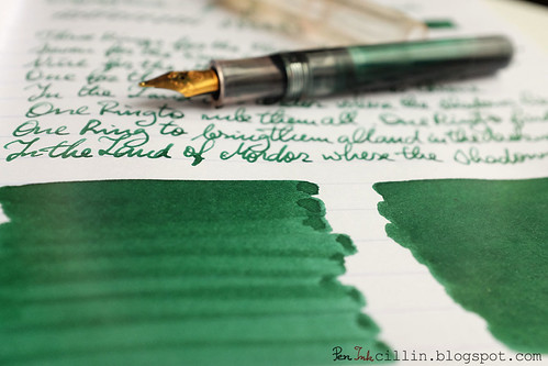
Noodler's GI Green marks the 4th ink tested by me in the V-Mail series, after North African Violet, Burma Road Brown, and Operation Overlord Orange. Read more about V-Mail inks directly on Noodler's site.

I always enjoyed the way Noodler's comes up with all these different ink series, with similar properties within the series, but slightly different from the inks outside it. That's why I picked up a few samples of V-Mail inks a while back.

Noodler's GI Green shading

Today's review was written in my Kaweco Sport Classic with broad nib.

Bottle and pricing

Bottle capacity: 3 oz / 90 ml
Price: $12.50
Price / ml: $0.14

Color and saturation

While I found the previous V-Mail inks to be rather unique in color, I can't say the same about GI Green. Perhaps I tested too many green inks. While fairly pedestrian, it is a pleasant shade of green, nonetheless.

GI Green is a dark green, saturated ink. I found that it looks duller (less saturated) on absorbent (read cheap photocopy) paper, but more vibrant on something like Clairefontaine.

In the copy paper sample I compared it with Diamine Green Black (darker) and Noodler's Gruene Cactus Eel (much lighter).

I also shot a separate comparison next to Noodler's Green and Green Marine. As you can see, these dark inks all look very similar, but personally I lean towards Noodler's Green.

Noodler's GI Green vs Green vs Marine Green

For what it's worth, this is the second ink review shot with my new camera.

Shading

Although dark(ish), Noodler's GI Green definitely has some shading going on. The shinier the paper, the more it likes to gather in dark pools at the end of the nib's stroke.

Noodler's GI Green shading

Feathering

None.

Bleedthrough

For how dark this ink is, it doesn't bleed a lot on cheap paper, but you can definitely see its ghost on the reverse.

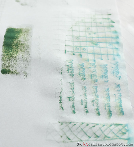
One thing that I found interesting was how the ink showed through under the very thick q-tip swab, as well as the patch where it seeped through the paper in the water resistance test. Check it out below: some cool hints of gold-green and turquoise.

Noodler's GI Green bleed

Flow, lubrication, and smoothness

In the Kaweco it flows very smoothly and also very wetly. I'm sure some folks will be put off by how wet it is. I'd give it a 9/10 wetness score. Just be careful if you put it in an eyedropper fountain pen, as it might start spitting once it runs low.

Drying time

The drying time is very quick on cheap paper but obviously longer on Clairefontaine. Even then, it's within acceptable range.

Smearing when dry

None.

Water resistance

Noodler's GI Green is supposed to be water resistant but I guess this varies from ink to ink. In this case, it's definitely not waterproof. As you can see from the sample, some of it washes off after being exposed to running water. The dark component runs off, leaving a much lighter shade of almost-turquoise or almost-teal.

Conclusion

Noodler's GI Green is the green member of the V-Mail family with nice shading and a bit of water resistance. If you want to collect all V-Mail inks, go for it. If not, it is still a very solid choice as a dark green ink. However, my personal take on this is that Noodler's simply has too many green inks (especially dark ones) in the lineup. While I love the quirkiness of Noodler's brand, sometimes it overwhelms even an ink enthusiast with so many variations of the same shade.

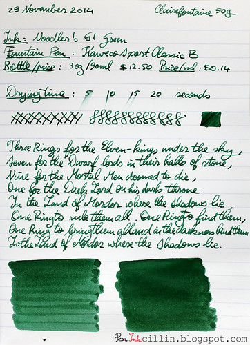
Following are the two samples on photocopy and Clairefontaine 90g paper, respectively.

Noodler's GI Green on photocopy

Noodler's GI Green on Clairefontaine

Wednesday, July 9, 2014

De Atramentis Black Green ink review

Today's review marks a double-premiere: my first contact with the De Atramentis brand and the first partnership with one of my favorite pen shops, Goulet Pens, who were very kind to send me a bottle of De Atramentis Black Green ink. As a disclaimer I will have to mention that I received the ink for free but no other payment for this review, and all the opinions herein are my own.

I specifically asked the Goulets for this ink, among the (literally) hundreds they have, because I decided to try a new brand and also because I wanted to compare it to a very similar ink I tested recently, Diamine Green Black. The impressions of that ink are still fresh so De Atramentis Black Green proved to be a good choice.

Bottle and pricing
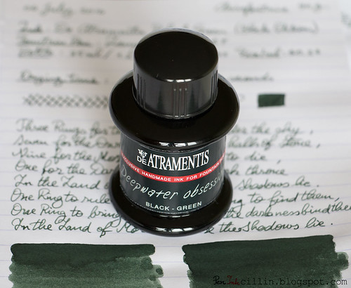
A bottle of De Atramentis Black Green is $12.50 and holds 35 ml / 1.2 oz. At $0.37 per milliliter it is rather expensive but that's what you get for an ink that's imported from Germany (despite the French-sounding name) and is allegedly hand-made. Hmm so that makes it a sort of German Noodler's? I bet they have more than one man running the show though.

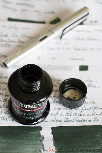
De Atramentis Black Green bottle

The Noodler's comparison isn't entirely without merit because I can see some similarities in the style of the bottles, which are rather plain but neo-vintage looking, while sporting different art on the labels for each ink. The one thing that this ink is apparently missing is a box, but I guess the black bottle substitutes the role of light protection.

This particular ink is part of the Black Edition series of De Atramentis inks. This signifies that the bottle is tinted black, to prevent any light (UV or otherwise) from altering the ink. This also means that you can't see the ink inside the bottle which can be a bit of a bummer if you like to photograph the bottle in contre-jour fashion, like me.

Color and saturation
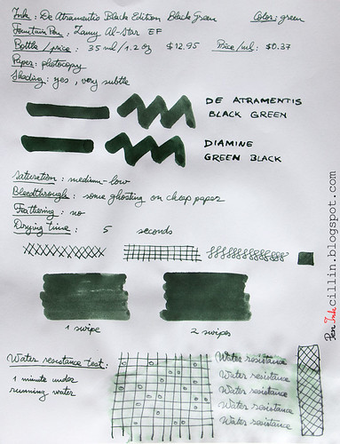
It's astonishing how similar De Atramentis Black Green and Diamine Green Black seem to be at first glance, especially since I tested both of them in my Lamy AL-Star with EF nib. If you start looking closer, you will start seeing plenty of small differences.

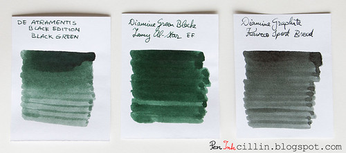
For starters, I think De Atramentis Black Green should be called De Atramentis Gray Green because it veers more towards gray than black. It is less saturated than the Diamine ink and also shades less, making it overall duller and more somber. In fact, it could just as well be called De Atramentis Khaki.

In the below comparison I added Diamine Graphite (which has hints of green) so you could see how the two green inks compare to a gray one.

De Atramentis Black Green compared with 2 inks

Shading
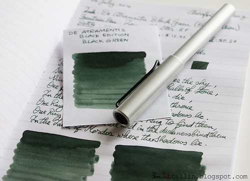
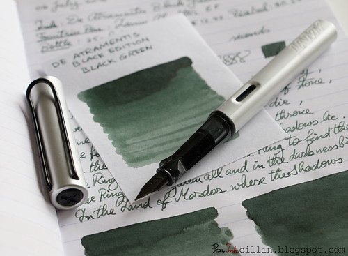
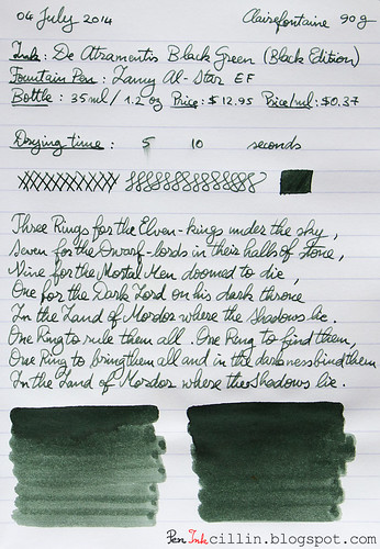
While the shading is not as pronounced as Diamine Green Black's, De Atramentis Black Green certainly has variation, and while it is subtle, it is more apparent on bright, smooth, high quality paper like the Clairefontaine 90g I tested on.

De Atramentis Black Green with Lamy AL-Star

Feathering
None.

Bleedthrough
On cheap paper it ghosts a little and may even bleed if you are a heavy writer like I am. No worries on good paper though.

Flow, lubrication, and smoothness
While nothing really stands out here in terms of wetness or smoothness, De Atramentis Black Green flows impeccably if not particularly wet. I'd give it a 6/10 for wetness but if you are looking for controlled flow, this might just be the ink for you.

De Atramentis Black Green with Lamy AL-Star

Drying time
On cheap paper it dries almost instantly, and within 10 seconds on Clairefontaint/Rhodia. That's pretty good, but remember it's not a wet ink and I used an EF nib.

Smearing when dry
None.

Water resistance
Now here's something that surprised me. Nowhere is this ink marked as water resistant. Yet, my standard dunk-it-for-1-minute-under-running-water test didn't phase it one bit. The sample remains completely readable after drying up, which puts it way ahead of Diamine Green Black in this aspect. Incidentally you can see how the dye components in the ink were broken up by the water: the green washed away while the gray remained.

Conclusion
For my first foray into the De Atramentis brand, I can say that I am generally pleased with De Atramentis Black Green Black Edition Deepwater Obsession (yes, this seems to be the full name). While not particularly remarkable, the performance is very solid, with no weak spots. As an unexpected perk, it seems to be more water resistant than most inks outside Noodler's specialized ones.

De Atramentis Black Green bottle

Personally, if I were to choose between De Atramentis Black Green and Diamine Green Black, I would go for the latter, but that's just because I prefer the slightly greener ink. However, there's no shortage of De Atramentis inks to choose from, and the Goulets have a wide variety of them, as well as a boatload of scented De Atramentis inks. I've already identified a few which look interesting. As for the scented ones, though I'm not in the habit of sniffing inks, they might be interesting to try.

The following samples are written on photocopy, and Clairefontaine 90g paper, respectively.

De Atramentis Black Green on photocopy

De Atramentis Black Green on Clairefontaine

Wednesday, June 25, 2014

Rohrer & Klingner Alt-Goldgrun ink review

Here I am, finally able to review one of the ink samples that I still have an abundance of. I asked you a while back if you would like to participate in my ink sample survey and the response was excellent. It was a good idea to hold a survey, if I say so myself.

So it turns out that Rohrer & Klingner Alt-Goldgrun came ahead of the other samples in the voting, which made it an easy choice to load in my Kaweco Sport Classic with broad nib and eyedropper conversion.

Is this ink deja-vu or what? We'll see soon enough.

Rohrer & Klingner Alt-Goldgrun with Kaweco Sport

Before I start, a couple of mentions.

First, I changed one of the review papers from Rhodia 80g to Clairefontaine 90g. My Rhodia notebook that I was using has finally filled up, allowing me to start a new Clairefontaine notebook, with even better paper. I'm already loving this paper more than the Rhodia. It seems to play really well with fountain pens. I might do a little paper comparison in a future post.

Second, I have joined two more social media networks, beside Twitter, since my last review: Pinterest and Instagram. If you decide to follow me on either of them, I'll follow you back. Click the links here or in the right sidebar -->

Bottle and pricing
Rohrer & Klingner Alt-Goldgrun comes in a 50ml / 1.7oz bottle which sells for $12. The price / ml is $0.24 which makes it more expensive than other inks.

Color and saturation
Did I mention deja-vu? Rohrer & Klingner Alt-Goldgrun reminds me strongly of J Herbin Vert Olive, of which I own a bottle. Vert Olive is lighter in color but both inks seem very closely related. They are both an olive sort of green.

Rohrer & Klingner Alt-Goldgrun vs J Herbin Vert Olive

To stretch the olive analogy farther, if Alt-Goldgrun is a ripe(r) olive, Very Olive is a green one. Apart from that, Alt-Goldgrun is darker and more saturated than Vert Olive.

Shading
Similarities to its J Herbin step-sibling don't simply stop at color. Alt-Goldgrun also features some very nice shading properties which are even more intense than the lighter ink. The Kaweco's broad nib really makes it stand out. Incidentally that's another reason why I prefer broader nibs.

Feathering
I'm sorry to say that Rohrer & Klingner Alt-Goldgrun feathers on cheap paper, which tends to act like a sponge. Combined with the broad nib, it's... not very pleasant. However, the problem all but disappears on good quality paper.

Bleedthrough
The situation here is similar to the feathering, in fact the two go hand in hand. Cheap paper is a sponge for Alt-Goldgrun, which causes it to bleed significantly. Personally it doesn't bother me too much because I use this ink at work to jot down notes and I use scrap photocopy paper. I can even use both sides because, well, I just hate wasting paper (and by association, trees). But if you're writing exclusively on better paper, like the Clairefontaine 90g I tested on, you won't have to worry about bleeding.

There is a bright side to this though, but not as you would imagine. Because the cheap paper I use literally sucks the ink out of that broad nib, my Kaweco is already empty after 4 days of use, which allows me to clean it and refill it with a new ink, hopefully to be reviewed next week.

Flow, lubrication, and smoothness
Rohrer & Klingner Alt-Goldgrun flows well in the Kaweco Classic and is wetter than average. On cheap paper it doesn't feel very smooth because of the sponge effect that I mentioned. On the plus side, it glides nicely on Clairefontaine.

Drying time
Drying on photocopy paper is nearly instant, but a somewhat longer (15-20 seconds) on Clairefontaine. Bear in mind though that this is with a broad nib. I'm sure it would dry quicker with a medium or fine nib.

Smearing when dry
None.

Water resistance
30 seconds exposure to running water completely destroyed this ink. Not. Water. Resistant.

Conclusion
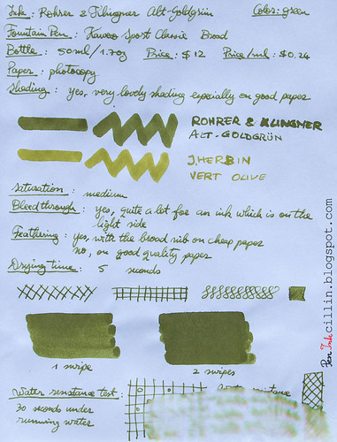
Despite some flaws (feathering and bleedthrough) on cheap paper, Rohrer & Klingner Alt-Goldgrun is a fun and attractive ink. If I were to choose between it and J Herbin Vert Olive, I would choose Alt-Goldgrun, hands down. Vert Olive is too watery and too light for my taste, while Alt-Goldgrun is darker, and the shading is also better, which gives it more character and makes it more distinguished. If the olive type of green appeals to you, I would definitely recommend Rohrer & Klingner Alt-Goldgrun, with the caveat that it requires premium paper if you want to avoid potential frustration.

Rohrer & Klingner Alt-Goldgrun with Kaweco Sport eyedropper

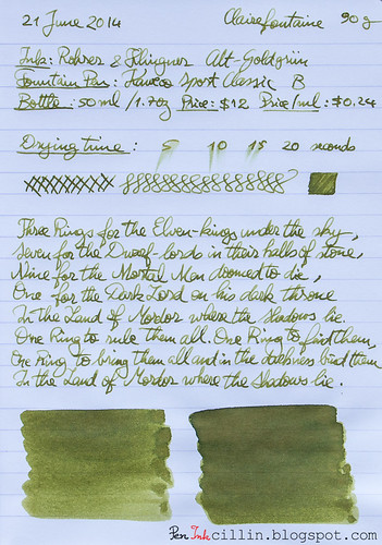
Following are the two samples on photocopy and Clairefontaine 90g paper, respectively.

Rohrer & Klingner Alt-Goldgrun on photocopy

Rohrer & Klingner Alt-Goldgrun on Clairefontaine

Tuesday, June 17, 2014

Diamine Green Black ink review

I know, I know, I promised that my next review would be from my collection of ink samples, based on the ink sample survey I ran a few weeks ago. I'm afraid I'm going to have to disappoint those who were expecting this, at least for another week. If you don't care why, skip the next paragraph.

There's a rhyme and reason as to what fountain pens I use for my reviews. Lately, I've come to prefer the Kaweco Sport Classic for ink samples, for several reasons. First, it has a broad nib, which shows off the ink better but more importantly allows me to go through inks quicker. Second, it's a relatively inexpensive pen which I can use at work without fear of losing/breaking a nicer pen. Third, I use it as an eyedropper, which means that I can load it with the full 2ml from an ink sample. This allows me to exhaust a complete sample for each review. Well, today's review, Diamine Green Black, came in a bottle. Since my Lamy AL-Star was clean, I decided to load it up and do a quick review before I can finish the Waterman Blue in my Kaweco.

Today's ink, Diamine Green Black, comes courtesy of Jetpens. A while ago I tweeted this:
I just have this thing for British Racing Green, the color. So Jetpens suggested Diamine Green Black and were nice enough to send me a bottle for review. As soon as my Lamy AL-Star (with EF nib) was clean and dry, I loaded it up with Diamine Green Black and... let's see how well it performs.

Before we start, you might want to follow me on Twitter: @Peninkcillin.

Bottle and pricing
My main beef with Diamine inks is that their box and bottle design is very plain and boring. Not only that but it's very hard to tell at a glance what ink is inside. No custom design, not even a color patch. Only a tiny sticker that weakly whispers the name of the ink. Even Noodler's bottles are cooler because all of them have custom graphics. That's such a shame because Diamine makes such great inks. Oh well, I'd rather have a great ink in a boring bottle than a lousy ink in a gorgeous package.

Diamine Green Black bottle

Diamine inks come in an 80ml / 2.7oz bottle and cost around $12.95 or $0.16 per milliliter, among the least expensive.

Color and saturation
Ah, now we're getting to the heart of the matter. The big question is: how closely does Diamine Green Black resemble the color British Racing Green? To my eyes, I would say a lot. I'm perfectly satisfied with this color. In fact, even if it was very far from BRG, I would still love it. I'll be honest: this is the best shade of green I've tested.

However, I decided to run a very non-scientific test to see just how similar the two colors are. So I did this little trick in Photoshop:

Diamine Green Black vs British Racing Green

I took the standard British Racing Green swatch and placed it between averaged (via blur) samples of Diamine Green Black. The first sample is 1 swipe with a q-tip while the second is 2 swipes. As you can see, BRG is actually lighter than both samples. Don't read too much into this though. For starters, consider that my samples are photographed and processed, which tends to alter the colors, while the BRG swatch is pure. Besides, the thickness of the ink sample can alter the averaged value considerably. Let's just leave it at that.

Color aside, you will notice that Diamine Green Black is a dark, saturated ink. The Green Black name is very appropriate. I feel that it can be successfully used in a professional setting. It looks even darker on glossy paper because more of it has the chance to pool on the surface before being absorbed.

Shading
Diamine Green Black doesn't disappoint and it features some decent amount of shading. The choice of paper will make a difference though, and this will come into play soon, as you will see. In other words, the shading is more visible on good paper and less so on cheap one.

Feathering
I was a bit surprised to notice that Diamine Green Black feathers a little on the cheap photocopy paper that I used for one of my test samples. It's not a lot but it's there. No such thing happens on Rhodia 80g. But then, not everybody uses their fountain pens on some of the cheapest paper available, so take that with a grain of sand.

Bleedthrough
Another small weakness, but wholly expected considering the poor quality of the paper and the darkness of the ink, is that it bleeds on cheap paper. You can still write on the reverse if you are using it as scrap but I would advise to try it before using it in any official document where bleeding might be an issue. Again, there's no bleeding on thicker/better paper such as Rhodia.

Flow, lubrication, and smoothness
In regards to flow and smoothness, things are looking very good. Diamine Green Black all but purrs when it flows through my Lamy AL-Star. It feels well lubricated, too. I would give it a 7-8 out of 10 for wetness. This also means that it dries differently, depending on the paper.

Drying time
Wet inks tend to dry quickly on poor, absorbent paper, and very slowly on glossy, high quality paper like the Rhodia 80g I used for one of the samples. On photocopy it dries within 5 seconds, while on Rhodia it takes its sweet time, at 20+ seconds.

Smearing when dry
None.

Water resistance
There isn't any water resistance to speak of, but perhaps contact with water wouldn't be a total disaster considering that some yellow undertones remained on the paper after the main green color washed off.

Conclusion
Diamine Green Black has been a very pleasant surprise for me. Not only does it resemble British Racing Green to some extent, but it is very smooth and wet flowing, with some solid shading. The two negatives, namely bleeding and a little feathering, aren't a big deal and they would be completely moot for those who prefer high quality paper anyway. Diamine Green Black is a beautiful ink. If you like dark green inks, do yourself a favor and try it. I doubt you'll be disappointed.

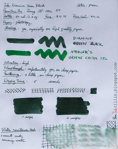
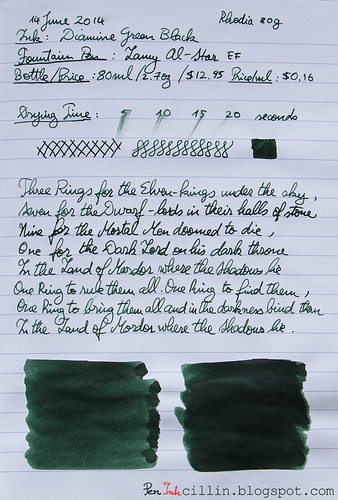
Following are the two samples, on photocopy and Rhodia 80g, respectively.

Diamine Green Black on photocopy

Diamine Green Black on Rhodia

Saturday, May 25, 2013

Noodler's Green ink review

Back to another green ink and this time it's Noodler's Green. In what has almost become a tradition these days, I'm reviewing a sample of this ink in my Pilot Varsity.

Bottle
A bottle of Noodler's Green will run you the usual $12.50 for 3oz (90ml) or $0.14 per milliliter. Cheap as rainwater... well, almost.

Color and saturation
Noodler's Green is well saturated and dark in color. It is very similar to Noodler's Green Marine, the other recently-reviewed green ink. Sometimes I wonder why Noodler's keeps producing such similar-looking inks. But then of course, Green Marine is much more water resistant. On my sample I've also compared it to Noodler's Gruene Cactus Eel, of which I own a bottle. You will notice that the Eel ink is lighter in color.

Shading
Though the ink is dark and it's harder to notice, Noodler's Green does have some shading. This is more obvious with a thicker nib.

Feathering
I haven't noticed any feathering.

Bleedthrough
As is the case with most dark inks, this one ghosts a little on cheap paper and may even bleed if applied liberally. With a dip pen or flex nib that's almost a given, but, I repeat, on cheap paper. There aren't such issues on something more decent like, for example, Rhodia or Clairefontaine.

Flow and lubrication
While in general it flows on the semi-wet side, I can't say I was very impressed with how well Noodler's Green flows on Rhodia paper where it felt dry. Even on photocopy the flow was sometimes erratic. When it flows, though, it feels quite smooth.

Drying time
Perhaps due to its rather dry flow, Noodler's Green dries quickly, around the 5-second mark on photocopy and in about 10 seconds on Rhodia.

Smearing when dry
None.

Water resistance
While its almost identical brother (sister?) Green Marine seems to have some hidden waterproof qualities, Noodler's Green is much more down to earth in that most of it washes off when exposed to water. However, all is seemingly not lost, as a light green component remains on the paper. I guess that you might be able to recover some of your precious manuscripts if it comes to that and you move fast enough.

Conclusion
Sometimes it's hard to come to a definite conclusion regarding an ink. Noodler's Green is one instance where I'm not very happy with how the ink performs but I can't call it terrible either. For someone who likes dark green, this ink might do the trick. On the other hand, having reviewed Noodler's Green Marine, I very much prefer that ink. The bottom line, and my recommendation, is to simply go with Noodler's Green Marine.

Here are the two samples on photocopy and Rhodia 90g, respectively.

Noodler's Green on photocopy

Noodler's Green on Rhodia

Monday, December 10, 2012

Noodler's Green Marine ink review

I think it's bad form to start any review with the conclusion but I'm afraid I can't help it in this case. In a nutshell, I absolutely love Noodler's Green Marine and it is definitely the best green ink I have tested so far. If your tastes are similar to mine, you can stop right here and confidently buy yourself a bottle or a sample. If not, read on to find out more about this ink.

Before I start, I'll just mention that I tested a sample of this ink (and not a whole bottle) in my long-suffering Pilot Varsity.

Bottle
If you buy a bottle of Noodler's Green Marine, it will come to no surprise that it costs the usual $12.50 for 3oz / 90ml, or $0.14 per milliliter.

Color and saturation
One of the reasons why I like Green Marine so much is the dark color. I've been looking for a dark green ink and this one is almost exactly what I was hoping for. While it comes very close to Noodler's Gruene Cactus and Noodler's Hunter Green, it is darker than both of these, with Hunter the lightest and Gruene Cactus in the middle. As for the saturation, it is on the high side, as you can see (scroll to the bottom for the samples).

Shading
The second reason why Noodler's Green Marine brings me so much joy is the shading. I certainly wasn't expecting it but this ink really likes to shade, even with the Varsity's medium/fine nib. To me, shading gives an ink character and personality and this one has plenty of both.

Feathering
None that I could see.

Bleedthrough
Because this is a dark ink, a small amount of ghosting is inevitable on cheap paper. However, the reverse side remains usable. I can attest to this because I've been using this ink daily at work for the past couple of weeks on cheap copy paper.

Flow and lubrication
Number three reason for loving Green Marine is the way it flows. I never tire of saying it: I am a big fan of wet flowing inks. On a scale of 1-10, I would rate this one a 8/9. It flows beautifully in the Varsity and glides like butter across the paper. It makes me want to pick up the pen to write something, even when I don't have anything to jot down.

Drying time
Noodler's Green Marine isn't perfect in all aspects, but nothing in this universe of ours is. Perhaps as a consequence of its wetness, it dries rather slowly on high quality, glossy paper such as the Rhodia 80g I tested it on. As you can see from the sample, it took close to 40 seconds to dry and even then it still smeared easily when I rubbed it. I suggest giving it ample time to dry if using it on more expensive (and less absorbent) paper.

On the other hand, it dries fairly quickly on regular copy paper, under 10 seconds. Either way, this doesn't bother me in the least; the benefits outweigh the slight inconvenience of a longer drying time on specific types of paper.

Smearing when dry
While there's no smearing on photocopy paper, Noodler's Green Marine is likely to smear if rubbed, when used on paper such as my Rhodia 80g, even after it has had ample time to dry (like 2-3 weeks). But many dark, saturated inks also have the same tendency so this isn't a quirk exclusive to this ink.

Water resistance
Here's another surprising fact about Noodler's Green Marine. Though it isn't marked as water resistant in any way, it is a lot more water resistant than most regular inks I've tested. Just look at the sample. It's amazing. After being exposed to running water for more than a minute, only a little ink washed off and the text and drawings remained perfectly legible. If this is a "hidden" feature and I'm ignorant of it, someone please let me know. In any case, it makes me even happier to get this unexpected bonus.

Conclusion
If I sound ecstatic about this ink, it's because I am. Noodler's Green Marine may well be the perfect green ink I've been searching for. I just love how it flows and glides on paper. I love its dark color and nice shading. To top it all off, a little water won't intimidate it. If you are looking for a dark green ink, I don't see how you could go wrong with Noodler's Green Marine. I highly recommend it!

Here are the two writing samples on photocopy and Rhodia 80g paper respectively.

Noodler's Green Marine on photocopy

Noodler's Green Marine on Rhodia

Monday, June 4, 2012

Pelikan Brilliant Green ink review

Welcome to my first review of a Pelikan ink! Although I didn't know what to expect from Pelikan Brilliant Green, the experience was so-so, leaning on the positive side. I only bought a sample which I tested in my trusted Pilot Varsity for over 2 weeks of daily writing.

Bottle
Brilliant Green comes in a 62.5ml / 2.1oz bottle which costs $9.25. At $0.20 per milliliter it isn't the cheapest ink, nor is it the most expensive.

Color and saturation
Pelikan Brilliant Green is, you guessed it, a green ink. Though it is the brightest green ink I have tested, I'm not sure I would call it "brilliant". The term "brilliant" implies something shiny, sparkly and perhaps even eye-popping. This, Brilliant Green is not. The color is, in fact, on the dull side and a bit washed out too. While the sample done with the q-tip looks brighter, that's by virtue of the large quantity of ink deposited on the paper. With a fountain pen, things are a bit different. I suspect this has something to do with the flow of this ink, discussed further below.

Overall I would liken this color to a light shade of emerald.

The watery nature of this ink doesn't help the saturation which is somewhere between low and medium.

Shading
Pelikan Brilliant Green may fail to sear your retinas but it features some surprising shading. This is especially evident in the large q-tip swaths but it is also apparent when writing with a medium nib like the the Varsity. The shading, in fact, reminds me strongly of watercolor. I did mention this ink is watery, didn't I?

Feathering
None.

Bleedthrough
The ink doesn't bleed through Rhodia paper, evidently. However, although I wrote in my review on copy paper that it doesn't bleed, upon using it some more I found that it bleeds a little on cheap paper, especially paper that's been abused a little (writing on both sides). I wouldn't worry too much about this unless you plan to use really cheap paper.

Flow and lubrication
I am puzzled by Pelikan Brilliant Green's flow. Though it glides relatively well across the paper (ok, feels a tiny little bit dry), the flow seems inconsistent. Can it be the Pilot Varsity pen? I'm doubtful because this pen has excellent flow with most of the inks I have tested. However, the more watery ones, such as J Herbin Diabolo Menthe, tend to flow poorly. I believe this is also the case with Pelikan's ink. The inconsistent flow practically means that one moment it writes wet, and if I pick it up again in 5 minutes it writes dry. All I can say is that this ink would get a huge usability boost if it wrote consistently and wetter.

Drying time
As you can see from the samples, drying times are very short, even on the shiny Rhodia paper.

Smearing when dry
None.

Water resistance
This isn't a water resistant ink. 15 seconds under running water almost wiped the ink clean from the paper.

Conclusion
Pelikan Brilliant Green is an ink with an interesting shade of green but the fact that it is watery doesn't help it stand out. Though the color is subdued you won't be able to use it in a formal setting. On the other hand, it can probably do a good job as watercolor substitute thanks to its strong - and quite lovely - shading. My sample had inconsistent flow issues and that's something to consider. You'll probably be fine using it in a pen with wet flow. Would I buy a bottle of Pelikan Brilliant Green? Frankly, no. While this isn't by far the worst green I've tested, it is a bit pricy for all its little disadvantages. In the meantime, I'm still searching for the perfect green ink.

Here are the two writing samples on photocopy and Rhodia 80g, respectively.
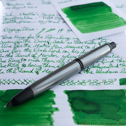
Pelikan Brilliant Green on copy

Pelikan Brilliant Green on Rhodia

Monday, February 20, 2012

Noodler's Polar Green ink review

Noodler's Polar Green marks the third ink in Noodler's "Polar" range that I tested, the other two being Polar Brown and Polar Blue. Third time's the charm they say but not in this case, I'm afraid. Due to a combination of factors I just couldn't enjoy this ink.

I tested Polar Green first in my Jinhao X750 and then, after being dissatisfied with the flow, in my Kaweco Classic Sport. Both pens have a broad nib.

As a reminder, Noodler's Polar inks are meant to resist very low temperatures, which make them ideal if you are a polar explorer. There is another, very practical, use for these inks though. Because I live in Illinois, which can get very cold in winter, I keep a Pilot Varsity filled with Noodler's Polar Brown in my car. Ballpoint pens always freeze in the cold and so would a normal ink. A Polar ink, on the other hand, feels right at home in the cold.

Another characteristic of the Polar range of inks is that they are bulletproof, which means water resistance as well as resistance to various chemicals that forgers might use.

Bottle
Polar Green comes in a 3oz / 89ml bottle and is priced at $12.50, or $0.14 per milliliter. This price is in line with most Noodler's inks.

Color and saturation
I was expecting an interesting shade but instead I got a very dull and melancholy green which is also fairly unsaturated. The color is definitely on the cool side of the spectrum. Essentially there's nothing cheerful about the appearance of this ink. You might like it but I don't. Polar Blue also had a subdued appearance but I enjoyed that ink a lot more.

Shading
Polar Green doesn't have any shading, unless you stack several layers of it.

Feathering
I haven't noticed any feathering, either on Rhodia or the cheap photocopier paper.

Bleedthrough
Unfortunately Noodler's Polar Green loves to bleed through cheaper paper. On higher quality paper such as Rhodia 80g or Clairefontaine 90g it shows some serious ghosting. This could also be as a result of using a broad nib but at any rate, it does show through. I could still use the reverse side of the cheap paper but while that may be ok for notes, it would probably look bad on official documents.

Flow and lubrication
Another place where Noodler's Polar Green fails to score any points is flow. This was one of the driest inks I've tested. It flowed poorly in the Jinhao X750 and only slightly better in the Kaweco. I am willing to give it the benefit of the doubt because I did not test this ink at the temperatures it was meant for. Perhaps it works much better when the temperatures are very low but I was hoping it would perform well at room temperature.

Drying time
It may fail at other chapters but Noodler's Polar Green dries in record time. This is one of the fastest drying inks I have tried. As you can see from the samples, it is dry in less than 5 seconds, and that's using a broad nib. Very impressive. On the other hand I've noticed that inks which dry very quickly also tend to bleed though the paper, which is definitely the case here.

Smearing when dry
No surprises here. Not only does Polar Green dry quickly but it doesn't smear one bit when touched. That's in opposition to Polar Brown and very similar behavior to Polar Blue.

Water resistance
Being a bulletproof ink, Polar Green's water resistance is exemplary. From the sample, you can see that after being held for over a minute under running water there isn't the slightest indication (apart from the rumpling of the paper) that this ink has been subjected to water.

Conclusion
Noodler's Polar Green is a peculiar ink. Personally I didn't enjoy it but looks are subjective and others might find that the dullness and lack of saturation are appealing. Is it appropriate for business use? Possibly, depending whether your line of work allows for green inks, even if they are subdued. If the dryness doesn't scare you away, then you might still be partial to the quick drying time and the high water resistance. One thing is certain: if you are in desperate need of a freeze-resistant green ink, then Noodler's Polar Green is the one and only ink for you.

Following are two writing samples on photocopier paper and Rhodia 80g, respectively.
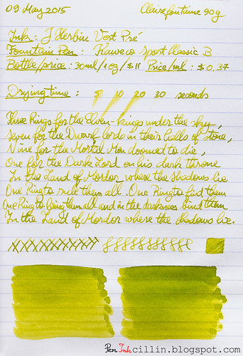
Noodler's Polar Green on photocopy

Noodler's Polar Green on Rhodia