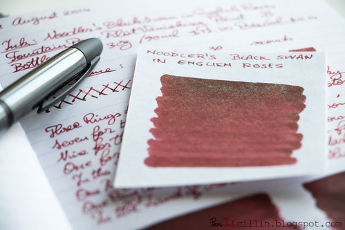
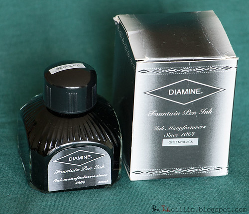
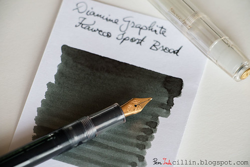
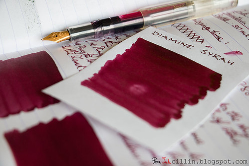
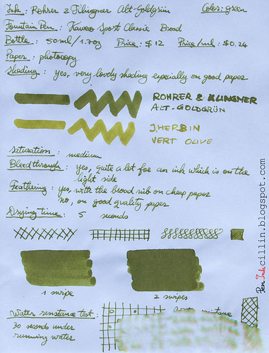
Without further ado, I present you my top 3 favorite inks tested in 2014, along with 3 runners-up.
Showing posts with label Rohrer & Klingner ink. Show all posts
Tuesday, January 27, 2015
2014 ink of the year
I know this post is a month late and a few bucks short but better late than never. In my defense, I'm back from a long vacation and it's hard to get the old routine back on track.
Without further ado, I present you my top 3 favorite inks tested in 2014, along with 3 runners-up.
Monday, August 25, 2014
Rohrer & Klingner Verdigris ink review
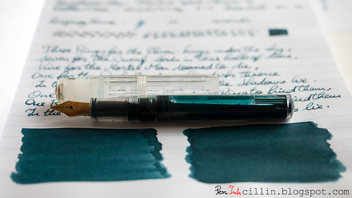
You voted for it, so the next ink in my ink sample survey is Rohrer & Klingner Verdigris. I tested the sample (in fact I'm still using it as we speak) in my Kaweco Sport Classic with broad nib.
To compound the problem, under fluorescent light R & K Verdigris looks like a dirty, dull gray. I've been using it daily at work over the past couple of weeks, under such lighting, and that's how it is.
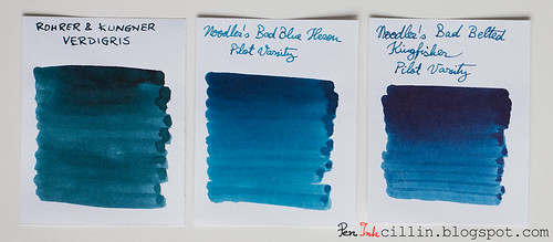
I've compared it to two of the only inks I've tested which bear a passing resemblance to it: Noodler's Bad Blue Heron and Noodler's Bad Belted Kingfisher. You can clearly tell which inks are blue and which isn't.
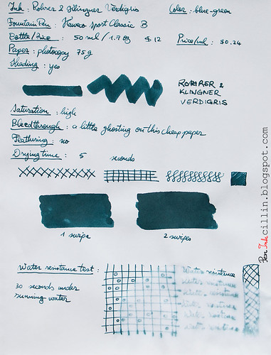
As far as saturation goes, it's pretty high.
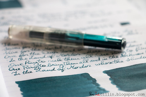
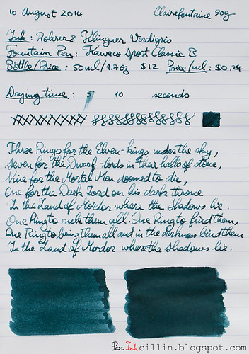
Here are the two writing samples on photocopy and Clairefontaine 90g paper, respectively.
Bottle and pricing
A bottle of Rohrer & Klingner Verdigris holds 50ml / 1.7oz and retails for $12. That's $0.24 per milliliter, quite pricy.Color and saturation
I've barely started this review and I have already arrived at the crux of why I don't like this ink. It's not the only reason, but I dislike the color. While it's considered a blue ink, there's not a lot of blue in it, I'm afraid. It veers more towards green, but the greenish shade of copper oxide, which, in fact, is where the term "verdigris" comes from. Either way, my eyes just can't see any blue in this ink.To compound the problem, under fluorescent light R & K Verdigris looks like a dirty, dull gray. I've been using it daily at work over the past couple of weeks, under such lighting, and that's how it is.
I've compared it to two of the only inks I've tested which bear a passing resemblance to it: Noodler's Bad Blue Heron and Noodler's Bad Belted Kingfisher. You can clearly tell which inks are blue and which isn't.
As far as saturation goes, it's pretty high.
Shading
To be fair, Rohrer & Klingner Verdigris redeems itself just a little by showing some decent (but not outstanding) shading. It's best seen in the q-tip samples but also a bit in the writing samples, although the latter suffer from another problem which I'm going to mention shortly.Feathering
None.Bleedthrough
It ghosts a little on cheap paper and the reverse side remains writable, though barely so.Flow, lubrication, and smoothness
Here's the second (and perhaps biggest) reason why I dislike Rohrer & Klingner Verdigris. Just like it's brand-mate Fernambuk, Verdigris is a dry ink. It flows poorly in the Kaweco, and also inconsistently. You can see that in my writing samples. Some lines are thick and wet, others thin and dry. In my book that's a big no-no.Drying time
Thanks to its dryness, Rohrer & Klingner Verdigris dries very quickly, even on smooth Clairefontaine paper. Small comfort though.Smearing when dry
None.Water resistance
This is not a water resistant ink. After 30 seconds under running water most of it has washed off.Conclusion
There's nothing positive I can say about Rohrer & Klingner Verdigris. There must have been a reason that determined me to buy a sample but I can't think of it for the life of me. Perhaps it looked better in other samples I saw online. In person, the color doesn't appeal to me (though I'm sure plenty of folk will love it) and the dryness and inconsistent flow are deal-breakers. I'd say buy it - only if you dare.Here are the two writing samples on photocopy and Clairefontaine 90g paper, respectively.
Wednesday, June 25, 2014
Rohrer & Klingner Alt-Goldgrun ink review
Here I am, finally able to review one of the ink samples that I still have an abundance of. I asked you a while back if you would like to participate in my ink sample survey and the response was excellent. It was a good idea to hold a survey, if I say so myself.
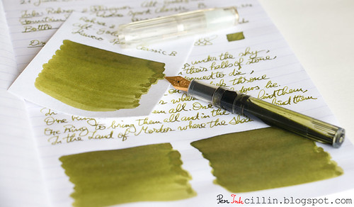
So it turns out that Rohrer & Klingner Alt-Goldgrun came ahead of the other samples in the voting, which made it an easy choice to load in my Kaweco Sport Classic with broad nib and eyedropper conversion.
Is this ink deja-vu or what? We'll see soon enough.
Before I start, a couple of mentions.
First, I changed one of the review papers from Rhodia 80g to Clairefontaine 90g. My Rhodia notebook that I was using has finally filled up, allowing me to start a new Clairefontaine notebook, with even better paper. I'm already loving this paper more than the Rhodia. It seems to play really well with fountain pens. I might do a little paper comparison in a future post.
Second, I have joined two more social media networks, beside Twitter, since my last review: Pinterest and Instagram. If you decide to follow me on either of them, I'll follow you back. Click the links here or in the right sidebar -->
Bottle and pricing
Rohrer & Klingner Alt-Goldgrun comes in a 50ml / 1.7oz bottle which sells for $12. The price / ml is $0.24 which makes it more expensive than other inks.
Color and saturation
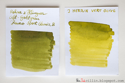
Did I mention deja-vu? Rohrer & Klingner Alt-Goldgrun reminds me strongly of J Herbin Vert Olive, of which I own a bottle. Vert Olive is lighter in color but both inks seem very closely related. They are both an olive sort of green.
To stretch the olive analogy farther, if Alt-Goldgrun is a ripe(r) olive, Very Olive is a green one. Apart from that, Alt-Goldgrun is darker and more saturated than Vert Olive.
Shading
Similarities to its J Herbin step-sibling don't simply stop at color. Alt-Goldgrun also features some very nice shading properties which are even more intense than the lighter ink. The Kaweco's broad nib really makes it stand out. Incidentally that's another reason why I prefer broader nibs.
Feathering
I'm sorry to say that Rohrer & Klingner Alt-Goldgrun feathers on cheap paper, which tends to act like a sponge. Combined with the broad nib, it's... not very pleasant. However, the problem all but disappears on good quality paper.
Bleedthrough
The situation here is similar to the feathering, in fact the two go hand in hand. Cheap paper is a sponge for Alt-Goldgrun, which causes it to bleed significantly. Personally it doesn't bother me too much because I use this ink at work to jot down notes and I use scrap photocopy paper. I can even use both sides because, well, I just hate wasting paper (and by association, trees). But if you're writing exclusively on better paper, like the Clairefontaine 90g I tested on, you won't have to worry about bleeding.
There is a bright side to this though, but not as you would imagine. Because the cheap paper I use literally sucks the ink out of that broad nib, my Kaweco is already empty after 4 days of use, which allows me to clean it and refill it with a new ink, hopefully to be reviewed next week.
Flow, lubrication, and smoothness
Rohrer & Klingner Alt-Goldgrun flows well in the Kaweco Classic and is wetter than average. On cheap paper it doesn't feel very smooth because of the sponge effect that I mentioned. On the plus side, it glides nicely on Clairefontaine.
Drying time
Drying on photocopy paper is nearly instant, but a somewhat longer (15-20 seconds) on Clairefontaine. Bear in mind though that this is with a broad nib. I'm sure it would dry quicker with a medium or fine nib.
Smearing when dry
None.
Water resistance
30 seconds exposure to running water completely destroyed this ink. Not. Water. Resistant.
Conclusion
Despite some flaws (feathering and bleedthrough) on cheap paper, Rohrer & Klingner Alt-Goldgrun is a fun and attractive ink. If I were to choose between it and J Herbin Vert Olive, I would choose Alt-Goldgrun, hands down. Vert Olive is too watery and too light for my taste, while Alt-Goldgrun is darker, and the shading is also better, which gives it more character and makes it more distinguished. If the olive type of green appeals to you, I would definitely recommend Rohrer & Klingner Alt-Goldgrun, with the caveat that it requires premium paper if you want to avoid potential frustration.
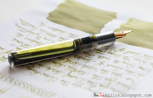
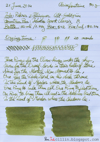
Following are the two samples on photocopy and Clairefontaine 90g paper, respectively.
So it turns out that Rohrer & Klingner Alt-Goldgrun came ahead of the other samples in the voting, which made it an easy choice to load in my Kaweco Sport Classic with broad nib and eyedropper conversion.
Is this ink deja-vu or what? We'll see soon enough.
Before I start, a couple of mentions.
First, I changed one of the review papers from Rhodia 80g to Clairefontaine 90g. My Rhodia notebook that I was using has finally filled up, allowing me to start a new Clairefontaine notebook, with even better paper. I'm already loving this paper more than the Rhodia. It seems to play really well with fountain pens. I might do a little paper comparison in a future post.
Second, I have joined two more social media networks, beside Twitter, since my last review: Pinterest and Instagram. If you decide to follow me on either of them, I'll follow you back. Click the links here or in the right sidebar -->
Bottle and pricing
Rohrer & Klingner Alt-Goldgrun comes in a 50ml / 1.7oz bottle which sells for $12. The price / ml is $0.24 which makes it more expensive than other inks.
Color and saturation
Did I mention deja-vu? Rohrer & Klingner Alt-Goldgrun reminds me strongly of J Herbin Vert Olive, of which I own a bottle. Vert Olive is lighter in color but both inks seem very closely related. They are both an olive sort of green.
To stretch the olive analogy farther, if Alt-Goldgrun is a ripe(r) olive, Very Olive is a green one. Apart from that, Alt-Goldgrun is darker and more saturated than Vert Olive.
Shading
Similarities to its J Herbin step-sibling don't simply stop at color. Alt-Goldgrun also features some very nice shading properties which are even more intense than the lighter ink. The Kaweco's broad nib really makes it stand out. Incidentally that's another reason why I prefer broader nibs.
Feathering
I'm sorry to say that Rohrer & Klingner Alt-Goldgrun feathers on cheap paper, which tends to act like a sponge. Combined with the broad nib, it's... not very pleasant. However, the problem all but disappears on good quality paper.
Bleedthrough
The situation here is similar to the feathering, in fact the two go hand in hand. Cheap paper is a sponge for Alt-Goldgrun, which causes it to bleed significantly. Personally it doesn't bother me too much because I use this ink at work to jot down notes and I use scrap photocopy paper. I can even use both sides because, well, I just hate wasting paper (and by association, trees). But if you're writing exclusively on better paper, like the Clairefontaine 90g I tested on, you won't have to worry about bleeding.
There is a bright side to this though, but not as you would imagine. Because the cheap paper I use literally sucks the ink out of that broad nib, my Kaweco is already empty after 4 days of use, which allows me to clean it and refill it with a new ink, hopefully to be reviewed next week.
Flow, lubrication, and smoothness
Rohrer & Klingner Alt-Goldgrun flows well in the Kaweco Classic and is wetter than average. On cheap paper it doesn't feel very smooth because of the sponge effect that I mentioned. On the plus side, it glides nicely on Clairefontaine.
Drying time
Drying on photocopy paper is nearly instant, but a somewhat longer (15-20 seconds) on Clairefontaine. Bear in mind though that this is with a broad nib. I'm sure it would dry quicker with a medium or fine nib.
Smearing when dry
None.
Water resistance
30 seconds exposure to running water completely destroyed this ink. Not. Water. Resistant.
Conclusion
Despite some flaws (feathering and bleedthrough) on cheap paper, Rohrer & Klingner Alt-Goldgrun is a fun and attractive ink. If I were to choose between it and J Herbin Vert Olive, I would choose Alt-Goldgrun, hands down. Vert Olive is too watery and too light for my taste, while Alt-Goldgrun is darker, and the shading is also better, which gives it more character and makes it more distinguished. If the olive type of green appeals to you, I would definitely recommend Rohrer & Klingner Alt-Goldgrun, with the caveat that it requires premium paper if you want to avoid potential frustration.
Following are the two samples on photocopy and Clairefontaine 90g paper, respectively.
Labels:
green ink,
ink review,
Rohrer & Klingner ink
Tuesday, March 4, 2014
Rohrer & Klingner Fernambuk ink review
With Rohrer & Klingner Fernambuk I'm yet again stepping in unknown territory by reviewing a new ink manufacturer. It's been a while since I reviewed a pink ink and while I realize that perhaps not many folks may be interested in such an ink, this is what I decided to pick for my everyday "red" pen. This is just a Pilot Varsity filled with red (-ish) ink that I keep at work for underlining and making notes. Since this is not my main note-taking pen, it takes a long time to exhaust the reserve, hence the infrequent review of red/pink/magenta inks.
Bottle and pricing
Rohrer & Kingner's bottles are small and dainty and retro-looking. They hold 50ml / 1.7oz and cost $12, which makes the ink rather expensive at $0.24 / ml. Unfortunately I don't have a full bottle to photograph and show you since I'm testing a sample. But you can easily google it.
Color and saturation
Rohrer & Klingner Fernambuk is a hot pink ink, very similar to the other hot pink ink I reviewed a while back, Diamine Cerise. You can see a comparison below. While both are highly saturated, Cerise trumps Fernambuk for vibrancy of color. Fernambuk is more subdued, yet I can see how some might appreciate it more.
Shading
You might be forgiven to think that R&K Fernambuk is flat but it actually has some shading, though subtle. It is mostly evident in the q-tip sample but if you squint you might also notice it in the normal writing sample. In all, there's nothing to write home about.
Feathering
There's no feathering unless you count the glass dip pen which feathers with almost any ink.
Bleedthrough
Surprisingly for such a light colored ink, it actually ghosts a little on low quality paper, and it can even bleed through if applied liberally on said paper.
Flow, lubrication and smoothness
I love me a wet-flowing ink but this one doesn't seem to be it. Granted, the Pilot Varsity isn't a paragon of wet-flow but it performs consistently with inks that aren't too dry. With R&K Fernambuk it managed to write without skipping but the nib feels dry and I don't get much pleasure when writing. So, it flows without enthusiasm in the Varsity but it is perhaps suited to a thicker nib.
Drying time
Because it's such a dry-feeling ink, it translates into swift drying times on both cheap and more expensive paper, photocopy and Rhodia respectively.
Smearing when dry
None.
Water resistance
Fernambuk isn't a water resistant ink, plain and simple. After 30 seconds of exposure to flowing water most of it washes off.
Conclusion
I'm having a hard time finding anything that I like about Rohrer & Klingner Fernambuk. While the color is pretty, I can't get over the dryness of the ink (similar to J Herbin Diabolo Menthe), and this is a deal-breaker for me. Even the color is nothing out of the ordinary. If you prefer something more vibrant you can always go with Diamine Cerise which seems to be a much better (and far cheaper) substitute. While my first introduction to Rohrer & Klingner inks wasn't very successful, I'm not prepared to give up on the brand. There are other inks in the lineup that I am interested in reviewing.
Bottle and pricing
Rohrer & Kingner's bottles are small and dainty and retro-looking. They hold 50ml / 1.7oz and cost $12, which makes the ink rather expensive at $0.24 / ml. Unfortunately I don't have a full bottle to photograph and show you since I'm testing a sample. But you can easily google it.
Color and saturation
Rohrer & Klingner Fernambuk is a hot pink ink, very similar to the other hot pink ink I reviewed a while back, Diamine Cerise. You can see a comparison below. While both are highly saturated, Cerise trumps Fernambuk for vibrancy of color. Fernambuk is more subdued, yet I can see how some might appreciate it more.
Shading
You might be forgiven to think that R&K Fernambuk is flat but it actually has some shading, though subtle. It is mostly evident in the q-tip sample but if you squint you might also notice it in the normal writing sample. In all, there's nothing to write home about.
Feathering
There's no feathering unless you count the glass dip pen which feathers with almost any ink.
Bleedthrough
Surprisingly for such a light colored ink, it actually ghosts a little on low quality paper, and it can even bleed through if applied liberally on said paper.
Flow, lubrication and smoothness
I love me a wet-flowing ink but this one doesn't seem to be it. Granted, the Pilot Varsity isn't a paragon of wet-flow but it performs consistently with inks that aren't too dry. With R&K Fernambuk it managed to write without skipping but the nib feels dry and I don't get much pleasure when writing. So, it flows without enthusiasm in the Varsity but it is perhaps suited to a thicker nib.
Drying time
Because it's such a dry-feeling ink, it translates into swift drying times on both cheap and more expensive paper, photocopy and Rhodia respectively.
Smearing when dry
None.
Water resistance
Fernambuk isn't a water resistant ink, plain and simple. After 30 seconds of exposure to flowing water most of it washes off.
Conclusion
I'm having a hard time finding anything that I like about Rohrer & Klingner Fernambuk. While the color is pretty, I can't get over the dryness of the ink (similar to J Herbin Diabolo Menthe), and this is a deal-breaker for me. Even the color is nothing out of the ordinary. If you prefer something more vibrant you can always go with Diamine Cerise which seems to be a much better (and far cheaper) substitute. While my first introduction to Rohrer & Klingner inks wasn't very successful, I'm not prepared to give up on the brand. There are other inks in the lineup that I am interested in reviewing.
Labels:
ink review,
pink/magenta ink,
Rohrer & Klingner ink
Subscribe to:
Posts (Atom)