Showing posts with label fountain pen review. Show all posts

Sunday, December 20, 2015

Baoer 507 fountain pen review

It's hard to believe I bought the Baoer 507 fountain pen over a year ago. It's been sitting ever since, patiently waiting its turn to be reviewed. Here it is, finally. I've been wanting to try it the moment I laid hands on its substantial heft, but kept delaying it.

Baoer 507 Fountain Pen

What is the Baoer 507?

The Baoer 507 is a fountain pen made by the Chinese Baoer company. If you're wondering how to pronounce "Baoer", you're not the only one. Is it bauer? Bower? Maybe someone can clear this up for me.
Baoer 507 Fountain Pen

Either way, Baoer is one of those Chinese brands (apart from Jinhao) which I'd heard of before. So one evening, while fishing for fountain pen deals on eBay, I came across this magnificent specimen featuring a copper embossed barrel. I placed a bid for $2.50 and promptly forgot about it. When the auction ended, I found myself with a $2.50 pen, including shipping. Delivery from China took a while, but I wasn't in any hurry.

Was the Baoer 507 worth my $2.50? You'll find out soon enough but I can tell you this much: it's some of the best $2.50 I've spent.

Packaging

As with the Jinhao 599 before it, I don't remember if it came in a (cardboard) box or not. If it did, I must have thrown it away. For $2.50 I don't have any expectations as far as packaging.

Body, construction, and dimensions

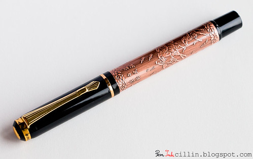
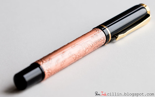
The Baoer 507's main feature is its actual copper barrel, embossed with horses, Chinese characters, and other flourishes. It's obviously garish but also very Chinese. Not everyone's cup of tea, I'm sure. I wanted it when I saw it, for the novelty factor.

Apart from that, there's a piano-black plastic cap with golden band, finial and clip, as well as a butt-end from the same plastic material.

Here are the Baoer 507's dimensions:
Length capped: 135 mm / 5.4 in
Length uncapped: 122 mm / 4.8 in
Length posted: 165 mm / 6.5 in
Cap length: 57 mm / 2.25 in

Here are the weights for the Baoer 507, compared to other fountain pens I've tested:
Baoer 507 (with cap) - 34.6 g - 1.22 oz
Baoer 507 (without cap) - 21.7 g - 0.76 oz
Jinhao 599 (with cap) - 17.8g - 0.63oz
Jinhao 599 (without cap) - 10.5g - 0.37oz
Pilot Vanishing Point (with cartridge and blind cap) - 30.5g - 1.08oz
TWSBI 530 (no ink) - 25.7g - 0.91oz
Lamy AL-Star (with converter) - 21.8g - 0.77oz
Noodler's Ahab (no ink) - 18.8g - 0.66oz
Pilot Prera (with converter) - 16.1g - 0.56oz

Right off the bat you'll notice 2 things: its dimensions are very similar to the Jinhao 599 (an all-plastic pen) at double the weight. Its weight, in fact, is even greater than the Pilot Vanishing Point. This makes the Baoer 507 a very hefty pen indeed.

In terms of construction, the Baoer 507 seems to be pretty well built. There are no seams or rough edges, and everything is put together nicely. The piano-black finish is slick, while the golden trim doesn't look cheap, although it is a little more than I like.
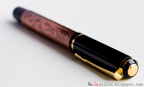
Baoer 507 Finial

The main attraction is the copper embossed body and I think it matches the piano-black cap and end piece rather well, though I'm not so sure about the gold accents around the cap. The barrel isn't exactly naked copper, instead seems to be covered in a thin layer of lacquer or some such.
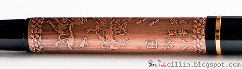
Baoer 507 Emboss

The cap features a gold metal band at either end, as well as a gold finial and a gold clip resembling those found on Pelikan pens. The gold band near the finial has "BAOER" inscribed.
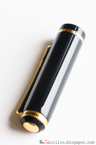
Baoer 507 Cap

The cap is a snap-on affair and I'm particularly impressed by how securely and authoritatively it snaps shut. This cap won't come off accidentally. The downside is that it's hard for me to pop the cap off with one hand by holding the barrel in the hand and pushing with my thumb against the bottom of the clip. The reason is that the clip ends in a sharp point that will pierce the skin of my thumb before the cap breaks contact.

Speaking of the clip, it is rather stiff, with some pretty strong tension in it. While it is very secure clipped to a shirt pocket, it's not easy to clip it using one hand. Due to that tension, and how the clip makes contact with the cap (via a tiny metal ball), you will need to spread it apart using your other hand. Well, at least it won't come off easily.

How about posting the cap? Some pens work well posted, while others are better unposted. The Baoer 507 feels very well balanced in my hand, without posting the cap.
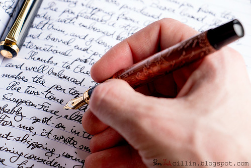
Baoer 507 In Hand Un-Posted

Due to the heavy weight of the pen itself, I found that posting the cap disturbs the balance and makes it top-heavy, so that doesn't work for me.
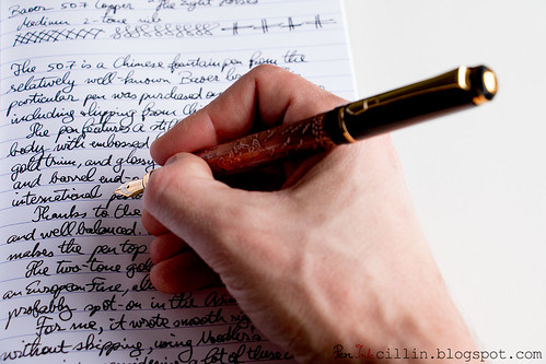
Baoer 507 In Hand Posted

If you are still determined to post the cap, you'll be happy to know that it posts very securely on the end. The butt seems to be very well designed with this intent, and while the cap is secured via friction, it's a tight but smooth fit.

The Baoer 507 comes with an international piston converter. I will use this opportunity to once again express my displeasure with higher-regarded brands who refuse to include converters with their significantly more expensive pens.
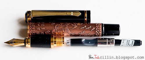
Baoer 507 Fountain Pen Parts

One last thing I'd like to direct your attention to in the picture above is the metal threads of the section. Yeah, this thing is sturdy.

The nib

My Baoer 507 has a medium/fine nib, and it's quite pretty in two-tone iridium-gold. I'm not sure I fancy the font they used to inscribe "BAOER", though. There's no nib thickness designation. Also, I'm fairly sure the nib isn't real gold. Just saying.
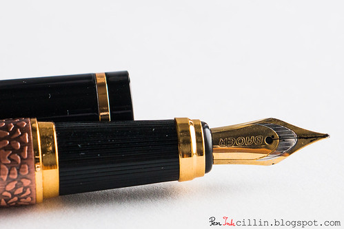
Baoer 507 Fountain Pen Nib & Section

The section is black plastic with lengthwise grooves. While this marginally improves the grip, I think I would have preferred a glossy section. The section ends in a necked down gold ring/fitting.

Unfortunately I didn't think to take pictures of the feed, and it's pretty late at this point in the review, but you're not missing much. The feed is a standard finned plastic affair, nothing to get excited about. It does its job well enough.

But does it write?

I'm happy to say that I hit the jackpot with the Baoer 507. The nib is a hard nail, without any flex, but it writes very well and very smoothly.
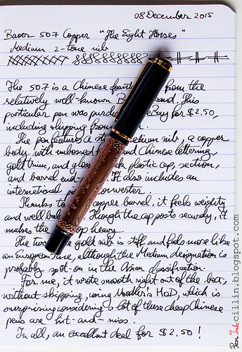
Baoer 507 Fountain Pen sample

While the nib isn't marked, it feels to me like an Asian medium or a European fine/extra fine.

I loaded the Baoer 507's converter with Noodler's Heart of Darkness (my go-to ink for testing fountain pens) and it doesn't skip one bit. The pen and the ink are a very good match.

Once, I left the 507 unused for 5 days and it wouldn't start again. Priming it by twisting the piston and soaking the feed with some ink got it started again and it wrote without skipping a beat ever since. It looks like with regular use (daily or every other day) it won't dry out, which is pretty good, on par with pens 1-2 orders of magnitude more expensive. This tells me that the cap has a pretty decent seal.

Baoer 507 Fountain Pen sample

Bottom line is that the Baoer 507 writes a lot better than both the Jinhao X750 and the Jinhao 599 I tested previously, and almost as well as the Pilot Metropolitan. Now obviously, it's all in the luck of the draw. The problem with cheap pens is that quality control is hit-and-miss. So you might get lucky and score a sweet-writing nib, or less lucky with an atrocious nib, as was the case with the Jinhao X750. But for $2.50 it's worth the gamble.

Final words

I am pleasantly surprised by the Baoer 507. I bought it for the novelty factor of the copper embossed barrel, never expecting it to perform worth a damn. Well, it obviously exceeded my very low expectations, and then some! You just can't get a real fountain pen (with a metal body, tight construction, piston converter, and decent nib) for much lower than $2.50.
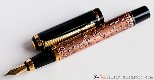
Baoer 507 Fountain Pen Uncapped

I highly recommend trying one, if the style appeals to you. You could try to snag one on eBay for close to nothing but with a long delivery time, or you could do me a small kindness and buy one from my Amazon affiliate link (I get a tiny commission of the sale with no cost to you) at a higher cost and potentially faster delivery, though it might still arrive from China.
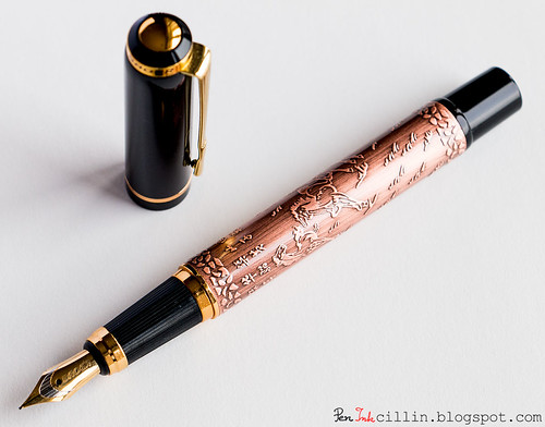
Baoer 507 Fountain Pen Uncapped

Below is the full, unobscured writing sample for your perusal.
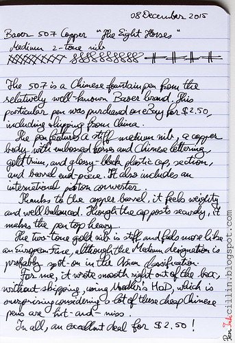
Baoer 507 Fountain Pen sample

Monday, June 29, 2015

Jinhao 599 fountain pen review

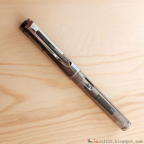
This was a long time in a-coming but here it is: a review of the Jinhao 599 fountain pen I picked up on eBay almost a year ago for $2.75, including shipping from China. If you're looking for a similar bargain you might have to do what I did: watch several auctions at once and place minimum bids on the ones that are closing soon. Eventually you'll win a pen.

Jinhao 599 Fountain Pen

What is the Jinhao 599?

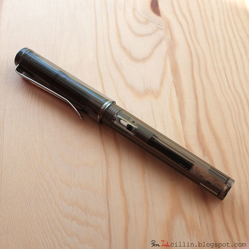
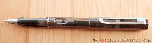
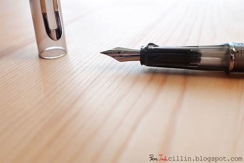
Apart from the obvious - a fountain pen - the Jinhao 599 is very clearly a Chinese clone of the German Lamy Safari / Vista. My copy is transparent smoke plastic, which puts in it line with the Lamy Vista.

Jinhao 599 Fountain Pen

The 599 isn't an exact replica, and that is also very obvious. However, plenty of design cues were poached straight from Lamy's classic line of fountain pens. More on this later.

Why would anyone, then, buy such an imitation? Well, the answer that comes to mind is that the Jinhao 599 is very cheap for a fountain pen, rather understated as Chinese pens go, and comes with a international sized piston converter, which can't be said for the Lamy Safari family.

Packaging

I'm afraid I don't recall if the pen came in a box or not. I believe it was inside a rather cheap-feeling cardboard box which I disposed of shortly.

Body, construction, and dimensions

My Jinhao 599 is, as previously mentioned, made out of transparent smoke-colored plastic. There are other variations out there, in a multitude of colors. I was also surprised to find out recently that there's a version made entirely out of metal (brass if I'm not mistaken), but covered in glossy paint, such that it resembles the plastic Lamy Safaris are made of. Those metal 599s look so good in the eBay pictures that I was tempted to buy a whole dozen of them in all the colors.

Here are some dimensions for the Jinhao 599:
Length capped: 137 mm / 5.4 in
Length uncapped: 129 mm / 5.08 in
Length posted: 165 mm / 6.5 in
Cap length: 65 mm / 2.56 in

Here's the weight, compared to other pens I've tested:
Jinhao 599 (with cap) - 17.8g - 0.63oz
Jinhao 599 (without cap) - 10.5g - 0.37oz
Pilot Vanishing Point (with cartridge and blind cap) - 30.5g - 1.08oz
TWSBI 530 (no ink) - 25.7g - 0.91oz
Lamy AL-Star (with converter) - 21.8g - 0.77oz
Noodler's Ahab (no ink) - 18.8g - 0.66oz
Pilot Prera (with converter) - 16.1g - 0.56oz

As you can see, this is among the lightest fountain pens that crossed my path. I don't mind that, it actually feels good to pick up.

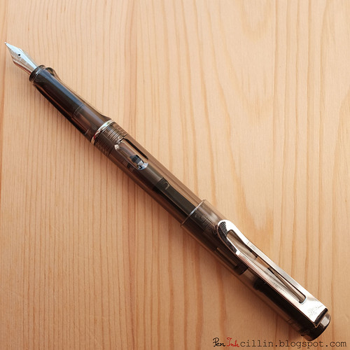
Jinhao 599 Fountain Pen Posted

The body construction looks very decent, and there are no blemishes or sharp edges. It feels very well machined. The Chinese have really got this inexpensive manufacturing down to a fine art. Of course, there are controversies regarding this, but let's not go there.

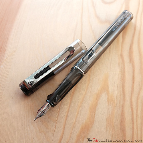
The resemblance to the Lamy Safari/Vista is strong, as mentioned. Unfortunately I don't have my Lamy AL-Star anymore, to compare, but the cross-section of the body is almost a mirror image to the Lamy: a flattened circle. The Jinhao log is embossed at one of the ends, almost in mockery to Lamy's identical design.

To add insult to injury, the Jinhao's section is also triangular, same as the Lamy's trademarked one. Some people don't like the feel of the triangular grip but I like it just fine.

The cap is slightly different, with a shiny flat black and opaque finial holding the clip. If there's one thing that distinguishes the Jinhao 599 from a Lamy, it's the clip. Compared to the Lamy's thick wire clip, the Jinhao's is rather pedestrian, in the form of a flat chromed blade with rounded edges and a slightly curving tip. It's also split along the middle and features a tiny logo which I believe resembles a horse-drawn cart. Like the Lamy, the Jinhao's cap is snap-on.

Jinhao 599 Fountain Pen Uncapped

The cap posts firmly and securely on the end of the barrel.

Jinhao 599 Fountain Pen Posted

Finally, the section is separated from the barrel by a chrome trim ring, again deviating from a Lamy.

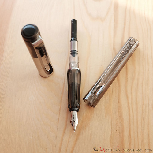
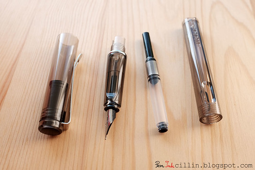
The Jinhao 599 one-ups the Lamy family by including an international piston converter (it also accepts international cartridges). It's not the highest quality but it does its job. In contrast, a Lamy converter costs almost twice as much as what I paid for the 599 itself, and is also proprietary, meaning that it only accepts Lamy converters and cartridges. Now that's what I call value!

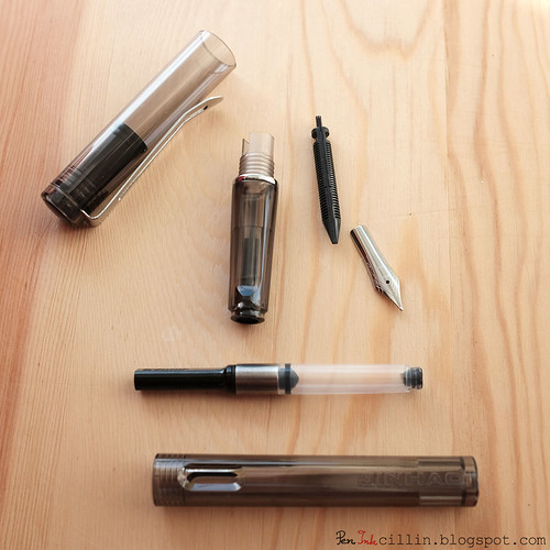
Jinhao 599 Fountain Pen Uncapped, Barrel Off

Jinhao 599 Fountain Pen component parts

A closer look at the nib

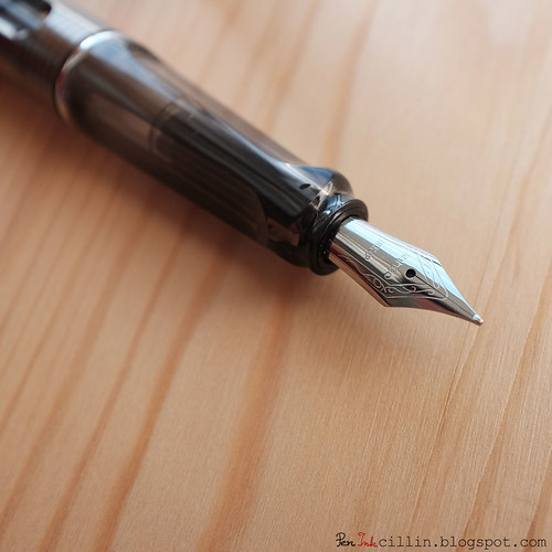
The nib, along with the feed, also differ from those in a Lamy pen. They are, in fact, quite pedestrian, and look like any other nib and feed you've seen before.

Jinhao 599 Fountain Pen Nib & Section

I have no idea what size the nib is. It feels somewhere between a medium and a fine. Let's say Japanese medium or European extra-fine.

The nib is engraved, rather delicately and precisely, with the word "Jinhao" and "18KGP" below that. If the 18KGP is meant to signify a gold nib, that must be a joke because this nib is quite hard and stiff. Besides, the price point invalidates the presence of a gold nib.

Jinhao 599 Fountain Pen Nib & Section

If you're wondering whether the nib and the feed can be pulled out easily, well, the answer lies in the image below. Yes, they can be pulled out with your fingers.

Jinhao 599 Fountain Pen component parts

But does it write?

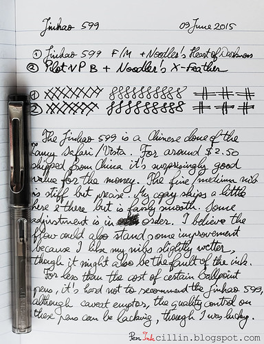
I wasn't too impressed with the Jinhao X750's performance when I reviewed it the first time or the second time around. This made me a bit wary about the 599. I was pleasantly surprised to discover that it wrote quite well, considering the price point and how hard the nib is.

The nib is smooth and the tines were well aligned right out of the gate. If the ink is primed correctly, it doesn't skip at all, and writes consistently, although it does seem to prefer better quality paper. I used Noodler's Heart of Darkness in it and I have to admit that, perhaps due to the thinness of the nib, it doesn't come out as dark as I would like. I'm guessing another ink would do it more justice.

Here's a sample written with the Jinhao 599 on Clairefontaine 90g paper.

Jinhao 599 writing sample

Final words

Being 95% satisfied with the Jinhao's 599 performance, I plan to make it my permanent work instrument, replacing the Kaweco Sport Classic that I've been using for so long. I'll probably change the ink with something else, but I'm looking forward to using this pen in an official capacity. It also helps that the design is very understated, as Chinese fountain pens go, since they usually tend to be gaudy and flamboyant.

What more is there to say? The Jinhao 599 was one of my best purchases and I can't recommend it highly enough, especially at this price. If you are patient you too can snag one for less than $3, shipped. It's well worth it. There's always the chance that quality control is spotty and your version might be a dud, but hey, at least you're not spending dozens or even hundreds of dollars on a pen that won't write out of the box.

Wednesday, September 3, 2014

Jinhao X750 revisited

Jinhao X750 revisited

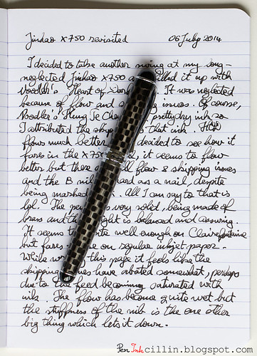
A while back (well, about 2 months ago) I decided to revisit my Jinhao X750 fountain pen. As a quick reminder, Jinhao is a Chinese fountain pen brand and can be found cheaply on eBay. My own pen sports a broad nib, which seems to be quite rare on the X750.

Nostalgia dictated that I give this pen another try, even though it didn't score perfectly in my original review. So I loaded it up with Noodler's Heart of Darkness and gave it a whirl. Without further ado, here's what I like and dislike about it, bearing in mind that these points may or may not be true for different-sized nibs.

What I Like

  • Price. Back at the time I paid $8, shipped, but recently (after buying 3 more Chinese pens for very little) I realized that I could have gotten it for even less.
  • Heft and build. While close inspection will reveal a certain roughness to its construction, it feels very solid nonetheless. Being all-metal (most likely brass), it is heavy and feels indestructible.
  • Styling. It's not the most handsome pen out there. In fact the X750 is a bit kitschy if you ask me, what with the unevenly stamped checkerboard pattern, but its quirkiness is partly what lends it its charm.
  • Comes with an international-sized piston converter. Much more expensive pens still eschew a converter and it really makes me question why those companies can't be bothered to include one.
  • Easy to disassemble. The nib and feed can be easily pulled out from the section using your fingers. Cleaning is, thus, a breeze.

What I Dislike

  • A little bit kitschy and a little bit gaudy.
  • The nib is a hard nail.
  • The broad nib isn't a good writer. It skips often and simply can't suck enough ink to work properly. This makes for an annoying writing experience. At some points the feed will saturate with ink and start to write better but it doesn't last. Which brings me to the next point...
  • The ink dries quickly in it. It seems that the nib isn't sealed properly inside the cap, which causes the ink to dry and evaporate. As a result, the ink runs out quickly even if you leave it sitting on your desk.
  • The ink drying issue amplifies the nib skipping.
  • The clip is too stiff, basically not well designed at all. I don't find it attractive either.


Conclusion

As you can see, there are plenty of things not to like about the Jinhao X750, with only a few positives. The balance might improve in favor of "likes" if a different nib were used. We shall see. I have acquired 2 other Jinhao pens (different models) with medium nibs and I'm curious to see if those perform better. For now, I would suggest to either stay away from the broad nib or to hunt for a really good deal on this pen, hopefully no more than $3 or so, if you can snipe it from eBay like I did for some of the other Chinese pens I bought.

Monday, July 28, 2014

Pilot Knight fountain pen review

My new friends at Pen Chalet sent me a very nice fountain pen to review: the Pilot Knight. Like the Metropolitan, this is a newer release from Pilot. Disclaimer: I received the pen free of charge but no other payment or incentive for this review, and all the opinions herein are my own.

For now, the Pilot Knight comes only in brushed silver finish with a medium nib. Pen Chalet has a pretty good deal on the Pilot Knight at the moment, 50% off list price, for only $24. If you use the coupon code PeninkCillin you can get an additional 10% off on your first order.

Packaging

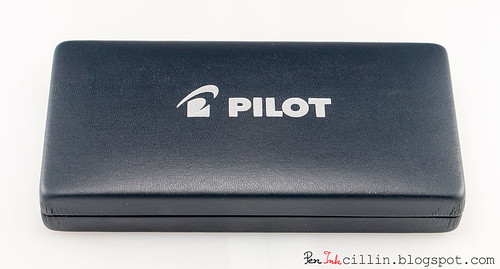
The Pilot Knight comes in a large clamsheel-type case, with a vaguely leather-like texture. The case itself is inside a white card-stock box (not pictured).

Pilot Knight case

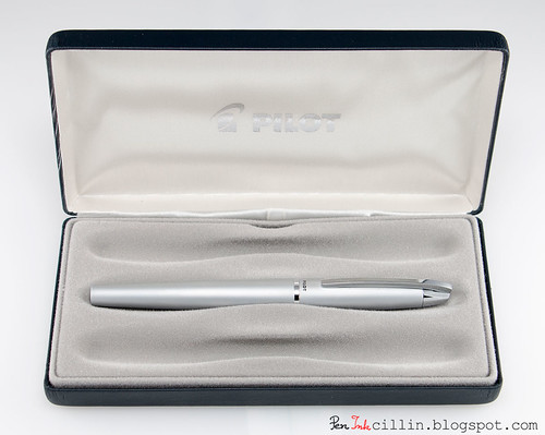
The clamshell case is larger than both the Metropolitan and the Vanishing Point I tested recently. In fact, it looks like there's space inside it for 3 pens. I don't understand why this is. It looks to me like a lot of wasted resources for such an inexpensive pen. However, my judgment might be warped by the half price sale. Perhaps this type of case would be more justified at the original $48 price.

Pilot Knight case

Underneath the tray insert Pilot includes a blue ink cartridge, an instruction manual, and a warranty card. Those are very similar to what's included with the Metropolitan and Vanishing Point so there was no point in photographing them again.

Body, construction, and dimensions

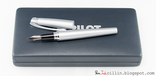
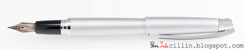
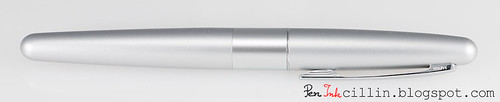
The Pilot Knight is a very handsome metal (likely brass) fountain pen, with brushed silver finish. Both the barrel and cap (as well as the clip) are metal, which gives it a hefty, solid weight.

It is, in fact, one of my heaviest pens (that I have weighed so far), heavier even than the metal-bodied Vanishing Point, and exactly 10 grams heavier than the Pilot Metropolitan. Here's a table comparing it with other pens I have weighed:

CappedUncapped
PenWeight (g)Weight (oz)Weight (g)Weight (oz)
Pilot Knight36.41.2821.60.76
Pilot Vanishing Point30.51.08--
Pilot Metropolitan26.40.9317.10.6
TWSBI Diamond 53025.70.91n/an/a
Lamy AL-Star21.80.77n/an/a
Noodler's Ahab18.80.66n/an/a
Pilot Prera16.10.56n/an/a

Lengthwise, the Knight is as follows:
Length capped: 13.5 cm / 5.25 in
Length un-capped: 11.5 cm / 4.5 in
Length posted: 14.5 cm / 5.75 in

Pilot Knight on case

While the weight might scare some folks off, it feels really good to me. It's well balanced but as is often the case, I prefer to use it unposted. With the cap posted I feel that it's too top heavy. I mean, the cap itself weighs almost 15 grams. The way I define "top heavy" is when I feel the pen starts to pivot upwards while resting between the thumb and index finger.

When posted, the cap is held on by friction. The fit is reasonably secure but I would still recommend pressing it hard from the get-go.

Pilot Knight posted

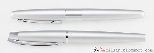
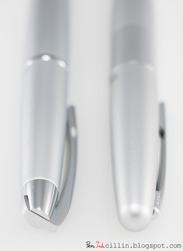
Shape-wise, the Knight resembles the Metropolitan in that it is roughly cigar-shaped (but a lot thinner) and tapers sharply at both ends. Here's where the resemblance ends.

Pilot Knight vs Metropolitan

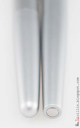
At the barrel end, the Knight is cut off sharply, and if you look at the end of the butt, there's a round polished chrome insert. The Metropolitan, in comparison, is rounded smooth. I prefer the Knight's barrel end.

Pilot Knight vs Metropolitan barrel end

Moving down the barrel, where it meets the cap there's a thin polished chrome band. Nothing fancy but I think it's classier than the Metropolitan's wide band. But then again, the Metropolitan seems like a more casual pen.

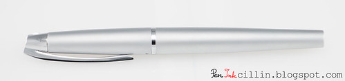
Pilot Knight

One of the most striking features of the Pilot Knight is the cap, or rather the clip. It's spring-loaded and the action is very smooth. It clips nicely to a shirt pocket and holds on tightly. Being very smooth it won't snag or tear the fabric. The clip, as well as the finial, are polished chrome, like the rest of the trim.

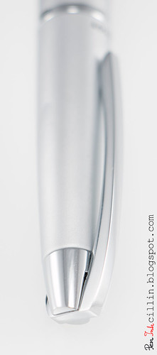
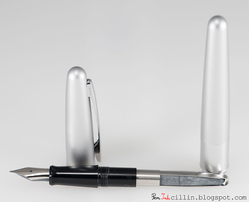
Pilot Knight cap

The clip comes up, through, and over the finial, and hinges somewhere inside it. I'm not sure if this description makes sense but I hope the image above will assist you in visualizing it. When activated, you can see how the whole thing pivots. It's pretty cool.

Compared to the Metropolitan, there's a huge difference in the aesthetics of the cap and the clip. While the Metropolitan ends in a smooth rounded dome, with no finial to speak of, the Knight has a very nice asymmetrical conical finial, with the clip forming a point, almost like a spearhead. I guess that's where the "Knight" name comes from.

Pilot Knight vs Metropolitan caps

I neglected to take a photo of the filling system but if you want to see what a pump converter looks like, just check out the Pilot Metropolitan review because the Knight uses the exact same system. I talked about the downsides of this system in the other review so I won't repeat them here. Pilot also includes a blue ink cartridge but I installed the pump converter right away, and filled it with Noodler's Heart of Darkness. The Knight can also take a CON-50 converter and I really wish they had included one. The CON-50 is a far superior solution compared to the pump converter.

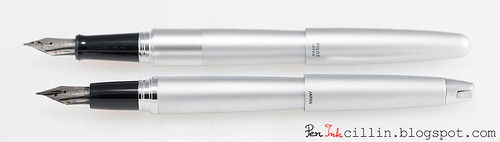
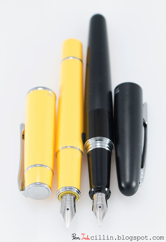
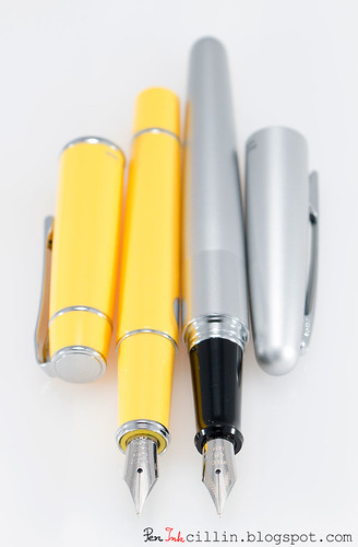
Here's a side-by-side shot of the Knight compared to the Metropolitan.

Pilot Knight vs Metropolitan

Notice that, while both pens have a glossy plastic section, the Knight's is shorter in length. The Metropolitan's section is also flared at the nib end, which might prevent fingers from slipping, while the Knight lacks the flare. However, despite being slippery, I haven't run into slip issues with either pen. I guess their weight (especially the Knight's) helps to keep it steady.

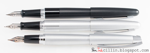
Finally, a shot of both Metropolitans (F and M) along with the Knight (M).

Pilot Knight vs Metropolitan

I think it's fair to say the Knight wins hands down in the looks department.

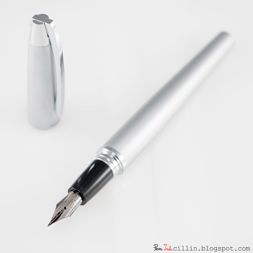
The nib

Not much to say here beyond what was already said in the Metropolitan review, because the Knight uses the exact same nib and feed as other Pilot pens, including the Prera. As such, I would expect it to write perfectly.

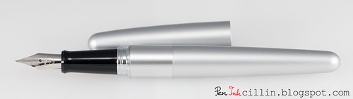
Pilot Knight uncapped

But does it write?

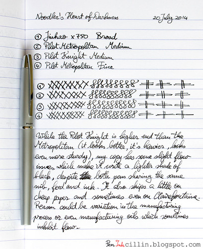
Despite all the praise I heaped upon the Pilot Knight so far, I was a bit disappointed to find out that it didn't write quite the same as the Metropolitan, even though both pens have identical feeds and medium nibs. The following sample should give you an idea of the differences.

Pilot Knight writing sample

So what's wrong? Well, if you haven't read the Metropolitan review, I'll just tell you that the medium nib (and the fine one in a smaller measure) impressed me hugely. I declared that medium nib to be the smoothest, with the best flow I've ever tested. The Knight's nib is neither as smooth, nor flows as well. It even had some skipping issues at first, until I used it some more, which perhaps helped to saturate the feed with more ink, and that in turn made it write without skipping. Still, the Knight's line remained thinner and lighter than the Metropolitan's.

My disappointment notwithstanding, the Knight wrote acceptably after "breaking it in", though it never equaled the Metropolitan. One possible explanation for this behavior is that the feed could have been covered in residual manufacturing oils, which can prevent proper flow. I didn't wash the pen before first use so it's a good an explanation as any. On the other hand I didn't wash the Metropolitan either.

Another, more likely explanation is that there will always be variation between these mass produced nibs. To be fair, the Metropolitan's nib is better even than the Prera's, and the latter is a $60 pen. So it boils down to luck of the draw.

The nib bears more testing, of course. I have given the system its first wash and we'll see how it performs afterwards. In the meantime, I did what anyone would do: I swapped the nibs and feeds between the Metropolitan and the Knight. The end result is a gorgeous pen which writes like a dream.

Final words

The Pilot Knight is a really impressive metal-bodied fountain pen with a modern design and clean, sharp looks. I'm sure it can impress in any boardroom or high-end office. For the $24 Pen Chalet is charging, it's frankly hard to beat. At the full price of $48, it becomes harder to recommend, chiefly because of the filling system. I feel that around the $50 mark, a fountain pen should have at least a twist converter. Yeah, I guess we've all been spoiled by pens such as the TWSBI, not to mention $2 Chinese pens which come standard with a converter.

As for the nib issue, I wouldn't sweat it too much. If I'm right about the manufacturing oils, this is a non-issue. Even if not, this isn't a problem specific to the Knight but rather a legacy to mass-produced nibs. As such, some of these nibs will perform outstanding, while others less so.

Personally I think the extra $9 over the Metropolitan is worth it for the superior looks and heavier body. If you are past the stage of a starter pen and would like something more distinguished, as long as you like a silver finish and a medium nib, you can't go wrong with the Pilot Knight.

Tuesday, July 22, 2014

Pilot Metropolitan fountain pen review

Thanks to Goulet Pens who sent me these pens for review, I can present you with two Pilot Metropolitan fountain pens, one plain silver with medium nib, the other plain black with fine nib. Disclaimer: I received the pens free of charge but no other payment or incentive for this review, and all the opinions herein are my own.

There are several different patterns available for the trim piece around the mid-section of these pens, as well as gold and purple finishes, but I opted for the plain versions because I wasn't sure I would like the patterns. Looking more carefully at the photos on Goulet Pens I believe that some of them, such as the silver dots, are quite interesting.

The Pilot Metropolitan must be a new model because I can't remember hearing about it a year ago. It certainly wasn't available when I got into fountain pens, around 2010-11, because instead of the much more expensive Pilot Prera, I might have looked into one of these instead. As it stands, the Pilot Metropolitan is a very affordable entry-level fountain pen which the Goulets sell for a modest $15. Let's dig in and find out what you get for 3 Lincolns.

Packaging
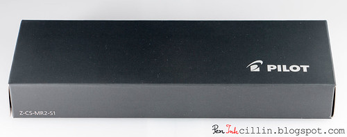
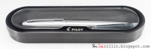
The Pilot Metropolitan comes in a simple but neat exterior cardboard sleeve. Inside is the inner display case which is made of some sort of thin metal or tin, with a plastic window through which the pen and a blue ink cartridge can be seen.

Pilot Metropolitan external box

Pilot Metropolitan internal box

This is quite a lot of decent quality packaging for a $15 pen. I actually prefer it to that of the Pilot Vanishing Point. This case looks sturdier and the metal is superior to the VP's fake-leather-covered-cardboard.

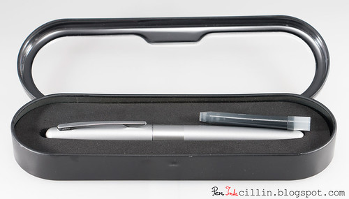
Here's what the case looks with the lid open. Pilot also includes a blue ink cartridge to get you started.

Pilot Metropolitan internal box open

Body, construction, and dimensions
The Pilot Metropolitan is a sleek, metal-bodied fountain pen, with a slim cigar-shaped body. It tapers to a rounded point at both ends and there's no finial to speak of.

Pilot Metropolitan silver

The silver version comes with a brushed metal finish, while the wide trim band around the middle is polished aluminum. The middle band can also be one of several patterns, such as dots, python, zig-zag and so on.

Regardless of color and finish, all Metropolitan pens sport a polished chrome clip which seems to be tension-loaded. It's very plain and I can't say I like it but it serves its purpose.

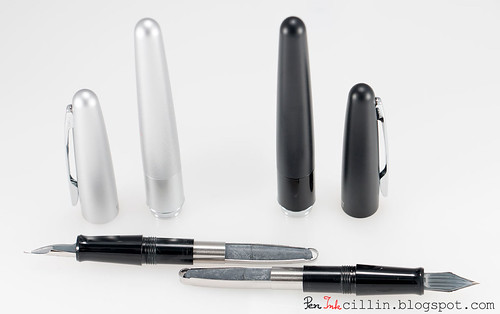
Moving on, uncapping the pen reveals the glossy black plastic section and the nib.

Pilot Metropolitan silver uncapped

The cap is of the slip-on type and snaps close with a solid click. You can post the cap but it doesn't feel very secure unless you press it down hard. I prefer to use the Metropolitan un-posted because the balance feels better for me. Posted, it's a little top heavy.

Pilot Metropolitan posted

Seeing the nib, immediately hinted that this would be a good writer. Why? Because at first sight the nib looked very similar to the Prera's. And the Prera is a very good writer. So are the nibs identical? I will reveal that shortly.

Unscrewing the barrel from the section reveals the filling mechanism. It's a squeeze converter.

Pilot Metropolitan silver disassembled

Now, I have some reservations regarding squeeze converters. They're rather imprecise when filling, you can't see the contents, ink capacity is low and, well, basically they're not the most elegant filling system out there. But considering the price of this pen, I'm actually glad that they even included a converter. Other manufacturers won't even dream of going beyond the courtesy lone cartridge for price points below $40-50. So I see this as a big plus.

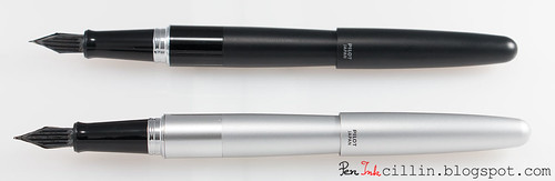
Pilot Metropolitan silver and black disassembled

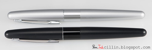
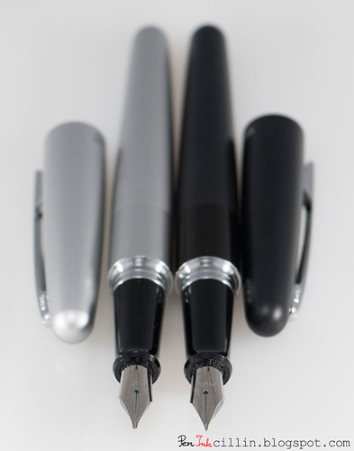
Here are the two pens I reviewed, next to each other. The black has a fine nib, while the silver sports a medium.

Pilot Metropolitan silver and black

The black pen has a similar brushed finish, but the black band is glossier than the silver.

Dimensions for the Pilot Metropolitan are as follows:

Length capped: 13.7 cm / 5.4 in
Length un-capped: 13 cm / 5 in
Length posted: 15.5 cm / 6 in
Weight (capped, with converter): 26.4 g / 0.93 oz
Weight (un-capped, with converter): 17.1 g / 0.6 oz

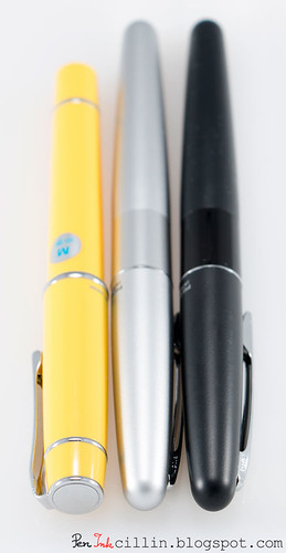
Here are the two Metropolitans compared to the Prera. They are longer but slimmer. I prefer the Prera's shape though, but that's a more premium pen.

Capped Pilot Metropolitan black and silver vs Prera

In operation, the Metropolitan is well balanced without posting the cap. While I would prefer a slightly thicker body, it is by no means uncomfortable. The glossy section is a bit slippery but the fingers won't slide too low because they are stopped by the flared end.

The nib
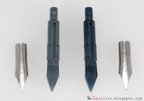
As mentioned, as soon as I saw the Metropolitan's nib, I knew it would be good, because it looked very similar to the Prera's. So I took both pens apart (the medium-nibbed Metropolitan and the medium Prera) and here's what I saw.

Pilot Metropolitan vs Prera nib and feed

As I suspected, both nib and feed are identical. The only difference is in the pattern which appears on the nib. The Metropolitan has a small dashed design, while the Prera lacks this, instead featuring the words "Super Quality". Well, I'm happy to report that both nibs are "super quality".
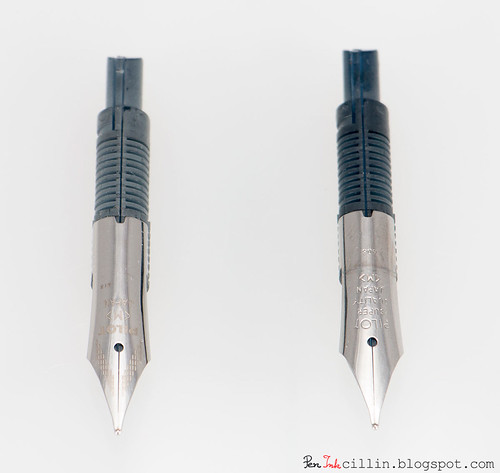
Here's the underside of the two feeds. Again, they are identical, except for the fact that the Metropolitan's is a lighter color.

Pilot Metropolitan vs Prera nib and feed

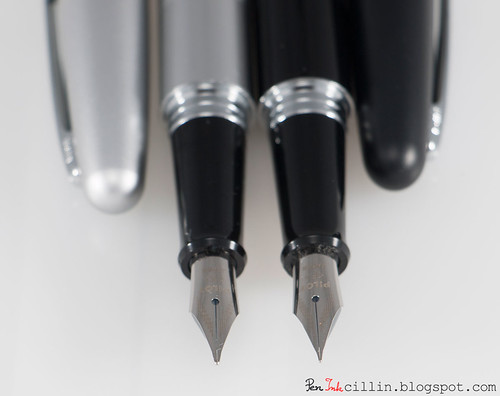
Next is a series of photos comparing the fine nib from the black Metropolitan with the medium nib from the silver Metropolitan, and the medium nib from the Prera.

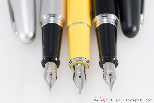
Pilot Metropolitan silver and black nibs

Pilot Metropolitan silver and black nibs close-up

Pilot Metropolitan nib vs Prera

Pilot Metropolitan black vs Prera

Pilot Metropolitan silver vs Prera

You can tell just by looking at these photos how much thinner the fine nib is compared to the medium.

But do they write?
Expectations can be low for inexpensive pens and high for expensive ones. My expectations for the Metropolitan were pretty high to start with but I'm happy to say that they were exceeded. I loaded both pens with Noodler's Heart of Darkness and also used a Jinhao X750 with a broad nib for comparison, filled with the same ink.

The medium nib in particular impressed me in no small measure. It writes better than the Prera. I suspect I was lucky to get a particularly good sample. This is without doubt the smoothest medium nib I have used. It writes like a dream, creamy smooth on any type of paper. It's so smooth, and the flow so satisfying that it resembles a Pilot V5 Rollerball. Scratch that, it's even smoother than the V5.
The medium nib's flow is well on the wet side with Noodler's HOD, but be rest assured that it doesn't gush. Since I like wet-flowing nibs, it is very enjoyable to use.

The fine nib has a different character. It is very smooth and the flow is consistent. It starts right away and never skips. Yet, due to the nature of the nib, it is not quite as smooth or as wet as the medium. Don't get me wrong, if the medium gets a 10/10 for smoothness, I'd give the fine a 8.5-9/10. Same for wetness.

The fine nib's strength lies in its precision. It lays a very thin and sharp line, which I'm sure would be perfect for Japanese or Chinese characters. If you like F/EF nibs, this is the nib for you. Myself, I prefer a thicker nib, that's why I favor the medium, but the fine is just as good, depending how you lean.

Both nibs require very little pressure to write.

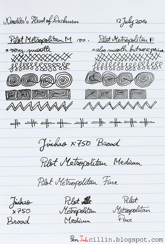
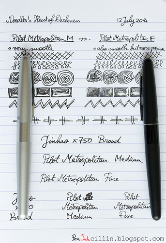
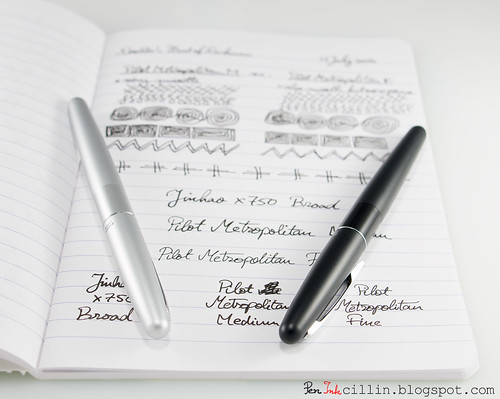
Here's the writing sample on Clairefontaine 90g, showing a comparison between the Pilot Metropolitan M and F, as well as the Jinhao X750 B, followed by a couple more glamour shots.

Writing sample for Pilot Metropolitan

Pilot Metropolitan silver and black with writing sample

Pilot Metropolitan silver and black with writing sample

Notice how much tighter the spiral designs are with the F. Both pens pair incredibly well with Noodler's Heart of Darkness.

Final words
The Pilot Metropolitan is an inexpensive but definitely not cheap fountain pen. $15 gets you a stylish metal body with good balance and decent ergonomics, and even a squeeze converter which is pretty rare at this price point. But more importantly, this entry-level fountain pen comes with an incredible nib which puts more expensive pens to shame.

I can't recommend the Metropolitan strongly enough but it's up to you to decide which nib size you prefer. While both are amazing, my own bias makes me lean towards the medium. Whichever way you go, there's only a big heap of win, so if my review convinced you, head on to Goulet Pens and take a look.