Showing posts with label red ink. Show all posts

Wednesday, September 10, 2014

Diamine Red Dragon ink review

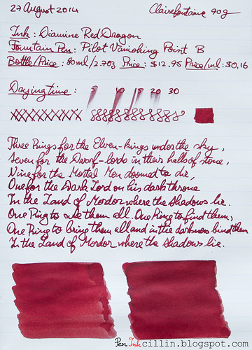
Looks like I'm caught in a vicious circle of red and burgundy ink reviews, because it's time for yet another red ink: Diamine Red Dragon. This is easily the darkest red I've tested, to the point where it could just as well be classified under burgundy, but since it has "red" in the name, this is what I will call it.

I reviewed Diamine Red Dragon in my trusty Pilot Vanishing Point with broad nib.
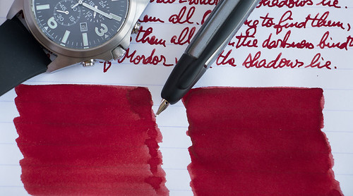
Diamine Red Dragon shading

Bottle and pricing

Bottle capacity: 80 ml / 2.7 oz
Price: $12.95
Price / ml: $0.16

Color and saturation

As I already mentioned, Diamine Red Dragon is a very dark red ink, so dark in fact that if I were to put it under the Burgundy category, no one would bat an eyelid. As such, it is also highly saturated. To an extent, it resembles thick, coagulated blood. Or, if you will, dried dragon's blood.

To give you a better idea, I compared it with 2 other similar inks, Noodler's Black Swan in English Roses and J Herbin 1670 Rough Hematite.
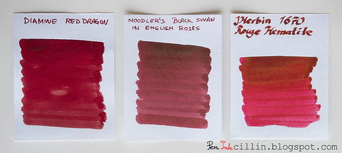
Diamine Red Dragon vs Noodler's BSER vs 1670 Rouge Hematite

Shading

Because it's so dark Diamine Red Dragon doesn't have a lot of shading. Now, some people will say that it does, and I guess if you used a brush instead of a nib, and peered really hard, you would find a little color variation. Actually, you can see that on the Clairefontaine sample shown at the bottom. But for all practical purposes, when used in a fountain pen, even one with a broad nib, there isn't any shading to speak of.
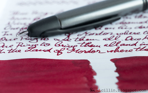
Diamine Red Dragon handwriting

Feathering

Diamine Red Dragon feathers a little on cheap paper, with the broad nib. No such thing happens on Clairefontaine 90g.

Bleedthrough

Considering the darkness and saturation of this ink, it was expected that it would at least ghost on cheap paper. That it does, though it doesn't outright bleed through. There's no ghosting on Clairefontaine.

Flow, lubrication, and smoothness

Diamine Red Dragon is very smooth - when it flows. I'm not sure exactly what happened to cause this, but in the Pilot Vanishing Point the flow was very inconsistent. At times it would stop entirely, and cause the nib to skip. I had to press the nib hard to the point of flexing, before it would start again. The Pilot VP has been a wonderful writer with other inks so it makes me wonder whether Red Dragon has some weird property that causes this. To make it flow properly, I had to resort to twisting the piston converter. But this made the ink flow a lot darker, for a while at least, until it would slow down again, becoming lighter in color.

I'm really puzzled as to why this is happening, especially considering that it is a fairly wet ink - when it behaves.

Drying time

Drying times were pretty long on both cheap and good quality paper, but that's partly due to the broad nib, as well as the wetness of the ink.

Smearing when dry

Unfortunately there's a lot of smearing going on, under certain conditions. First, Diamine Red Dragon is a slow drier. It takes its sweet time before you can turn that page, but this happens on Clairefontaine 90g. Second, you must leave it at least 24 hours before you can touch the text, or else it will smear. Even then, portions of the text where more ink has pooled will smear. It's not as bad as Diamine Syrah though.

Water resistance

There's no water resistance at all.

Conclusion

Diamine Red Dragon is a really cool looking dark red ink with a cool name and ordinary properties. I would really recommend it, with the caveat that it might (or might not) have some flow issues, and it might also smear if you are using it on good paper. If you are looking for a neutral, "true" red, this is not it, but if you want something outside the mainstream, perhaps trending towards burgundy/brown, you might want to take a look at Diamine Red Dragon.

Here are the two samples, on photocopy and Clairefontaine 90g, respectively.
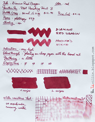
Diamine Red Dragon on photocopy

Diamine Red Dragon on Clairefontaine

Thursday, September 19, 2013

Lamy Red ink review

I haven't posted in a long time, and going forward it is highly likely that I will post very sporadically. While I still enjoy using inks and fountain pens, and I still have a large number of ink samples to review, life has guided me in a different direction and I find myself with very little time to involve myself with my hobbies.

All is not lost though because today I'm reviewing an ink that I've been using on a daily basis ever since my last ink review. Lamy Red, the ink in question, has lasted all this time in my Pilot Varsity that I use at work. In truth, I use red ink rarely so it usually lasts a long time. In this case, the nature of this ink also helped with longevity. Let's explore why.

Bottle
Lamy inks hail from Germany and they come in 50ml (1.7oz) bottles for $8.50, or $0.17 per milliliter.

Color and saturation
Lamy Red is not very saturated in writing, despite what you see from the samples. Swabbing with the q-tip produces more saturation, obviously. The color tends a bit towards orange-pink. You can see how it compares to Noodler's Nikita, which, to my opinion, is a truer red.

Shading
Lamy Red doesn't have any shading to speak of.

Feathering
The absence of feathering is always a good thing.

Bleedthrough
No bleedthrough either.

Flow and lubrication
Here's where Lamy Red starts to falter. This is one of the drier inks I've tried in recent memory. The lack of saturation and shading when using a fountain pen could be partly due to its dryness and reluctance to flow. While cheap paper will induce it to flow somewhat by acting as a sponge, better paper such as the Rhodia 80g I used for one of the samples offers a very poor surface. I did not enjoy writing that segment on Rhodia. Luckily I use cheap paper at work.

Drying time
Dry ink usually means quick dry. No exception here, though I would have traded some drying time for better flow.

Smearing when dry
None.

Water resistance
This ink isn't rated waterproof and it shows. A mere 15 seconds under flowing water made most of the text illegible.

Conclusion
To be honest I didn't have great expectations about Lamy Red. I guess I wasn't disappointed, in that sense. While I'm sure this ink has its fans (who perhaps like the color), personally I cannot recommend it. There's nothing particularly appealing about the color to me, while the dryness kills it completely. Verdict: there are much better red inks out there.

Following are the two samples on photocopy and Rhodia 80g paper, respectively.

Lamy Red on photocopy

Lamy Red on Rhodia

Monday, March 25, 2013

Pelikan Brilliant Red ink review

3 months into 2013 I'm finally posting something new on this blog. I've neglected it for too long, but in my defense I've been concerned with my personal well-being and healthy living in general, which left me with very little time to test and review new inks. As for fountain pens, I haven't bought any in a long time and it's unlikely I will. Although, to be honest, I'm tempted by the new TWSBI Diamond 580. Who knows, I might pick one up with an italic nib. My own Diamond 530 is showing signs of aging in the form of stress fractures around the section, despite using it very lightly.

During this time I haven't been completely idle in regards to inks. I still have a sizeable collection of samples that I would like to test, before I can even think about buying new inks. These past few months I have tested 2 inks. Today's review is about Pelikan Brilliant Red, which is your run-of-the-mill red ink. I tested it in my hardworking Pilot Varsity.

Before I begin, a disclaimer. I would like to apologize in advance for the inaccurate color reproduction in the samples. Some inks are harder to transpose to a screen and this is one of them. Since my workflow consists of photographing the sheet of paper (as opposed to scanning it), and then correcting the colors in post-processing, additional errors are sometimes introduced. Additionally, I do the processing on my good monitor, which tends to reproduce colors more accurately (as far as my eye can tell) but when I view the image on my cheaper monitor, it sometimes looks awful. Just be aware that color reproduction varies from monitor to monitor and eye to eye.

Bottle
Pelian Brilliant Red is almost as cheap as Noodler's inks. It comes in a 62.5 ml / 2 oz bottle and costs $9.45, or $0.15 per milliliter.

Color and saturation
As the name suggests, this is a bright red ink. I didn't find it highly saturated but it is rather bright. This is where my samples don't quite reflect reality. To my eye, the samples tend towards orange, while in reality the ink is actually a very neutral red. In addition, the samples are more saturated than the actual ink.

I compared it to another red ink I own, Noodler's Nikita, and the difference is obvious: while Nikita tends towards pink, Brilliant Red has a warmer and more neutral red tone. Out of the two I believe I prefer the Pelikan ink.

Shading
Pelikan Brilliant Red doesn't have any shading, being completely flat.

Feathering
None.

Bleedthrough
Since the ink is not very saturated, it doesn't bleed either. Of course, there's some ghosting when applied thickly with a q-tip or the glass dip pen.

Flow and lubrication
Pelikan Brilliant Red flows well in the Pilot Varsity. It's not too wet, nor dry. I assume that, being produced by one of the big ink brands, its properties are engineered to be very dependable and this is definitely the case here.

Drying time
Pelikan Brilliant Red dries quickly on regular (spongy) photocopy paper, somewhere between 5-10 seconds. On better paper, such as Rhodia 80g, drying times are comparable.

Smearing when dry
None.

Water resistance
This is not a water resistant ink and it shows in the water test. Within 30 seconds of being exposed to running water from the tap, most of the ink has washed off. You can notice some pink undertones when this happens.

Conclusion
Pelikan Brilliant Red is a decent, well behaving, non-water resistant ink. I would call it fairly average because it doesn't distinguish itself in any aspect. It simply performs. If you need a no-fuss red ink that is guaranteed to work well with any fountain pen, but are not interested in water resistance or other exotic properties, I would heartily recommend Pelikan Brilliant Red.

Finally, here are the two samples on photocopy and Rhodia 80g paper, respectively.

Pelikan Brilliant Red - photocopy


Pelikan Brilliant Red - Rhodia

Tuesday, June 26, 2012

Noodler's Fox Red ink review

Ah, Noodler's Fox Red, an ink that I wanted to test for a very long time. Its turn has finally come. Being a red ink, I didn't have much use for it, except in my red fountain pen that I use at work. I use red mostly to underline stuff and make small notes so it takes a long time before I exhaust the pen's supply. As usual, I use yet another Pilot Varsity for my red inks.

I didn't buy a full bottle of Fox, but merely a sample. It's just as well, because this ink is expensive. What makes it so special though? Read on to find out.

Bottle
Fox Red is one of the few (and exclusive) inks that come in Noodler's dainty little 1oz (30ml) bottles. The bottle itself costs the same as a 3oz bottle, $13.50, which actually makes it 3 times more expensive than one of Noodler's regular inks, at $0.45 per milliliter. Nathan Tardiff, Noodler's creator and owner, opted for this solution to keep the ink relatively affordable.

But why is this ink so expensive? I tested another ink in this series, Hunter Green, but there's also La Reine Mauve, Luxury Blue, Periwinkle and Whiteness of the Whale. The simple answer is that the components which go into these inks are very expensive. I don't doubt that for a minute because Noodler's is known for its wide range of inexpensive inks but sometimes there are exceptions.

Color and saturation
Fox Red has a very... foxy color. Forgive the pun but it is rather deceiving. I wouldn't call it a pure red by any stretch of the imagination. Instead, it is warm, tending a bit towards orange. Overall it feels a bit vermilion if you ask me.

In the writing sample I compared it to Noodler's Nikita (of which I own a bottle). The two inks are very different, both in shade and in their properties. While Nikita is red-pink, Fox is red-orange.

Shading
Noodler's Fox Red doesn't have any shading. It is a flat color. Incidentally, the liquid is milky and rather opaque.

Feathering
I haven't noticed any feathering.

Bleedthrough
It ghosts strongly on cheap paper (but not on Rhodia) but it doesn't yet bleed through. Both sides of the paper remain usable. With the dip pen it bleeds copiously but then again, most inks do.

Flow and lubrication
Noodler's Fox Red flows well in the Pilot Varsity. I would easily give it a 6/10. On the other hand, it feels just a tiny bit dry. It's hard to describe exactly but to me it seems that the chalky nature of this ink has something to do with this. It still writes very well but it doesn't glide as well as, say, Bad Blue Heron that impressed me so much.

Drying time
Drying times are brisk on both Rhodia 80g and photocopy. While on Rhodia is requires just a little over 10 seconds, on photocopy it is dry within 5 seconds.

Smearing when dry
None.

Water resistance
I saved the best for last. I didn't breathe a word about this until now but Noodler's Fox is a water resistant red ink. While this may not seem very special, consider the fact that there aren't many waterproof red inks out there. In fact, there isn't another I can think of off the top of my head. This, alone, may be what makes Noodler's Fox so special, and may also provide an answer as to why it costs so much. As you can see from the sample, the water resistance is exemplary. But wait, there's more! Noodler's Fox is also forgery resistant, which means that you can use it to write important and/or official documents.

Conclusion
Taken separately, none of Noodler's Fox's features stands out. But together, it makes for a very compelling package. While it behaves well in most aspects, the most important feature is its water resistance. I don't know of another red ink that is also forgery resistant to boot. If you do, please drop me a line. If this is a definite requirement for your red ink, Noodler's Fox is a buy. If you can live without water resistance, there are other, much cheaper, inks out there. Then again, even if you buy it purely for its color, you can't go wrong with Noodler's Fox.

Following are two writing samples on photocopy and Rhodia 80g paper, respectively.

Noodler's Fox Red on photocopy

Noodler's Fox Red on Rhodia

Thursday, May 19, 2011

J Herbin 1670 Anniversary Rouge Hematite ink review

Many words have been written about J Herbin's 1670 Anniversary Rouge Hematite (whew what a mouthful!) and now it's my turn to give my impressions on this special ink.

I had set my sights on this ink even before I got into fountain pens. From various reviews I came to the understanding that this is one of the best shading inks out there. Not only that but it was supposed to be produced in limited quantities because it celebrates 340 years of J Herbin's existence. That's an amazing feat on its own, after all, how many companies are still in business after 300 years? Well, J Herbin, a French company, are still at it and they took this opportunity to produce an ink with unique properties and a uniquely designed bottle.

Unfortunately I botched some of the photos I took of the packaging so I only have a decent photo of the actual bottle, leaving the cardboard box out.

j-herbin-1670-anniversary-bottle

As you can see, the bottle has a very interesting design. It is roughly cubic-shaped and made from thick glass. The cap is coated in a red wax-like material, which is real wax if I'm not mistaken. Initial batches of the ink had some issues with this coating which crumbled easily when handled but J Herbin changed the formula and the version I got has no such problems. The cap is slightly flimsy though (it's made from very thin metal) so be careful not to squeeze it too hard.

The bottle itself is tinier than anticipated and feels positively dainty. I was really expecting a larger bottle but it impressed me nonetheless with its delicate appearance. The bottle holds 50ml or about 1.69oz.

The coup de grâce (if I may poach a French expression) is the nicely done golden seal at the front of the bottle, embossed with the 1670 logo. The seals are all applied by hand and there's a video somewhere on the web showing the process but unfortunately I can't find it anymore.

J Herbin 1670 is an expensive ink. The only other fountain pen ink that I know of which is more expensive than 1670 is the range of Iroshizuku inks. Considering the packaging, the limited quantities and the ink's qualities, I would say that the price is justified. The price per milliliter comes to $0.40 (the bottle itself cost me $20) and this is much more expensive than, say, Noodler's inks which generally cost $0.14 per milliliter.

Let me talk for a second about the name. J Herbin 1670 Anniversary Rouge Hematite is the full name and while the "J Herbin 1670 Anniversary" part is self-explanatory, I will offer my own theory about "Rouge Hematite". First, Rouge is French for "red. Second, Hematite almost certainly refers to the strong shading this ink exhibits. Hematite is the mineral from which iron is extracted. Take a look at the rock's color and then look at the samples farther down. Yup, it's a match.

Before the review proper, a word of caution. Some folks have expressed frustration with this ink, claiming that it settles in the bottle and it is hard to use in a fountain pen as a result. Yes, it is true that it settles. The "hematite" component, which seems to be heavier, separates from the red and settles on the bottom of the bottle. Thus, before using the ink, it is mandatory to shake the bottle well for a few minutes. Keep watching the bottom of the bottle until it becomes clear. This is a known fact about 1670 and it is a consequence of how the ink's components are mixed together. Just bear this in mind if you ever want to use this ink.

My humble opinion is that such an ink shouldn't be used merely for writing. Instead, it is much better suited for calligraphy and/or art. The reason is that the powerful shading is more evident with wider swaths of color and a thin nib wouldn't be able to show it off to the best advantage.

Hence, I loaded this ink in an empty Pilot cartridge and used it in my Pilot Parallel calligraphy pen with 2.4mm nib. Please excuse my poor attempts at pseudo-calligraphy but, in my defense, it's the ink that's on trial, not my writing skills.

J Herbin 1670 Rouge Hematite is a saturated red, very similar in color with Noodler's Nikita which I have reviewed previously, especially when wet. When it dries up, it retains more vibrancy than the Nikita.

It hardly bleeds when applied normally with the pen, nor does it feather. It flows very well but then again, the Pilot Parallel pens have very good flow.

Drying times are very slow. It took ages for the ink to dry, even on the more absorbent photocopier paper. This is due in part to the very wet and wide line drawn by the Pilot Parallel. I also timed drying times by writing with the thin side of the nib. Although shorter, it still takes at least 30 seconds for the ink to dry. Considering that I wouldn't use J Herbin 1670 to write, these times are acceptable for drawing.

One side-effect of this ink is that it tends to smear if touched, even after it has dried well. I learned that the hard way after accidentally touching a drawing I had done on a birthday card for my dad.

Surprisingly, there seems to be a small amount of water resistance to J Herbin 1670 Rouge Hematite. After holding the sample about a minute under a running faucet, most of the dark color has washed off but the text is still very much legible. What's left behind is pink instead of red so I'm assuming it's part of the "Rouge" component, rather than the "Hematite".

Moving on to the most exciting feature of J Herbin's 1670, the shading is the most beautiful I have experienced so far in an ink. It is best seen on wider swaths of ink and when the paper is tilted towards the light. This is where the golden tones start shining and it's a wonderful thing to see. It literally makes the ink come alive. Thanks to this, it gives the ink a very warm shade of red. There are, of course, hints of orange in there and visions of a fiery sunset come to mind.

j-herbin-1670-anniversary-ink-review

To wrap up, J Herbin 1670 Anniversary Rouge Hematite is a very delightful red ink with gorgeous golden shading, particularly well suited for artistic endeavors. It is just as usable for loading in a fountain pen for writing, thanks to its vibrant, saturated shade of red. Drying times are slow, especially when the nib is wet but to compensate, it shows a little bit of water resistance. The bottle is a work of art in itself and if you're worried that this ink might disappear forever, there are hints that J Herbin will continue to produce it, albeit in a less interesting bottle. If the price does not scare you, I highly recommend a bottle.

Here are two samples, written on plain photocopier paper and Rhodia 80g.

j-herbin-1670-anniversary-ink-review-photocopier-paper

j-herbin-1670-anniversary-ink-review-rhodia-80g

Saturday, March 5, 2011

Noodler's Nikita ink review

We will BURY YOU! is written on the 4.5oz bottle of Noodler's Nikita ink, right above an emblem of the former Soviet Union and next to a picture of a gesticulating Nikita Khrushchev. While Nathan Tardiff's (the owner and creator of the Noodler brand) political statements might not be to everyone's liking, I have nothing but respect for a man who makes such high quality inks and enjoys his craft to the extent he does.

Personally I find it amusing that he manages to incorporate his views into his ink labels and ink names. Noodler's Nikita is, just like the former Soviet's Union favorite color, red. A shade of red is required in any ink collection and I thought it might as well be this one for mine. I wanted this to be the one because I found the artwork on the label funny and because it comes with a free pen.

Noodler's Nikita ink and free pen

In the case of Nikita, the free pen is a Noodler's eyedropper fountain pen with a "creaper" nib. The pen is red and because it matches the ink, I'm using the Nikita in it. I won't say more about the pen at this point because I want to review it fully later. What's interesting is that Nathan has been stealthily including these pens in certain 4.5oz bottles but not all. My bottle of Heart of Darkness came with an eyedropper Platinum Preppy. I was under the impression that Platinum Preppys usually accompanied the larger Noodler's bottles but apart from the Nikita there's at least another ink (can't remember which) that comes with a Noodler's eyedropper fountain pen. And that one too is colored to match the ink.

The 4.5oz bottle includes an eyedropper and the cost is $0.14 per milliliter, same as most other Noodler's inks but overall you are still getting a better deal thanks to the free pen.

Noodler's Nikita has nice saturation but it doesn't show any shading. For all practical purposes it produces a flat color. This bears more testing with wider nibs but so far I haven't noticed any shading. Bear in mind that it is a dark shade of red.

Feathering and bleedthrough are not a concern and this is something to be appreciated, especially on the cheap paper I've been using.

Nikita flows well through the cheap Noodler's eyedropper fountain pen. Nothing to complain about here.

Drying times are variable. It seems that the photocopier paper I use is actually of better quality than the Staples journal. So the ink shows a longer drying time on the former. On thicker, 90g Clairefontaine sketchbook paper, thicker coatings of the ink take forever to dry but it doesn't matter a lot to me because I can just set it aside until it does.

An interesting feature of Noodler's Nikita is its water resistance. I haven't seen it mentioned anywhere that this ink is waterproof. My test shows that it isn't. However, it does seem to be water resistant. As you can see from the sample, subjecting it to more than a minute under the faucet does not erase the ink completely. It does cause some of the reg pigment to run but the lines themselves remain very visible and readable. So don't count on it being bulletproof but there is definitely some resistance to water in this ink. In this aspect, it is leagues ahead of other inks that I've tested such as Diamine Orange (which washes away completely) or Noodler's Gruene Cactus Eel (which washes away almost completely).

What impressed me the most about Noodler's Nikita was the dark, blood red color when the ink is fresh on paper. It literally feels like writing in blood. This ink has two faces though. Once it dries, it loses some of its vibrancy and becomes duller. I would have preferred if it had kept its original demeanor. Still, this is only a minor complaint because it retains its saturation.

The above minor issue could be influenced by the type and quality of the paper. I've noticed that on certain papers it retains more of its initial redness than on others.

So there you have it: Nikita is another ink in Noodler's "political lineup", with good performance and a punchy, vibrant shade or red (at least until it dries, and depending on the paper used). It comes exclusively in the 4.5oz bottle, with funny (and unique) artwork on the label and a free Noodler's eyedropper fountain pen which isn't bad at all. As an added bonus, it even exhibits some resistance to water which means that your precious notes won't be forever lost if you drop your notebook into the sea. Would I buy it again? Sure, why not. The question is moot at this point because it will take me years to go through this large bottle and I want to experience other inks as well. (Sorry Nikita, I can't stay faithful to you alone). One thing is certain: if you need an ink with some (or all) of Nikita's characteristics, you can't go wrong with it.

Noodler's Nikita ink on photocopier paper

Noodler's Nikita ink on Staples journal