Showing posts with label ink review. Show all posts

Tuesday, October 13, 2015

Noodler's Gruene Cactus Eel ink review 2015 edition

In the off-chance this review sounds familiar to you, let me tell you that I have, in fact reviewed Noodler's Gruene Cactus Eel way back in 2011 at the beginnings of this blog, which puts it more than 4 1/2 years back. The current review isn't about an updated ink formula, or a new bottle I purchased. It's simply an update to the original review, to put it in line with my current (2015) format for ink reviews, as far as the writing samples are concerned.

My ink reviews have understandably evolved since I started this blog and I've decided to re-do some of the inks for which I bought whole bottles. Since the reviews are essentially the same, I will just add some updated impressions, and showcase the 2015 edition of the writing samples.

Without further ado, here are my impressions of Noodler's Gruene Cactus Eel, in 2015. This time the ink went into my flagship fountain pen, the Pilot Vanishing Point with broad nib, and it's a good match, as you'll read below.

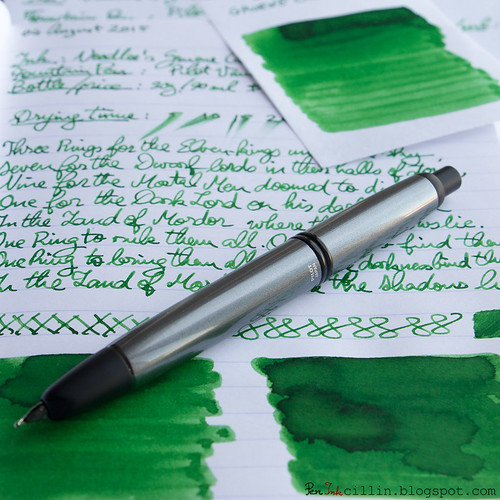
Noodler's Gruene Cactus Eel shading

Right off the bat, I was impressed with how smoothly Gruene Cactus Eel felt in the Pilot VP. Whether it's the broad nib or the better-than-average lubricating properties of the ink, it makes for very smooth writing indeed.

While in my initial review I was pretty ambivalent about the shade of green, this time I felt a much greater attraction to it and I really enjoy it now. The broad nib also helps bring out the excellent shading, which is always a plus. I have a vague suspicion that sitting in a bottle for > 4 years helped "mature" the ink, though I don't know how accurate that is.

I've been using Gruene Cactus Eel in the Pilot Vanishing Point for almost a couple of months now, refilling the converter as I run out, and I like it so much that I don't really feel like trying another ink for the moment. I've also noticed that it doesn't really dry out in the Pilot VP, nor does it skip. I've had skipping issues with other inks in the VP, to the point where I was afraid that there was something wrong with the nib unit, but Gruene Cactus Eel belies that.

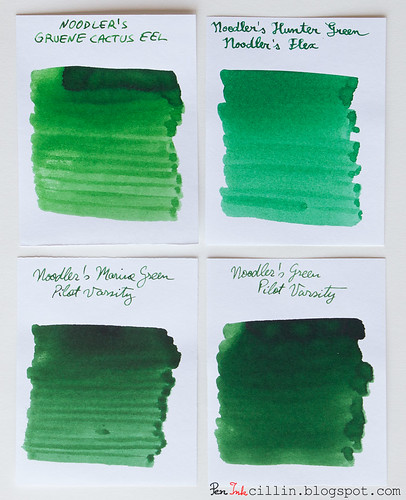
This time I managed to do a comparison with other green inks I've tested over the years, so here's Noodler's Gruene Cactus Eel compared to Noodler's Hunter Green, Noodler's Marine Green, and Noodler's Green.

Noodler's Gruene Cactus Eel vs Hunter Green vs Marine Green vs Green

You'll notice how the latter 2 are more "foresty", while Gruene Cactus does, indeed, resemble a cactus, being lighter. I still prefer the darker greens, but the shading is excellent for all 3 inks mentioned.

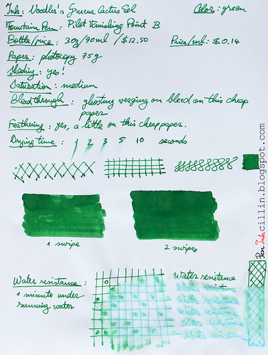
My 2015 conclusion is that I enjoy Noodler's Gruene Cactus Eel a lot more the second time around, but I'm sure the pen also makes a huge difference. The water resistance is still a sore point but whacha gonna do now.

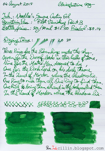
So here are the updated writing samples on photocopy, and Clairefontaine 90g paper, respectively.

Noodler's Gruene Cactus Eel on photocopy

Noodler's Gruene Cactus Eel on Clairefontaine

Tuesday, July 28, 2015

Noodler's Bernanke Blue ink review

This, my friends, will be my last new ink review for a good while. I have reached the last of my ink samples and, after blogging about fountain pens and inks for more than 4 years, I will be taking a break from it all to focus on other, unrelated, projects.

I wish I could say I saved the best ink for last, but alas it's not the case. My opinion of Noodler's Bernanke Blue started out on a very positive note but quickly plummeted as I continued to use it in my Pilot Vanishing Point with broad nib.

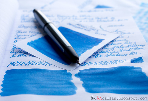
Noodler's Bernanke Blue with Pilot VP

Bernanke Blue (leaving aside the attempted political statement) is yet another specialty ink in Noodler's seemingly unending arsenal of "curiosities". This particular ink's strength is the ability to dry extremely quickly on paper. If this ink was conceived as quickly as it dries, I can begin to understand why it is so bad otherwise.

I could just tell you to stop reading at this point and simply skip this ink, but if you're curious to find out why I didn't like it, keep reading.

Bottle and pricing

Bottle capacity: 90 ml / 3 oz
Price: $12.50
Price / ml: $0.14

Color and saturation

The only positive thing about Noodler's Bernanke Blue (it's all downhill from here) is the gorgeous blue color. It's saturated and vibrating, resembling Baystate Blue to an extent, except a bit subdued. When I first started writing with it I thought "Wow, this is going to be an amazing ink!". Sigh. If only.

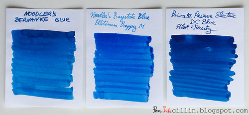
Here is Bernanke Blue compared to Noodler's Baystate Blue and Private Reserve Electric DC Blue, two blue inks that are fairly similar in vibrancy and saturation.

Noodler's Bernanke Blue vs Noodler's BSB vs PR Electric DC Blue

Shading

Despite what you might see in the comparo above, Noodler's Bernanke Blue is flat, without shading, when written with a fountain pen.

Feathering

Here's where the problems start. This ink feathers like crazy on cheap paper. It goes, in fact, a little beyond that, because it feels like writing on blotting paper. It just goes right through the paper and spreads evenly in all directions.

Bleedthrough

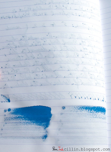
If you thought feathering was a problem, wait till you see how it bleeds. I've never seen an ink penetrate cellulose as strongly as Bernanke Blue. It feels almost exactly like one of those alcohol-based felt-tip markers (the Pilot VP's broad nib helps).

The sample below was written on Clairefontaine 90g paper, in other words very good, thick, fountain pen-friendly paper, which has withstood everything I threw at it - until now. This ink penetrated not only through what you see, but in places where I pressed harder it went through the next sheet. I did use a broad nib, which partly contributes to this state of affairs, but still...

Noodler's Bernanke Blue bleed

Flow, lubrication, and smoothness

While initially Bernanke Blue flowed well and was very smooth, it quickly became apparent that I was having issues with the Pilot Vanishing Point. There were hard starts to be had, as well as a lot of skipping. It got so frustrating that I simply cleaned out the pen despite not being empty, then threw out the remaining ink from the sample vial.

Drying time

The flagship feature of Noodler's Bernanke Blue is its very short drying time. So how did that go? Quite well in fact. On cheap paper it dries virtually immediately, within 1-2 seconds. On Clairefontaine 90g it took about 1 second longer but that's still fairly short. Impressive? Well, it's oh-kay, but unfortunately this one "trick" doesn't make up for all the other drawbacks.

Smearing when dry

None.

Water resistance

Another disaster. In what is quite atypical of Noodler's inks, Bernanke Blue has zero water resistance. My 1 minute test (under flowing water) was probably overkill but as you can see in the sample at the end of the review, in contact with water it obfuscated, dissipated, and blurred to oblivion.

Conclusion

So should you bother with Noodler's Bernanke Blue? A resolute no. Yes, it is a beautiful shade of blue. Yes, it dries fast. No, everything else. The shortcomings of this ink are disastrous and simply not worth it. There are much better blue inks out there that take an extra 1-2 seconds to dry but are so much more bearable in all other aspects.

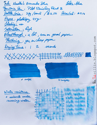
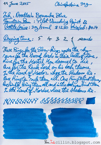
Following are the two samples on photocopy and Clairefontaine 90g paper, respectively.

Noodler's Bernanke Blue on photocopy

Noodler's Bernanke Blue on Clairefontaine

Tuesday, June 16, 2015

Diamine China Blue ink review

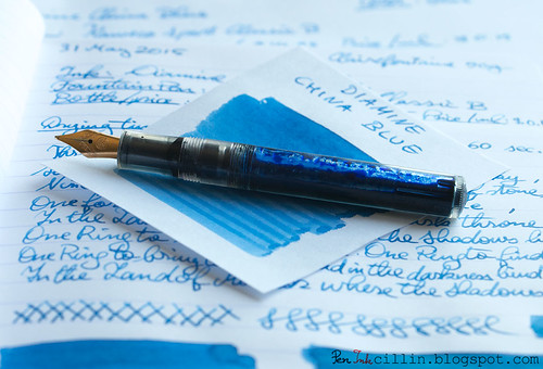
I bought this sample of Diamine China Blue some time ago because I was attracted by the exotic name. It wasn't too bad looking either, judging from other reviews I'd seen. I tested it in my Kaweco Sport Classic with broad nib and eyedropper conversion.

Diamine China Blue with Kaweco

Bottle and pricing

Quick note here. To my dismay, when I was putting this review together, I noticed that Diamine has increased their ink prices across the board, by roughly $2 per bottle. While still relatively inexpensive, I'm a bit saddened that this happened. Here are the new prices then. Notice the price per milliliter jumped by $0.02.

Bottle capacity: 80 ml / 2.7 oz
Price: $14.95
Price / ml: $0.19

Color and saturation

Diamine China Blue is a medium saturated blue, quite similar to denim. It looks darker when freshly written and still wet, but it resembles a faded pair of blue jeans when it dries.

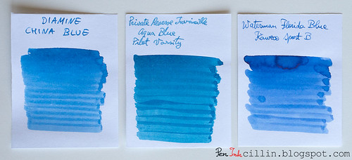
In the comparison below, Diamine China Blue is set against Private Reserve Invincible Aqua Blue, and Waterman Florida Blue. These are the closest colors to China Blue that I could find among my previously reviewed inks, especially PR Aqua Blue (which is discontinued). Notice how China Blue is just a little less vibrant than Waterman Blue and perhaps a fraction warmer in tone.

Diamine China Blue vs PR Invincible Aqua Blue vs Waterman Florida Blue

Shading

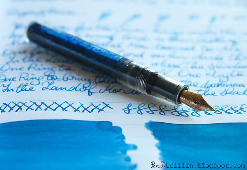
Diamine China Blue shows a fair amount of shading, even though it might not be apparent at first. Your results may vary, of course, but a thicker nib will bring our the color variance nicely.

Diamine China Blue shading

Feathering

I'm a little on the fence here. Diamine China Blue seems to be causing a tiny bit of feathering on cheap paper with the broad nib but I'd wager that doesn't happen with a medium or thinner nib on the same paper. That's definitely not the case on Clairefontaine.

Bleedthrough

While it doesn't outright show through on cheap paper, China Blue exhibits enough ghosting to be iffy on this type of paper, provided you want to use both sides. I still do though, but it's mostly for jotting down random notes, so it doesn't matter to me.

Flow, lubrication, and smoothness

Diamine China Blue is very smooth in the Kaweco Sport. It is also rather wet, which probably contributes a little to the small amounts of feathering and ghosting. As mentioned before, it looks much darker when it is freshly laid on paper but lightens up as it dries. In general I like that in an ink, because it's almost like it has two personalities.

Drying time

On cheap paper Diamine China Blue dries almost instantly, aided perhaps by the good absorption rate. On Clairefontaine it took close to 1 minute to dry completely, although in fairness that's what usually happens with a combination of broad nib and wet ink.

Smearing when dry

None.

Water resistance

This isn't a water resistant ink and it shows. My standard test which exposes the ink to water for 1 minute didn't wipe it out completely, and there are still faint traces of it on paper, but I wouldn't expose it to moisture.

Conclusion

Diamine China Blue is a fairly run-of-the-mill blue ink, well behaved overall, with no single feature standing out but that's just fine because it makes for a reliable ink. The blue color is pleasing, dependent on your tastes of course, and you can definitely use it in an official capacity. Just make sure to use it on higher quality paper because it doesn't play very nice with the cheap stuff. Personally I'm not big on blue inks, especially since I prefer even more personality (read deeper shading and unique tone) but I can still recommend China Blue without any reservations.

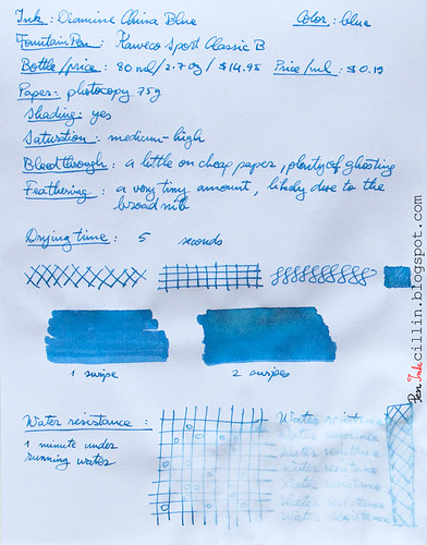
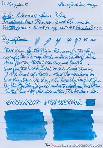
Below are the two samples on photocopy and Clairefontaine 90g paper, respectively.

Diamine China Blue on photocopy

Diamine China Blue on Clairefontaine

Sunday, May 31, 2015

J Herbin Vert Pre ink review

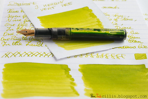
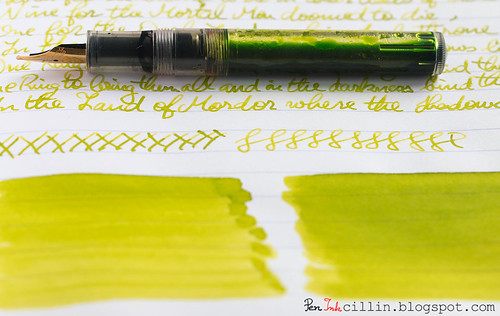
This will probably be my last green ink review for a while, so I present J Herbin Vert Pre, reviewed in my Kaweco Sport Classic with broad nib and eyedropper conversion.

J Herbin Vert Pre shading with Kaweco

Bottle and pricing

Bottle capacity: 30 ml / 1 oz
Price: $11
Price / ml: $0.37

Color and saturation

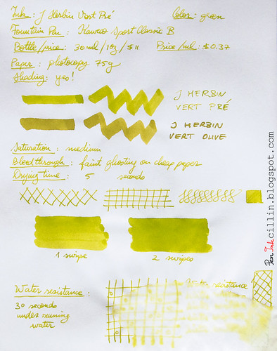
I'll say this from the get-go: Vert Pre is a type of green very similar to the other J Herbin green ink I reviewed (of which I own a bottle), Vert Olive. The only major difference between them is that Vert Pre is slightly less saturated and lighter than Vert Olive. Otherwise, all features apply to both equally. At this point I could just call it a day and refer you to the Vert Olive review but I'll keep going.

The best way to tell the difference between the two is to imagine Vert Pre as lime green, and Vert Olive as olive green (as the name actually translates).

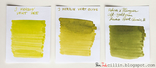
Below is a better comparison between the two inks, as well as Rohrer & Klingner Alt-Goldgrun, which is somewhat similar to the two, only darker and avocado-ish.

J Herbin Vert Pre vs J Herbin Vert Olive vs Rohrer & Klingner Alt-Goldgrun

Whichever variation you prefer, J Herbin Vert Pre remains in good company and is a beautiful ink on its own.

Shading

J Herbin Vert Pre features very nice shading, almost on par with Vert Olive. It's probably less only due to the fact that it's lighter in color. To benefit the most from the shading I would recommend a broader nib, but only on good, fountain pen-friendly paper.

J Herbin Vert Pre text shading with Kaweco

Feathering

Unfortunately I forgot to mention feathering in my copy paper written review, but here it goes. Vert Pre is a wet, watery ink and because of that it feathers a fair amount on cheap paper. It can't be helped, but in this respect it behaves very similarly to Vert Olive, as well as a couple of other J Herbin inks that I didn't particularly enjoy: Diabolo Menthe and Bleu Azur. If you don't use this on cheap paper you'll be fine though, because this is definitely a non-issue on good stuff, such as Clairefontaine or Rhodia.

Bleedthrough

Linked to the above point, being a wet and watery ink, J Herbin Vert Pre will bleed on very cheap paper, especially if both sides are written. In my copy paper review I stated that it only ghosts a little. This is true on the condition that you only use one side of the paper. As soon as you start writing on the reverse, though, things change. The cheap paper acts as a saturated sponge and spreads the ink throughout the fibers, causing it to both feather and bleed significantly.

Flow, lubrication, and smoothness

J Herbin Vert Pre flows really well - flawlessly in fact - through the Kaweco's broad nib. Apart from that, it bears stressing once again that this ink is pretty wet.

Drying time

Drying happens quickly - almost instantly - on cheap paper. On good paper the situation is reversed, and it usually takes around 30 seconds for it to dry completely, accounting of course for the broad nib.

Smearing when dry

None.

Water resistance

As is the case with all the inks in this "series", J Herbin Vert Pre is completely non-water resistant. Keep it far away from any form of moisture.

Conclusion

J Herbin Vert Pre is another hit in J Herbin's "hit & miss series". OK, I made this up but you know what I mean: I didn't enjoy the light blue inks in the family but I adore the greens. It's a gorgeous ink with a unique color and great shading, which flows well and performs nicely on good paper. The only caveat is that I wouldn't recommend it for cheap paper, at least not with a broad nib. Should you buy it? A resolute yes! The only question remains: this or Vert Olive? Personally I'd still pick Vert Olive by a slim margin.

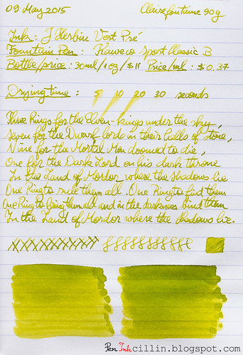
Following are the two handwritten reviews, on photocopy and Clairefontaine 90g paper, respectively.

J Herbin Vert Pre on photocopy

J Herbin Vert Pre on Clairefontaine

Monday, May 25, 2015

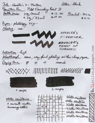
Noodler's X-Feather ink review

I find it fascinating how a small, boutique ink maker like Noodler's can offer not only a vast range of colors, but also a large variety of specialized ink features. But perhaps that's the secret: a 1-man company like Noodler's can be a lot more flexible than a large corporation.

Today's special ink is X-Feather, an ink that is designed specifically to resist feathering on poor quality paper. Feathering is the process by which the ink spreads through the paper via the fibers. Different inks have different spreading "ability". In general it's considered a good thing to control this spreading as much as possible. This is where Noodler's X-Feather comes in. If I'm not mistaken, Nathan Tardiff (Noodler's owner) designed X-Feather with newspaper crossword puzzles in mind. We all know how poor quality newspaper sheet is, and generally we'd like to avoid using fountain pen ink on it.

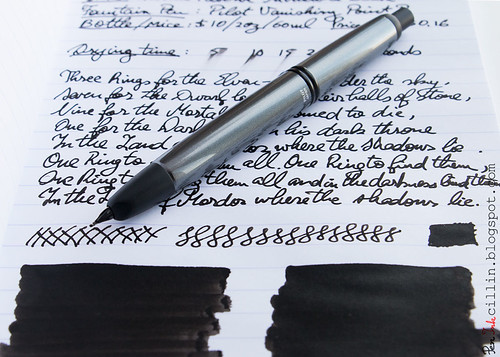
Noodler's X-Feather with Pilot VP

I tested the sample (that I've been saving for a long time) in my Pilot Vanishing Point with broad nib. The broad nib should make the test even more poignant, as thick nibs put more ink to the paper.

Bottle and pricing

Bottle capacity: 90 ml / 3 oz
Price: $12.50
Price / ml: $0.14

Color and saturation

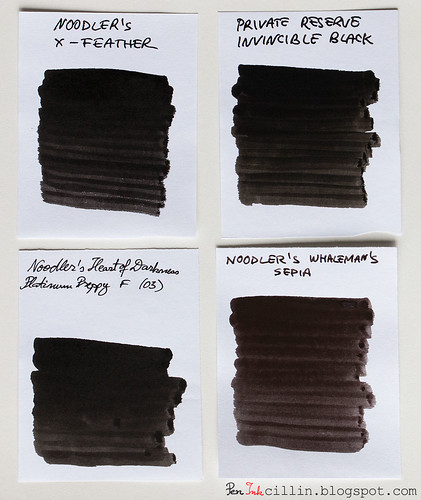
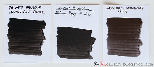
Noodler's X-Feather is a dark shade of highly saturated black. It looks a tad darker than Heart of Darkness and about on par with Private Reserve Invincible Black. Check out the comparison below. I included Noodler's Whaleman's Sepia just for kicks, despite not being a black ink.

Noodler's X-Feather vs PR Invincible Black vs Noodler's HOD vs Noodler's Whaleman's Sepia

Shading

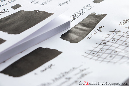
You wouldn't expect much shading in a dark black ink, and that is true here, but X-Feather manages to surprise in a different way, by exhibiting a high amount of sheen.

Noodler's X-Feather Sheen

Yes, this is how the q-tip swab looks after it has dried up. Very cool. If I were to take a shot in the dark, I'd guess the sheen is part of the feathering-resist mechanism.

Feathering

Here we are at the crux of the matter. Is X-Feather really resistant to feathering or is it just clever marketing? I'm happy to report that it does, indeed, do a good job at holding the line intact and tightly controlling any ungainly spreading.

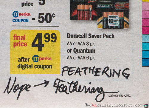
I have tested X-Feather on cheap photocopy paper (see the sample at the bottom), on cheap and flimsy notebook paper, as well as on newspaper. In fact here's a close-up of the newspaper sample below.

Noodler's X-Feather on newspaper

Granted, the lines in the latter aren't perfectly sharp but I believe that's more of a paper issue, because the paper itself has an uneven surface. To me it looks like the ink is part of the print. Thus, I declare Noodler's X-Feather worthy of its name.

Bleedthrough

Interestingly, Noodler's X-Feather also does a great job controlling bleed, even on cheap paper. There is a little ghosting because this is, after all, a black ink, but it doesn't bleed. Once again, I believe this is a positive side-effect from the feathering resistance.

Flow, lubrication, and smoothness

Noodler's X-Feather flows very smoothly in the Pilot Vanishing Point. It's rather wet, but also feels thick and dense, almost like soot. If I didn't know better I'd say this is pigment ink.

Drying time

One thing that I don't appreciate as much as all the other features is the drying time. X-Feather takes around 1 minute to fully (more like 99%) dry on Clairefontaine 90g paper, which is pretty long in my book. That time drops down to about 15 seconds on copy paper. I suspect this is due to the fact that most of the ink stays on top of the paper instead of penetrating the fibers deeply. Again, all connected with the feathering resistance and the lack of bleed.

Smearing when dry

Kind of. You see, X-Feather is one of those inks that needs to be left to dry properly before even thinking about touching the paper. Even after it dries, I'd be very careful around shiny and good quality paper. On copy paper, you can still get it to smear a little if you rub it hard but that shouldn't be an issue in normal use.

Water resistance

As an added bonus, X-Feather is also water resistant. As you can see in the sample below, exposure to water for 1 minute left it virtually untouched. While this is not the headline feature, it's always nice to have.

Conclusion

Noodler's Ink has produced another hit with X-Feather. This ink wears its name proudly and does it good justice. It is also a pleasure to write with, being smooth and wet, and even offers excellent water resistance. The only things that keeps it from a perfect 10/10 are the long drying times and the possibility of smearing. However, these won't stop me from highly recommending it, especially if you need the unique feature of feathering resistance which, to my knowledge, no other ink offers as a main selling point. Even as a simple black ink, X-Feather won't disappoint. To top it all off, this special ink is priced the same as most regular inks in Noodler's lineup.

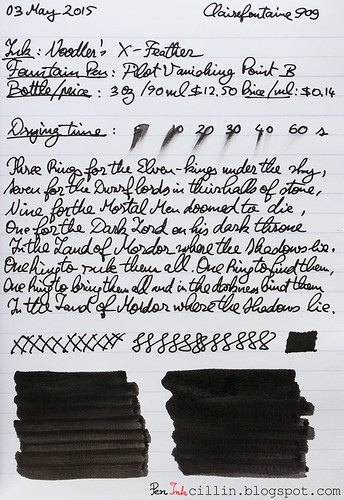
Following are the two samples on photocopy and Clairefontaine 90g paper, respectively.

Noodler's X-Feather on photocopy

Noodler's X-Feather on Clairefontaine

Tuesday, May 12, 2015

Noodler's Shah's Rose ink review

A review of Noodler's Shah's Rose has been a long time coming. This is one of the first inks I had heard of when the fountain pen craze first struck, around 2011. By now, everyone and their grandma has reviewed Noodler's Shah's Rose. Perhaps because of that, I didn't feel a lot of pressure to review the sample I bought some time ago. Now its time has come.

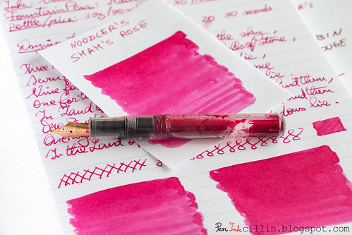
Noodler's Shah's Rose shading with Kaweco

I reviewed Noodler's Shah's Rose in my Kaweco Sport Classic with eyedropper conversion.

Bottle and pricing

Bottle capacity: 90 ml / 3 oz
Price: $12.50
Price / ml: $0.14

Color and saturation

Noodler's Shah's Rose is a magenta/rose/pink/red ink. There's a little bit of each of those words in it. It is vibrant and saturated, and strongly reminds me of roses, which makes the name very apt. At the same time, it's also a dark pink, depending how you choose to look at it.

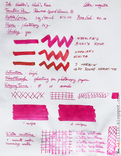
In the photocopy sample (at the bottom of the review) I compared Shah's Rose to two of the red inks I own: Noodler's Nikita and J Herbin 1670 Rouge Hematite. I'm kind of comparing apples to oranges here but I just wanted to illustrate how this ink compares to neutral red.

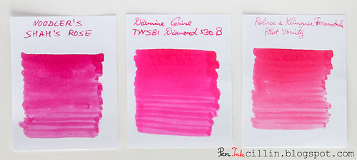
A more apt comparison is the one below, where I'm pitting Shah's Rose against two other pink inks: Diamine Cerise and Rohrer & Klingner Fernambuk.

Noodler's Shah's Rose vs Diamine Cerise vs R&K Fernambuk

In this case you'll notice how Shah's Rose is the darkest of the three, while Cerise is brighter, and Fernambuk is the least saturated, as well as duller. Shah's Rose also seems to have better shading than the other two.

Shading

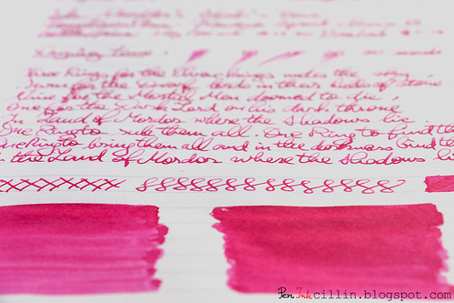
Noodler's Shah's Rose features some decent color variation. While not as pronounced as other inks, it's definitely there so if you want to experience that, you'll be better served by a thicker/broad nib.

Noodler's Shah's Rose shading

Feathering

No.

Bleedthrough

No, but there's a little ghosting on cheap paper due to the high saturation.

Flow, lubrication, and smoothness

Noodler's Shah's Rose flows very smoothly in my Kaweco Sport. It feels just right, falling perhaps a little on the wet side.

Drying time

It dries quickly on cheap paper but on Clairefontaine it takes its sweet time. As you can see from the sample, depending how thick the line is, it can take 30 seconds or so for it to dry completely.

Smearing when dry

No.

Water resistance

Interestingly, Shah's Rose is not meant to be water resistant but it can stand up to water just as well. You'll notice in the sample below that exposing it to 1 minute under running water washed only a little bit away, while most of it remained perfectly legible.

Conclusion

Noodler's Shah's Rose remains the quintessential magenta ink for those who love the color. It is overall a well behaving ink, with no weaknesses that I can discern. It even features a little bonus water resistance. Personally I'm not very fond of magenta/pink inks so I wouldn't buy a bottle but I still think it's a beautiful color, and I highly recommend it.

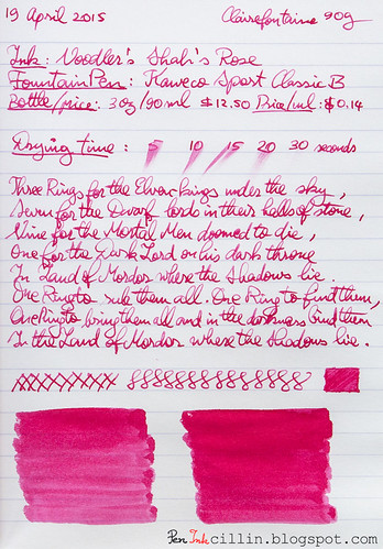
Below are the two samples on photocopy and Clairefontaine 90g paper, respectively.
Noodler's Shah's Rose on photocopy

Noodler's Shah's Rose on Clairefontaine

Wednesday, May 6, 2015

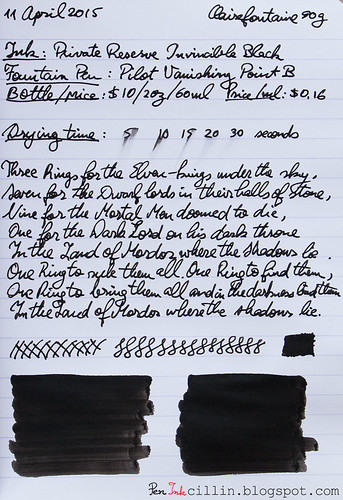
Private Reserve Invincible Black ink review

Private Reserve Invincible Black is one of those inks that seem to have vanished from the market between the time when I bought the sample and now, when I finally got the chance to review it. It's quite a shame since waterproof inks (which it is) are not in every manufacturer's portfolio. Outside of Noodler's, not many brands seem to care about this segment. Unfortunately it seems that PR has sent its Invincible inks (along with PR Invincible Aqua Blue which I fancied) along the way of the dodo.

Read the review for curiosity or nostalgia sake but I'm not sure where you'd find this ink if you wanted it.

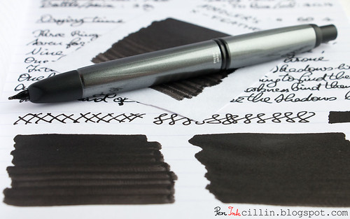
Private Reserve Invincible Black with Pilot VP

I reviewed the sample in my Pilot Vanishing Point with broad nib.

Bottle and pricing

Bottle capacity: unknown
Price: unknown
Price / ml: unknown

Color and saturation

Private Reserve Invincible Black is, well, black. A very dark black in fact. Side by side with Noodler's Heart of Darkness it looks even darker.

I also compared it with Noodler's Whaleman's Sepia, just for reference, even though the latter isn't technically black.

Private Reserve Invincible Black vs Noodler's HOD vs Noodler's Whaleman's Sepia

Shading

Private Reserve Invincible Black is black as the night and thus pretty much flat.

Feathering

None.

Bleedthrough

PR Invincible Black bleeds less than I would have expected, even on cheap paper. There's evidently some ghosting but even that comes more from the contrast between the very dark ink and thin white paper than from actual penetration.

Flow, lubrication, and smoothness

Invincible Black flows nicely and smoothly in the Pilot Vanishing Point with the broad nib unit. However, I have noticed that it likes to dry up rather quickly in the pen, within a few hours. This makes for hard starts and it's definitely not a feature I appreciate, especially in my most expensive pen.

Drying time

Here's the rub. Umm, pun not intended, but you'll see... Private Reserve Invincible Black dries reasonably fast on cheap paper and even the shinier and more expensive stuff like the Clairefontaine 90g sample. Keep reading...

Smearing when dry

Following up on the previous section, this ink is quite prone to smudging when rubbed. So even though it is technically dry, it needs a lot more time to become inert, and even then you can still get it to smear a little if you rub it hard.

Water resistance

As advertised, Private Reserve Invincible Black is completely water resistant and immune to the elements (not sure about acid rain though).

Conclusion

This review might have been all for nothing, considering Private Reserve Invincible Black has been discontinued, but it was interesting, nonetheless, to see how it behaves in relation to other waterproof inks. Overall it's a decently performing ink, with two exceptions: the drying up inside the pen and the fact that it likes to stain containers, including the Pilot VP's converter. Since it's extinct, if you are looking for a black water resistant ink my only option is to recommend one of many such variations that Noodler's makes, including Heart of Darkness and another black ink that I will review soon.

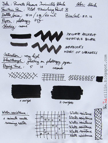
Following are the two samples on photocopy and Clairefontaine 90g paper, respectively.
Private Reserve Invincible Black on photocopy

Private Reserve Invincible Black on Clairefontaine

Monday, April 27, 2015

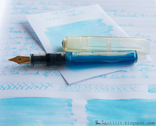
J Herbin Bleu Azur ink review

My ink sample supply is dwindling fast and I found myself scraping the bottom of the barrel as I reached for the vial of J Herbin Bleu Azur. For a while now I've been reviewing the inks that I thought would be the most interesting, so what's left are, naturally, the runts of the litter. Well, ok, that sounds a little harsh, though maybe not in this particular case.

I popped the sample of J Herbin Bleu Azur in my Kaweco Sport Classic with broad nib and eyedropper conversion and away I went...

J Herbin Bleu Azur with Kaweco

Bottle and pricing

Bottle capacity: 30 ml / 1 oz
Price: $11
Price / ml: $0.37

Quick note here. J Herbin bottles are small and cost a pretty penny, as you can see. Generally the inks are double the cost of brands such as Noodler's and Diamine, and I'm sorry to say that I don't find the value in some of them.

Color and saturation

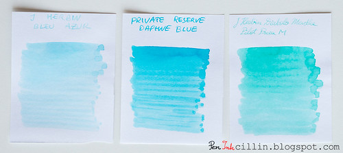
Here's where J Herbin Bleu Azur fails right off the bat for me. It is an extremely light and watery shade of baby blue, with very, very low saturation. I don't see how this ink can be used in day-to-day writing, and I'm sure that the thinner the nib the more faded it looks.

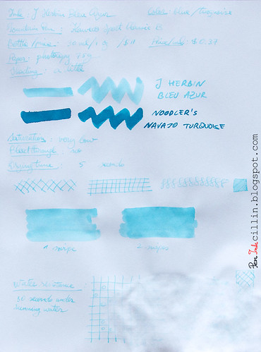
In the photocopy sample (at the end of the review) I compared it to Noodler's Navajo Turquoise, even though these two inks have nothing in common, but it's the closest ink I had a bottle of. Notice how much darker Navajo Turquoise is.

A much better comparison is the one just below. Put J Herbin Bleu Azur next to two other light colored blue/turquoise inks, Private Reserve Daphne Blue and J Herbin Diabolo Menthe, and you'll see how Bleu Azur is still lighter than both. And I didn't even like Diabolo Menthe back when I reviewed it, for similar reasons.

J Herbin Bleu Azur vs Private Reserve Daphne Blue vs J Herbin Diabolo Menthe

In fairness, some people have seen some success with using Bleu Azur as a highlighter ink. I can almost see how that might work.

Shading

As much as I'd like to bash J Herbin Bleu Azur even more than I already have, I will admit that it has a little shading, though insignificant, and unlikely to show unless using a thicker nib or perhaps employing it for highlighter duty.

Feathering

No

Bleedthrough

No. It's too light to show through and it has basically zero penetration power.

Flow, lubrication, and smoothness

I can't say I was impressed by how J Herbin Bleu Azur flowed. Watery inks sometimes feel - paradoxically - dry, as is the case here. As a result, it wasn't much pleasure to write with.

Drying time

As expected, drying times were quite short, even on Clairefontaine 90g paper.

Smearing when dry

None.

Water resistance

Water resistance, as can be seen in the photocopy sample below, is nil, perhaps even negative. Totally expected though, so I won't knock any points off for this.

Conclusion

What more is there to say about J Herbin Bleu Azur that I haven't already? I'm afraid there's nothing here that would make me recommend this ink, unless you're heavily into highlighting stuff in light baby blue. Even if you love such a light, faded blue, you might find better success, at a much lower price, by diluting another blue ink with water. Caveat emptor.

Epilogue

I don't usually do an epilogue to my reviews. In fact this is the first epilogue ever.
Being dissatisfied with J Herbin Bleu Azur, I thought I might improve it by mixing it with another ink. So I added a couple of drops of Noodler's Nikita and hoped for the best. It's usually not advisable to mix different inks in this manner so it wasn't much of a surprise that the result was yet another watery and vile concoction, of the violet persuasion. It proved worse than the original ink and I ended up dumping the whole thing in the sink. Thus I didn't get to use Bleu Azur in the real world, outside the confines of this review. Good riddance.

Following are the two samples on photocopy and Clairefontaine 90g paper, respectively.
J Herbin Bleu Azur on photocopy

J Herbin Bleu Azur on Clairefontaine

Tuesday, March 31, 2015

Private Reserve Daphne Blue ink review

I haven't reviewed a bright blue ink in, like, forever, so I was almost taken aback to realize that I actually had some Private Reserve Daphne Blue among my samples. Here it goes then: PR Daphne Blue reviewed in the Kaweco Sport Classic with broad nib and eyedropper conversion.

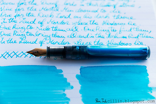
Private Reserve Daphne Blue shading

Bottle and pricing

Bottle capacity: 66 ml / 2.2 oz
Price: $11
Price / ml: $0.17

Color and saturation

Private Reserve tries to be cute with the name "Daphne Blue" and I'd say it succeeds because this ink is light blue, bright and cheerful as a warm summer day. You could just as easily call it cerulean/sky blue, or baby blue. Or a light shade of turquoise. It fits all these descriptions.

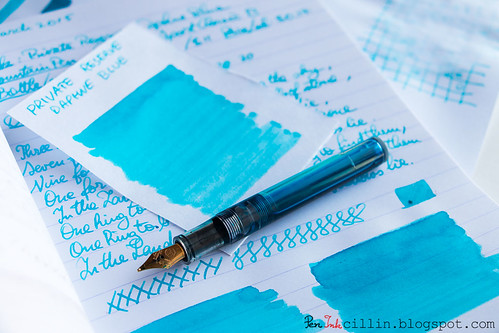
Private Reserve Daphne Blue shading

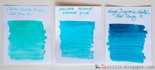
To get an even better idea, here it is next to two similar inks: J Herbin Diabolo Menthe and Noodler's Navajo Turquoise.

Private Reserve Daphne Blue vs J Herbin Diabolo Menthe vs Noodler's Navajo Turquoise

What's immediately obvious from this comparison is that Diabolo Menthe leans towards green, while Navajo Turquoise is a darker shade of turquoise than Daphne Blue.

Shading

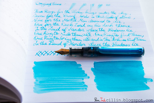
Whenever an ink shows color variation I'm a happy camper. Light inks sometimes don't do that, but Daphne Blue shades nicely. Of course, the broad nib brings this better into perspective.

Private Reserve Daphne Blue text

Feathering

I haven't noticed any.

Bleedthrough

No, although a broad nib on cheap, spongy paper tends to at least produce some ghosting. Luckily this is pretty well controlled in this case due to the lightness of the ink.

Flow, lubrication, and smoothness

While it flows very well in the Kaweco, I noticed a tiny amount of dryness, but it's hard to pinpoint. I could chalk it to "measured flow" and I wouldn't be half wrong. So it flows very satisfactorily and it's smooth to boot.

Drying time

Nothing out of the ordinary here. As expected, it takes its sweet time on good paper, up to 30 seconds or so (especially with the broad nib). On cheap paper it dries in a few seconds.

Smearing when dry

None.

Water resistance

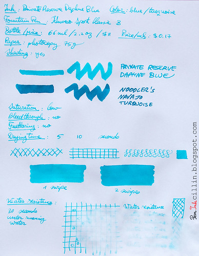
Water resistance is exactly as I was expecting, despite knowing nothing about this ink prior to testing it. It's non-existent. You can see from the bottom (copy paper) sample how it reacted to only 30 seconds under water.

Conclusion

Private Reserve Daphne Blue has all the markings of a great ink, provided you're on board with the baby blue color. It's very well behaved on all fronts, with the exception of water resistance but that wasn't an advertised feature in any case. If you like turquoise inks, there's nothing that would prevent me from recommending it, with the caveat that it might be a bit light for certain uses. Otherwise, a solid ink.

Private Reserve Daphne Blue shading

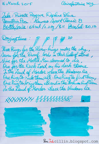
Following are the two samples on photocopy and Clairefontaine 90g paper, respectively.
Private Reserve Daphne Blue on photocopy

Private Reserve Daphne Blue on Clairefontaine

Wednesday, March 18, 2015

Noodler's Mandalay Maroon (V-Mail) ink review

Noodler's Mandalay Maroon is one of those inks that I wanted to test for a while and its time has finally come. Two things attracted me to this ink: the exotic name, and the color burgundy. It is also a V-Mail ink, resembling vintage inks to some extent. Along with this label, water resistance comes standard but this will be discussed in more detail below.

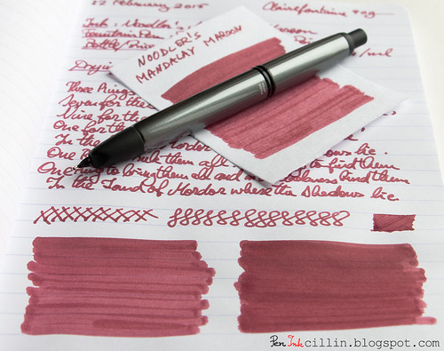
I tested a sample of Mandalay Maroon in my Pilot Vanishing Point with broad nib.

Bottle and pricing

Bottle capacity: 3 oz / 90 ml
Price: $12.50
Price / ml: $0.14

Color and saturation

Noodler's Mandalay Maroon is a burgundy/maroon/reddish-brown ink with average saturation. It bears a passing resemblance to other inks I have tested but for the most part it has a unique color.

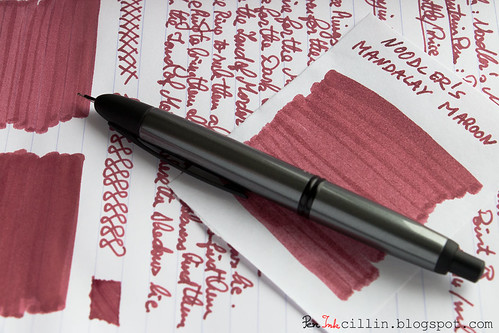
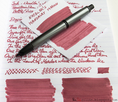
Noodler's Mandalay Maroon detail

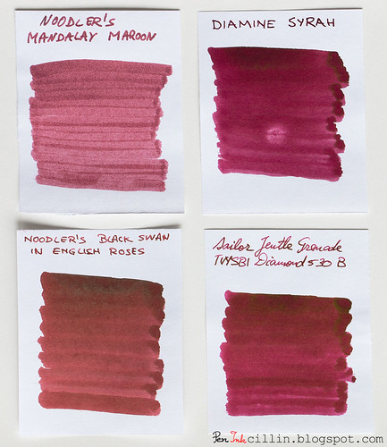
Below, I compared it to a few other burgundy inks: Diamine Syrah, Noodler's Black Swan in English Roses, and Sailor Jentle Grenade. I believe you'll agree with me when I say that Mandalay Maroon is the least attractive ink in this lineup.

Noodler's Mandalay Maroon vs Syrah vs BSER vs Jentle Grenade

Shading

Sadly, Mandalay Maroon is completely flat, without any kind of shading or color variation. This is clearly evident from the 4-ink comparison above.

Noodler's Mandalay Maroon detail

Feathering

I'll admit I was a bit surprised that Mandalay Maroon doesn't feather even on cheap paper. For some reason I was expecting it to, especially since it really likes to seep into the paper. It's one of those deeply penetrating inks, similar to what you might find in alcohol-based markers.

Bleedthrough

Bleeding is high on cheap paper, to the extent that the reverse side will be mostly unusable. The situation on Clairefontaine 90g is improved but there's plenty of ghosting and even bleeding where the nib presses hard. This, of course, is based on my tests done with a broad nib. If you want to use this ink I'd recommend a medium nib or thinner. I'm sure those won't produce the same sort of bleeding.

Flow, lubrication, and smoothness

One thing that Noodler's Mandalay Maroon has going for itself is that it feels very smooth and flows well through the Pilot VP's broad nib. It's also pretty wet, which is probably what causes the bleed through.

Drying time

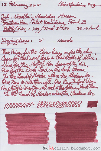
You would expect a wet ink in a broad nib to take ages to dry on good paper such as the Clairefontaine I used for one of the tests. Once again I was surprised by how quickly it dried. 5 seconds on this paper is incredible. This is easily explained by what I mentioned previously: this ink penetrates the paper like a drop of water on a dry sponge.

Smearing when dry

None.

Water resistance

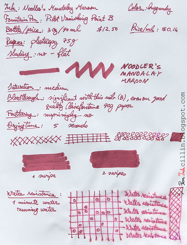
Water resistance is one of the main features of Noodler's Mandalay Maroon. It didn't disappoint in my standard water test whereupon I held the sample under flowing water for 1 minute. OK, it wasn't completely watertight, and a tiny little bit of pink dye can be seen spreading out like capillaries from the edges of the lines, but the text and drawings remain perfectly intact.

Conclusion

Noodler's Mandalay Maroon is a quirky ink, quite interesting in some aspects (water resistance and drying speed) but dull in others (color/shading and bleed). To my eye it is not very attractive, especially in comparison to other burgundy inks. As such, I wouldn't buy a whole bottle but I know that lots of folks love it, so if Mandalay Maroon catches your fancy don't be detracted by my purely subjective opinion.

Noodler's Mandalay Maroon detail

Below are the two samples on photocopy and Clairefontaine 90g, respectively.
Noodler's Mandalay Maroon on photocopy

Noodler's Mandalay Maroon on Clairefontaine