Showing posts with label Diamine ink. Show all posts

Tuesday, June 16, 2015

Diamine China Blue ink review

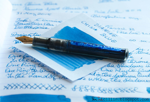
I bought this sample of Diamine China Blue some time ago because I was attracted by the exotic name. It wasn't too bad looking either, judging from other reviews I'd seen. I tested it in my Kaweco Sport Classic with broad nib and eyedropper conversion.

Diamine China Blue with Kaweco

Bottle and pricing

Quick note here. To my dismay, when I was putting this review together, I noticed that Diamine has increased their ink prices across the board, by roughly $2 per bottle. While still relatively inexpensive, I'm a bit saddened that this happened. Here are the new prices then. Notice the price per milliliter jumped by $0.02.

Bottle capacity: 80 ml / 2.7 oz
Price: $14.95
Price / ml: $0.19

Color and saturation

Diamine China Blue is a medium saturated blue, quite similar to denim. It looks darker when freshly written and still wet, but it resembles a faded pair of blue jeans when it dries.

In the comparison below, Diamine China Blue is set against Private Reserve Invincible Aqua Blue, and Waterman Florida Blue. These are the closest colors to China Blue that I could find among my previously reviewed inks, especially PR Aqua Blue (which is discontinued). Notice how China Blue is just a little less vibrant than Waterman Blue and perhaps a fraction warmer in tone.
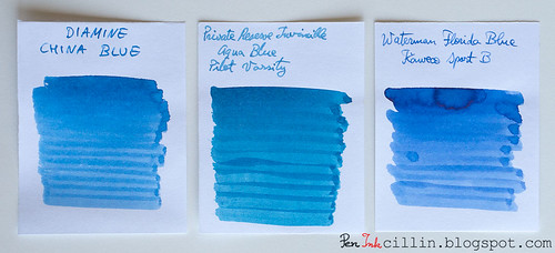
Diamine China Blue vs PR Invincible Aqua Blue vs Waterman Florida Blue

Shading

Diamine China Blue shows a fair amount of shading, even though it might not be apparent at first. Your results may vary, of course, but a thicker nib will bring our the color variance nicely.
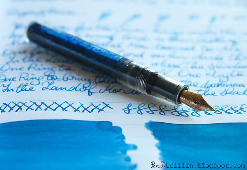
Diamine China Blue shading

Feathering

I'm a little on the fence here. Diamine China Blue seems to be causing a tiny bit of feathering on cheap paper with the broad nib but I'd wager that doesn't happen with a medium or thinner nib on the same paper. That's definitely not the case on Clairefontaine.

Bleedthrough

While it doesn't outright show through on cheap paper, China Blue exhibits enough ghosting to be iffy on this type of paper, provided you want to use both sides. I still do though, but it's mostly for jotting down random notes, so it doesn't matter to me.

Flow, lubrication, and smoothness

Diamine China Blue is very smooth in the Kaweco Sport. It is also rather wet, which probably contributes a little to the small amounts of feathering and ghosting. As mentioned before, it looks much darker when it is freshly laid on paper but lightens up as it dries. In general I like that in an ink, because it's almost like it has two personalities.

Drying time

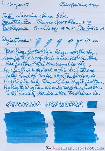
On cheap paper Diamine China Blue dries almost instantly, aided perhaps by the good absorption rate. On Clairefontaine it took close to 1 minute to dry completely, although in fairness that's what usually happens with a combination of broad nib and wet ink.

Smearing when dry

None.

Water resistance

This isn't a water resistant ink and it shows. My standard test which exposes the ink to water for 1 minute didn't wipe it out completely, and there are still faint traces of it on paper, but I wouldn't expose it to moisture.

Conclusion

Diamine China Blue is a fairly run-of-the-mill blue ink, well behaved overall, with no single feature standing out but that's just fine because it makes for a reliable ink. The blue color is pleasing, dependent on your tastes of course, and you can definitely use it in an official capacity. Just make sure to use it on higher quality paper because it doesn't play very nice with the cheap stuff. Personally I'm not big on blue inks, especially since I prefer even more personality (read deeper shading and unique tone) but I can still recommend China Blue without any reservations.

Below are the two samples on photocopy and Clairefontaine 90g paper, respectively.
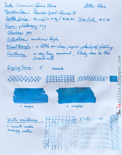
Diamine China Blue on photocopy

Diamine China Blue on Clairefontaine

Tuesday, March 10, 2015

Diamine Pumpkin ink review

Diamine Pumpkin is yet another orange ink from Diamine. How does it measure up to other orange inks? Does it shade? Is it worth picking up? Why Pumpkin over other inks? Pumpkins in March? All these, and more, will be answered shortly.

But first, a short reminder that I tested this ink in my Kaweco Sport Classic with broad nib and eyedropper conversion.

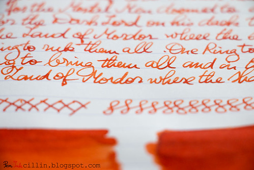
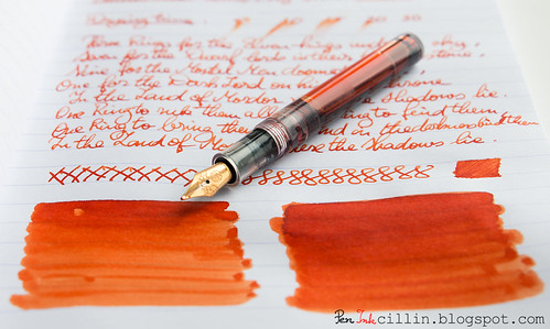
Diamine Pumpkin shading with Kaweco

Bottle and pricing

Bottle capacity: 80 ml / 2.7 oz
Price: $12.95
Price / ml: $0.16

Color and saturation

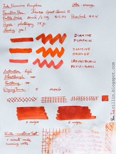
Diamine Pumpkin is, once again, an orange ink. It is bright and very saturated, though not the cheeriest of oranges. It's not a pure orange, as Diamine Orange is (see comparison in the copy paper writing sample at the bottom), but a bit dirty. It's very pumpkinish in fact, and I find the name very appropriate for once.

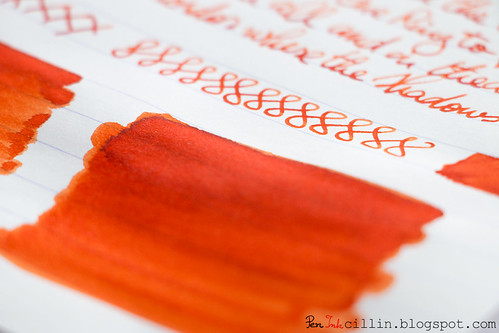
Diamine Pumpkin shading

To get a better idea of the exact shade of orange Pumpkin exhibits, I'm illustrating this via a comparison with a couple of other orange inks I've tested: Sailor Jentle Apricot and Noodler's Dragon's Napalm (as well as Iroshizuku Fuyu-Gaki in the photocopy paper sample at the bottom).

Diamine Pumpkin vs Sailor Jentle Apricot vs Noodler's Dragon's Napalm

When placed side by side like this I actually find Pumpkin to be more fiery and expressive than both these inks, though each is beautiful in its own way.

Shading

Some inks are completely flat, as is the case with Diamine Orange, but Diamine Pumpkin is not. It shades very nicely, and that gives it a lot more character than its purer sibling. It's very easy to obtain darker patches of fiery orange and almost-red on top of lighter shades of orange. In writing, the shading is obviously more easily discerned with a broad nib, as is the case here.

Diamine Pumpkin shading

Feathering

None.

Bleedthrough

None.

Flow, lubrication, and smoothness

I can't complain here: Diamine Pumpkin flows very well in the Kaweco Sport and is appropriately wet. It's not the wettest ink out there and your experience may certainly differ if you are using a medium nib or thinner.

Drying time

On cheap paper (photocopy), Diamine Pumpkin dries almost instantly, but this time is considerably lengthened on Clairefontaine 90g, dependent, of course, on the nib. I'm assuming it would take less than 30 seconds to dry with a thinner nib.

Smearing when dry

None

Water resistance

Diamine Pumpkin is not water resistant but after being exposed for 1 minute to running water some faint traces remain. This component seems to be pink in color.

Conclusion

I am suitably impressed by Diamine Pumpkin. I was expecting this to be a plain ol' orange ink but it has more character than more reputable inks (whether that reputation is well-earned or not). What I like most about Diamine Pumpkin is that it's not just a generic orange, but instead has that "dirty" look (while staying bright and saturated) which gives so much justice to its name. And then the beautiful shading only helps to make it better. I would urge you to try Diamine Pumpkin. If you like orange inks, I'm betting you'll love it too.

Diamine Pumpkin shading

Following are the two writing samples on photocopy and Clairefontaine 90g paper, respectively.
Diamine Pumpkin on photocopy

Diamine Pumpkin on Clairefontaine

Monday, February 9, 2015

Diamine Evergreen ink review

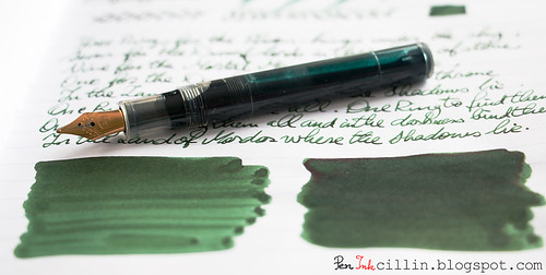
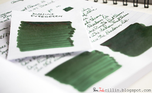
Diamine Evergreen is one of the more special greens that have passed through my hands in recent memory. I tested the sample in my Kaweco Sport Classic with broad nib. I can tell you right away that I like this ink but read on to find out more details.

Diamine Evergreen shading with Kaweco

Bottle and pricing

Bottle capacity: 80 ml / 2.7 oz
Price: $12.95
Price / ml: $0.16

Color and saturation

Right off the bat, Diamine Evergreen starts strong with an interesting and rather unique shade of green. I have tested plenty of green inks but I can still be surprised. I'm of the opinion that Diamine Evergreen should have been called Diamine Avocado because that's exactly the shade of green - avocado - that comes to mind. It is dark, organic, and not too saturated, making it well suited for official use.

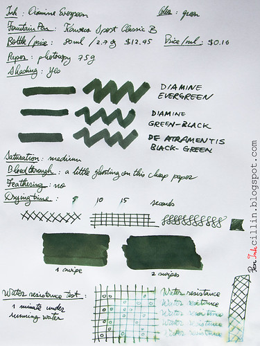
In the photocopy sample (at the bottom) I compared Evergreen to Diamine Green Black and De Atramentis Black Green, both of which I own a bottle, and both of which are also dark, somber inks. There is some resemblance between these three inks but Diamine Evergreen immediately stands out as - at the risk of repeating myself - the more organic of the bunch, and that imparts it more character in my opinion.

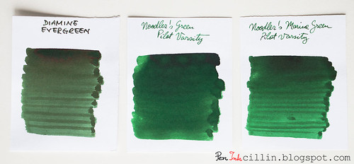
I've also done a comparison with Noodler's Green and Noodler's Marine Green, two of the darker inks I've tested but these are both more saturated as well as brighter and they don't resemble Evergreen much.

Diamine Evergreen vs Noodler's Green vs Noodler's Marine Green

Shading

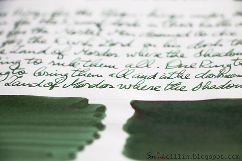
Diamine Evergreen does a great job in the color variation department. The broad nib helps with that, but I have a feeling medium and even fine nibs will exhibit plenty of shading. In addition to the shading, if you look closely you will see an almost reddish sheen in the dark sections where the ink had a chance to dry in a thicker layer.

Diamine Evergreen shading

Diamine Evergreen shading

Feathering

None.

Bleedthrough

As expected, there's a little ghosting on very cheap paper but otherwise there's no bleeding and both sides of the paper can be used without fear.

Flow, lubrication, and smoothness

Diamine Evergreen is a wet ink. It flows really well through the Kaweco Sport. At times it feels a little too wet. If the paper is particularly spongy, it soaks right into it. For me that's fine because I love wet inks, but if you don't, you could always try it in a pen with a dry nib or one that has flow issues.

Drying time

On absorbent paper it dries within normal parameters, around 10 seconds or so, but on glossy paper it can take up to 30 seconds. Fairly average drying times for how wet it is.

Smearing when dry

None.

Water resistance

Diamine Evergreen is not meant to be water resistant but when I put it under running water for 1 minute it didn't wash off completely, so I guess you might stand a chance to recover some of your writings if they get drenched in water.

Conclusion

It looks like I started 2015 on a positive ink-reviewing note because I really like Diamine Evergreen. From the exquisite color to the great shading, to the wet flow, there's much to like about it and nothing really to critique. As such, I highly recommend Diamine Evergreen, especially if you are looking to emulate the appearance of "avocado".

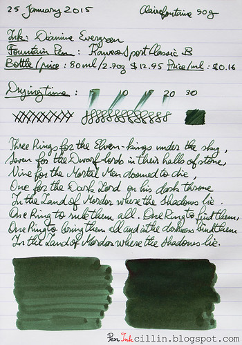
Following are the two samples on photocopy, and Clairefontaine 90g paper, respectively.
Diamine Evergreen on photocopy

Diamine Evergreen on Clairefontaine

Tuesday, January 27, 2015

2014 ink of the year

I know this post is a month late and a few bucks short but better late than never. In my defense, I'm back from a long vacation and it's hard to get the old routine back on track.

Without further ado, I present you my top 3 favorite inks tested in 2014, along with 3 runners-up.

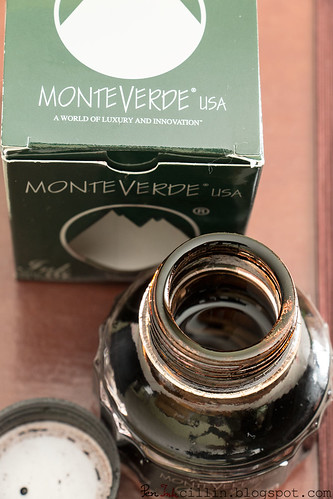
#1 Monteverde Brown

Monteverde Brown is absolutely the ink I enjoyed most in 2014. I just love brown inks and this is the definitive brown.

Monteverde Brown open bottle

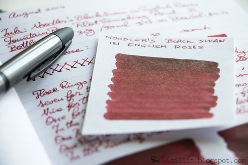
#2 Noodler's Black Swan in English Roses

Noodler's Black Swan in English Roses is a close second. I love its burgundy/brown color and beautiful shading.

Noodler's Black Swan in English Roses sheen

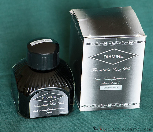
#3 Diamine Green Black

Diamine Green Black is the ink which resembles the color "British racing green" the most. If I were to pick a green ink out of all the ones I've tested (not just in 2014), this would be it.

Diamine Green Black bottle

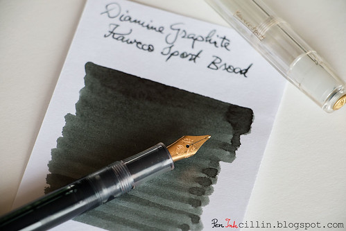
Runner Up #1 - Diamine Graphite

Normally I'm not a fan of gray inks because they're too boring, but Diamine Graphite changed my mind. It proves that a gray ink can be engineered well enough to make it useful in a professional setting and look good at the same time.

Diamine Graphite and Kaweco Sport

Runner Up #2 - Diamine Syrah

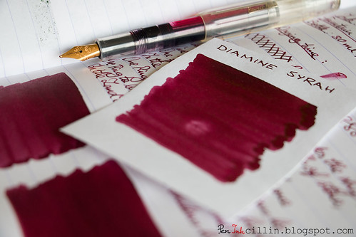
Diamine Syrah is an ink I love to hate. The color and shading are gorgeous and hard to beat. However, it likes to stain plastic and smears on glossy paper.

Diamine Syrah shading

Runner Up #3 - Rohrer & Klingner Alt-Goldgrun

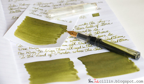
Rohrer & Klingner Alt-Goldgrun is a wonderful shade of bright, saturated olive green with beautiful shading. R&K inks are a bit quirky though and flawed in other aspects, such as feathering and sometimes flow.

Rohrer & Klingner Alt-Goldgrun with Kaweco Sport

Tuesday, November 25, 2014

Diamine Coral ink review

Crazy as it may sound, I've been using Diamine Coral in my Kaweco Sport Classic with broad nib and eyedropper conversion at work for the past couple of weeks. Yes, a hot pink ink. What baffles me is how my co-workers can be completely oblivious to the fact. Oh well, I like flying under the radar.

So here's my review of Diamine Coral, specifically a small sample of it since I didn't purchase an entire bottle.

Bottle and pricing

Bottle capacity: 80 ml / 2.7 oz
Price: $12.95
Price / ml: $0.16

Color and saturation

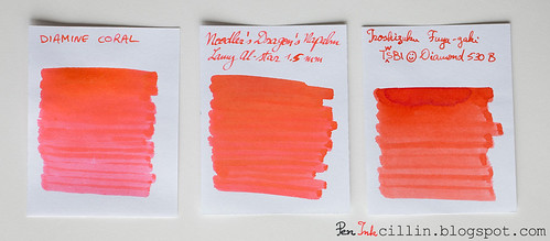
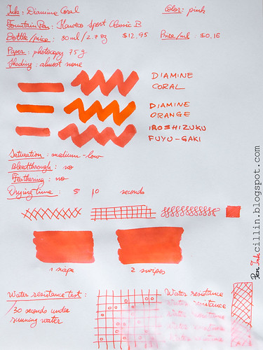
Diamine Coral is essentially a pink ink with a twist. You see, there are some hints of orange in it, and even magenta. It's practically borderline orange. While I put "medium-low" for saturation on the photocopy sample, it is actually a pretty well saturated ink, bright and vibrant. I will thus upgrade the saturation rating to "medium-high".

Diamine Coral vs Noodler's Dragon's Napalm vs Iroshizuku Fuyu-Gaki

Notice that I compared it to several inks I've tested in the past, including Noodler's Dragon's Napalm (orange classification) to which it bears the greatest resemblance, Iroshizuku Fuyu-Gaki, and even Diamine Orange, which I used as a control sample since it is the most neutral orange in the comparison.

Shading

While not evident at first, Diamine Coral shades subtly, with the aforementioned hints of orange. You'd have to use thicker lines or swabs to see it though.

Diamine Coral shading

Feathering

None.

Bleedthrough

None.

Flow, lubrication, and smoothness

Diamine Coral flows liberally in the Kaweco Sport. While smooth, it may be a little too wet for some folks' liking. As the level in the eyedropper got low and the air inside expanded, it started spitting ink on the page, at a slightly higher rate than other inks. I'm used to that because it happens with every ink, but it's worth bearing in mind if you want to use this ink in an eyedropper fountain pen.

Drying time

It took a while for it to dry on Clairefontaine but I did use a broad nib, so it might vary for you. On cheap copy paper it dries quickly though.

Smearing when dry

None.

Water resistance

Diamine Coral is not water resistant.

Conclusion

I wasn't very keen on Diamine Coral at first but it grew on me as I used it. I guess the subtle shading played its part but I also liked how well and smooth it flowed. While I would personally not buy an entire bottle of pink ink, I'm sure it would be great for any artistic endeavor. There's one feature of Diamine Coral that I'm not too fond of: it tends to stain containers. The plastic vial it came in remained pink after I washed it, and my demonstrator Kaweco Sport is all pink, including the inside of the cap where the ink leaked. I'm preparing to give it a long and thorough wash when I'm done with it. But yeah, if you're looking for a pink ink, you can't go wrong with Diamine Coral.

Following are the two samples on photocopy and Clairefontaine 90g paper, respectively.
Diamine Coral on photocopy

Diamine Coral on Clairefontaine

Wednesday, September 24, 2014

Diamine Prussian Blue ink review

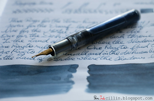
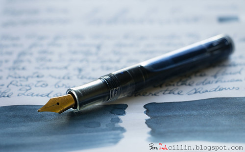
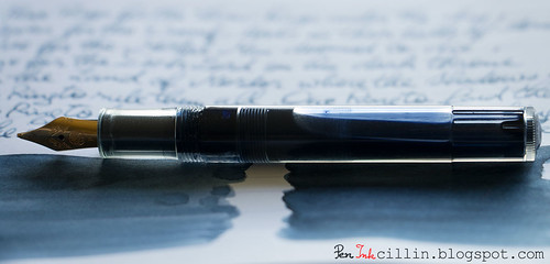
Slowly but surely I am moving into the less voted-for inks in my ink sample survey. This time it's Diamine Prussian Blue and I loaded it into my Kaweco Sport Classic with broad nib and eyedropper conversion.

Diamine Prussian Blue shading

Bottle and pricing

Bottle capacity: 80 ml / 2.7 oz
Price: $12.95
Price / ml: $0.16

Color and saturation

Diamine Prussian Blue is, well, a blue ink. However, the saturation is so low that it can be easily mistaken for a grey. Essentially it's a very dull and subdued slate blue, which is just fine with me. You might not like it ink at first, or at all. It didn't "sing" to me the first couple of days I used it, but then it started to grow on me.

Prussian Blue's muted tone actually makes a lot of sense in a formal environment, such as an office. Is it the best ink for official documents? Perhaps not, based on how light it is. But for less official papers it's pretty good, and the color is not the only thing that helps.

Diamine Prussian Blue shading

So what exactly is "Prussian Blue"? Interestingly, it's one of the first modern pigments. Does the ink resemble its namesake? I would say yes, allowing for differences in saturation.

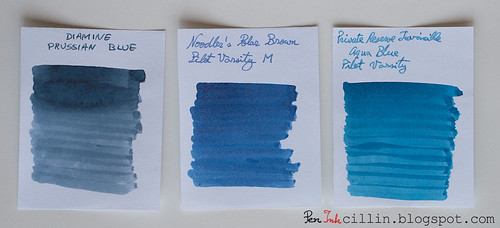
Below I tried to compare Prussian Blue with two other muted inks I tested in the past, Noodler's Polar Blue (forgive the mistake in the photo) and Private Reserve Invincible Aqua Blue, though the three aren't very similar.

Diamine Prussian Blue vs Noodler's Polar Blue vs PR Invincible Aqua Blue

Shading

You might be forgiven to think that Diamine Prussian Blue doesn't shade. Light inks don't always feature a lot of variation and it's almost the case here. However, this ink does have a little bit of shading, probably made more discernible by the broad nib.

Diamine Prussian Blue shading

Feathering

No.

Bleedthrough

Being a light-colored and de-saturated ink, Prussian Blue doesn't bleed, even on cheap paper.

Flow, lubrication, and smoothness

One very pleasant trait that Diamine Prussian Blue manifests is how easily and smoothly it flows in the Kaweco. It doesn't gush, and it has a very measured flow, yet it's wet enough (around a 6.5-7/10) that it satisfies my requirements.

Drying time

On cheap paper it dries almost instantly, but on Clairefontaine 90g (a thick, glossy, high quality paper) it is more stubborn and might require up to 30 seconds to dry completely with the broad nib.

Smearing when dry

A resolute no!

Water resistance

Color me surprised, but Diamine Prussian Blue is more resistant to water than it lets on. No where is it advertised as being water resistant but my standard test by which I let water run on a sample for 30s - 1m clearly shows that the ink remains perfectly legible. Granted, the top layer has washed off but what remains is more than enough.

Conclusion

While the slate-blue / blue-grey of Diamine Prussian Blue might not appeal to everyone, I would give it a try if I were looking for a more formal shade of blue. It could grow on you too. It's a very well-behaved ink which flows smoothly, has just enough shading to make it interesting, and on top of everything, plays well with water.

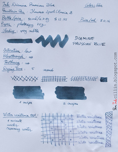
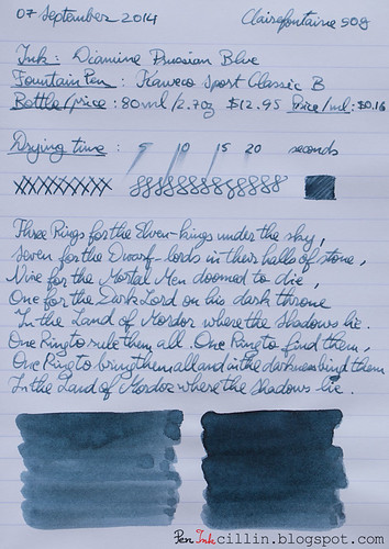
Here are the two samples on photocopy, and Clairefontaine 90g paper, respectively.

Diamine Prussian Blue on photocopy

Diamine Prussian Blue on Clairefontaine

Wednesday, September 10, 2014

Diamine Red Dragon ink review

Looks like I'm caught in a vicious circle of red and burgundy ink reviews, because it's time for yet another red ink: Diamine Red Dragon. This is easily the darkest red I've tested, to the point where it could just as well be classified under burgundy, but since it has "red" in the name, this is what I will call it.

I reviewed Diamine Red Dragon in my trusty Pilot Vanishing Point with broad nib.

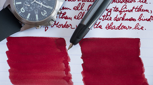
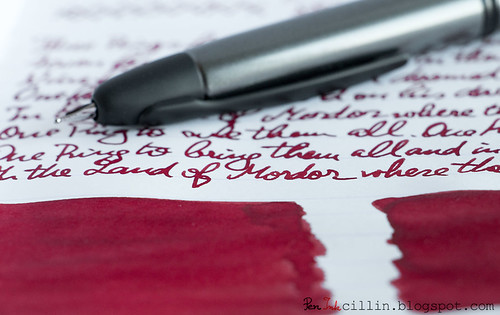
Diamine Red Dragon shading

Bottle and pricing

Bottle capacity: 80 ml / 2.7 oz
Price: $12.95
Price / ml: $0.16

Color and saturation

As I already mentioned, Diamine Red Dragon is a very dark red ink, so dark in fact that if I were to put it under the Burgundy category, no one would bat an eyelid. As such, it is also highly saturated. To an extent, it resembles thick, coagulated blood. Or, if you will, dried dragon's blood.

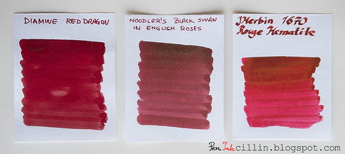
To give you a better idea, I compared it with 2 other similar inks, Noodler's Black Swan in English Roses and J Herbin 1670 Rough Hematite.

Diamine Red Dragon vs Noodler's BSER vs 1670 Rouge Hematite

Shading

Because it's so dark Diamine Red Dragon doesn't have a lot of shading. Now, some people will say that it does, and I guess if you used a brush instead of a nib, and peered really hard, you would find a little color variation. Actually, you can see that on the Clairefontaine sample shown at the bottom. But for all practical purposes, when used in a fountain pen, even one with a broad nib, there isn't any shading to speak of.

Diamine Red Dragon handwriting

Feathering

Diamine Red Dragon feathers a little on cheap paper, with the broad nib. No such thing happens on Clairefontaine 90g.

Bleedthrough

Considering the darkness and saturation of this ink, it was expected that it would at least ghost on cheap paper. That it does, though it doesn't outright bleed through. There's no ghosting on Clairefontaine.

Flow, lubrication, and smoothness

Diamine Red Dragon is very smooth - when it flows. I'm not sure exactly what happened to cause this, but in the Pilot Vanishing Point the flow was very inconsistent. At times it would stop entirely, and cause the nib to skip. I had to press the nib hard to the point of flexing, before it would start again. The Pilot VP has been a wonderful writer with other inks so it makes me wonder whether Red Dragon has some weird property that causes this. To make it flow properly, I had to resort to twisting the piston converter. But this made the ink flow a lot darker, for a while at least, until it would slow down again, becoming lighter in color.

I'm really puzzled as to why this is happening, especially considering that it is a fairly wet ink - when it behaves.

Drying time

Drying times were pretty long on both cheap and good quality paper, but that's partly due to the broad nib, as well as the wetness of the ink.

Smearing when dry

Unfortunately there's a lot of smearing going on, under certain conditions. First, Diamine Red Dragon is a slow drier. It takes its sweet time before you can turn that page, but this happens on Clairefontaine 90g. Second, you must leave it at least 24 hours before you can touch the text, or else it will smear. Even then, portions of the text where more ink has pooled will smear. It's not as bad as Diamine Syrah though.

Water resistance

There's no water resistance at all.

Conclusion

Diamine Red Dragon is a really cool looking dark red ink with a cool name and ordinary properties. I would really recommend it, with the caveat that it might (or might not) have some flow issues, and it might also smear if you are using it on good paper. If you are looking for a neutral, "true" red, this is not it, but if you want something outside the mainstream, perhaps trending towards burgundy/brown, you might want to take a look at Diamine Red Dragon.

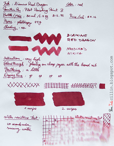
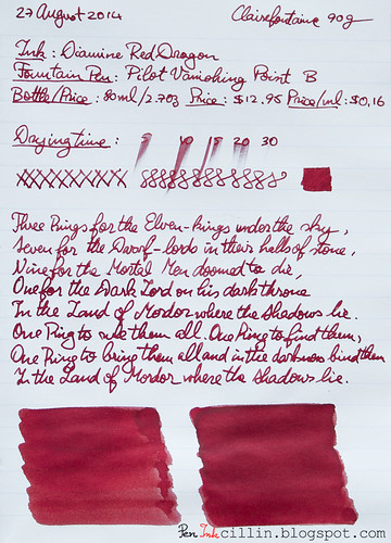
Here are the two samples, on photocopy and Clairefontaine 90g, respectively.

Diamine Red Dragon on photocopy

Diamine Red Dragon on Clairefontaine

Monday, August 11, 2014

2 things I don't like about Diamine Syrah

In my Diamine Syrah review I waxed poetically about how great this ink is. I will maintain my opinion (kind of), but in the meantime I discovered two things which made me cool down my assessment somewhat. Usually Diamine inks are very well behaved so I was surprised to discover that...

1. It stains plastic. Notice my Kaweco Sport demonstrator after I thoroughly washed it. I had to use copious amounts of rubbing alcohol and q-tips to get it clean again.


2. It smears on good/glossy paper (such as Clairefontaine 90g) even after it has had a week or more to dry. I used the Kaweco's broad nib so you might notice different behavior with a thinner nib.

In conclusion, caveat emptor.

Saturday, July 26, 2014

Ink samples (5x) GIVEAWAY

This past week I reached my first 300 followers, after 170 days on Twitter. I am both happy and humbled by this, since I had no idea what might come out of my Twitter presence. I used to be a social media luddite until recently, but things changed when I realized that instead of viewing social media as another time-wasting internet fad, it's much more lucrative to see it as a tool.

Though I'm not on Facebook (which I don't see as relevant for my blog, especially since I'm not a business), I've come to see Twitter, Instagram, and Pinterest as very powerful tools that can expand one's audience, fans, and connections for a particular subject. In my case, the subject includes inks, fountain pens, calligraphy and handwriting, and stationery in general.

I try not to tweet about subjects that are not relevant to the above. On the other hand, I'm more lenient on Instagram, where I've been known to post pictures of things that I cook for myself or other stuff that I might find interesting. Still, the majority of my focus is on the bread and butter of this blog.

To celebrate my 300-follower milestone, I decided to give away 5 ink samples from my ink collection of 15 inks, to one lucky participant. I'm grateful and humbled by all the attention and support I've been getting since this blog launched, and this is my small way of thanking you, my readers. Unfortunately I can't give more than 1 prize at this point, but hopefully there will be other milestones down the road which I can celebrate with more giveaways.

Also unfortunately, this giveaway will be valid only for US residents (including Alaska and Hawaii), because otherwise the shipping would be prohibitive.


Here's a list of 15 inks that you can pick from. Notice that next to each ink there's a quantity in milliliters. This signifies the maximum amount that I will give out from each ink. Some inks I have more of, others less, hence the disparity.

You can check out my reviews for each ink by following the links.
  1. De Atramentis Black Green (3 ml)
  2. Diamine Green Black (2 ml)
  3. Diamine Orange (3 ml)
  4. J Herbin 1670 Bleu Ocean (3 ml)
  5. J Herbin 1670 Rouge Hematite (2 ml)
  6. J Herbin Vert Olive (2 ml)
  7. Iroshizuku Fuyu-Gaki (2 ml)
  8. Monteverde Brown (2 ml)
  9. Noodler's Heart of Darkness (3 ml)
  10. Noodler's Gruene Cactus Eel (3 ml)
  11. Noodler's Navajo Turquoise (3 ml)
  12. Noodler's Nikita (5 ml)
  13. Noodler's Polar Brown (2 ml)
  14. Waterman Florida Blue (3 ml)
  15. Waterman Havana Brown (2 ml)

How to participate

I chose to use Google Forms to collect your information. I've been suggested ROFLcopter or some such but I don't really trust these 3rd party services and Google Docs is already integrated with Blogger, not to mention incredibly easy to work with, so in the end it was a no-brainer.

Head on to the giveaway form and please fill in the required fields.

I will need a name/nickname/screen name, so I can announce the winner by it. It doesn't have to be your real name, just something that you will recognize when I make the announcement. I will also need a valid email address so I can ask for your mailing address if you win. Not least, you will need to pick 5 inks (no more, no less).

Submissions are open until Saturday, August 9th, 12:00 AM CST. I will most likely announce a winner on Sunday, August 10th.

How to increase your chances to win

There are 2 additional ways in which you can increase your chances to win.
  1. Follow me (@peninkcillin) on Instagram and post a relevant picture with the tag #picgiveaway1. The picture should be related to the subject of this blog (ink / fountain pen / handwriting / stationery).
  2. Follow me (@peninkcillin) on Twitter and re-tweet the giveaway tweet (which will contain the tag #picgiveaway1).

Rules for participating/winning

  • The giveaway is US-only, really sorry about this :(
  • You can pick no more, nor less, than 5 inks.
  • The giveaway won't cost you a thing - I will ship the 5 samples for free.
  • Winners will be drawn at random from the list compiled from the giveaway form  + Instagram + Twitter participants. Submitting entries on Instagram and/or Twitter will increase your chances to win. I will use a popular online random number generator to pick the winner.
  • The draw will take place 2 weeks after the giveaway is announced.
  • You will be disqualified if: your data is incomplete, OR the email address is invalid, OR you are outside the US, OR you re-tweet or post on Instagram without following me, OR you re-tweet the wrong thing, OR the Instagram picture is not according to the guidelines listed above.
  • If I contact you and you don't respond to my request for a mailing address within a week of the drawing, you will be disqualified and another drawing will be held.
  • Once I obtain your mailing address I will ship the 5 samples you picked within 5 business days.
  • I will ship via USPS Domestic Flat Rate so theoretically you should be OK if you are inside the US.

Final words

If you win and write/draw something cool with the inks I sent you, and post it online, feel free to let me know so I can tweet it or otherwise broadcast it.

Good luck and may the ink gods be on your side!

Friday, July 25, 2014

Diamine Syrah ink review

The next ink from my ink sample survey, which got equal votes to Rohrer & Klingner Alt-Goldgrun, is Diamine Syrah. This ink is perfect for today's review because it is similar to the subject of a recent controversy: the change in formula for Noodler's Black Swan in Australian Roses (aka BSAR). As a result, I reviewed both inks in parallel. You will notice a comparison to Noodler's ink (original formula) in one of my samples but the actual review for that ink will be posted some time next week.

I reviewed Diamine Syrah in my Kaweco Sport Classic with broad nib and eyedropper conversion.

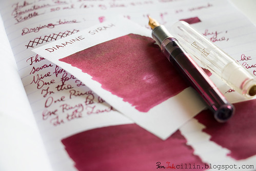
Diamine Syrah shading

Bottle and pricing
Diamine inks typically come in 80 ml / 2.7 oz bottles, selling for $12.95, or $0.16 per milliliter. Very affordable. I only had a sample of Diamine Syrah at my disposal, hence the lack of bottle pictures.

One thing that I'd like to mention here is that this ink stained my sample vial such that it didn't wash off with just water like most inks. Not a big deal, obviously, but worth keeping in mind.

Color and saturation
Diamine Syrah is a beautiful burgundy ink, of a deep and dark shade, very reminiscent of a good vintage wine. I couldn't get it to look so good if I poured actual wine in my Kaweco. Too bad it doesn't have the fragrance and bouquet of wine.

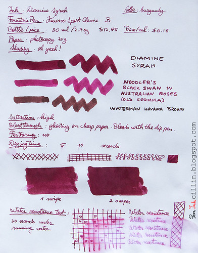
It is a very saturated ink and you will notice that it is a darker shade of burgundy than Noodler's Black Swan in Australian Roses (original formula). In reality, it depends how you sample the inks. On cheap photocopy paper, Noodler's BSAR appears lighter, almost pinkish, but on Clairefontaine 100g sketch paper it is much darker, which makes it very similar to Diamine Syrah. In actual use, BSAR is lighter on paper. This will be revealed in my review of Noodler's BSAR.

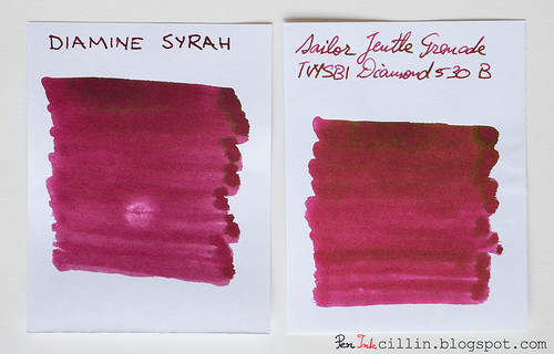
Diamine Syrah vs Sailor Jentle Grenade

At the same time, I compared Diamine Syrah with the only other burgundy ink I tested: Sailor Jentle Grenade. I'll have to admit that Sailor's ink is even more beautiful, with really wild shading and even some golden sheen. There's slightly more red in Sailor's ink, but apart from that, the two inks are fairly similar, more so than Syrah vs BSAR.

For good measure I also threw in a sample of Waterman Havana Brown (see at the bottom of the article) because it's a brown ink with some red in it but it actually doesn't help this review much.

Shading
Diamine Syrah has some very nice ink variation, otherwise known as shading. It is not as good as Sailor Jentle Grenade though. I can actually see Grenade's sheen with the naked eye in the handwriting, never mind the color swab. Still, Syrah has some of the better shading inks I've tested.

For the ink variation to "shine", a broad(er) nib is indicated.

Diamine Syrah shading

Feathering
None.

Bleedthrough
As usual, such a dark, saturated ink will most certainly ghost on cheap paper and even bleed if the line is wet enough. It doesn't do any of that on Clairefontaine 90g though.

Flow, lubrication, and smoothness
Diamine Syrah flows well in the Kaweco Sport, despite the broad nib. Paradoxically, it also feels a bit dry on cheap, absorbent paper. Having used it for the past week at work taking notes on scrap photocopy paper, flow is not always consistent. Sometimes it skips and sometimes the line is too thin. This could also be a result of my style of writing, which can often be rushed. If I press harder on the nib and take my time, it seems to flow much better.

On Clairefontaine 90g it glides smoothly, without any of the above issues.

I can't even be sure if this is an ink issue, or a paper issue, or a fountain pen issue. Basically Diamine Syrah is on the wet side but shows dry tendencies under certain conditions which are hard to pinpoint. Either way, it is not a serious problem.

Drying time
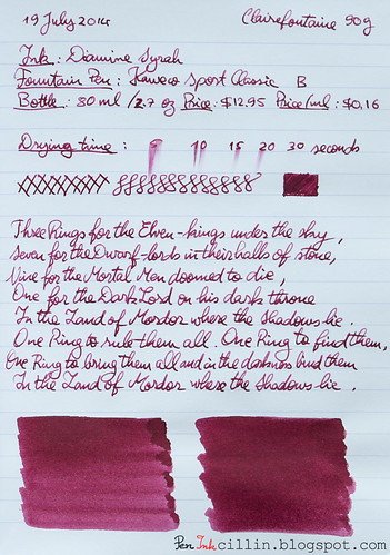
Drying times are long on Clairefontaine 90g with the broad nib (a little over 30 seconds), but that's entirely expected. Cheap paper absorbs it quickly and renders it dry in under 10 seconds.

Smearing when dry
None, with the mention that you will have to give it a very long period of time on good, shiny paper, before you can touch it without smearing. A lot of dark, saturated inks behave this way.
Update: it does smear on good paper like Clairefontaine, even after it has dried for a very long time. I did use a broad nib, so your mileage may vary.

Water resistance
This is by no means a water resistant ink but it seems to not be a total pushover like other inks, either. 30 seconds under running water washed some of it off but the text and diagrams appear recoverable.

Conclusion
Diamine Syrah is a really cool looking burgundy ink with excellent shading and amazing looks. In typical Diamine fashion, it is generally a well-behaved ink and inexpensive to boot. If you enjoy your red wine, you'll very likely enjoy Diamine Syrah. Give it a try, you won't regret it!

Following are the two writing samples on photocopy, and Clairefontaine 90g paper, respectively.
Diamine Syrah on photocopy

Diamine Syrah on Clairefontaine

Tuesday, June 17, 2014

Diamine Green Black ink review

I know, I know, I promised that my next review would be from my collection of ink samples, based on the ink sample survey I ran a few weeks ago. I'm afraid I'm going to have to disappoint those who were expecting this, at least for another week. If you don't care why, skip the next paragraph.

There's a rhyme and reason as to what fountain pens I use for my reviews. Lately, I've come to prefer the Kaweco Sport Classic for ink samples, for several reasons. First, it has a broad nib, which shows off the ink better but more importantly allows me to go through inks quicker. Second, it's a relatively inexpensive pen which I can use at work without fear of losing/breaking a nicer pen. Third, I use it as an eyedropper, which means that I can load it with the full 2ml from an ink sample. This allows me to exhaust a complete sample for each review. Well, today's review, Diamine Green Black, came in a bottle. Since my Lamy AL-Star was clean, I decided to load it up and do a quick review before I can finish the Waterman Blue in my Kaweco.

Today's ink, Diamine Green Black, comes courtesy of Jetpens. A while ago I tweeted this:
I just have this thing for British Racing Green, the color. So Jetpens suggested Diamine Green Black and were nice enough to send me a bottle for review. As soon as my Lamy AL-Star (with EF nib) was clean and dry, I loaded it up with Diamine Green Black and... let's see how well it performs.

Before we start, you might want to follow me on Twitter: @Peninkcillin.

Bottle and pricing
My main beef with Diamine inks is that their box and bottle design is very plain and boring. Not only that but it's very hard to tell at a glance what ink is inside. No custom design, not even a color patch. Only a tiny sticker that weakly whispers the name of the ink. Even Noodler's bottles are cooler because all of them have custom graphics. That's such a shame because Diamine makes such great inks. Oh well, I'd rather have a great ink in a boring bottle than a lousy ink in a gorgeous package.

Diamine Green Black bottle

Diamine inks come in an 80ml / 2.7oz bottle and cost around $12.95 or $0.16 per milliliter, among the least expensive.

Color and saturation
Ah, now we're getting to the heart of the matter. The big question is: how closely does Diamine Green Black resemble the color British Racing Green? To my eyes, I would say a lot. I'm perfectly satisfied with this color. In fact, even if it was very far from BRG, I would still love it. I'll be honest: this is the best shade of green I've tested.

However, I decided to run a very non-scientific test to see just how similar the two colors are. So I did this little trick in Photoshop:

Diamine Green Black vs British Racing Green

I took the standard British Racing Green swatch and placed it between averaged (via blur) samples of Diamine Green Black. The first sample is 1 swipe with a q-tip while the second is 2 swipes. As you can see, BRG is actually lighter than both samples. Don't read too much into this though. For starters, consider that my samples are photographed and processed, which tends to alter the colors, while the BRG swatch is pure. Besides, the thickness of the ink sample can alter the averaged value considerably. Let's just leave it at that.

Color aside, you will notice that Diamine Green Black is a dark, saturated ink. The Green Black name is very appropriate. I feel that it can be successfully used in a professional setting. It looks even darker on glossy paper because more of it has the chance to pool on the surface before being absorbed.

Shading
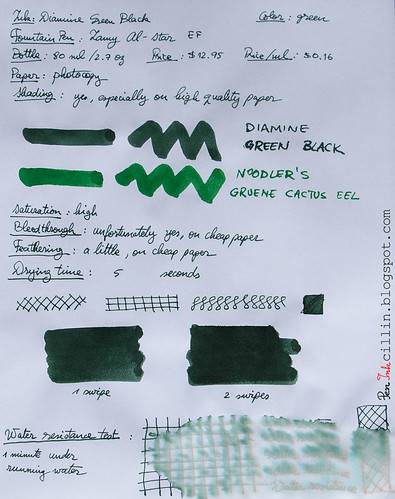
Diamine Green Black doesn't disappoint and it features some decent amount of shading. The choice of paper will make a difference though, and this will come into play soon, as you will see. In other words, the shading is more visible on good paper and less so on cheap one.

Feathering
I was a bit surprised to notice that Diamine Green Black feathers a little on the cheap photocopy paper that I used for one of my test samples. It's not a lot but it's there. No such thing happens on Rhodia 80g. But then, not everybody uses their fountain pens on some of the cheapest paper available, so take that with a grain of sand.

Bleedthrough
Another small weakness, but wholly expected considering the poor quality of the paper and the darkness of the ink, is that it bleeds on cheap paper. You can still write on the reverse if you are using it as scrap but I would advise to try it before using it in any official document where bleeding might be an issue. Again, there's no bleeding on thicker/better paper such as Rhodia.

Flow, lubrication, and smoothness
In regards to flow and smoothness, things are looking very good. Diamine Green Black all but purrs when it flows through my Lamy AL-Star. It feels well lubricated, too. I would give it a 7-8 out of 10 for wetness. This also means that it dries differently, depending on the paper.

Drying time
Wet inks tend to dry quickly on poor, absorbent paper, and very slowly on glossy, high quality paper like the Rhodia 80g I used for one of the samples. On photocopy it dries within 5 seconds, while on Rhodia it takes its sweet time, at 20+ seconds.

Smearing when dry
None.

Water resistance
There isn't any water resistance to speak of, but perhaps contact with water wouldn't be a total disaster considering that some yellow undertones remained on the paper after the main green color washed off.

Conclusion
Diamine Green Black has been a very pleasant surprise for me. Not only does it resemble British Racing Green to some extent, but it is very smooth and wet flowing, with some solid shading. The two negatives, namely bleeding and a little feathering, aren't a big deal and they would be completely moot for those who prefer high quality paper anyway. Diamine Green Black is a beautiful ink. If you like dark green inks, do yourself a favor and try it. I doubt you'll be disappointed.

Following are the two samples, on photocopy and Rhodia 80g, respectively.
Diamine Green Black on photocopy

Diamine Green Black on Rhodia