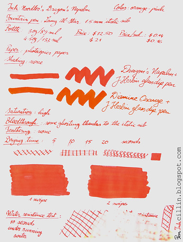
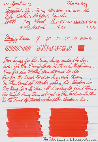
Noodler's Dragon's Napalm is an ink that I wanted to try for a long time. I finally decided to test the sample I've been saving. My general impressions are good. This is a very balanced ink but the color may be off-putting to some due to its brightness and saturation. Oh, in case you're wondering, this ink is classified as orange, but more on that later.
I decided to test Dragon's Napalm in my Lamy AL-Star and I fitted the 1.5mm italic nib for the occasion. I thought that a very broad nib would showcase the ink better than a regular nib.
Bottle
Noodler's Dragon's Napalm comes in 2 bottles. There's the classic 3oz/89ml bottle which sells for $12.50 or $0.14 per milliliter. And then there's the large 4.5oz/133ml bottle fitted with an eyedropper, which goes for $21, or $0.16 per milliliter. The latter, however, also includes a Noodler's eyedropper fountain pen. It's up to you if the bigger bottle is worth the price difference. The general wisdom remains that if you anticipate using gallons and gallons of this ink, you should probably go with the big bottle.
Color and saturation
Ah, here's where Dragon's Napalm comes into its own. The color of this ink is very peculiar. The best way to describe it is to tell you a little anecdote.
When I finished the samples for this review, I asked my wife how would she characterize this ink. She pondered for a second, then said "Well, it isn't orange and it isn't pink". There you have it, straight from the mouth of babes (forgive the pun). Dragon's Napalm is a strange mix of orange and pink. It is better characterized by what it is not, rather than by what it is.
Retailers classify it as orange and so do I. But you could just as well claim it's a pinkish orange as you could claim it's an orange-ish pink. Whatever the case, I would appreciate your opinion in the comments.
As for saturation, it is high. The ink pops out at you from the page and comes close to doing damage to your retinas (I kid, of course). In the sample that I did on photocopy paper you can also see a comparison with Diamine Orange (of which I own a bottle). That one is a true orange ink and the difference between the two inks is obvious from the swatches.
Shading
Just like its Diamine "rival", Dragon's Napalm is a flat color, without any shading present.
Feathering
None.
Bleedthrough
There is a little ghosting in evidence, thanks to the 1.5mm italic nib, but even this nib produces extremely little bleed on cheap photocopy paper, except in places where I pressed too hard on it. The q-tip swatches tend to bleed a little in places where the ink had the chance to pool. On the other hand, Rhodia 80g paper is much more resistant to ink and neither does it ghost, nor does it bleed.
Flow and lubrication
The flow is excellent in my Lamy AL-Star, despite the 1.5mm nib requiring more ink than a normal nib. The ink feels just a tiny little bit dry on paper but this could also come from the nib. It's hard to tell exactly because it is a subjective experience but it seems to me that Dragon's Napalm is not a 10/10 on the lubrication scale. Nevertheless, the very small resistance that it gives when writing is just right.
Drying time
Noodler's Dragon's Napalm dried fairly quickly, around the 10-15 second mark, despite the 1.5mm nib, on both photocopy paper and Rhodia.
Smearing when dry
No smearing whatsoever.
Water resistance
Big fail here! But don't worry, this ink wasn't billed as a water resistant ink. As you can see from the sample, it washed off almost completely after 10 seconds under running water. Just don't dunk your masterpieces penned in Dragon's Napalm in liquids and you should be fine. What's interesting about these water resistance tests is that sometimes you get to see an underlying pigment or component of the ink. In the case of Dragon's Napalm, there are strong traces of yellow.
Conclusion
Noodler's Dragon's Napalm is a very bright and saturated orange-pink ink with some very solid and balanced properties. Everything about this ink reminds me strongly of Diamine Orange and even the color comes close, though you won't confound the two. I couldn't find anything to criticize about Dragon's Napalm. For that reason I highly recommend it, if you are looking for a bright orange ink (with a twist).


This looks like an interesting ink. You know, I don't have an orange in my growing collection yet. Hmm...
ReplyDeleteDepends what kind of orange you want. Diamine Orange is probably the truest orange you can find. This one has... extra character if I may say so.
ReplyDeleteI'm off to add this to my Goulet Pens wishlist thank to this review! I hadn't considered this ink before, but your review has piqued my curiosity. Thanks!
ReplyDeleteGlad I could help! You might want to try a sample first, just in case you don't like it. Personally I'm cured of buying ink bottles without trying the ink first.
ReplyDeleteInteresting color! As for a bit more on the red side. I would like to see an in-depth review of the new Diamine Matador. See here:
ReplyDeletehttp://bertramsinkwell.com/blog/Bert-s-Blog/NEW-Diamine-Ink-Colors.html
Those pictures are a little dark. But I have tested something comparable: J Herbin 1670 Rouge Hematite. And also Noodler's Nikita but that one is lighter and also tends (sometimes) toward pink.
ReplyDeleteI love Noodlers.
ReplyDeleteWater resistance used to be a big deal to me, but these days I care much more about fade resistance and if its pH neutral or not.
With the exception of the Bay State series, all Noodlers inks are pH neutral and from the things I've seen on Fountain Pen Network, most of their inks are VERY good at resisting fading/discoloration. So needless to say most of my fountain pen ink collection is Noodlers.
Yeah I have a sweet spot for Noodler's. Most of my samples and ink tests are Noodler's. The high variety of inks is staggering.
ReplyDeleteThis ink actually looks really great in a fine nib, too. This color won't shade, but that extra saturation means that it looks pretty much the same regardless of what you put it in, I think. I reviewed it in a Hero 616, and it performed really well. (I haven't posted the review on my blog yet, though.) It reminds me most of Iroshizoku's Fuyu-Gaki. It's more red/pink that Fuyu-Gaki, but it's certainly in the same color-area.
ReplyDeleteYes, it is really a beautiful ink. My opinion is that it doesn't shade at all, it's practically flat.
ReplyDeleteGreat review! I recently had some fun bringing this ink to life:
ReplyDeletehttp://www.youtube.com/watch?v=a0azaLcPKWU
Haha that was really awesome! Coolest thing I've seen done with an ink. You're a real video wizard!
ReplyDeleteThanks for checking it out! I'm thinking of trying another video with J. Herbin Lierre Sauvage, which I'm really enjoying. Have you ever tried that green? Love the blog!
ReplyDeleteI've only tried Vert Olive which has great shading. Now I'm really intrigued, what does it take to create a video like this?
ReplyDeleteThis video took a full day to shoot using a DSLR, not counting time waiting for the train during which I dreamed up the idea. I've recently become a fountain pen and ink fan and was inspired to make it because I think ink makes a beautiful subject, and was also curious about how much character could be given to an inanimate ink drop. I pitched the idea to a friend of mine who is a puppeteer and he agreed to help. It's all live action, no animation or computer graphics. We used some science tricks for the special effects. I'm a science centre professional so I'll take any chance to experiment :) Closeups were filmed with a Canon EF 100mm f/2.8L Macro (rented - wish I owned one!) If you've never used one of these, you might enjoy renting or borrowing one for a day to experiment, although you're getting really beautiful results with whatever you're currently using!
ReplyDeleteThanks for the explanation! It doesn't look like CGI of any kind, more like stop-motion animation if you ask me. Again, very original and totally cool. I am in fact familiar with the Canon 100mm 2.8 macro, because I own one. The older, non-L version, which is great nonetheless. For my pen/ink shots I use a Canon G10 because it's easier to set up than the SLR. The only exception was for my latest review, http://peninkcillin.blogspot.com/2013/10/pilot-iroshizuku-fuyu-gaki-winter.html where I decided to use the SLR for the bokeh.
ReplyDeleteThanks! I'm kinda rusty on my photo technique but I had an idea and apparently it worked for this shot.
ReplyDelete