Showing posts with label burgundy ink. Show all posts

Wednesday, March 18, 2015

Noodler's Mandalay Maroon (V-Mail) ink review

Noodler's Mandalay Maroon is one of those inks that I wanted to test for a while and its time has finally come. Two things attracted me to this ink: the exotic name, and the color burgundy. It is also a V-Mail ink, resembling vintage inks to some extent. Along with this label, water resistance comes standard but this will be discussed in more detail below.

I tested a sample of Mandalay Maroon in my Pilot Vanishing Point with broad nib.

Bottle and pricing

Bottle capacity: 3 oz / 90 ml
Price: $12.50
Price / ml: $0.14

Color and saturation

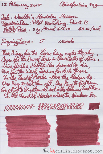
Noodler's Mandalay Maroon is a burgundy/maroon/reddish-brown ink with average saturation. It bears a passing resemblance to other inks I have tested but for the most part it has a unique color.
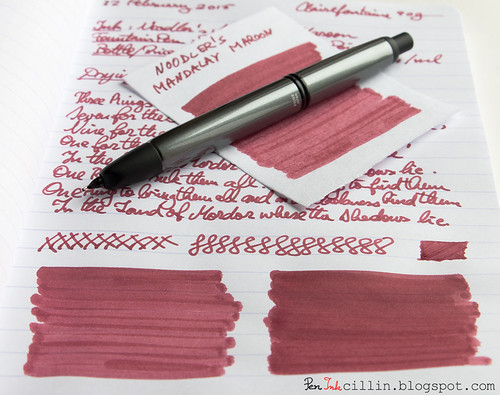
Noodler's Mandalay Maroon detail

Below, I compared it to a few other burgundy inks: Diamine Syrah, Noodler's Black Swan in English Roses, and Sailor Jentle Grenade. I believe you'll agree with me when I say that Mandalay Maroon is the least attractive ink in this lineup.
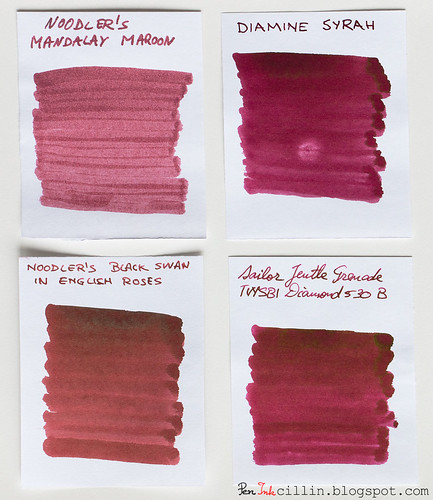
Noodler's Mandalay Maroon vs Syrah vs BSER vs Jentle Grenade

Shading

Sadly, Mandalay Maroon is completely flat, without any kind of shading or color variation. This is clearly evident from the 4-ink comparison above.
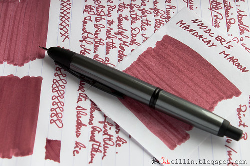
Noodler's Mandalay Maroon detail

Feathering

I'll admit I was a bit surprised that Mandalay Maroon doesn't feather even on cheap paper. For some reason I was expecting it to, especially since it really likes to seep into the paper. It's one of those deeply penetrating inks, similar to what you might find in alcohol-based markers.

Bleedthrough

Bleeding is high on cheap paper, to the extent that the reverse side will be mostly unusable. The situation on Clairefontaine 90g is improved but there's plenty of ghosting and even bleeding where the nib presses hard. This, of course, is based on my tests done with a broad nib. If you want to use this ink I'd recommend a medium nib or thinner. I'm sure those won't produce the same sort of bleeding.

Flow, lubrication, and smoothness

One thing that Noodler's Mandalay Maroon has going for itself is that it feels very smooth and flows well through the Pilot VP's broad nib. It's also pretty wet, which is probably what causes the bleed through.

Drying time

You would expect a wet ink in a broad nib to take ages to dry on good paper such as the Clairefontaine I used for one of the tests. Once again I was surprised by how quickly it dried. 5 seconds on this paper is incredible. This is easily explained by what I mentioned previously: this ink penetrates the paper like a drop of water on a dry sponge.

Smearing when dry

None.

Water resistance

Water resistance is one of the main features of Noodler's Mandalay Maroon. It didn't disappoint in my standard water test whereupon I held the sample under flowing water for 1 minute. OK, it wasn't completely watertight, and a tiny little bit of pink dye can be seen spreading out like capillaries from the edges of the lines, but the text and drawings remain perfectly intact.

Conclusion

Noodler's Mandalay Maroon is a quirky ink, quite interesting in some aspects (water resistance and drying speed) but dull in others (color/shading and bleed). To my eye it is not very attractive, especially in comparison to other burgundy inks. As such, I wouldn't buy a whole bottle but I know that lots of folks love it, so if Mandalay Maroon catches your fancy don't be detracted by my purely subjective opinion.
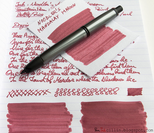
Noodler's Mandalay Maroon detail

Below are the two samples on photocopy and Clairefontaine 90g, respectively.
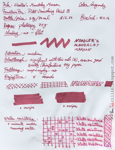
Noodler's Mandalay Maroon on photocopy

Noodler's Mandalay Maroon on Clairefontaine

Tuesday, January 27, 2015

2014 ink of the year

I know this post is a month late and a few bucks short but better late than never. In my defense, I'm back from a long vacation and it's hard to get the old routine back on track.

Without further ado, I present you my top 3 favorite inks tested in 2014, along with 3 runners-up.

#1 Monteverde Brown

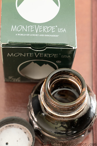
Monteverde Brown is absolutely the ink I enjoyed most in 2014. I just love brown inks and this is the definitive brown.

Monteverde Brown open bottle

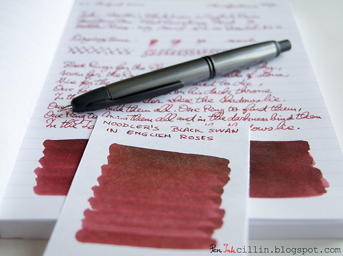
#2 Noodler's Black Swan in English Roses

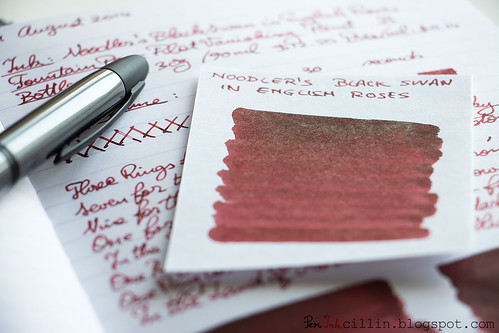
Noodler's Black Swan in English Roses is a close second. I love its burgundy/brown color and beautiful shading.

Noodler's Black Swan in English Roses sheen

#3 Diamine Green Black

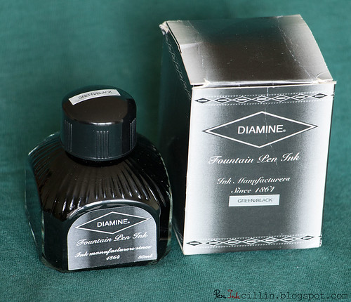
Diamine Green Black is the ink which resembles the color "British racing green" the most. If I were to pick a green ink out of all the ones I've tested (not just in 2014), this would be it.

Diamine Green Black bottle

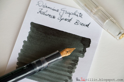
Runner Up #1 - Diamine Graphite

Normally I'm not a fan of gray inks because they're too boring, but Diamine Graphite changed my mind. It proves that a gray ink can be engineered well enough to make it useful in a professional setting and look good at the same time.

Diamine Graphite and Kaweco Sport

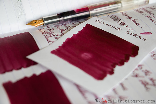
Runner Up #2 - Diamine Syrah

Diamine Syrah is an ink I love to hate. The color and shading are gorgeous and hard to beat. However, it likes to stain plastic and smears on glossy paper.

Diamine Syrah shading

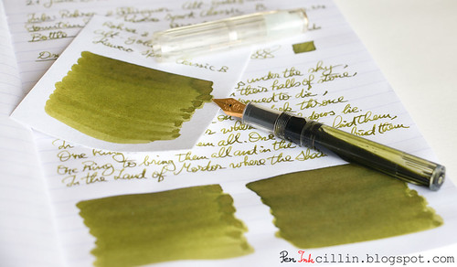
Runner Up #3 - Rohrer & Klingner Alt-Goldgrun

Rohrer & Klingner Alt-Goldgrun is a wonderful shade of bright, saturated olive green with beautiful shading. R&K inks are a bit quirky though and flawed in other aspects, such as feathering and sometimes flow.

Rohrer & Klingner Alt-Goldgrun with Kaweco Sport

Wednesday, August 13, 2014

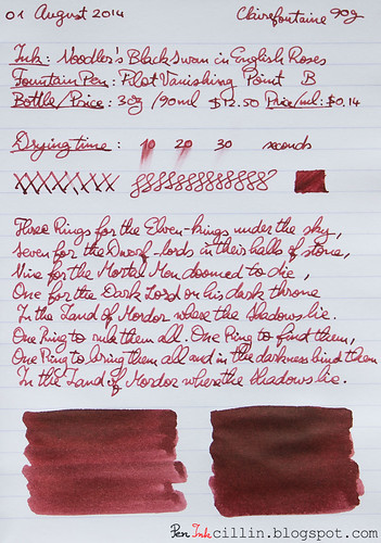
Noodler's Black Swan in English Roses ink review

With my recent reviews of burgundy inks - Diamine Syrah and Noodler's Black Swan in Australian Roses - I thought it might be fitting to end this "series" by reviewing the other ink in Noodler's Black Swan family, English Roses.

Noodler's Black Swan in English Roses (BSER) is a bit of a departure from strict burgundy, but it's close enough that I can put it in this category.

I reviewed this ink in my Pilot Vanishing Point with broad nib, same as its Australian sister. The VP really helps bring out the qualities in the ink.

Noodler's Black Swan in English Roses shading


Bottle and pricing

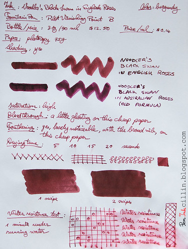
I didn't have a whole bottle of BSER, just a sample. But a 3 oz / 90 ml bottle will set you back $12.50, same as most Noodler's inks. That amounts to $0.14 per milliliter. Dirt cheap!

Color and saturation

While Noodler's Black Swan in English Roses is still a shade of burgundy, it's definitely more brown than Australian Roses. The original formula of Australian Roses was redder, while the new formula is apparently purplish. But English Roses leans towards brown. In fact, the first thought that came to my mind when I saw it on paper was that it looks like dried blood.

Saturation is high.

Noodler's Black Swan in English Roses writing

Initially I didn't like it much, after just having transitioned from Australian Roses, but it quickly grew on me. Now, I'd say it's a wash between the two. It may be that I slightly prefer English Roses over the original formula Australian Roses.

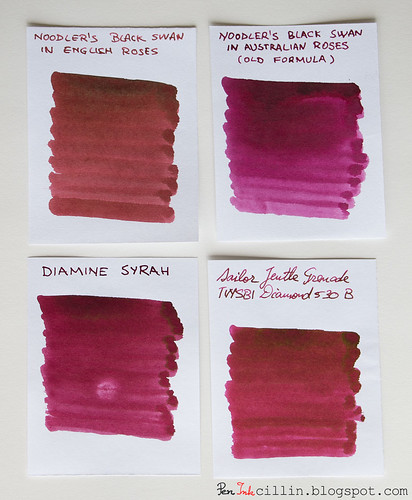
Here's a comparison between English Roses, Australian Roses (original formula), Diamine Syrah, and Sailor Jentle Grenade (discontinued). Notice how brown Enlish Roses looks compared to the others.

Noodler's Black Swan in English Roses vs Australian Roses vs Diamine Syrah vs Sailor Jentle Grenade

Shading

English Roses is very pleasing shade-wise. The line variation with the Pilot Vanishing Point's broad nib is outstanding, and it confers a lot of personality to the ink. The springiness of the nib helps bring out this character even more.

Noodler's Black Swan in English Roses shading

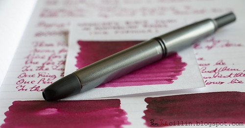
Sometimes shading is complemented by sheen, and I'm happy to note that, under the right light, Noodler's Black Swan in English Roses shows some interesting golden sheen, almost (but not quite) in the vein of J Herbin 1670 Rouge Hematite. Don't get your hopes too high though, because this is hard to spot in written lines, but it can be seen in the q-tip swab.

Noodler's Black Swan in English Roses sheen

Feathering

There is a little bit of feathering on cheap photocopy paper unfortunately, but it's probably due in part to the high saturation of the ink, as well as the broad nib. It's nothing to worry about, especially since it's a non-issue on better paper.

Bleedthrough

Black Swan in English Roses will produce a little show-through (but not excessively so) on cheap paper, since, I re-iterate, it's a dark and saturated ink, and it was tested with a broad, wet nib. On Clairefontaine that's not an issue.

Flow, lubrication, and smoothness

I am extremely pleased with how Noodler's Black Swan in English Roses flows in my Pilot Vanishing Point. It is wet and very smooth, just the way I like it. Apart from that, there's nothing else to say, except maybe that it didn't dry once from non-use, despite using the pen briefly once a day. I guess that's also a testament to how good the VP is.

Drying time

Wet, saturated inks will usually have longer drying times and so is the case here. On cheap paper it can take up to 15-20 seconds to dry, with the broad nib, while on Clairefontaine that time can stretch beyond 30 seconds. That is a bit of a problem because one of the things I do with this ink and the Pilot VP is to jot down journal notes in a Clairefontaine 90g notebook. I have to be careful to let it dry thoroughly before I turn the page.

Smearing when dry

Surprisingly, despite the darkness and saturation, English Roses doesn't really smear, even on smooth, glossy Clairefontaine paper, provided enough drying time is allowed. That's in sharp contrast to Diamine Syrah which does smear. In fairness, if I rub it really hard, I can see just a little bit rubbing off but not if I casually touch the text with my skin. I suspect this resistance to smearing is partly due to its water resistance.

Water resistance

The inks in this family are water resistant and so is English Roses. Not completely, as you can see from the sample, but plenty, such that you won't lose valuable notes if you get them wet. A little dye does get washed away though.

Conclusion

I started out being a little "meh" about Noodler's Black Swan in English Roses but as I used it more and more, it quickly grew on me, to the point where I can confidently state that I like it a lot, perhaps even more than Australian Roses. Imagine a saturated, brown-leaning, water resistant burgundy ink with great flow and exquisite shading, and that would be a good description for Noodler's Black Swan in English Roses. If you can load it in an awesome pen like the Pilot Vanishing Point, even better. My recommendation is to buy yourself a bottle (if you like the color) while the current formula is still being made.

Here are the two samples, on photocopy 75g and Clairefontaine 90g paper, respectively.
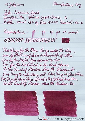
Noodler's Black Swan in English Roses on photocopy

Noodler's Black Swan in English Roses on Clairefontaine

Monday, August 11, 2014

2 things I don't like about Diamine Syrah

In my Diamine Syrah review I waxed poetically about how great this ink is. I will maintain my opinion (kind of), but in the meantime I discovered two things which made me cool down my assessment somewhat. Usually Diamine inks are very well behaved so I was surprised to discover that...

1. It stains plastic. Notice my Kaweco Sport demonstrator after I thoroughly washed it. I had to use copious amounts of rubbing alcohol and q-tips to get it clean again.


2. It smears on good/glossy paper (such as Clairefontaine 90g) even after it has had a week or more to dry. I used the Kaweco's broad nib so you might notice different behavior with a thinner nib.

In conclusion, caveat emptor.

Wednesday, July 30, 2014

Noodler's Black Swan in Australian Roses (original formula) ink review

There's been some discussion lately surrounding Noodler's Black Swan in Australian Roses (see here for example). What essentially happened is that one of the components in the original ink was changed subtly by the manufacturer of said component, without informing anyone of the fact, much less Nathan Tardif, the man behind Noodler's ink.

A lot of people were (understandably) up in arms over this incident and many were of the opinion that Nathan should have discontinued the "old" Black Swan in Australian Roses (BSAR) and instead named the new formulation something else. I tend to agree, for the simple fact that as an engineer I like version numbers. If the old one was version 1.0, the new one is version 2.0 and the two, while alike, are not identical.

I don't doubt the new formulation is just as beautiful, as in fact many people have confirmed, but I'm also sure it's not the same as the old. So in my personal opinion I think he should have probably retired the old BSAR and called the new formulation something different.

As luck would have it, I had a sample of the original formula Black Swan in Australian Roses, and despite not getting sufficient votes for it in my ink sample survey, I decided to review it in parallel with my last ink review, Diamine Syrah. Why? Because the two inks are pretty similar. Doing them in parallel allowed me to better see the differences.

Because it's such a special ink, I decided to load Noodler's Black Swan in Australian Roses in my special fountain pen: the Pilot Vanishing Point with a broad nib.

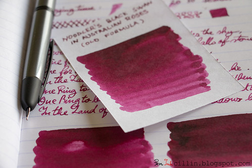
Noodler's Black Swan in Australian Roses shading

Bottle and pricing

The new formulation of BSAR sells for $12.50 for a 3 oz / 90 ml bottle, or $0.14 per milliliter.

Color and saturation

In a nutshell, Noodler's Black Swan in Australian Roses (original formula :) is gorgeous. While initially I thought Diamine Syrah might have the edge, after using both inks in parallel some more, I came to the conclusion that I prefer Australian Roses.

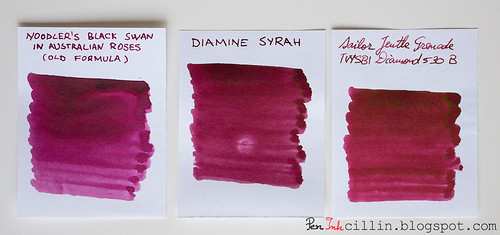
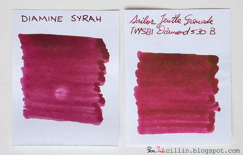
To get a better idea, I compared the two inks with Sailor Jentle Grenade (also discontinued).

Noodler's Black Swan in Australian Roses vs Diamine Syrah vs Sailor Jentle Grenade

All three inks are a dark shade of burgundy red but Australian Roses is redder and slightly lighter. All are also highly saturated. To continue the wine analogy started with Syrah, which resembles dark red wine, Australian Roses is somewhere between that and rose wine. I really love it and it almost makes me drink it. Thankfully it's not scented, or who knows what might happen.

For the record, I've been hearing that the new formulation is more purple than red. Hopefully I'll get the chance to test that one day.

Shading

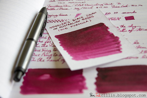
Noodler's Black Swan in Australian Roses is very playful in the shading department. The color variation is great, and depending how much the ink pools on paper when you write, it can vary from dark pink to deep burgundy. In that sense it beats Syrah. A wet swatch of both inks looks almost the same but as the ink starts to thin, BSAR gets lighter.

Noodler's Black Swan in Australian Roses shading

In addition to shading, there's even some sheen, when viewed at just the right angle, but you would have to use a thicker nib to spot that.

Feathering

If you use cheap paper and a thick nib, and peer really closely, you might notice a little feathering. Otherwise, that's not an issue on good paper.

Bleedthrough

As in most such cases, using a broad nib on cheap paper with a dark, saturated ink, will at the very least produce some ghosting. Such is the case here, though it doesn't happen on Clairefontaine paper.

Flow, lubrication, and smoothness

There's nothing out of the ordinary to report here. Black Swan in Australian Roses flows well in the Pilot Vanishing Point, regardless of the broad nib. The flow was controlled, perhaps a bit on the wet side. The Pilot VP's broad nib has some spring to it and that certainly helps in getting more ink to flow if you press harder.

Drying time

Dark, saturated inks are a good recipe for long drying times on glossy, high quality paper like the Clairefontaine 90g I uses for one of the samples. It took around 30 seconds to dry on that paper, but less than 10 on absorbent photocopy paper. Even after 30 seconds, I would be careful of touching the written surface because it might still smear.

Smearing when dry

Yes and no. To elaborate, I would let it dry for a very long time before attempting to touch it. But after 24 hours or so it should be all dried out and smearing won't be an issue.

Water resistance

Apparently Noodler's Black Swan in Australian Roses is partially water resistant and that's exactly what I found. After 1 minute exposure to running water, some of the pink/red dye washes off but most of it remains, leaving the text perfectly legible. That's good enough for me.

Conclusion

Noodler's Black Swan in Australian Roses (old formula) marks the end of an icon. This beautiful ink has had a short but glorious life, if I'm to believe the hype surrounding it. That hype is well-founded though, because I found it to be a beautiful and unique burgundy ink, with great shading and good behavior, even offering the additional bonus of mild water resistance. I would recommend for you to go out and buy a bottle but I'm sure it's all been sold out at this point. You could always try the new formulation if you think that you're OK with a more purple ink. Myself, I'm a bit saddened that this ink is no more. I'm going to hold on to my remaining sample in case one day they'll be able to clone it.

Noodler's Black Swan in Australian Roses shading

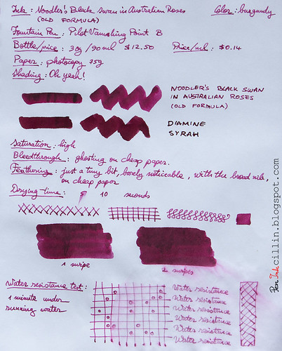
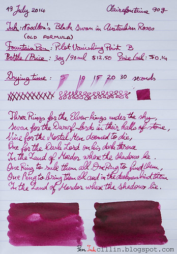
Following are the two samples on photocopy and Clairefontaine 90g paper, respectively.

Noodler's Black Swan in Australian Roses on photocopy

Noodler's Black Swan in Australian Roses on Clairefontaine

Friday, July 25, 2014

Diamine Syrah ink review

The next ink from my ink sample survey, which got equal votes to Rohrer & Klingner Alt-Goldgrun, is Diamine Syrah. This ink is perfect for today's review because it is similar to the subject of a recent controversy: the change in formula for Noodler's Black Swan in Australian Roses (aka BSAR). As a result, I reviewed both inks in parallel. You will notice a comparison to Noodler's ink (original formula) in one of my samples but the actual review for that ink will be posted some time next week.

I reviewed Diamine Syrah in my Kaweco Sport Classic with broad nib and eyedropper conversion.

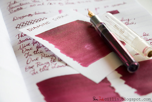
Diamine Syrah shading

Bottle and pricing
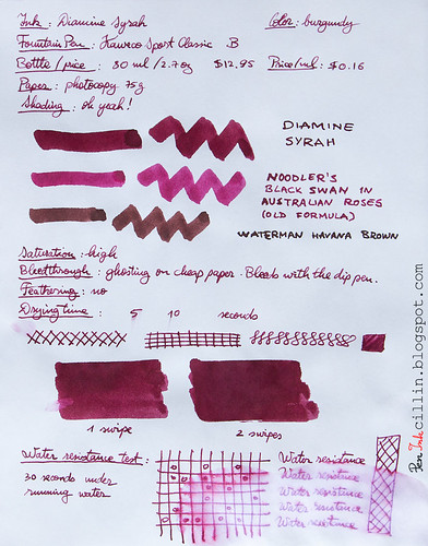
Diamine inks typically come in 80 ml / 2.7 oz bottles, selling for $12.95, or $0.16 per milliliter. Very affordable. I only had a sample of Diamine Syrah at my disposal, hence the lack of bottle pictures.

One thing that I'd like to mention here is that this ink stained my sample vial such that it didn't wash off with just water like most inks. Not a big deal, obviously, but worth keeping in mind.

Color and saturation
Diamine Syrah is a beautiful burgundy ink, of a deep and dark shade, very reminiscent of a good vintage wine. I couldn't get it to look so good if I poured actual wine in my Kaweco. Too bad it doesn't have the fragrance and bouquet of wine.

It is a very saturated ink and you will notice that it is a darker shade of burgundy than Noodler's Black Swan in Australian Roses (original formula). In reality, it depends how you sample the inks. On cheap photocopy paper, Noodler's BSAR appears lighter, almost pinkish, but on Clairefontaine 100g sketch paper it is much darker, which makes it very similar to Diamine Syrah. In actual use, BSAR is lighter on paper. This will be revealed in my review of Noodler's BSAR.

Diamine Syrah vs Sailor Jentle Grenade

At the same time, I compared Diamine Syrah with the only other burgundy ink I tested: Sailor Jentle Grenade. I'll have to admit that Sailor's ink is even more beautiful, with really wild shading and even some golden sheen. There's slightly more red in Sailor's ink, but apart from that, the two inks are fairly similar, more so than Syrah vs BSAR.

For good measure I also threw in a sample of Waterman Havana Brown (see at the bottom of the article) because it's a brown ink with some red in it but it actually doesn't help this review much.

Shading
Diamine Syrah has some very nice ink variation, otherwise known as shading. It is not as good as Sailor Jentle Grenade though. I can actually see Grenade's sheen with the naked eye in the handwriting, never mind the color swab. Still, Syrah has some of the better shading inks I've tested.

For the ink variation to "shine", a broad(er) nib is indicated.

Diamine Syrah shading

Feathering
None.

Bleedthrough
As usual, such a dark, saturated ink will most certainly ghost on cheap paper and even bleed if the line is wet enough. It doesn't do any of that on Clairefontaine 90g though.

Flow, lubrication, and smoothness
Diamine Syrah flows well in the Kaweco Sport, despite the broad nib. Paradoxically, it also feels a bit dry on cheap, absorbent paper. Having used it for the past week at work taking notes on scrap photocopy paper, flow is not always consistent. Sometimes it skips and sometimes the line is too thin. This could also be a result of my style of writing, which can often be rushed. If I press harder on the nib and take my time, it seems to flow much better.

On Clairefontaine 90g it glides smoothly, without any of the above issues.

I can't even be sure if this is an ink issue, or a paper issue, or a fountain pen issue. Basically Diamine Syrah is on the wet side but shows dry tendencies under certain conditions which are hard to pinpoint. Either way, it is not a serious problem.

Drying time
Drying times are long on Clairefontaine 90g with the broad nib (a little over 30 seconds), but that's entirely expected. Cheap paper absorbs it quickly and renders it dry in under 10 seconds.

Smearing when dry
None, with the mention that you will have to give it a very long period of time on good, shiny paper, before you can touch it without smearing. A lot of dark, saturated inks behave this way.
Update: it does smear on good paper like Clairefontaine, even after it has dried for a very long time. I did use a broad nib, so your mileage may vary.

Water resistance
This is by no means a water resistant ink but it seems to not be a total pushover like other inks, either. 30 seconds under running water washed some of it off but the text and diagrams appear recoverable.

Conclusion
Diamine Syrah is a really cool looking burgundy ink with excellent shading and amazing looks. In typical Diamine fashion, it is generally a well-behaved ink and inexpensive to boot. If you enjoy your red wine, you'll very likely enjoy Diamine Syrah. Give it a try, you won't regret it!

Following are the two writing samples on photocopy, and Clairefontaine 90g paper, respectively.

Diamine Syrah on photocopy

Diamine Syrah on Clairefontaine

Monday, July 16, 2012

Sailor Jentle Grenade ink review

I love testing new inks but reviewing a new brand altogether can be even more exciting. So is the case with my first ink from Sailor, Jentle Grenade. Once again, this is just a sample that I picked up to review, and not a full bottle. I will admit that the name of this ink is rather peculiar. "Jentle Grenade" sounds like an oxymoron, unless "Jentle" has nothing to do with "Gentle". Apparently the word "Grenade" comes from pomegranate and I can see how that would make sense, considering some of the seeds mimic the color of this ink.

Speaking of color, Goulet Pens (from where I bought the sample, no affiliation yada yada) categorizes it under "burgundy" so I will do the same. I really can't put it under red, nor purple, nor brown.

Because I had a feeling this ink might be interesting, I decided to use it in my TWSBI Diamond 530 with a broad nib unit. This is still my best fountain pen so it made sense to pair it with Sailor's ink. Without further ado, let's dig right into my impressions of this ink.

Bottle
My sample only holds 2ml of ink but if you were to buy a whole bottle you would get 50ml or 1.7oz for $12.50. At $0.25 per milliliter, this is one of the more expensive inks but I find it worth the price.

Color and saturation
As I already mentioned, Sailor Jentle Grenade is a deep dark burgundy, somewhere between red and purple. I'm not a wine drinker but it reminds me of it. The saturation is also high. On the photocopy sample I compared this ink with Waterman Havana Brown which also has a very lovely brown color with hints of red. Unfortunately it isn't a very apt comparison because the color of the two inks differs greatly.

Shading
Sailor Jentle Grenade has some of the best shading I've seen in an ink. It is definitely on par with the other awesome ink I tested (and incidentally the one I used as comparison on the sample), Waterman Havana Brown. Layering the ink also shows varying shades of intensity. The shading is very nice and apparent when used with the broad nib of the TWSBI.

Feathering
None that I could notice.

Bleedthrough
While most inks tend to bleed through the cheap photocopier paper when applied with a q-tip, and Jentle Grenade is no exception, it merely ghosts a little when used with a pen. This is expected behavior considering how dark and saturated the ink is. It doesn't bleed or ghost on Rhodia.

Flow and lubrication
I prefer wet flowing inks and although Sailor Jentle Grenade flows well, I'm not 100% satisfied. I have a suspicion it might have something to do with the TWSBI, whose flow is known to be a little dry. I'd give it a 6-6.7 / 10 but I would prefer an 8/10. Either way, this isn't something that kills my enjoyment of the ink.

Drying time
Here's where the performance of Jentle Grenade varies quite a lot depending on the type of paper used. With cheap, spongy copy paper, it dries quickly, a little over 5 seconds. With the high quality, glossy Rhodia 80g it takes up to 20 seconds. Bear in mind that this is using a broad nib which puts more ink to the paper. Still, even 20 seconds is not too bad, if you know what to expect and give it a little time to dry.

Smearing when dry
None.

Water resistance
I love it when an ink manages to sneak in a bonus feature. While this ink isn't labeled waterproof (to my knowledge), it seems to be a lot more water resistant than most regular inks. Holding it for over a minute under running water managed to make a mess of things but didn't completely wipe it off the paper. The writing is still legible. Notice though how Jentle Grenade sheds its layers when exposed to water. It seems that this ink has red and blue components. The blue component is more water resistant than the red which is the first to wash off. It's a very interesting behavior but it still doesn't make it a waterproof ink.

Conclusion
Jentle Grenade represents my first successful foray into Sailor's line of inks. The color and saturation are beautiful and the shading is gorgeous. It flows well in my fountain pen and it's a pleasure to write with. Hey, you might even get away with using it in a formal setting. As an added bonus, the little water resistance it has can save your precious writings in a pinch. Don't let the slightly higher price detract you. If you like this particular shade of ink, Sailor Jentle Grenade is a definite buy!

Following are the two samples on photocopy and Rhodia 80g paper, respectively.

Sailor Jentle Grenade on photocopy

Sailor Jentle Grenade on Rhodia