Showing posts with label orange ink. Show all posts

Tuesday, March 10, 2015

Diamine Pumpkin ink review

Diamine Pumpkin is yet another orange ink from Diamine. How does it measure up to other orange inks? Does it shade? Is it worth picking up? Why Pumpkin over other inks? Pumpkins in March? All these, and more, will be answered shortly.

But first, a short reminder that I tested this ink in my Kaweco Sport Classic with broad nib and eyedropper conversion.

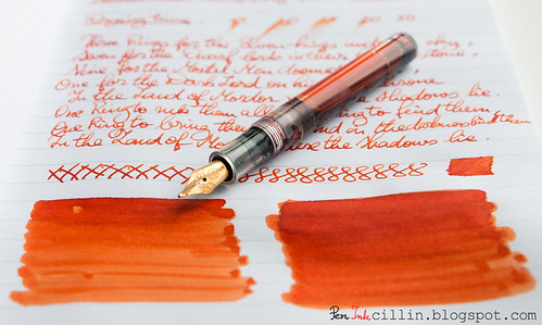
Diamine Pumpkin shading with Kaweco

Bottle and pricing

Bottle capacity: 80 ml / 2.7 oz
Price: $12.95
Price / ml: $0.16

Color and saturation

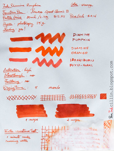
Diamine Pumpkin is, once again, an orange ink. It is bright and very saturated, though not the cheeriest of oranges. It's not a pure orange, as Diamine Orange is (see comparison in the copy paper writing sample at the bottom), but a bit dirty. It's very pumpkinish in fact, and I find the name very appropriate for once.

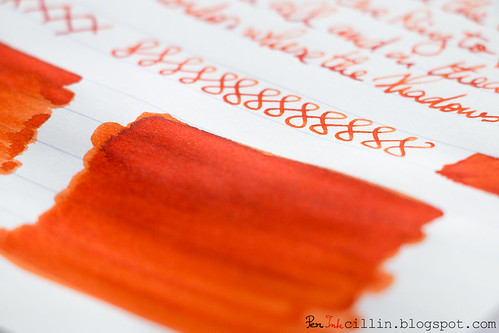
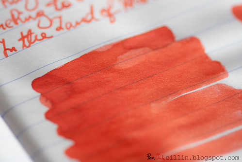
Diamine Pumpkin shading

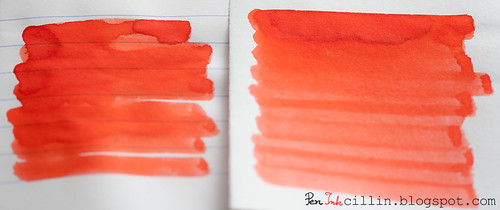
To get a better idea of the exact shade of orange Pumpkin exhibits, I'm illustrating this via a comparison with a couple of other orange inks I've tested: Sailor Jentle Apricot and Noodler's Dragon's Napalm (as well as Iroshizuku Fuyu-Gaki in the photocopy paper sample at the bottom).

Diamine Pumpkin vs Sailor Jentle Apricot vs Noodler's Dragon's Napalm

When placed side by side like this I actually find Pumpkin to be more fiery and expressive than both these inks, though each is beautiful in its own way.

Shading

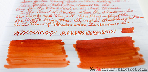
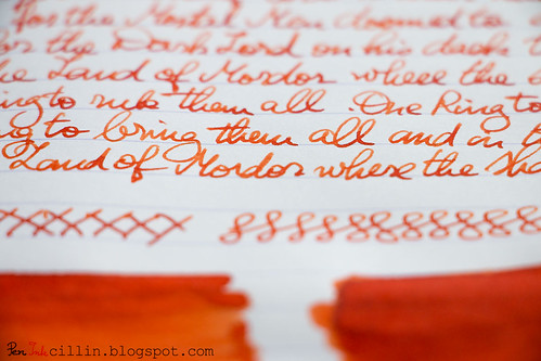
Some inks are completely flat, as is the case with Diamine Orange, but Diamine Pumpkin is not. It shades very nicely, and that gives it a lot more character than its purer sibling. It's very easy to obtain darker patches of fiery orange and almost-red on top of lighter shades of orange. In writing, the shading is obviously more easily discerned with a broad nib, as is the case here.

Diamine Pumpkin shading

Feathering

None.

Bleedthrough

None.

Flow, lubrication, and smoothness

I can't complain here: Diamine Pumpkin flows very well in the Kaweco Sport and is appropriately wet. It's not the wettest ink out there and your experience may certainly differ if you are using a medium nib or thinner.

Drying time

On cheap paper (photocopy), Diamine Pumpkin dries almost instantly, but this time is considerably lengthened on Clairefontaine 90g, dependent, of course, on the nib. I'm assuming it would take less than 30 seconds to dry with a thinner nib.

Smearing when dry

None

Water resistance

Diamine Pumpkin is not water resistant but after being exposed for 1 minute to running water some faint traces remain. This component seems to be pink in color.

Conclusion

I am suitably impressed by Diamine Pumpkin. I was expecting this to be a plain ol' orange ink but it has more character than more reputable inks (whether that reputation is well-earned or not). What I like most about Diamine Pumpkin is that it's not just a generic orange, but instead has that "dirty" look (while staying bright and saturated) which gives so much justice to its name. And then the beautiful shading only helps to make it better. I would urge you to try Diamine Pumpkin. If you like orange inks, I'm betting you'll love it too.

Diamine Pumpkin shading

Following are the two writing samples on photocopy and Clairefontaine 90g paper, respectively.

Diamine Pumpkin on photocopy

Diamine Pumpkin on Clairefontaine

Wednesday, July 2, 2014

Sailor Jentle Apricot ink review

As per my ink sample survey, I present you with the second ink you voted for: Sailor Jentle Apricot. In truth, this ink tied with 2 others, but I decided to review it first because, as you might (or might not) know, Sailor is discontinuing all their old inks, including this one, and replacing them with new ones which don't seem to bear much resemblance. There's a chance you can still find bottles of Sailor Jentle ink at some retailers if my review persuades you.

Once again, I reviewed this ink in my Kaweco Sport Classic, eyedropper mode.

Bottle and pricing
No longer relevant - discontinued.

Color and saturation
In my photocopy paper sample I wrote "Medium-High" for saturation and if you feel that this ink is definitely highly saturated, I won't blame you. To me eye, it feels less so than, for example, Diamine Orange, to which I have compared it side by side. The saturation is high but I've seen higher in other inks.

The color is an intense orange but there are visible differences compared to Diamine Orange. The Sailor ink is a truer orange while Diamine seems to contain a tad more red, making it more fiery in appearance. Below you will also see these two inks compared to Noodler's Dragon's Napalm, but this last one is very different from the first two: it looks a lot more pinkish-red.

Sailor Jentle Apricot compared

Shading
Sailor Jentle Apricot has the second-best shading among the orange inks I tested, after Iroshizuku Fuyu-gaki. Compared to Diamine Orange, which is flat, Jentle Apricot definitely shows some character.

Sailor Jentle Apricot shading

Feathering
Despite the broad nib of the Kaweco Sport, Sailor Jentle Apricot doesn't feather on cheap paper.

Bleedthrough
As is often the case with higher-than-average saturated inks, Sailor Jentle Apricot will ghost a little on cheap paper but you won't have to worry about that on the good stuff such as the Clairefontaine 90g I used for my other sample.

Flow, lubrication, and smoothness
Sailor Jentle Apricot feels pretty good in the Kaweco Sport. Broad nibs usually need a steady supply of ink and dryer inks might have issues but this wasn't the case at all with this ink. While it wasn't gushing, the flow felt very measured, which in turn gave better control of the nib on paper. As for smoothness, I have nothing to complain about. The pen doth not protest at all with this ink.

Drying time
Nothing out of the ordinary here. Dry times are a bit longish on Clairefontaine 90g, at around 25 seconds, but keep in mind the broad nib. On cheap paper that won't be an issue, at 5 seconds.

Smearing when dry
None.

Water resistance
Bottom line is that Sailor Jentle Apricot is not at all resistant to water. It did nothing to withstand 30 seconds under running water.

Conclusion
It's always sad to see a good line of inks being discontinued. Sailor probably has good reasons but I'm sure a lot of people are disappointed. While this may not be the best orange ink there is, it's certainly one of the better ones I've tested. While Iroshizuku Fuyu-gaki is more impressive and Diamine Orange more fiery, Sailor Jentle Apricot is actually a truer orange and features some shading, which the Diamine ink doesn't. Price-wise it is about halfway between Iroshizuku and Diamine. The other properties are pretty solid, and while none of them really stands out, they don't lag behind other inks either. Overall I'm pleased with this ink and with the chance to review it before it disappeared completely. I hope you can snag one if you fancy it, before it's gone!

The writing samples below are done on photocopy and Clairefontaine 90g paper, respectively.

Sailor Jentle Apricot on photocopy

Sailor Jentle Apricot on Clairefontaine

Bonus! My Instagram shot that I took while reviewing this ink.

Tuesday, October 29, 2013

Pilot Iroshizuku Fuyu-gaki Winter Persimmon ink review and GIVEAWAY

The day has finally come when I can review an Iroshizuku ink. Deviating slightly from my usual format for recent reviews, instead of a sample, I'm able to play with an entire bottle, courtesy of Jetpens. Full disclosure: while Jetpens provided the ink, they haven't paid me for this review so the opinions therein are my own.

THE GIVEAWAY
Because Jetpens is a pretty chill company (they were the main factor that kindled my love for fountain pens), they are also giving away a bottle of Iroshizuku Fuyu-gaki Winter Persimmon exclusively to my readers. So head on to their website for a chance to win. NOTE: you will need to subscribe (or already be a subscriber) to Jetpens' newsletter before you can submit your entry for the giveaway. For existing subscribers, just enter your email and hit "Submit". If you are not already a subscriber there's a handy "Subscribe to our newsletter" box on the bottom right side. The giveaway runs from 10/29 6PM PST to 11/05 11:59PM PST. Good luck!

For many in the fountain pen world, Iroshizuku ink is perceived as being somewhat of an unicorn: rare, precious and with magical qualities. While Iroshizuku seems to be a brand of its own (that's what I thought when I first heard about it) it is actually produced by Pilot. It is to Pilot what Lexus is to Toyota: a more refined and luxurious sub-brand. As a result, the price is also much higher than its regular stablemates who go under the Pilot label.

I'm happy to finally be able to test one of these lovely inks. Iroshizuku Fuyu-gaki Winter Persimmon is essentially a vermillion ink but there's more to it than that. Let's explore some of its properties.

For this review I went outside the norm, because I had access to more ink, and pulled out a trio of pens: Noodler's Ahab, Lamy AL-Star (with EF, 1.1mm, 1.5mm and 1.9mm italics) and TWSBI Diamond 530 (with EF and B nibs).

Bottle and pricing
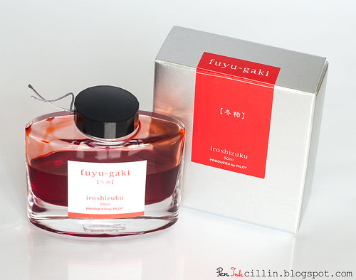
Refinement starts on the outside and it isn't a stretch to say that Iroshizuku inks come in very elegant bottles. This is easily the sexiest ink bottle I've handled, apart from the rather unique J Herbin 1670 Rouge Hematite but I'm not sure that's a fair comparison considering the 1670 is a limited edition. Nonetheless, the Iroshizuku bottle looks a bit like something out of a Swarovski catalog. Notice however that while it seems big, the bottle only holds 50ml because the bottom is thick glass, but this makes it hefty and stable on your desk.

Iroshizuku Fuyu-gaki

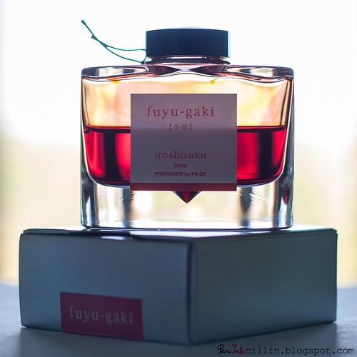
Another nice touch in the bottle's design is the conical cavity at the bottom designed for the nib to fit in when you are filling your pen. This made me actually fill the pens used in this review the way they are meant to, as opposed to using a syringe as I normally do.

Iroshizuku Fuyu-gaki backlit

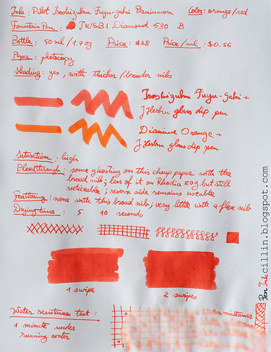
All this comes at a price. Iroshizuku is perhaps the most expensive mainstream ink, at $28 for 50ml / 1.7oz, or $0.56 per milliliter. Compare this with something regular like Noodler's Ink which is only about $0.14 / ml. But is it worth it? While the cool packaging certainly adds to the cost, the ink itself does a great job in justifying its price. Personally, it's a bit much for me, so I'm not sure I'd buy a full bottle, but that's because I don't write/draw enough to justify that. For heavy fountain pen users it's another story. Nevertheless, I'm sorely tempted...

Color and saturation
Iroshizuku Fuyu-gaki Persimmon is, as mentioned, a vermillion ink. Vermillion is a color between dark orange and red, with a warm tone. To my eyes it looks more orange than red, hence the classification under the Orange Inks category. It's a beautiful color, definitely one that I haven't encountered before in a fountain pen ink. It is rich, vibrant and saturated.

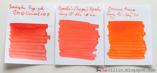
Fuyu-gaki, Dragon's Napalm, Diamine Orange

Compared to other inks that I have tested, it is darker and more fiery than both Diamine Orange and Noodler's Dragon's Napalm to which it bears a passing resemblance.

Shading
It's only proper for such a regal ink to feature at least some shading and Iroshizuku Fuyu-gaki doesn't disappoint. I would say that the amount of shading is above average and this makes the ink look almost like watercolor, when applied in liberal amounts such as the q-tip samples shown below.

Iroshizuku Fuyu-gaki shading closeup

Iroshizuku Fuyu-gaki shading

Thicker nibs work best to show of the shading properties and that's one reason why I prefered the broad nibs versus EFs, for this ink.

Feathering
In normal use (with a nib, that is) there is no feathering. I have noticed, however, that there is a bit when using the J Herbin glass dip pen. That's excusable though, for two reasons: this is a wet ink and cheap paper tends to act like a sponge, and most inks act the same under similar circumstances.

Bleedthrough
Fuyu-gaki doesn't bleed through the paper but it ghosts a little with the dip pen. I'm guessing because of its higher-than-average saturation you can see its shadow even on heavier paper such as the Rhodia 80g but the reverse side remains eminently usable. Even the cheap photocopy paper can be used on both sides.

Flow, lubrication and smoothness
Iroshizuku Fuyu-gaki flows well in the pens I've tested but...

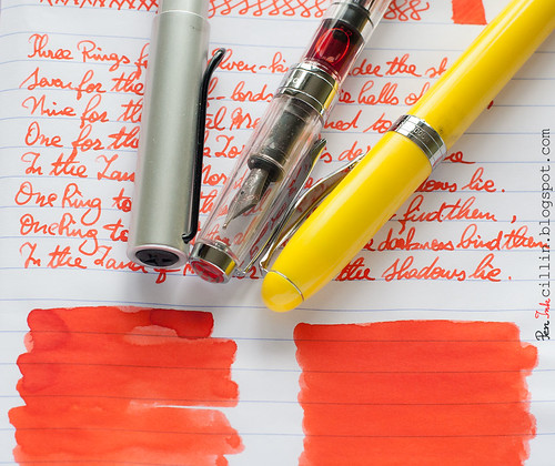
Maybe it's the fact that in recent times I've taken a liking to thicker nibs, or that my particular fine nibs aren't that great, but I actively disliked how both the TWSBI and the Lamy wrote with their respective EF nibs. The both felt scratchy and dry. Notice that the line from the Lamy EF looks rather thick in comparison. On the other hand, it's a real joy to use the broad nib in the TWSBI and all 3 italics for the Lamy. The Fuyu-gaki flows wet and smooth in these nibs.

Noodler's Ahab sits somewhere in the middle. It had some flow issues when flexing, which caused railroading. The ink also dried up in between uses. But I think that's a problem with the pen itself. I really wish I could get my hands on a proper vintage flex pen for $10 or so. Yeah, never gonna happen.

Iroshizuku Fuyu-gaki and pens

Drying time
I tested Fuyu-gaki's drying time in a less-than-scientific manner, as I always do, with whatever nib is handy at the moment. For this test I used the TWSBI B. Since the ink flows wet in this nib, it took quite a while before it dried on Rhodia 80g paper, somewhere north of 30 seconds. On cheap, absorbent paper, however, it dried quickly, closer to 5 seconds than 10.

Smearing when dry
None.

Water resistance
The documentation doesn't mention anything about Iroshizuku Fuyu-gaki's water resistance and, as it's usually the case, it turns out the ink is entirely vulnerable to water. A minute under water diffuses this ink into illegibility. No big deal though, that wasn't a selling point.

Conclusion
Pilot's Iroshizuku Fuyu-gaki Persimmon is a beautiful, polarizing vermillion ink, rich in appearance and smooth in flow. It has some very nice shading especially if used with broader nibs which can be a perk if broad nibs are what you prefer because personally I don't think fine nibs do it justice. On the other hand this is also an Iroshizuku, which puts it way above the crowd in terms of price. Is it worth buying? That's up to you to decide. While a Toyota provides sufficient utility to most people, there are plenty who prefer (and can afford) a Lexus. One thing is certain: it's hard to find this combination of color/shading/smoothness in lesser inks.

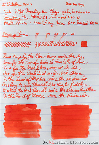
Below are the two samples written on photocopy and Rhodia 80g, respectively.

Iroshizuku Fuyu-gaki on photocopy

Iroshizuku Fuyu-gaki on Rhodia

Monday, April 16, 2012

Noodler's Dragon's Napalm ink review

Noodler's Dragon's Napalm is an ink that I wanted to try for a long time. I finally decided to test the sample I've been saving. My general impressions are good. This is a very balanced ink but the color may be off-putting to some due to its brightness and saturation. Oh, in case you're wondering, this ink is classified as orange, but more on that later.

I decided to test Dragon's Napalm in my Lamy AL-Star and I fitted the 1.5mm italic nib for the occasion. I thought that a very broad nib would showcase the ink better than a regular nib.

Bottle
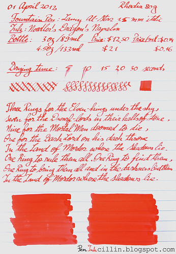
Noodler's Dragon's Napalm comes in 2 bottles. There's the classic 3oz/89ml bottle which sells for $12.50 or $0.14 per milliliter. And then there's the large 4.5oz/133ml bottle fitted with an eyedropper, which goes for $21, or $0.16 per milliliter. The latter, however, also includes a Noodler's eyedropper fountain pen. It's up to you if the bigger bottle is worth the price difference. The general wisdom remains that if you anticipate using gallons and gallons of this ink, you should probably go with the big bottle.

Color and saturation
Ah, here's where Dragon's Napalm comes into its own. The color of this ink is very peculiar. The best way to describe it is to tell you a little anecdote.

When I finished the samples for this review, I asked my wife how would she characterize this ink. She pondered for a second, then said "Well, it isn't orange and it isn't pink". There you have it, straight from the mouth of babes (forgive the pun). Dragon's Napalm is a strange mix of orange and pink. It is better characterized by what it is not, rather than by what it is.

Retailers classify it as orange and so do I. But you could just as well claim it's a pinkish orange as you could claim it's an orange-ish pink. Whatever the case, I would appreciate your opinion in the comments.

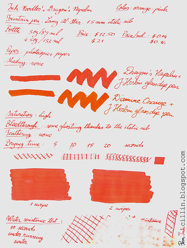
As for saturation, it is high. The ink pops out at you from the page and comes close to doing damage to your retinas (I kid, of course). In the sample that I did on photocopy paper you can also see a comparison with Diamine Orange (of which I own a bottle). That one is a true orange ink and the difference between the two inks is obvious from the swatches.

Shading
Just like its Diamine "rival", Dragon's Napalm is a flat color, without any shading present.

Feathering
None.

Bleedthrough
There is a little ghosting in evidence, thanks to the 1.5mm italic nib, but even this nib produces extremely little bleed on cheap photocopy paper, except in places where I pressed too hard on it. The q-tip swatches tend to bleed a little in places where the ink had the chance to pool. On the other hand, Rhodia 80g paper is much more resistant to ink and neither does it ghost, nor does it bleed.

Flow and lubrication
The flow is excellent in my Lamy AL-Star, despite the 1.5mm nib requiring more ink than a normal nib. The ink feels just a tiny little bit dry on paper but this could also come from the nib. It's hard to tell exactly because it is a subjective experience but it seems to me that Dragon's Napalm is not a 10/10 on the lubrication scale. Nevertheless, the very small resistance that it gives when writing is just right.

Drying time
Noodler's Dragon's Napalm dried fairly quickly, around the 10-15 second mark, despite the 1.5mm nib, on both photocopy paper and Rhodia.

Smearing when dry
No smearing whatsoever.

Water resistance
Big fail here! But don't worry, this ink wasn't billed as a water resistant ink. As you can see from the sample, it washed off almost completely after 10 seconds under running water. Just don't dunk your masterpieces penned in Dragon's Napalm in liquids and you should be fine. What's interesting about these water resistance tests is that sometimes you get to see an underlying pigment or component of the ink. In the case of Dragon's Napalm, there are strong traces of yellow.

Conclusion
Noodler's Dragon's Napalm is a very bright and saturated orange-pink ink with some very solid and balanced properties. Everything about this ink reminds me strongly of Diamine Orange and even the color comes close, though you won't confound the two. I couldn't find anything to criticize about Dragon's Napalm. For that reason I highly recommend it, if you are looking for a bright orange ink (with a twist).

Noodler's Dragon's Napalm on photocopy

Noodler's Dragon's Napalm on Rhodia

Wednesday, July 27, 2011

Noodler's Operation Overlord Orange (V-Mail) ink review

Operation Overlord Orange is the third ink in Noodler's V-Mail series that I've tested. The other two were Burma Road Brown and North African Violet. I liked NA Violet, didn't like Burma Road Brown but I really disliked Operation Overlord Orange. Read on to find out why.

Like all V-Mail inks, "OO" Orange has a vintage vibe about it. In this case, the ink is rather dull and not very saturated. Personally I'm not a big fan of the shade but others might enjoy it.

Noodler's Operation Overlord Orange has several flaws. Though the drying time is very good (some of the best I've seen), it comes at a heavy cost: bleedthrough. Yep, Overlord Orange bleeds through paper like a bullet bleeds through butter. I haven't met an ink yet which bleeds so much through the Rhodia 80g paper I use for testing. Photocopier paper is much worse.

So this ink dries quickly but that's probably because it gets absorbed by the paper at such a prodigious rate. As a result, I find it useless for writing. It could definitely be used for drawing, as long as you don't mind the bleeding. I would assume that it can also be diluted successfully, minimizing the penetration but that would only make it duller and fainter.

As another consequence of the bleedthrough, there is also some feathering but it's less severe than I would have expected. This only happens on the cheap photocopier paper, not on Rhodia.

There is also a little bit of shading, even though this can be subjective. Applying several layers of Overlord Orange does change the density of the ink on paper.

Noodler's Operation Overlord Orange's water resistance is weird. On the one hand, as you can see from the sample, exposing it for a minute under running water simply muddies up the color, fades it a bit and breaks it down into some (or all) of its components. It can't be called a waterproof ink but on the other hand it doesn't wash off completely either. What's interesting is that its components seem to be a yellow and a pink and it looks like the pink is the water resistant component.

In conclusion, Noodler's Operation Overlord Orange is one of the quirkiest inks I've come across, one that doesn't seem well suited to writing but looks to be geared more towards the arts. Even then, it can prove finicky with it's strong bleeding abilities but it does make up for it to an extent with a quick drying time. The dull color of Operation Overlord Orange might not be to everyone liking but I'm sure some folks will prefer a dull, subdued shade of orange.

In fairness, I did use it in a Pilot Parallel (2.4mm) pen for this review which puts a lot of ink to the paper. It seems that the quality of paper also has a big say in how this ink performs. High quality paper such as the Rhodia 80g I use for one of my tests does not let so much of the ink to show through. Common photocopier paper is very bad in contrast: the reverse side is unusable.

Here are some writing samples done on photocopier paper and Rhodia 80g, as well as examples of bleeding on both papers.

Noodler's Operation Overlord Orange photocopier

Noodler's Operation Overlord Orange Rhodia 80g

Noodler's Operation Overlord Orange bleedthrough photocopier

Noodler's Operation Overlord Orange bleedthrough Rhodia