Showing posts with label purple ink. Show all posts

Monday, October 29, 2012

Private Reserve Tanzanite ink review

It's been a long time since I wrote a review and here I am now, typing this from an airport waiting-lounge on another continent. In truth, I haven't been using other inks save for the one I'm reviewing now: Private Reserve Tanzanite. In what has almost become a tradition, I tested this new ink in my trusty Pilot Varsity.

Private Reserve is a new brand for me and Tanzanite may just be that perfect purple ink I've been searching for. Let's find out if it really is. But before that, I'd like to mention something. Ever since I heard about the Private Reserve brand, I made an automatic association in my mind with old cognac. Am I the only one who makes this connection?

Bottle
I'm only testing a sample, but Private Reserve Tanzanite comes in a 50ml (1.7oz) bottle which retails for $8.75 or $0.18 per milliliter. This makes it middle-of-the-road, neither cheap, nor prohibitively expensive.

Color and saturation
I have a strong suspicion that the name Tanzanite comes from the semi-precious stone of the same name. As such, this is a purple ink. Dark purple, to be precise. This ink reminds me strongly of another purple ink whose color I liked, Noodler's North African Violet. However, as you might remember, that ink contributed to the ruination of one of my fountain pens so in the end I wasn't that fond of it. Private Reserve Tanzanite is darkly purple but pleasantly so. I really like its color. It is also highly saturated.

Shading
You might be forgiven to believe that PR Tanzanite doesn't shade very well, especially with a thin nib (I guess everything short of broad or italic). Well, you would  be surprised. It actually has some very nice shading, especially when applied liberally, such as I did with the q-tip. Tilting the paper towards the light will reveal the beautiful golden-red accents.
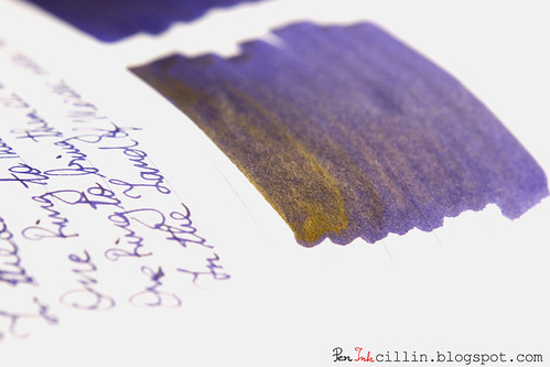
Private Reserve Tanzanite shading

Feathering
None to speak of.

Bleedthrough
Being a dark ink, PR Tanzanite ghosts a little on cheap paper but otherwise behaves nicely and I can testify to that since I used it daily for over a month at work, on the cheapest copy paper possible, on both sides, without issues.

Flow and lubrication
Generally PR Tanzanite flows well in the Pilot Varsity but that pen is very well behaved as a rule. However, it seems to me that flow isn't consistent all the time. Sometimes it's wetter, other times drier. It's hard to pinpoint the exact cause of this and I very much doubt it's the pen. Still, in the overwhelming majority of cases PR Tanzanite flows impeccably.

Drying time
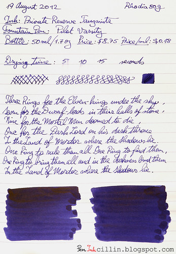
Happily, the drying times are short, between 5 and 10 seconds on photocopy paper and 10-15 seconds on Rhodia 80g.

Smearing when dry
None.

Water resistance
Though this ink isn't labelled as waterproof, it is surprisingly water resistant as can be seen from the sample which was exposed to running water for 1 minute. Notice that the text remains completely legible even though some of the color has washed off.

Conclusion
Private Reserve Tanzanite has been a pleasant introduction to PR's line of inks. I'll be sure to try others from the brand. I love the color and the general behavior and I especially appreciate the added bonus of water resistance. The latter does come at a price though. It makes the ink harder to clean than your garden variety watery ink. In all, I highly recommend this ink if purple is your color.

Finally, here are the two samples of Private Reserve Tanzanite on photocopy and Rhodia 80g paper, respectively.
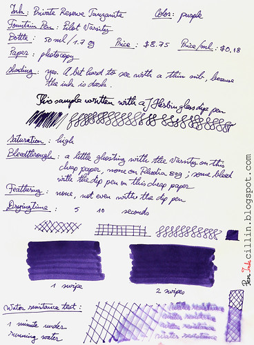
Private Reserve Tanzanite on photocopy

Private Reserve Tanzanite on Rhodia

Sunday, May 13, 2012

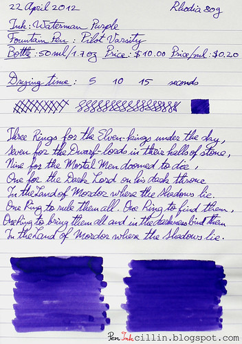
Waterman Purple ink review

For my second Waterman ink, after Waterman Havana Brown, I tested their Purple ink, which is now called Tender Purple. Tender, perhaps, because that's the shade of a particularly nasty bruise? Maybe. I bought a sample of this ink and tested it for two weeks (that's about how long a typical 2ml sample lasts me) in my trusty Pilot Varsity. To be honest, I was expecting more of this ink. I am slightly disappointed for some of the reasons detailed below.

Bottle
Waterman bottles hold 50ml (1.7oz) and cost $10 or $0.20 per milliliter. Well, it seems that along with the re-branding, Waterman also increased the price of their inks from what used to be $0.17 / ml. Either that or retailers are selling it for more.

Color and saturation
Waterman Purple's color can be best described as "pansy". It's not very saturated and depending on the paper, it can even look dull sometimes. It just doesn't have the punch I was expecting. On copy paper it tends to look better because more of it gets absorbed into the paper but not so much on Rhodia.

Shading
To tell the truth, I was hoping for some excellent shading like Havana has. Unfortunately, Waterman Purple seems to belong to a different family because there isn't much shading to speak of. There is some, but it's very faint, influenced perhaps by the blandness of the ink. From the samples you can see that the q-tip swabs do show some nice shading but unfortunately we don't normally write with q-tips. In a normal fountain pen I'm afraid you won't see much of that shading.

Feathering
None that I could discern.

Bleedthrough
There isn't much bleedthrough and certainly not on more expensive paper like the Rhodia 80g. On copy paper there's some slight ghosting depending on how hard you press with the nib.

Flow and lubrication
Waterman Purple felt a little bit dry. Not much, but it just didn't glide across the paper like Havana.

Drying time
Drying times were very good. On Rhodia it took 10-15 seconds to dry but on photocopy paper the ink was smudge-free in 5-10 seconds. That's not unexpected considering the average saturation and slight dryness.

Smearing when dry
None.

Water resistance
This is not a water resistant ink. Holding the sample for a minute under running water washed most of the ink off.

Conclusion
I was expecting more of Waterman Purple. I hoped for some interesting shading and more saturation. I also hoped for better flow. Unfortunately this ink left me unsatisfied. I am sure there are better purple inks out there and if you like a more vibrant color I can always recommend Noodler's North African Violet which is really beautiful but has the disadvantage of being tough to clean, not to mention that it can stain a pen real bad. I will keep looking for the perfect purple ink but in the meantime have a look at the two samples, on copy and Rhodia 80g paper, respectively.

Waterman Purple photocopy

Waterman Purple Rhodia 80g

Monday, February 13, 2012

Noodler's Kung Te-Cheng ink review

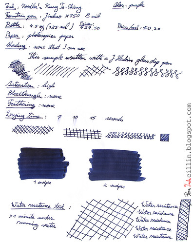
Noodler's Kung Te-Cheng is a very interesting ink. It is apparently reproduced from an ancient Chinese formula and it is meant to mimic the color of the inks used by Chinese emperors. If you ask me, I tend to agree that this color seems particularly royal. The ink itself is purple but it can trick you into thinking it is blue. It's in fact a purple-blue combination and, depending on how the light shines on it and the paper used, you could swear it's one or the other. I will classify it as purple because that is how it is designated.

Kung Te-Cheng is bulletproof which means it is resistant to a forger's chemicals and, more importantly, to water.

I tested Kung Te-Cheng in my Jinhao X750 with a broad nib.

Bottle
This ink only comes in 4.5oz (133ml) bottles, and it is rather pricy compared to other Noodler's inks. One bottle costs about $27.50 (or $0.20 per milliliter). On the other hand you do get some extra goodies with it, namely an eyedropper Platinum Preppy with an interchangeable ballpoint tip and also a brush pen.

Noodler's recommends that you use Kung Te-Cheng only with the provided pens and for good reason. You will see further on why.

Color and saturation
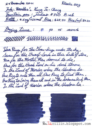
Kung Te-Cheng, as mentioned, is a mysterious blue-purple which seems to change its color depending on how you view it. Paper makes a difference and so does the light which shines on it. To me, it looks more purple on Rhodia than on photocopy paper. That's probably due to the fact that Rhodia absorbs less of it than photocopy paper.

Saturation is average to high. This is not a bright ink by all means but it is dark and opaque and it does stand out.

Shading
Noodler's Kung Te-Cheng doesn't show any shading to speak of, at least not when used with the broad nib of the Jinhao pen. With the q-tip it gets darker in places where the ink has the chance to pool up but I can't exactly call that shading.

Feathering
Kung Te-Cheng behaves very well in this respect. I haven't noticed any feathering, even on the cheap photocopier paper.

Bleedthrough
Surprisingly, bleedthrough is well contained, though if you press hard enough on the nib it will show through on cheap paper.

Flow and lubrication
Here's where some of Kung Te-Cheng's deficiencies start to show. I found that this ink is very dry flowing, especially in the Jinhao which is not exactly a champion of good flow. While I love the ink's other properties (color and water resistance), the fact that it felt as dry as sandpaper when writing with it helped to tone down some of my enthusiasm.

In addition I found that it tended to dry up in the pen and it also produced a fair amount of nib creep.

Drying time
Considering the above, it's not a big surprise that Noodler's Kung Te-Cheng dries quickly on Rhodia paper and even quicker on photocopy, within 10-15 seconds.

Smearing when dry
I haven't noticed any smearing but that's also helped by the fact that the ink is absorbed really well into the paper.

Water resistance
Needless to say, Noodler's Kung Te-Cheng is very resistant to water, in addition to other chemicals. After more than 1 minute under running water it remains rock-solid.

Conclusion
Noodler's Kung Te-Cheng is one of those classy inks that are quite beautiful to behold but still manage to be flawed. It can certainly be used in a business setting but in any case I would recommend a fountain pen which is very wet flowing, to compensate for its dryness. If strong chemical smell bothers you a lot you might also give Kung Te-Cheng a pass. While the chemical smell it emits is not overpowering, it is certainly there and it becomes evident when you start laying it down on paper. Water resistance is very often a good thing and in this aspect Kung Te-Cheng is a winner but this is offset by its tendency to dry inside pens and potentially ruin them in the very long run if you forget to clean them. I won't be buying a bottle of this ink but it is definitely worth to try at least a sample. I'm pretty sure that for art it shines, especially when used with a brush pen. Noodler's Kung Te-Cheng does a good job of capturing the mystery and nostalgia of Imperial China.

Following are the two samples I wrote on photocopy paper and Rhodia 80g, respectively.


Noodlers Kung Te-Cheng on photocopy

Noodlers Kung Te-Cheng on Rhodia

Monday, May 2, 2011

Noodler's North African Violet (V-Mail) ink review

Noodler's North African Violet is a V-Mail series ink and it is, of course, purple. V-Mail inks are a collection of inks from Noodler's, with "vintage qualities" though I'm a bit unclear as to what that means exactly. All I know is that the term "V-Mail", which stands for Victory Mail, was used during World War II.

I did not buy an entire bottle of North African Violet because I just wanted to give this ink a try first. Besides, I'm not big on purple ink. So I got a sample from Goulet Pens. A sample is the perfect size for such a review.

Noodlers North African Violet

I tested North African Violet in my Noodler's piston filler fountain pen, which I only considered fitting seeing that they are from the same brand.

From what I had seen in other reviews, North African Violet is a lovely purple and I wasn't disappointed. Truth be told, I was also attracted by the "V-Mail" label and was curious to see what vintage characteristics this ink exhibits. Since I'm not an ink expert, I can tell you right away that I have no idea how a vintage ink is supposed to look or behave.

This was the first (and only) purple ink I tested so far and it was a good one. It has a deep, rich tone, though it is relatively flat without much shading. The color makes me think of dark grapes but that's maybe not accurate. What's certain is that it is very saturated and I like that in an ink. I'm sure it could be diluted with water to a great extent and it would still write strong.

One thing that I found very curious is that I couldn't get a good photo of Noodler's North African Violet. That's very strange indeed because usually when I shoot inks, the resulting photo is at least similar to the actual ink. In this case however, instead of violet, every single photo turned out blue, not matter how I adjusted the exposure or the white balance. In the end I had to adjust all the photos manually from software to get the color to look close to the original. As a result, the samples shown here may not be 100% accurate.

The ink flowed well in the Noodler's pen but it did tend to dry up, though I think that's more of a flaw of the fountain pen.

Drying times are moderate but it depends on the type of paper used. Higher quality paper almost always gives a longer drying time as you can see from the Rhodia which took ages to dry.

A great characteristic of this ink, which I wasn't expecting, is the good water resistance. As you can see from the sample written on photocopier paper, Noodler's North African Violet is almost waterproof. Some of it does wash off but I'm sure that's just the layer which hasn't bonded well with the cellulose.

Unfortunately there's also a "dark side" to North African Violet. It likes to stain fountain pens and it stains them really well. At least that is what happened to my Noodler's piston filler. I admit that part of the blame lies with me because I left the ink a long time in the pen without using it, until it dried up. But when I tried to clean the pen (which is a clear demonstrator), I couldn't. It remained stained purple. And, as you will see in a future article, I ended up destroying my Noodler's pen as a result.

To wrap up this review, if I were to buy a whole bottle of purple ink, Noodler's North African Violet would be it. I absolutely adore the color, saturation and richness of this ink. Its water resistance is a very pleasant bonus and something that I find desirable in a good ink. The only disadvantage to North African Violet is its staining capabilities. This means that I don't recommend it for use in clear demonstrators. Instead, dedicate a pen only to this ink, or use a fountain pen which doesn't show the ink reserve, or use the ink to refill a cartridge.

Here are the two samples on plain photocopier paper and Rhodia 80g paper.

Noodlers North African Violet on photocopier paper

Noodlers North African Violet on Rhodia