Merry Christmas and Happy Holidays folks!
This is my last ink review for this year and I decided to post it on Christmas day, at the risk of no one reading it. But Noodler's Air Corp Blue Black is a rather special and quirky ink so it's probably fitting. Don't get me wrong, I really like this ink, but for reasons that you will read about shortly, I find it a bit strange.
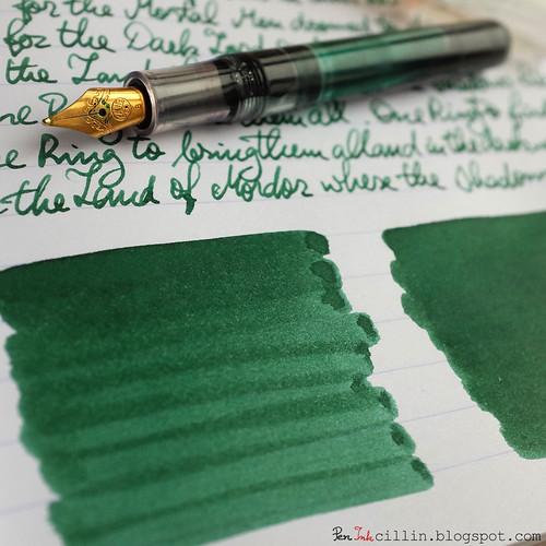
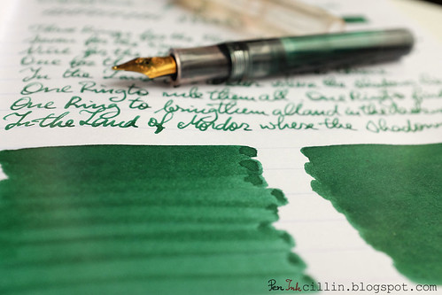
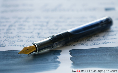
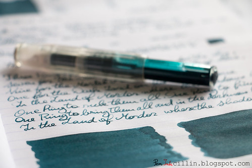
I tested a sample of it in my Pilot Vanishing Point with broad nib.
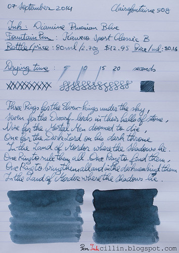
Bottle and pricing
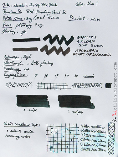
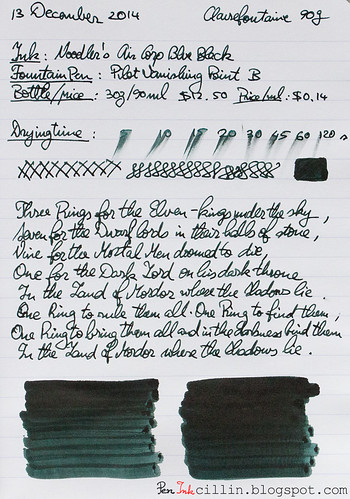
Bottle capacity: 3 oz / 90 mlPrice: $12.50
Price / ml: $0.14
Color and saturation
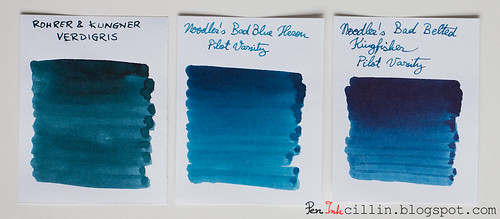
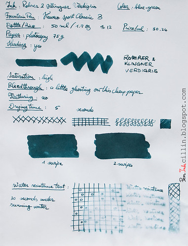
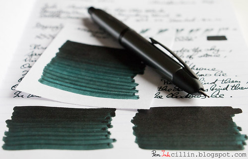
The wackiness of Noodler's Air Corp Blue Black comes into play as soon as you start laying it on paper. Blue black you say? More like green black. You see, there's no blue whatsoever in it. It is very dark (almost black) and saturated but the only hint of another color that you will see is green. A dark, coppery green at that. You can even call it "verdigris".Shading
Look closely at Noodler's Air Corp's Blue Black and you'll notice the green undertones. Does it also shade? Yes, to an extent, but being so dark it's hard to see.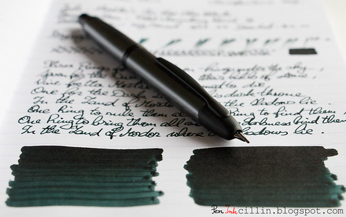
Feathering
None.Bleedthrough
Well, this is a very dark ink and as a result it ghosts a little on cheap paper but even that is surprisingly well controlled. I would have expected a lot more show-through, to be honest.Flow, lubrication, and smoothness
What I love about Air Corp Blue Black is how well it flows in the Vanishing Point, as well as how wet it is. Compared to a few other inks which passed through this pen, this one is a revelation. On the other hand, some might find it a bit too wet. I would give it a 9-9.5/10 for wetness. To me it feels wonderful. It starts right away and flows like silk through that broad nib.Drying time
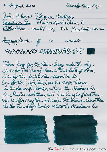
Unfortunately this is one of the longest drying inks I've tested. A very wet, dark ink can sometimes take its sweet time to dry and this one does it too, and then some. On Clairefontaine 90g (high quality paper) it wasn't completely dry even after 2 minutes. Even on cheap paper it needs about 30 seconds or so before it becomes safe to touch. I, for one, am willing to put up with this aspect, because the rest of it is so good.Smearing when dry
Somewhat. I've noticed that it does smear a little on Clairefontaine, even after it has dried for days. I used this ink to jot a few entries in my journal and accidentally touched some of the older text with my hand, causing it to smear. It's not a big issue, as long as you're careful, but I'd rather it didn't behave like this.Water resistance
If you thought by this point Noodler's Air Corp Blue Black ran out of surprises, you'd be wrong. First of all, this ink is billed as water resistant. As you can see from the photocopy sample, it remains completely legible after being exposed to running water for 1 minute. However, this is where the fun begins. Notice how some of it has run off? Well, that component is the very definition of blue. Yes folks, here's where the "Blue" in Blue Black was hiding.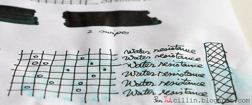
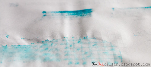
Not only that, but looking at the reverse of the page, where the ink bled through (through heavy application of the q-tip), once again you'll be presented with the blue component in all its glory. Pretty cool, but I believe it still doesn't justify the Blue Black moniker.
Conclusion
Noodler's Air Corp Blue Black is one of the most interesting inks I've tested, though a bit quirky. I love about it its dark color with green accents, the smoothness and wetness, and the water resistance. I'm not a big fan of how long it takes to dry and the risk of smearing. Having said that, I would still warmly recommend it. Most of its downsides can be easily bypassed by using lower quality paper, so if that's what you are using most of the time, you'll be fine. If a true blue-black ink is what you are going for, I'm afraid this isn't it, but have you considered green-black?Following are the two samples on photocopy and Clairefontaine 90g paper, respectively.