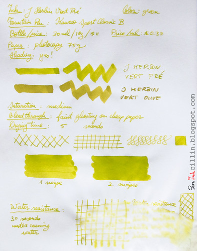
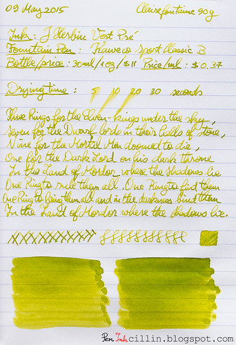
Bottle and pricing
Bottle capacity: 30 ml / 1 ozPrice: $11
Price / ml: $0.37
Color and saturation
I'll say this from the get-go: Vert Pre is a type of green very similar to the other J Herbin green ink I reviewed (of which I own a bottle), Vert Olive. The only major difference between them is that Vert Pre is slightly less saturated and lighter than Vert Olive. Otherwise, all features apply to both equally. At this point I could just call it a day and refer you to the Vert Olive review but I'll keep going.The best way to tell the difference between the two is to imagine Vert Pre as lime green, and Vert Olive as olive green (as the name actually translates).
Below is a better comparison between the two inks, as well as Rohrer & Klingner Alt-Goldgrun, which is somewhat similar to the two, only darker and avocado-ish.
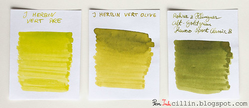
Whichever variation you prefer, J Herbin Vert Pre remains in good company and is a beautiful ink on its own.
Shading
J Herbin Vert Pre features very nice shading, almost on par with Vert Olive. It's probably less only due to the fact that it's lighter in color. To benefit the most from the shading I would recommend a broader nib, but only on good, fountain pen-friendly paper.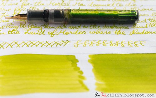
Feathering
Unfortunately I forgot to mention feathering in my copy paper written review, but here it goes. Vert Pre is a wet, watery ink and because of that it feathers a fair amount on cheap paper. It can't be helped, but in this respect it behaves very similarly to Vert Olive, as well as a couple of other J Herbin inks that I didn't particularly enjoy: Diabolo Menthe and Bleu Azur. If you don't use this on cheap paper you'll be fine though, because this is definitely a non-issue on good stuff, such as Clairefontaine or Rhodia.Bleedthrough
Linked to the above point, being a wet and watery ink, J Herbin Vert Pre will bleed on very cheap paper, especially if both sides are written. In my copy paper review I stated that it only ghosts a little. This is true on the condition that you only use one side of the paper. As soon as you start writing on the reverse, though, things change. The cheap paper acts as a saturated sponge and spreads the ink throughout the fibers, causing it to both feather and bleed significantly.Flow, lubrication, and smoothness
J Herbin Vert Pre flows really well - flawlessly in fact - through the Kaweco's broad nib. Apart from that, it bears stressing once again that this ink is pretty wet.Drying time
Drying happens quickly - almost instantly - on cheap paper. On good paper the situation is reversed, and it usually takes around 30 seconds for it to dry completely, accounting of course for the broad nib.Smearing when dry
None.Water resistance
As is the case with all the inks in this "series", J Herbin Vert Pre is completely non-water resistant. Keep it far away from any form of moisture.Conclusion
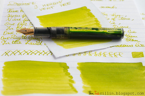
J Herbin Vert Pre is another hit in J Herbin's "hit & miss series". OK, I made this up but you know what I mean: I didn't enjoy the light blue inks in the family but I adore the greens. It's a gorgeous ink with a unique color and great shading, which flows well and performs nicely on good paper. The only caveat is that I wouldn't recommend it for cheap paper, at least not with a broad nib. Should you buy it? A resolute yes! The only question remains: this or Vert Olive? Personally I'd still pick Vert Olive by a slim margin.Following are the two handwritten reviews, on photocopy and Clairefontaine 90g paper, respectively.

Another great review. I have the Vert Olive and really like it. Based on your review, if I had neither ink but was in the market for one of them, I'd still choose Vert Olive. Because it is slightly darker I feel it gives off a bit more character.
ReplyDeleteIndeed, it's interesting how J Herbin made these two inks to look so similar. Just like you said, Olive has that little bit of extra character that pushes it to the front, albeit by a small margin.
ReplyDeleteGreat review (and pics)! Add me to the Vert Olive list though - it's just a little more intense. This one looks pretty good in a juicy flex pen though :)
ReplyDeleteHey thanks! It should be a great ink for a flex pen... however, I'm worried about feathering. You'd need really really good paper to prevent it from feathering.
ReplyDeleteGreat review! I love this color :)
ReplyDeleteI have a bottle of this stuff. Its my least favorite ink. I use it when smoothing a nib, but have little use for it as a regular writing ink. That said, I do not own any B or BB nibs. In a F or M nib, there's not enough ink on the paper, making it a challenge to read. I find it too light for daily use in any of my pens. Dunno if that's a Herbin thing or just this color. Too watered down for me.
ReplyDeleteGood point, it is indeed light. I haven't used it in anything less than a broad, but I would guess it's very faint especially on absorbent paper.
ReplyDeleteI like your review however I believe the sample might've been misplaced/mislabelled. The Vert Pre I had in the bottle is nowwhere near this color - it's intense joyful green.
ReplyDeleteThanks! It's hard to get the color right after photographing and processing, not to mention each person's display. I doubt it was mislabeled, however it sat for a long time so there's a possibility that some of its properties changed.
ReplyDelete