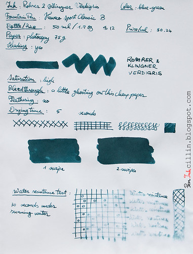
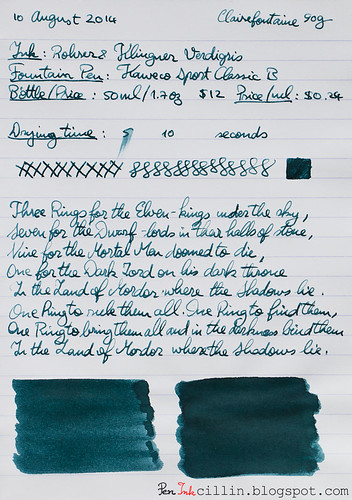
Bottle and pricing
A bottle of Rohrer & Klingner Verdigris holds 50ml / 1.7oz and retails for $12. That's $0.24 per milliliter, quite pricy.Color and saturation
I've barely started this review and I have already arrived at the crux of why I don't like this ink. It's not the only reason, but I dislike the color. While it's considered a blue ink, there's not a lot of blue in it, I'm afraid. It veers more towards green, but the greenish shade of copper oxide, which, in fact, is where the term "verdigris" comes from. Either way, my eyes just can't see any blue in this ink.To compound the problem, under fluorescent light R & K Verdigris looks like a dirty, dull gray. I've been using it daily at work over the past couple of weeks, under such lighting, and that's how it is.
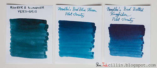
I've compared it to two of the only inks I've tested which bear a passing resemblance to it: Noodler's Bad Blue Heron and Noodler's Bad Belted Kingfisher. You can clearly tell which inks are blue and which isn't.
As far as saturation goes, it's pretty high.
Shading
To be fair, Rohrer & Klingner Verdigris redeems itself just a little by showing some decent (but not outstanding) shading. It's best seen in the q-tip samples but also a bit in the writing samples, although the latter suffer from another problem which I'm going to mention shortly.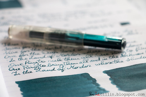
Feathering
None.Bleedthrough
It ghosts a little on cheap paper and the reverse side remains writable, though barely so.Flow, lubrication, and smoothness
Here's the second (and perhaps biggest) reason why I dislike Rohrer & Klingner Verdigris. Just like it's brand-mate Fernambuk, Verdigris is a dry ink. It flows poorly in the Kaweco, and also inconsistently. You can see that in my writing samples. Some lines are thick and wet, others thin and dry. In my book that's a big no-no.Drying time
Thanks to its dryness, Rohrer & Klingner Verdigris dries very quickly, even on smooth Clairefontaine paper. Small comfort though.Smearing when dry
None.Water resistance
This is not a water resistant ink. After 30 seconds under running water most of it has washed off.Conclusion
There's nothing positive I can say about Rohrer & Klingner Verdigris. There must have been a reason that determined me to buy a sample but I can't think of it for the life of me. Perhaps it looked better in other samples I saw online. In person, the color doesn't appeal to me (though I'm sure plenty of folk will love it) and the dryness and inconsistent flow are deal-breakers. I'd say buy it - only if you dare.Here are the two writing samples on photocopy and Clairefontaine 90g paper, respectively.

It reminds me somewhat of a darker Blue Suede (Private Reserve.) I love the shading, and I'm happy that you chose to use a broad nib to show this. Thanks.
ReplyDeleteLooks like I'll be using broad nibs from now on for my reviews. They just bring out the properties of the inks more.
ReplyDeleteAh, I See what you mean about inconsistency (the last photo). That is a bummer. I know that sometimes inks will act funny in different pens. I am just curious - and it is just a thought - but could it be an issue of the pen? I am not familiar with Kaweco, so you probably have a better Idea than me.
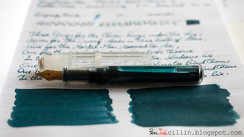
ReplyDeleteYou captured me with the first picture. That eyedropper O.O
ReplyDeleteOkay, but I also happen to be a huge fan of this ink. Lovely review!
I didn't know that this shade existed until I read your review. I had been looking for something similar, but the closest I could get is Private Reserve's Blue Suede (which I love.) However, I wanted something deeper so I mixed some of the Blue Suede with just a couple of drops of Private Reserve's DC Supershow Blue and I am really pleased with the result. I love broad nibs, and I use the Kaweco Double Broad, which really shows off the colour and shading nicely. Thanks for your review.
ReplyDeleteHi PenInkcillin. Based on your photos, the color reminds me somewhat of Diamine Eau de Nil, a color I am particularly fond of. However, that is about the only good thing I have to say about Rohrer & Klinger inks. At one point in the Goulet Ink Drop, the Goulets decided to send out a sample of every R&K color over a few months. I disliked the properties of just about all of them, and for pretty much the reasons you describe here in your review. I own quite a few bottles of ink but none are R&K. Right now, the only other brand I dislike pretty much across the board, based on performance, is De Atramentis. Both of these brands have large followings so, as always, it is a case of YMMV (Your Mileage May Vary). What pleases one person may not please another.
ReplyDeleteThanks, again, for your reviews as I always look for them on your blog. :-)
How would you compare Private Reserve to Rohrer & Klingner when it comes to a "dry ink"?
ReplyDeleteJust bear in mind that there's a lot of green in this ink. Frankly to me it looks more green than blue. It also changes color depending on the light.
ReplyDeleteGood question. Truth be told, the Kaweco isn't the wettest flowing pen but neither is it dry. I've been using it for a lot of my reviews and other inks behaved significantly different from this one.
ReplyDeleteHaha glad you liked it! That's what I like about eyedroppers, you can really show off the color of the liquid inside.
ReplyDeleteThanks Freddy! I've only tested one De Atramentis ink so far http://peninkcillin.blogspot.com/2014/07/de-atramentis-black-green-ink-review.html and while I wasn't ecstatic about the color, it flowed well enough. I prefer wetter inks though, so I wouldn't put that one in the wet category either.
ReplyDeleteOut of the 3 PR inks I tested, they flowed better than R&K if I recall correctly. Of course, I need to test more of them to be sure. Thing is, from what I've seen so far, not all inks from a brand behave the same. Some brands are more consistent in terms of flow and wetness (Diamine), while others are all over the place (Noodler's). In Noodler's case, that's to be expected, because the inks have wildly varying properties.
ReplyDeleteOh I'm sure a lot of people like the ink. In fact, if it looked like in the glamor pictures above, I wouldn't mind it either. In normal use it looks a bit dull to me.
ReplyDeleteAs for the wetness, I wouldn't be surprised if it flowed well in a high-end pen like the Pilot 823. The poor Kaweco can only do so much :) I'm guessing if I put this in my most expensive pen (Pilot VP), it would perform better.
Hello - thanks for the review! This is one of my off-and on inks: sometimes I like the color, sometimes not; it's nearly a twin to Diamine "Twilight", by the way (so avoid that one, if you don't like "Verdigris"). Regarding your problems with flow, I am wondering if you ended up with a contaminated sample. My batch of Verdigris flows flawlessly from a number of Lamy (L2k), Pilot (Metro) and TWSBI (580, Vac 700) pens and is actually too wet for my Pelikan M400!
ReplyDeletealso: great pics!
ReplyDeleteThanks Peter! You might be right about the contaminated sample. I mean, perhaps not as extreme as "contaminated" but more like variation in ink batches. That's certainly possible. Luckily I'm not very attracted by the color either, so the flow issue isn't the only thing that keeps me away from it.
ReplyDelete