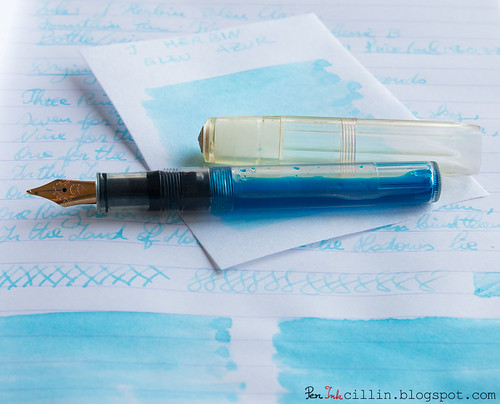
I popped the sample of J Herbin Bleu Azur in my Kaweco Sport Classic with broad nib and eyedropper conversion and away I went...
Bottle and pricing
Bottle capacity: 30 ml / 1 ozPrice: $11
Price / ml: $0.37
Quick note here. J Herbin bottles are small and cost a pretty penny, as you can see. Generally the inks are double the cost of brands such as Noodler's and Diamine, and I'm sorry to say that I don't find the value in some of them.
Color and saturation
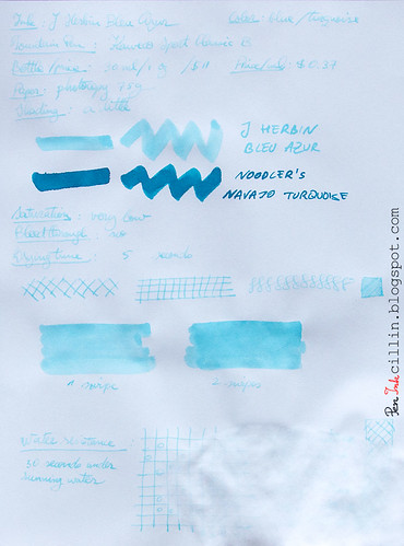
Here's where J Herbin Bleu Azur fails right off the bat for me. It is an extremely light and watery shade of baby blue, with very, very low saturation. I don't see how this ink can be used in day-to-day writing, and I'm sure that the thinner the nib the more faded it looks.In the photocopy sample (at the end of the review) I compared it to Noodler's Navajo Turquoise, even though these two inks have nothing in common, but it's the closest ink I had a bottle of. Notice how much darker Navajo Turquoise is.
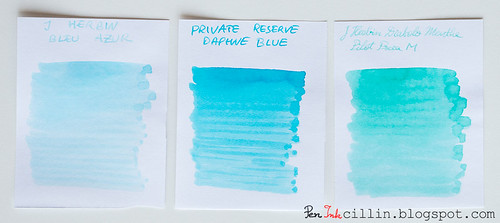
A much better comparison is the one just below. Put J Herbin Bleu Azur next to two other light colored blue/turquoise inks, Private Reserve Daphne Blue and J Herbin Diabolo Menthe, and you'll see how Bleu Azur is still lighter than both. And I didn't even like Diabolo Menthe back when I reviewed it, for similar reasons.
In fairness, some people have seen some success with using Bleu Azur as a highlighter ink. I can almost see how that might work.
Shading
As much as I'd like to bash J Herbin Bleu Azur even more than I already have, I will admit that it has a little shading, though insignificant, and unlikely to show unless using a thicker nib or perhaps employing it for highlighter duty.Feathering
NoBleedthrough
No. It's too light to show through and it has basically zero penetration power.Flow, lubrication, and smoothness
I can't say I was impressed by how J Herbin Bleu Azur flowed. Watery inks sometimes feel - paradoxically - dry, as is the case here. As a result, it wasn't much pleasure to write with.Drying time
As expected, drying times were quite short, even on Clairefontaine 90g paper.Smearing when dry
None.Water resistance
Water resistance, as can be seen in the photocopy sample below, is nil, perhaps even negative. Totally expected though, so I won't knock any points off for this.Conclusion
What more is there to say about J Herbin Bleu Azur that I haven't already? I'm afraid there's nothing here that would make me recommend this ink, unless you're heavily into highlighting stuff in light baby blue. Even if you love such a light, faded blue, you might find better success, at a much lower price, by diluting another blue ink with water. Caveat emptor.Epilogue
I don't usually do an epilogue to my reviews. In fact this is the first epilogue ever.Being dissatisfied with J Herbin Bleu Azur, I thought I might improve it by mixing it with another ink. So I added a couple of drops of Noodler's Nikita and hoped for the best. It's usually not advisable to mix different inks in this manner so it wasn't much of a surprise that the result was yet another watery and vile concoction, of the violet persuasion. It proved worse than the original ink and I ended up dumping the whole thing in the sink. Thus I didn't get to use Bleu Azur in the real world, outside the confines of this review. Good riddance.
Following are the two samples on photocopy and Clairefontaine 90g paper, respectively.


This has to be the lightest color ink you have ever reviewed. Based on what you are showing here, I can see why you are not crazy about it (to say the least).
ReplyDeleteDefinitely the lightest. Even Gris Nuage was better than this http://peninkcillin.blogspot.com/2011/10/j-herbin-gris-nuage-ink-review.html though it's also J Herbin.
ReplyDeleteGreat review and an educational "cautionary tale" of sorts, thank you!
ReplyDeleteI agree with you, it looks too faint to be practical for everyday use or for work. I would think that nobody would want their readers (or themselves) to have to squint to see what has been written.
Thanks! I guess if you want to use it as highlighter ink it might work.
ReplyDeleteTrue, hadn't considered that possibility either. Thanks again!
ReplyDelete