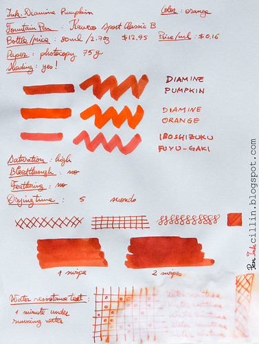
Tuesday, March 31, 2015

Private Reserve Daphne Blue ink review

I haven't reviewed a bright blue ink in, like, forever, so I was almost taken aback to realize that I actually had some Private Reserve Daphne Blue among my samples. Here it goes then: PR Daphne Blue reviewed in the Kaweco Sport Classic with broad nib and eyedropper conversion.

Private Reserve Daphne Blue shading

Bottle and pricing

Bottle capacity: 66 ml / 2.2 oz
Price: $11
Price / ml: $0.17

Color and saturation

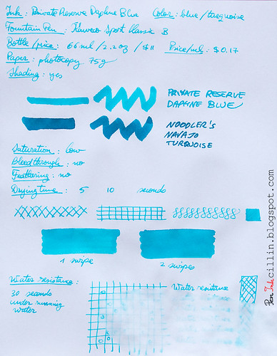
Private Reserve tries to be cute with the name "Daphne Blue" and I'd say it succeeds because this ink is light blue, bright and cheerful as a warm summer day. You could just as easily call it cerulean/sky blue, or baby blue. Or a light shade of turquoise. It fits all these descriptions.

Private Reserve Daphne Blue shading

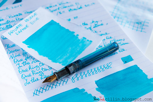
To get an even better idea, here it is next to two similar inks: J Herbin Diabolo Menthe and Noodler's Navajo Turquoise.

Private Reserve Daphne Blue vs J Herbin Diabolo Menthe vs Noodler's Navajo Turquoise

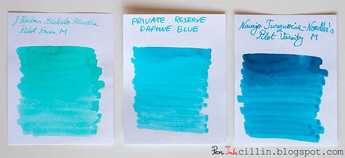
What's immediately obvious from this comparison is that Diabolo Menthe leans towards green, while Navajo Turquoise is a darker shade of turquoise than Daphne Blue.

Shading

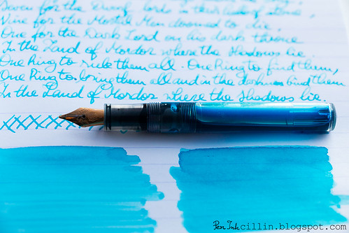
Whenever an ink shows color variation I'm a happy camper. Light inks sometimes don't do that, but Daphne Blue shades nicely. Of course, the broad nib brings this better into perspective.

Private Reserve Daphne Blue text

Feathering

I haven't noticed any.

Bleedthrough

No, although a broad nib on cheap, spongy paper tends to at least produce some ghosting. Luckily this is pretty well controlled in this case due to the lightness of the ink.

Flow, lubrication, and smoothness

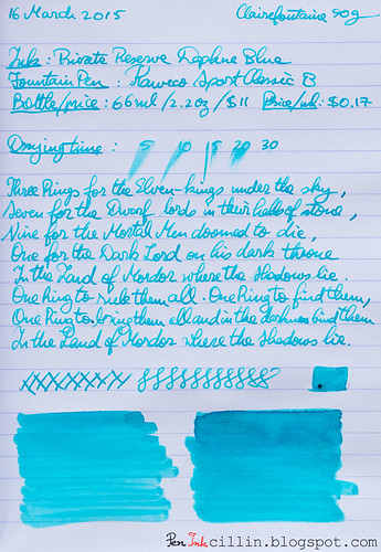
While it flows very well in the Kaweco, I noticed a tiny amount of dryness, but it's hard to pinpoint. I could chalk it to "measured flow" and I wouldn't be half wrong. So it flows very satisfactorily and it's smooth to boot.

Drying time

Nothing out of the ordinary here. As expected, it takes its sweet time on good paper, up to 30 seconds or so (especially with the broad nib). On cheap paper it dries in a few seconds.

Smearing when dry

None.

Water resistance

Water resistance is exactly as I was expecting, despite knowing nothing about this ink prior to testing it. It's non-existent. You can see from the bottom (copy paper) sample how it reacted to only 30 seconds under water.

Conclusion

Private Reserve Daphne Blue has all the markings of a great ink, provided you're on board with the baby blue color. It's very well behaved on all fronts, with the exception of water resistance but that wasn't an advertised feature in any case. If you like turquoise inks, there's nothing that would prevent me from recommending it, with the caveat that it might be a bit light for certain uses. Otherwise, a solid ink.

Private Reserve Daphne Blue shading

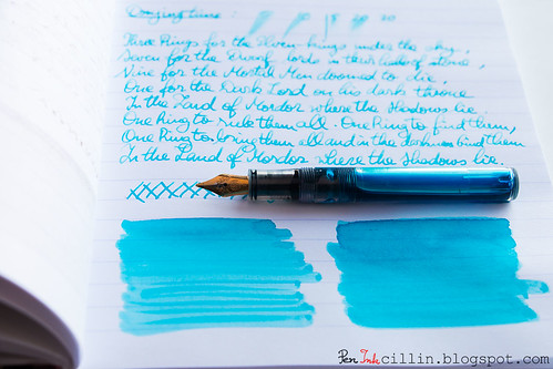
Following are the two samples on photocopy and Clairefontaine 90g paper, respectively.

Private Reserve Daphne Blue on photocopy

Private Reserve Daphne Blue on Clairefontaine

Wednesday, March 18, 2015

Noodler's Mandalay Maroon (V-Mail) ink review

Noodler's Mandalay Maroon is one of those inks that I wanted to test for a while and its time has finally come. Two things attracted me to this ink: the exotic name, and the color burgundy. It is also a V-Mail ink, resembling vintage inks to some extent. Along with this label, water resistance comes standard but this will be discussed in more detail below.

I tested a sample of Mandalay Maroon in my Pilot Vanishing Point with broad nib.

Bottle and pricing

Bottle capacity: 3 oz / 90 ml
Price: $12.50
Price / ml: $0.14

Color and saturation

Noodler's Mandalay Maroon is a burgundy/maroon/reddish-brown ink with average saturation. It bears a passing resemblance to other inks I have tested but for the most part it has a unique color.

Noodler's Mandalay Maroon detail

Below, I compared it to a few other burgundy inks: Diamine Syrah, Noodler's Black Swan in English Roses, and Sailor Jentle Grenade. I believe you'll agree with me when I say that Mandalay Maroon is the least attractive ink in this lineup.

Noodler's Mandalay Maroon vs Syrah vs BSER vs Jentle Grenade

Shading

Sadly, Mandalay Maroon is completely flat, without any kind of shading or color variation. This is clearly evident from the 4-ink comparison above.

Noodler's Mandalay Maroon detail

Feathering

I'll admit I was a bit surprised that Mandalay Maroon doesn't feather even on cheap paper. For some reason I was expecting it to, especially since it really likes to seep into the paper. It's one of those deeply penetrating inks, similar to what you might find in alcohol-based markers.

Bleedthrough

Bleeding is high on cheap paper, to the extent that the reverse side will be mostly unusable. The situation on Clairefontaine 90g is improved but there's plenty of ghosting and even bleeding where the nib presses hard. This, of course, is based on my tests done with a broad nib. If you want to use this ink I'd recommend a medium nib or thinner. I'm sure those won't produce the same sort of bleeding.

Flow, lubrication, and smoothness

One thing that Noodler's Mandalay Maroon has going for itself is that it feels very smooth and flows well through the Pilot VP's broad nib. It's also pretty wet, which is probably what causes the bleed through.

Drying time

You would expect a wet ink in a broad nib to take ages to dry on good paper such as the Clairefontaine I used for one of the tests. Once again I was surprised by how quickly it dried. 5 seconds on this paper is incredible. This is easily explained by what I mentioned previously: this ink penetrates the paper like a drop of water on a dry sponge.

Smearing when dry

None.

Water resistance

Water resistance is one of the main features of Noodler's Mandalay Maroon. It didn't disappoint in my standard water test whereupon I held the sample under flowing water for 1 minute. OK, it wasn't completely watertight, and a tiny little bit of pink dye can be seen spreading out like capillaries from the edges of the lines, but the text and drawings remain perfectly intact.

Conclusion

Noodler's Mandalay Maroon is a quirky ink, quite interesting in some aspects (water resistance and drying speed) but dull in others (color/shading and bleed). To my eye it is not very attractive, especially in comparison to other burgundy inks. As such, I wouldn't buy a whole bottle but I know that lots of folks love it, so if Mandalay Maroon catches your fancy don't be detracted by my purely subjective opinion.

Noodler's Mandalay Maroon detail

Below are the two samples on photocopy and Clairefontaine 90g, respectively.

Noodler's Mandalay Maroon on photocopy

Noodler's Mandalay Maroon on Clairefontaine

Tuesday, March 10, 2015

Diamine Pumpkin ink review

Diamine Pumpkin is yet another orange ink from Diamine. How does it measure up to other orange inks? Does it shade? Is it worth picking up? Why Pumpkin over other inks? Pumpkins in March? All these, and more, will be answered shortly.

But first, a short reminder that I tested this ink in my Kaweco Sport Classic with broad nib and eyedropper conversion.

Diamine Pumpkin shading with Kaweco

Bottle and pricing

Bottle capacity: 80 ml / 2.7 oz
Price: $12.95
Price / ml: $0.16

Color and saturation

Diamine Pumpkin is, once again, an orange ink. It is bright and very saturated, though not the cheeriest of oranges. It's not a pure orange, as Diamine Orange is (see comparison in the copy paper writing sample at the bottom), but a bit dirty. It's very pumpkinish in fact, and I find the name very appropriate for once.

Diamine Pumpkin shading

To get a better idea of the exact shade of orange Pumpkin exhibits, I'm illustrating this via a comparison with a couple of other orange inks I've tested: Sailor Jentle Apricot and Noodler's Dragon's Napalm (as well as Iroshizuku Fuyu-Gaki in the photocopy paper sample at the bottom).

Diamine Pumpkin vs Sailor Jentle Apricot vs Noodler's Dragon's Napalm

When placed side by side like this I actually find Pumpkin to be more fiery and expressive than both these inks, though each is beautiful in its own way.

Shading

Some inks are completely flat, as is the case with Diamine Orange, but Diamine Pumpkin is not. It shades very nicely, and that gives it a lot more character than its purer sibling. It's very easy to obtain darker patches of fiery orange and almost-red on top of lighter shades of orange. In writing, the shading is obviously more easily discerned with a broad nib, as is the case here.

Diamine Pumpkin shading

Feathering

None.

Bleedthrough

None.

Flow, lubrication, and smoothness

I can't complain here: Diamine Pumpkin flows very well in the Kaweco Sport and is appropriately wet. It's not the wettest ink out there and your experience may certainly differ if you are using a medium nib or thinner.

Drying time

On cheap paper (photocopy), Diamine Pumpkin dries almost instantly, but this time is considerably lengthened on Clairefontaine 90g, dependent, of course, on the nib. I'm assuming it would take less than 30 seconds to dry with a thinner nib.

Smearing when dry

None

Water resistance

Diamine Pumpkin is not water resistant but after being exposed for 1 minute to running water some faint traces remain. This component seems to be pink in color.

Conclusion

I am suitably impressed by Diamine Pumpkin. I was expecting this to be a plain ol' orange ink but it has more character than more reputable inks (whether that reputation is well-earned or not). What I like most about Diamine Pumpkin is that it's not just a generic orange, but instead has that "dirty" look (while staying bright and saturated) which gives so much justice to its name. And then the beautiful shading only helps to make it better. I would urge you to try Diamine Pumpkin. If you like orange inks, I'm betting you'll love it too.

Diamine Pumpkin shading

Following are the two writing samples on photocopy and Clairefontaine 90g paper, respectively.

Diamine Pumpkin on photocopy

Diamine Pumpkin on Clairefontaine