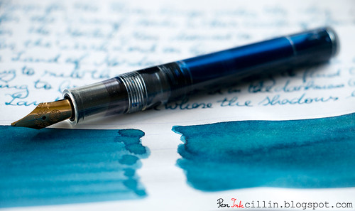
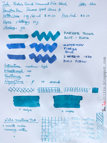
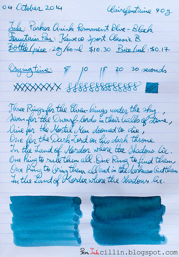
Saying that Parker doesn't have a wide range of inks is a bit of an understatement. Currently it seems that it only sells 3: a black and two blues. I bought a sample of Blue Black a long time ago - and its time to be tested finally came. I loaded it in my Kaweco Sport Classic with broad nib and eyedropper conversion.
Bottle and pricing
Bottle capacity: 60 ml / 2 ozPrice: $10.30
Price / ml: $0.17
Color and saturation
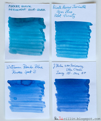
The "Blue Black" in the name is somewhat of a misnomer, because this ink veers more towards turquoise than black. Depending on the light, you can catch faint hints of green in it. It's not very saturated or vibrant, being rather dull. It also changes color as it dries. Wet, it looks more like a true blue, but once it dries it acquires the green/turquoise tint. I don't know why they call it "Blue Black" either, unless the "black" refers to its dullness.I made a comparison with 3 other blue inks: Private Reserve Invincible Aqua Blue, Waterman Florida Blue, and J Herbin 1670 Anniversary Bleu Ocean. As you can see, the Waterman and J Herbin inks are the "truest" blues of the bunch, while the PR ink is most similar to Parker Blue Black, but even PR Aqua Blue is more neutral than the Parker ink.
Shading
Parker Quink Blue Black has a little shading going on, thankfully. It's not much, but a broad nib will bring it out, as will a wide stroke with a q-tip.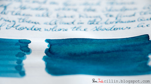
In the right light you might even notice some sheen, which is always nice to have, but probably won't be evident in normal use.
Feathering
None.Bleedthrough
Insignificant.Flow, lubrication, and smoothness
I'm pleased that Parker Quink Blue Black flows very well, perhaps a bit wet. It runs nicely in the Kaweco.Drying time
The drying time is lengthy on Clairefontaine 90g paper, but I think the broad nib is at fault here. It's much quicker on cheap copy paper.Smearing when dry
None.Water resistance
Here's the thing. Parker Quink Permanent Blue Black has the word "permanent" in its full name. That would imply at least a modicum of water resistance. Even the official specs say that it is water resistant. If so, why did it perform a lot worse in my water resistance test than Diamine Prussian Blue, an ink which is definitely not water resistant? This ink has no water resistance whatsoever, I'm sorry to say.Conclusion
I'm afraid that I can't recommend Parker Quink Permanent Blue Black because there's nothing that makes it better than other blue inks. I suppose you could go for it if you're adamant about using Parker inks in Parker fountain pens but even then there are much better options and besides, this thing about using the same brand of pen and ink is mostly myth. The color doesn't sing to me either, although, to be fair, it has some decent shading in the right light. It also looks to me like Parker is doing some false advertising (unless my sample was from a bad batch) in regards to the water resistance of this ink. Final verdict: thumbs down.Here are the two sample on photocopy paper and Clairefontaine 90g, respectively.

Dude, no way can that ink be considered blue-black. It's more turquoise than anything else! I discovered Diamine Prussian Blue before your great review, and as I commented on that post, I'll stick with that. I wish Parker would stop trying to be so "trendy" and not just with inks but with pens and re-issue the heavy Parker "51." My grandfather has one he's been using for at least fifty years for writing prescriptions. I tried it and loved it, although the nib has "worn" into his hand position. Oh, and now he uses Diamine Prussian Blue as well!
ReplyDeleteAn excellent review. I have enough blue inks that it will be easy to give this one a pass. While the name of this ink is an old standby, I wonder how many reformulations it has been through, where it is made, and what the current quality control is like. Something tells me that except for the name, the current Parker Permanent Blue Black has little relationship to the current production.
ReplyDeleteHow does one become an invited viewer of "The Purple Penhead" blog?
ReplyDeleteHaha, yeah, I don't know how they come up with these color names. It's more of a dull turquoise. The water resistance thing bothers me the most. Glad you liked my Prussian Blue review!
ReplyDeleteWow, I just noticed that. I have no idea! I guess they didn't set it up properly because who would want to keep people away from reading their blog?
ReplyDeleteThanks! To be honest I feel like I've reviewed too many blue inks and it's time to switch to something else. My samples are dwindling but the next review should be more exciting (at least for me).
ReplyDeleteThis used to be one of my 'staple inks', back in the 80s - largely because I was reliant on ink cartridges, and Quink Blue was harder to find. It was never one of my favourites, though, for precisely the reason you outline - I didn't (and still don't) like the greenish tinge. And apart from the good lubrication of the ink, its other properties (light resistance and water resistance) left a great deal to be desired... Thanks for doing a review, though - and confirming for me that I don't need to look back!
ReplyDeleteThe simple truth of the matter is the majority of current production Blue-Black ink available in the US and for that matter EU are dye based inks not Iron Gall inks and as a result are Blue-Black inks in name only. Real Blue-Black ink should go on Blue and over time turn Black examples of current production real Blue-Black inks would be Diamine Registrars ink, Rohrer & Klingner Eisen-Gallus- Tinte Salix, P.W. Akkerman #10 Ijzer-Galnoten Blau-Zwarte, Ecclesiastical Stationery Supplies Registrars' ink, Pelikan 4001 Blue-Black, and Chesterfield Archival Vault. I have used all the ink above except for Chesterfield Archival Vault. It should be noted that Montblanc and Lamy made a Iron Gall Blue-Black ink but like Parker, Waterman, Sheaffer, Noodlers, and many others the inks they call Blue-Black is produced by mixing of different dyes. Additionally Iron Gall inks can be other colors than just Blue-Black. The good new is if you want a bottle of Blue-Black ink made by Parker, Sheaffer, or Waterman there are still bottles of vintage ink full or otherwise on e-bay or at pen shows, flea markets, or yard sales for sale the question is how much are you willing to pay and what condition is it in.
ReplyDeleteVery good insight, thanks for that. I'd love some vintage ink, especially for the packaging design but I'd be afraid to use it, because that stuff is not being produced anymore.
ReplyDeleteWhy be afraid to use it, if the ink is still good. If you are worrying about using the last pen full of ink why it was made to be used and though many of these vintage inks have very long shelf lives they will not last forever even under the best of conditions. So to not use and enjoy these vintage inks while they are still in a usable condition is in itself a waste or would you just rather let them slowly evaporate \ spoil in their bottles.
ReplyDeleteOh I meant I'd be afraid to waste it. It's like very rare and expensive vintage wine. Once you drink it, it's gone forever.
ReplyDeleteEven the best wines stored under the best of conditions will eventually one day become undrinkable. I myself have opened more than one bottle of wine I was saving for a special occasion only to discover their time for drinking has come and past. Ink is not wine and it is not hard to tell by looking at things I wrote as a child in the 70's with either Parker, Waterman, or Sheaffer Blue-Black inks compared to things I have written now with inks made then or earlier that they have all deteriorated some and some worse than others. So write with the inks and enjoy them and save the bottles and boxes to remember them or buy two bottles and say one and write with the other. If my reasoning this time can not persuade you to change your mind about using \ and enjoying vintage inks then lets agree to disagree because I think its time to become analog again a prick up my pen filled with Blue-Black Waterman's ink circa 1970
ReplyDeleteReally Nice Blog and Pen
ReplyDeleteWilliam Pen
http://www.williampenn.net/
very nice looking
ReplyDelete