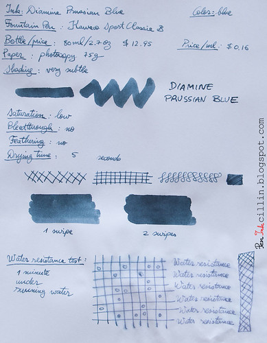
Bottle and pricing
Bottle capacity: 80 ml / 2.7 ozPrice: $12.95
Price / ml: $0.16
Color and saturation
Diamine Prussian Blue is, well, a blue ink. However, the saturation is so low that it can be easily mistaken for a grey. Essentially it's a very dull and subdued slate blue, which is just fine with me. You might not like it ink at first, or at all. It didn't "sing" to me the first couple of days I used it, but then it started to grow on me.Prussian Blue's muted tone actually makes a lot of sense in a formal environment, such as an office. Is it the best ink for official documents? Perhaps not, based on how light it is. But for less official papers it's pretty good, and the color is not the only thing that helps.
So what exactly is "Prussian Blue"? Interestingly, it's one of the first modern pigments. Does the ink resemble its namesake? I would say yes, allowing for differences in saturation.
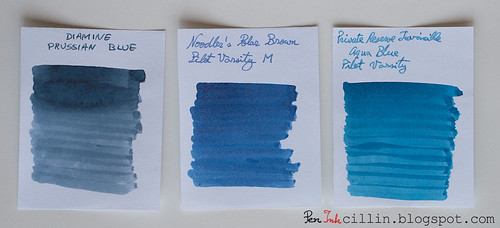
Below I tried to compare Prussian Blue with two other muted inks I tested in the past, Noodler's Polar Blue (forgive the mistake in the photo) and Private Reserve Invincible Aqua Blue, though the three aren't very similar.
Shading
You might be forgiven to think that Diamine Prussian Blue doesn't shade. Light inks don't always feature a lot of variation and it's almost the case here. However, this ink does have a little bit of shading, probably made more discernible by the broad nib.
Feathering
No.Bleedthrough
Being a light-colored and de-saturated ink, Prussian Blue doesn't bleed, even on cheap paper.Flow, lubrication, and smoothness
One very pleasant trait that Diamine Prussian Blue manifests is how easily and smoothly it flows in the Kaweco. It doesn't gush, and it has a very measured flow, yet it's wet enough (around a 6.5-7/10) that it satisfies my requirements.Drying time
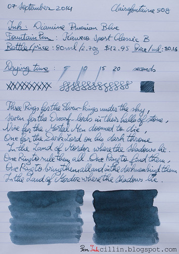
On cheap paper it dries almost instantly, but on Clairefontaine 90g (a thick, glossy, high quality paper) it is more stubborn and might require up to 30 seconds to dry completely with the broad nib.Smearing when dry
A resolute no!Water resistance
Color me surprised, but Diamine Prussian Blue is more resistant to water than it lets on. No where is it advertised as being water resistant but my standard test by which I let water run on a sample for 30s - 1m clearly shows that the ink remains perfectly legible. Granted, the top layer has washed off but what remains is more than enough.Conclusion
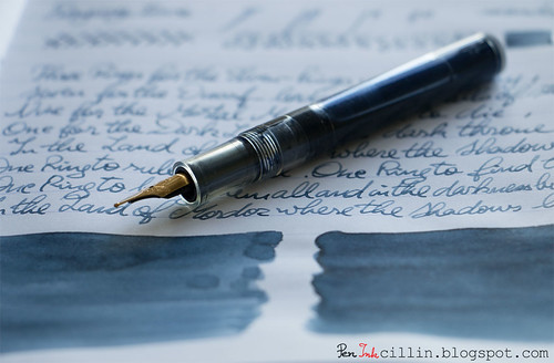
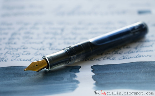
While the slate-blue / blue-grey of Diamine Prussian Blue might not appeal to everyone, I would give it a try if I were looking for a more formal shade of blue. It could grow on you too. It's a very well-behaved ink which flows smoothly, has just enough shading to make it interesting, and on top of everything, plays well with water.Here are the two samples on photocopy, and Clairefontaine 90g paper, respectively.

https://www.williampenn.net/
ReplyDeleteWilliam Penn - The World Online Pen Shop, is India's only multi-brand retail store chain housing the most premium brands in fine writing instruments, desktop, mens accessories and lifestyle accessories from the world over...
Nice review, as always. The color does seem a bit dull. I usually like subdued colors in the blue/gray category but this one seems a bit too boring.
ReplyDeleteI wouldn't knock it just yet. I thought so too but as I used it more I started to like it. But I agree, if you're looking for punch, this isn't it.
ReplyDeleteI have always liked Diamine inks, but my experience with them has been with the darker blues and blue-blacks. As it happens, Prussian Blue is my current favorite ink and I use it an all of the pens with which I am currently writing. Only three, and all of them "cheap." Using your excellent blog entry about refilling Varsity pens, I have one in use with the Prussian Blue. This is a great ink for note taking in class and also for more formal uses, like personal cards and notes. I really like it.
ReplyDeleteOh, I think this ink has lots of punch. I think it's a really good "gentleman's" ink in that it's just dark enough for formal correspondence and "blue" enough not to be too dark.
ReplyDeleteNice pen.
ReplyDeleteWilliam Pen
http://www.williampenn.net/
nice pen.
ReplyDeleteWilliam pen
http://www.williampenn.net/
very nice one
ReplyDeletehttp://www.williampenn.net/
I know mixing ink is not always advised, but I mix Prussian and Royal Blues (both Diamine) in equal parts, and the resulting color is a soft, clear blue like pale, pale sometsuke. It's my new favorite! I bought some empty ink bottles just for this purpose!
ReplyDeleteThanks for the tip! I'm totally fine with mixing inks, especially if they're they same brand and have similar properties.
ReplyDeleteHere are a couple of my own experiments, not sure you've seen them:
http://peninkcillin.blogspot.com/search/label/ink%20mix
I actually really like this color, it reminds me of a stormy summer sky over Florida, it's sad but comforting.
ReplyDeleteMelancholic eh?
ReplyDelete