For now, the Pilot Knight comes only in brushed silver finish with a medium nib. Pen Chalet has a pretty good deal on the Pilot Knight at the moment, 50% off list price, for only $24. If you use the coupon code PeninkCillin you can get an additional 10% off on your first order.
Packaging
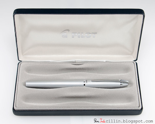
The Pilot Knight comes in a large clamsheel-type case, with a vaguely leather-like texture. The case itself is inside a white card-stock box (not pictured).
The clamshell case is larger than both the Metropolitan and the Vanishing Point I tested recently. In fact, it looks like there's space inside it for 3 pens. I don't understand why this is. It looks to me like a lot of wasted resources for such an inexpensive pen. However, my judgment might be warped by the half price sale. Perhaps this type of case would be more justified at the original $48 price.
Underneath the tray insert Pilot includes a blue ink cartridge, an instruction manual, and a warranty card. Those are very similar to what's included with the Metropolitan and Vanishing Point so there was no point in photographing them again.
Body, construction, and dimensions
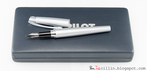
The Pilot Knight is a very handsome metal (likely brass) fountain pen, with brushed silver finish. Both the barrel and cap (as well as the clip) are metal, which gives it a hefty, solid weight.It is, in fact, one of my heaviest pens (that I have weighed so far), heavier even than the metal-bodied Vanishing Point, and exactly 10 grams heavier than the Pilot Metropolitan. Here's a table comparing it with other pens I have weighed:
| Capped | Uncapped | |||
| Pen | Weight (g) | Weight (oz) | Weight (g) | Weight (oz) |
| Pilot Knight | 36.4 | 1.28 | 21.6 | 0.76 |
| Pilot Vanishing Point | 30.5 | 1.08 | - | - |
| Pilot Metropolitan | 26.4 | 0.93 | 17.1 | 0.6 |
| TWSBI Diamond 530 | 25.7 | 0.91 | n/a | n/a |
| Lamy AL-Star | 21.8 | 0.77 | n/a | n/a |
| Noodler's Ahab | 18.8 | 0.66 | n/a | n/a |
| Pilot Prera | 16.1 | 0.56 | n/a | n/a |
Lengthwise, the Knight is as follows:
Length capped: 13.5 cm / 5.25 in
Length un-capped: 11.5 cm / 4.5 in
Length posted: 14.5 cm / 5.75 in
While the weight might scare some folks off, it feels really good to me. It's well balanced but as is often the case, I prefer to use it unposted. With the cap posted I feel that it's too top heavy. I mean, the cap itself weighs almost 15 grams. The way I define "top heavy" is when I feel the pen starts to pivot upwards while resting between the thumb and index finger.
When posted, the cap is held on by friction. The fit is reasonably secure but I would still recommend pressing it hard from the get-go.
Shape-wise, the Knight resembles the Metropolitan in that it is roughly cigar-shaped (but a lot thinner) and tapers sharply at both ends. Here's where the resemblance ends.
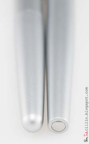
At the barrel end, the Knight is cut off sharply, and if you look at the end of the butt, there's a round polished chrome insert. The Metropolitan, in comparison, is rounded smooth. I prefer the Knight's barrel end.
Moving down the barrel, where it meets the cap there's a thin polished chrome band. Nothing fancy but I think it's classier than the Metropolitan's wide band. But then again, the Metropolitan seems like a more casual pen.
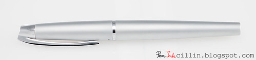
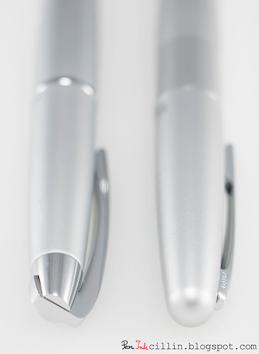
One of the most striking features of the Pilot Knight is the cap, or rather the clip. It's spring-loaded and the action is very smooth. It clips nicely to a shirt pocket and holds on tightly. Being very smooth it won't snag or tear the fabric. The clip, as well as the finial, are polished chrome, like the rest of the trim.
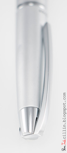
The clip comes up, through, and over the finial, and hinges somewhere inside it. I'm not sure if this description makes sense but I hope the image above will assist you in visualizing it. When activated, you can see how the whole thing pivots. It's pretty cool.
Compared to the Metropolitan, there's a huge difference in the aesthetics of the cap and the clip. While the Metropolitan ends in a smooth rounded dome, with no finial to speak of, the Knight has a very nice asymmetrical conical finial, with the clip forming a point, almost like a spearhead. I guess that's where the "Knight" name comes from.
I neglected to take a photo of the filling system but if you want to see what a pump converter looks like, just check out the Pilot Metropolitan review because the Knight uses the exact same system. I talked about the downsides of this system in the other review so I won't repeat them here. Pilot also includes a blue ink cartridge but I installed the pump converter right away, and filled it with Noodler's Heart of Darkness. The Knight can also take a CON-50 converter and I really wish they had included one. The CON-50 is a far superior solution compared to the pump converter.
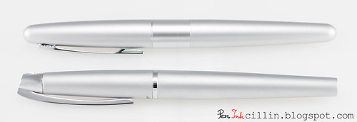
Here's a side-by-side shot of the Knight compared to the Metropolitan.
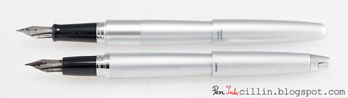
Notice that, while both pens have a glossy plastic section, the Knight's is shorter in length. The Metropolitan's section is also flared at the nib end, which might prevent fingers from slipping, while the Knight lacks the flare. However, despite being slippery, I haven't run into slip issues with either pen. I guess their weight (especially the Knight's) helps to keep it steady.
Finally, a shot of both Metropolitans (F and M) along with the Knight (M).
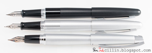
I think it's fair to say the Knight wins hands down in the looks department.
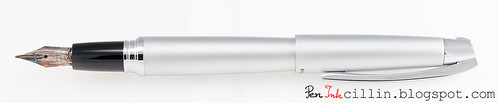
The nib
Not much to say here beyond what was already said in the Metropolitan review, because the Knight uses the exact same nib and feed as other Pilot pens, including the Prera. As such, I would expect it to write perfectly.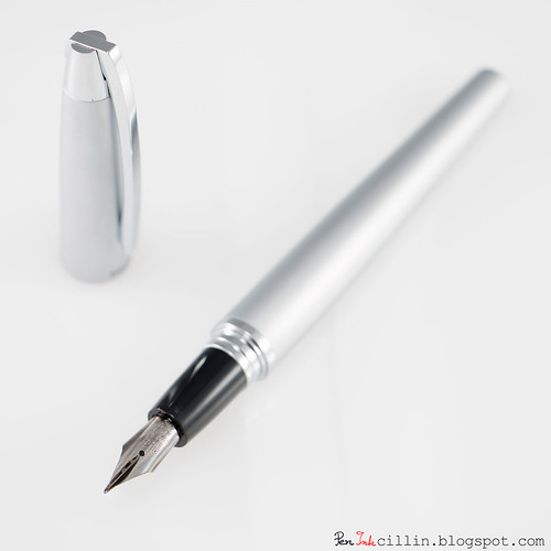
But does it write?
Despite all the praise I heaped upon the Pilot Knight so far, I was a bit disappointed to find out that it didn't write quite the same as the Metropolitan, even though both pens have identical feeds and medium nibs. The following sample should give you an idea of the differences.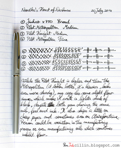
So what's wrong? Well, if you haven't read the Metropolitan review, I'll just tell you that the medium nib (and the fine one in a smaller measure) impressed me hugely. I declared that medium nib to be the smoothest, with the best flow I've ever tested. The Knight's nib is neither as smooth, nor flows as well. It even had some skipping issues at first, until I used it some more, which perhaps helped to saturate the feed with more ink, and that in turn made it write without skipping. Still, the Knight's line remained thinner and lighter than the Metropolitan's.
My disappointment notwithstanding, the Knight wrote acceptably after "breaking it in", though it never equaled the Metropolitan. One possible explanation for this behavior is that the feed could have been covered in residual manufacturing oils, which can prevent proper flow. I didn't wash the pen before first use so it's a good an explanation as any. On the other hand I didn't wash the Metropolitan either.
Another, more likely explanation is that there will always be variation between these mass produced nibs. To be fair, the Metropolitan's nib is better even than the Prera's, and the latter is a $60 pen. So it boils down to luck of the draw.
The nib bears more testing, of course. I have given the system its first wash and we'll see how it performs afterwards. In the meantime, I did what anyone would do: I swapped the nibs and feeds between the Metropolitan and the Knight. The end result is a gorgeous pen which writes like a dream.
Final words
The Pilot Knight is a really impressive metal-bodied fountain pen with a modern design and clean, sharp looks. I'm sure it can impress in any boardroom or high-end office. For the $24 Pen Chalet is charging, it's frankly hard to beat. At the full price of $48, it becomes harder to recommend, chiefly because of the filling system. I feel that around the $50 mark, a fountain pen should have at least a twist converter. Yeah, I guess we've all been spoiled by pens such as the TWSBI, not to mention $2 Chinese pens which come standard with a converter.As for the nib issue, I wouldn't sweat it too much. If I'm right about the manufacturing oils, this is a non-issue. Even if not, this isn't a problem specific to the Knight but rather a legacy to mass-produced nibs. As such, some of these nibs will perform outstanding, while others less so.
Personally I think the extra $9 over the Metropolitan is worth it for the superior looks and heavier body. If you are past the stage of a starter pen and would like something more distinguished, as long as you like a silver finish and a medium nib, you can't go wrong with the Pilot Knight.

Wow, that is one smart looking pen! However, I'm beginning to get a bit tired of form over function; I want both. ;-) No fine nib is a killer for me, or if it had a .8 stub, I'd be all over this. The fact that you seem to have received a nib/feed like I got on my Metropolitan medium suggests to me to steer clear of these. It's a shame, really, because style wise it is a gorgeous looking pen. Thanks for the full review.
ReplyDeleteWell, you can always swap in your F nib from the Metropolitan. I also have a feeling that if you have the knowledge and don't mind messing a bit with the nib you could get it to write really nicely. I'm not that knowledgeable I'm afraid.
ReplyDeleteI am sad to hear that the Metropolitan nibs are better than the prera's, since I just ordered a Pilot Prera from Goulet Pens :( I hope that I have better luck and that my nib is as smooth as butter :)
ReplyDeleteI have the same issue with mine not writing very well. The pen looks and feels great. But I would pick my Lamy Safari all day over this pen. I've re-inked this pen 3 times now and it still writes horribly. I'm glad I only paid $24 for it. I'm going to try some cleaning and adjustments and see if it'll work any better. I'm very disappointed with this pen.
ReplyDeleteI enjoy writing with my Metropolitan with a Plumix nib, but I almost didn't buy it because I don't much like the shape of the pen (found a great sale price). I tend to favor the squared off ends, so the Knight is a pen I'll put on my list to consider if I see it in any other finish than the silver.
ReplyDeleteI love what Pilot does with their entry level line. I have not picked up a Knight yet but I gift a lot of Metros. Will need to give this one a try. I find it interesting that articulated clip is almost a dead ringer for the Sheaffer 300.
ReplyDeleteI actually had a bad experience with my Lamy Safari the first time I got it. It skipped to the point where it was unusable. I tweaked the nib a bit and it's been writing pretty well ever since. As for the Knight, I suggest soaking the feed in ammonia solution for a day or two and flossing the nib.
ReplyDeleteAgreed on the square ends. I prefer pens which aren't all curves.
ReplyDeleteThey've really stepped up their game, haven't they? A couple of years ago there weren't many options between the Prera and the Plumix. OK, maybe the 78G but even that one was hard to find at one point.
ReplyDelete