I don't have a lot of experience with Platinum pens, the only other that I have tried being the cheap (and almost-disposable) Platinum Preppy. The Platinum Carbon costs a lot more than the Preppy ($13.50) but it also seems to serve a different and more specialized function. From what I gather, the "Desk" designation suggests that it is a good companion for a... um... desk. In fact, Jetpens also sells a stand for the Carbon pen which replaces the cap if you choose to use it instead. The stand is also more expensive than the pen itself but that shouldn't be an objection if you want to make your desk look classy.
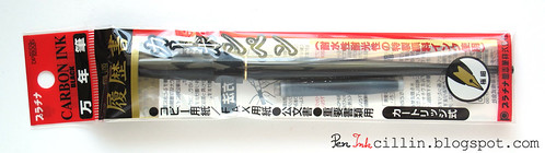
At $13.50 don't expect fancy packaging and the Carbon doesn't break the norm. It comes in a simple plastic sleeve, together with a black ink cartridge. There are instructions written in Japanese all over the packaging but I threw it away nonetheless.
In my view, the Platinum Carbon looks like one of those old pens that I would expect to see on my grandfather's desk and it is very reminiscent of a dip pen. The black plastic body is long and sleek, tapering down to an almost sharp point. This, of course, completely negates any desire to post the cap. For me that's not a biggie because in general I don't like to post caps anyway.
The Platinum logo and "Carbon Pen" are embossed in gold on the barrel and there's gold trim where the cap stops.
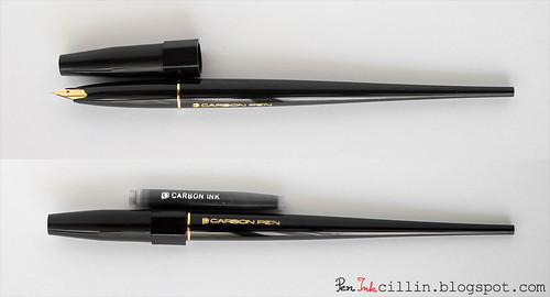
Speaking of the cap, it is friction-fit and quite plain. It tapers slightly at the top and has a thick hexagonal rim which undoubtedly is meant to prevent the pen from rolling across your desk, since it doesn't have a clip. Interestingly, the included ink cartridge also has the logo and "Carbon Ink" embossed, only this time in silver.
Removing the cap reveals a "gold-plated" nib which reminds me a lot of those classic hooded nibs, even though it isn't one, though it is narrow and thin enough to give the impression. The fact that it's gold plated plays in tune with the other gold trim found on the pen but frankly it leaves me indifferent. I doubt gold plating has any effect over the way it writes, as opposed to an actual gold nib. And I'm not saying that I was expecting a real gold nib for $13, goodness no. Personally I prefer silver (iridium) nibs and trim but that's just me.
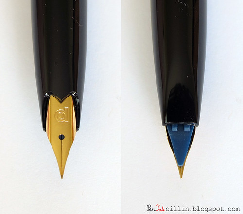
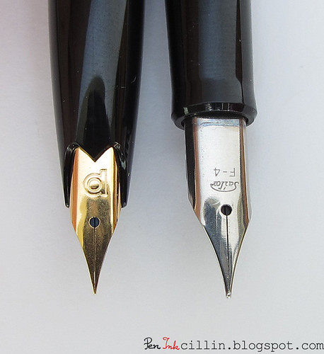
A close-up of the nib shows how thin it is. Apparently this is an XF nib which is exciting for me because I've never tried a true Japanese XF. Of course, I have my Lamy AL-Star EF but, being European, it compares more favorably to a Japanese M/B. The underside shows the odd-looking plastic feed which for some reason is blue.
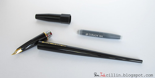
Unscrewing the barrel reveals the metal threads and this fact alone immediately dashes any hopes that this pen could be converted to an eyedropper. Well, this and the fact that the thin end of the barrel isn't sealed. But that's alright, I don't see any reason why someone would need the extra capacity for such a thin nib. As it is, the ink cartridge is hefty enough.
Just for fun, I decided to compare the Platinum Carbon pen to my other thin-nibbed Japanese pen: the Sailor HighAce Neo which features an F nib. I thought that the Sailor was thin as a needle, but when you put the two side by side, it looks as thick as a tree trunk compared to the Carbon. Now you can truly see how sharp and precise the Platinum Carbon's nib is. This is the point where I got scared because I didn't know if I was capable of using such a thin nib. I'm only partially kidding...
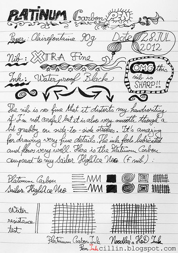
Moving on to the writing experience, I produced this sample (written on Clairefontaine 90g paper). Please excuse my poor attempts at doodling but I thought such an exercise would be perfect for the XF nib.
Before discussing the actual writing experience, let me talk a little bit about the ink itself. The included cartridge holds no ordinary ink. This is Platinum's Carbon ink which is waterproof and also resistant to forgery. As far as I know, there aren't many inks like that which come in a cartridge. To boot, it is also pigment-based, which apparently makes it more suitable for this type of pen.
After plugging in the cartridge it didn't take long for the ink to flow. It took me a couple of minutes to prime it but after that the pen wrote very smoothly. The flow is good but because the nib is so thin, it feels just a tiny bit grippy on the side-to-side strokes. It doesn't surprise me, because it's like writing with a sewing needle.
Did I mention the nib is sharp and precise? I'm not sure I did, but to reiterate, it is definitely the most precise nib I've laid hands on. It's amazing what detail you can draw, provided you have steady hands. I'm not used to such precise nibs and my handwriting tends to become spidery.
Comparing the Platinum Carbon to the Sailor HighAce Neo, I've come to realize that there's quite a difference between them. Before the Carbon, I thought the Sailor's nib was sharp. Boy was I wrong. Even though it might not be entirely obvious from the sample (look closely at the spiral), the Sailor feels a lot thicker and less precise.
Going back to the ink, I used Noodler's Heart of Darkness in the HighAce Neo. As you can see, there's virtually no difference between the two inks. Since HoD is already a very dark ink, we can infer that Platinum Carbon is also very dark. Personally I like deep blacks. The interesting thing, though, is that Heart of Darkness feathered on the Clairefontaine paper. I was very surprised by this because normally it is a very well behaved ink, but there you have it. Platinum Carbon, on the other hand, didn't.
I also ran a basic water resistance test, once again comparing the two inks. It turns out that Platinum Carbon beats Noodler's Heart of Darkness in this aspect. I placed a drop of water inside each grid and waited for it to dry. The Platinum sample looks virtually untouched. The HoD sample shows a little shadow where the drop evaporated. This means some of the water washed off and makes Platinum Carbon the winner in this informal contest.
I should mention one last thing which almost slipped my mind. The Platinum Carbon is a very light pen but it is comfortable to hold. The balance is optimal for me thanks to the long barrel. I didn't feel any fatigue while creating the sample.
Conclusion
To wrap this up, Platinum Carbon surprised me in a number of different ways. While the design of the pen is nothing to write home about (though it would look classy on a business person's desk), and personally I'm not very partial to the gold trim, the real beauty lies in the nib. This incredibly precise needle seems to be perfectly suited for drawing very fine details, especially when paired with the Carbon waterproof ink. For example you can use it to trace a drawing and then paint it with watercolor without fear.
Myself, I'm not a big fan of fine nibs. I thought I was, that's why I bought the Sailor HighAce Neo, but then I realized that I prefer broader strokes, where the ink can show its full potential. But that's just me. If you have a preference for fine nibs, I'm sure the Platinum Carbon has one of the finest you will find, and all that for a pittance.
Finally, thanks again to David at Jetpens for providing this opportunity!

Whoa! I've never even heard of this fountain pen before!! I actually rather like Platinum fountain pens, go figure that I've never seen it hehe. It kind of reminds me of the Rotring art pens in terms of its body shape. You sure make it look appealing, especially with the pretty pictures and your cute writing sample!
ReplyDeleteThe pen's specially designed for carbon ink, and it's pretty popular with people who like to wash over ink drawings with water colour, or ink wash.
ReplyDeleteI've seen people cut down the tapered part for portability, although I can't find that link now!
Wow I wouldn't wanna do that. I'm sure it messes with the balance. But if you need something more portable, I guess shortening it can be an option. The only problem is that the end is hollow.
ReplyDeleteAww thanks! I wouldn't exactly call my sample "cute" but I'm glad you liked it.
ReplyDeleteNice review.
ReplyDeleteThe Platinum nib looks like those implemented on Platinum pens already by the late 1950s. Truly great nibs with wonderfully precise feeds.
On the conclusions you spoke of Pilot when, I think, you meant Platinum.
Thanks for keeping your blog active and updated.
Cheers,
BT
Thanks Bruno! I corrected the error, for some reason I kept typing Pilot throughout my review... I guess one of them slipped through the proofreading.
ReplyDeleteI guess cute isn't a very desirable description hehe. It's really nice though! I like the doodles and flourishes. You do great reviews.
ReplyDelete*blush* thanks again :)
ReplyDeleteSounds interesting. Too bad it can't convert to an eyedropper or be fitted with a converter.
ReplyDeleteThank you for posting this review! I am glad to see this great pen get more visibility. I discovered this pen in January and after struggling with a bad nib on my first fountain pen, a Lamy Safari EF, this pen is an absolute dream. The flow is wonderfully dependable, the extra fine line is just what I want for my drawings, and the Platinum Carbon ink holds fast against watercolor washes. I am so tempted to get another because I love it so much.
ReplyDeleteWell, I'm not so sure about the converter. Since I didn't have one, I couldn't test this but it is possible that something like this http://www.jetpens.com/Platinum-Fountain-Pen-Converter/pd/3463 might fit.
ReplyDeleteHah! You validated my own conclusion! It really is useful for drawing. In your experience do you think there's another fountain pen with such a fine nib?
ReplyDeleteYou are tough to get a hold of besides through comment hehe. I just wanted to let you know I picked you for a Versatile Bloggers Award :) You don't have to actually do anything but I thought you'd like to know :) The post is here: http://www.gourmetpens.com/2012/08/versatile-blogger-awards.html
ReplyDeleteThanks for the review! I have been curious about the desk pen, though I have quite a few other extremely fine nibs already.
ReplyDeleteA minor correction I'd like to offer though...there are no nibs made of iridium. Iridium and a number of other elements were, and some of them like osmium still are (though iridium is no longer used by most or any manufacturers despite the labels on the nibs) used as a tipping material on both gold and steel nibs. Gold does not touch the paper, and neither does steel in most cases. There are some old steel nibs without tipping, but most all round-tipped nibs today are tipped with a very hard alloy that is much more wear resistant than gold or steel. Stainless steel nibs are only plated for aesthetics and perhaps chemical resistance. Silver-colored nibs are often unplated stainless steel, or perhaps gold with rhodium plating. I'm leaving out palladium and titanium nibs because they are less frequently encountered.
To sum up, iridium is just an old marketing word to describe a nib with a hard tipping. All gold nibs and almost all steel nibs are tipped. Untipped nibs exist, especially among budget older pens, but almost all modern non-italic nibs are tipped.
Hi Robert and thanks for the correction. Yeah, I got the terms a little bit mixed up there. I just meant that the nib is "silver" in appearance. It isn't made from iridium, of course. I do get the terms rhodium and iridium confused though.
ReplyDeleteI don't have much experience (only the Carbon Pen, Lamy EF, and Preppy). I've noticed the Pilot Penmanship available through JetPens and people report a super fine nib on that one.
ReplyDeleteIt's got to be another Japanese pen. The Lamy EF is like a BB in comparison (at least mine is).
ReplyDeleteIs this nib interchangeable with the Preppy / Plasir nib? I would love to have that nib on a standard feed.
ReplyDeleteNo, this nib is unique to the Carbon (as far as I know). The one on the Preppy/Plaisir is completely different.
ReplyDeleteThe Platinum converter is only about a 1/4 of an inch longer than their cartridge, so it would probably fit in such a long pen.
ReplyDeletewell, I was not so lucky to laid my hands on it personally, but thinking about Platinum Carbon Desk pen I have to mention Sailor Recycled Material Desk Fountain Pen - Extra Fine Nib for $11.50. Design is so similar, also Japan pen with extra nib, made of recycled plastic, with stainless steel nib (when you do not like "gold"). In my future plans I see this tei beauties on my desk ;) The other "sharp thing" I could think of is cheap Pilot Penmanship Fountain Pen with Ergo Grip - Extra Fine Nib - Clear or Black body.
ReplyDeleteand this was really very nice review :)
Pilot Penmanship... isn't it also known as the Plumix? I'm too lazy to Google it right now, even as I'm typing this...
ReplyDeleteI realize I'm late to the party here but I purchased this pen (and the desk stand) about 6 months ago. I use it when I need permanency, such as check writing, and it definitely suits that purpose. However, what I don't like about it is ink does end up creeping out of the nib, collecting in the bottom of the holder and along the sides of the pen. When I go for the pen and write with it, my fingers get covered in ink.
ReplyDeleteI do like the extra fine nib and the feel of the pen in my hand. However, the creeping ink can be problematic. Perhaps it has something to do with the ink's lubrication.
Now that's an interesting perspective. I didn't have the holder so there was no way to test that. But I've noticed certain pens like to leak when stored with the nib down. Case in point: all my Noodler's pens do that.
ReplyDelete