Monday, June 27, 2011

Pipettes for ink filling

So I picked up a cheap set of pipettes from Walmart a couple of weeks ago. They were in the eye/ear section of the pharmacy. As soon as I laid my eyes on them I thought INK! I paid about $3 for them.

Pipettes

As you can see, one has a straight tip while the other is slightly bent. Though I would have preferred that both tips were straight, it turns out that I can still use the curved tip almost as well as the straight.

The reason why I like these little eyedroppers more than syringes is because they are made of glass and thus very easy to clean. The other nice thing is that the suction is very good for such a cheap eyedropper.

Pipettes

These are great for drawing ink out of sample vials. I use them to fill anything that can accommodate the tip. They work great with any of my eyedropper fountain pens. They work with Pilot cartridges because they have a wide opening. Unfortunately Lamy and international cartridges have a very narrow opening so I can only use the needle of a syringe to fill those.

One other way in which I use these pipettes is to fill a fountain pen via the feed saturation method. This works mostly for piston fillers such as my Noodler's flex.

I would really recommend these pipettes if you haven't found something more suitable for your ink filling needs. They are cheap and extremely easy to clean.

Monday, June 20, 2011

Noodler's Polar Blue ink review

I'm on a quest to find the perfect blue ink. With Noodler's Polar Blue, I'm so very close but not there yet. Read on to find out why.

Noodler's Polar range of inks is interesting because it has some very cool properties.

One of them is them is resistance to forgery, including exposure to water. I'm not worried about forgery per se but I do need an ink which is impervious to water.

The other interesting property is the resistance to low temperatures. This is useful only if you use your fountain pens a lot in very cold weather but I could almost qualify. Chicago gets some very low winter temperatures, 10 below or even less. I have decided that I'm going to keep a cheap "disposable" fountain pen in my car all year round, filled with a Polar ink, because ballpoint pens freeze in winter and run in summer.

Polar Blue is the second Polar ink from Noodler's which I have tested. The first, Polar Brown, has left me mostly satisfied, except for one big flaw: the powdery nature of the ink makes it very prone to smearing, even after it has dried for a very long period of time. The sad thing is that you can easily smudge this ink without trying, just by casually touching it with your hand. This is even worse on fine paper such as Clairefontaine or Rhodia where the ink isn't absorbed completely into the fibers.

I'm happy to report that Noodler's Polar Blue does not suffer from this affliction. The ink dries quickly (another great quality) and it does not smear or smudge no matter how hard you rub it. In fact, I like to call this ink (jokingly of course) Bernanke Polar Blue due to how quickly it dries. Polar Blue gets top marks as far as drying time and smearing are concerned.

Perhaps as a side effect of the quick drying, I have unfortunately arrived at the only negative aspect of Polar Blue. It tends to bleed through, especially if the paper is cheap. On cheap photocopier paper it is guaranteed to bleed, although personally I can still write on the reverse side. On Rhodia 80g, it bleeds to a lesser degree. On Rhodia I would call it a more severe form of ghosting (where the ink has not yet bled all the way through but still shows) instead of bleedthrough.

I admit that the bleeding issue might be compounded by the fact that I tested Polar Blue in a Pilot Varsity which I refilled with this innk. The Varsity has a thicker nib, therefore I'm sure that a thin nib will lessen the problem.

Although Noodler's Polar Blue and Polar Brown are from the same family, they don't share all of the same characteristics. Where Polar Brown is saturated and dark, Polar Blue has a low-to-medium saturation and its color is rather dull and pastelated. Some people have called it "chalky" and I think this description applies. What's interesting is that (if you look at the samples) Polar Blue behaves a bit differently depending on the paper used. On photocopier paper, where more of it is absorbed, it appears darker. On the higher quality and heavier Rhodia paper, it appears lighter.

Noodler's Polar Blue shows another quirk: it is much darker when wet, but it lightens up considerably as it dries up. I find this thing quite amusing.

If you dislike chemical smells, then Polar Blue might not be for you. Although I only got a sample and not a full bottle, this ink emanates one of the most powerful chemical smells I've yet encountered in an ink. However, this all depends on your tolerance to such things. I am not troubled by this in the least. It's not like you'd faint from it. It's just more pungent than other inks. But I guess that's one of the prices you get for resistance to all known forms of forgery substances.

Feathering doesn't seem to be much of an issue with Polar Blue. I haven't noticed any, even on cheap, absorbent paper.

Shading is a non-factor with Polar Blue. It is one of the flattest inks I've tested. When it's wet you will notice that the dried ink is much lighter than the wet ink, even if you layer it on top. Once it dries up, everything becomes uniform.

Finally, here I am at one of the trademark signatures of the Polar range of inks: water resistance. No surprises here, this ink is as impervious to water as they come. Actually, I would say it does even better than Polar Brown because that one leaves a very thin powdery layer on top of the paper, which washes off when wet.

Noodler's Polar Blue is slightly more expensive than the regular Noodler's inks. Since a 3oz bottle of Polar Brown is the usual $12.50 ($0.14 / ml), I don't understand why Polar Blue is $16.00 per 3oz bottle ($0.18 / ml), unless the cost of materials used for the blue ink are higher. Actually, I bet that's the explanation, which would also account for the pungent smell and the slightly different properties. Polar Blue is also available in 4.5oz bottles where an eyedropper pen (Platinum Preppy) is also included so if you use a lot of this ink, the larger bottle looks like a marginally better deal.

To conclude, Noodler's Polar Blue is an excellent bulletproof blue ink, with a lot of desirable qualities. It dries quickly, doesn't smear or feather and can be used in a formal, official setting. Its only major drawback, the tendency to bleed through, may put you off if you are not using high quality paper. It has certainly made me reconsider buying a whole bottle although I was on the verge. In the last minute I decided to give other waterproof inks a try before committing to a bottle.

Here are two samples written with Noodler's Polar Blue loaded inside a Pilot Varsity, on photocopier paper and Rhodia 80g.

Noodler's Polar Blue on photocopy

Noodler's Polar Blue on Rhodia 80g

Monday, June 13, 2011

Pilot Parallel calligraphy pen review

The Pilot Parallel pens, although fountain pens, are not meant for writing novels, journals or to use in the office. That's because they are primarily intended for calligraphy. This is not meant to be an exhaustive review of the Pilot Parallel, but rather an insight into what makes these pens so special.

Pilot Parallel 2.4mm capped

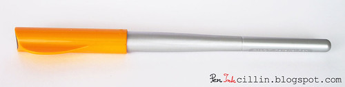
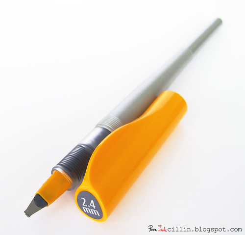
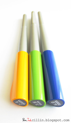
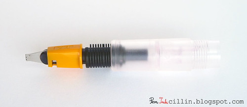
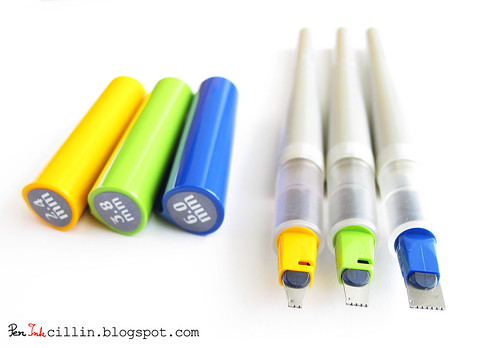
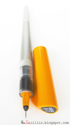
Pilot has invented a rather unique concept with the Parallel series. There are currently 4 nib sizes in the series: 1.5mm, 2.4mm, 3.8mm and 6.0mm. The caps are color coded in orange, yellow, green and blue, respectively. The innovative thing about the Parallels is the nib, which is made up of two parallel plates between which the ink flows. And it flows very well.

If you look at the nib you will see how sharp the edges are. You'd be forgiven to think that the pen skips and the nib likes to grab the paper. In fact, the Pilot Parallel is very smooth on any type of paper. The sharp edges of the nib ensure that the line is sharply delimited and that there is no fuzziness at the edges.

Pilot Parallel 2.4mm nib

As I write this, I have only played with the 2.4mm version but I just received the 3.8mm and the 6.0mm pens. As such, the impressions in this review pertain to my experience with the 2.4mm nib, but I'm sure the same observations are in order for the other nib sizes.

Pilot Parallel 2.4mm 3.8mm 6.0mm

I started with the 2.4mm nib because I didn't know what to expect from these pens. After playing with it, I realized that I wanted to experience the larger nib sizes so that's why I ordered the 3.8mm and 6.0mm. I won't be getting a 1.5mm pen because I already have a 1.5mm nib for my Lamy AL-Star and the line width is about the same, although the Lamy nib is not as crisp.

Pilot Parallel 2.4mm 3.8mm 6.0mm

One thing that beginners (myself included) might not realize is that the Pilot Parallel can be used in two ways: you can draw with the entire width of the nib or you can just use the edge (one of the sharp corners) which creates a thin line, comparable to a classic medium or fine nib.

Pilot Parallel 2.4mm nib
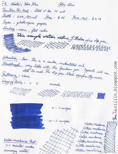
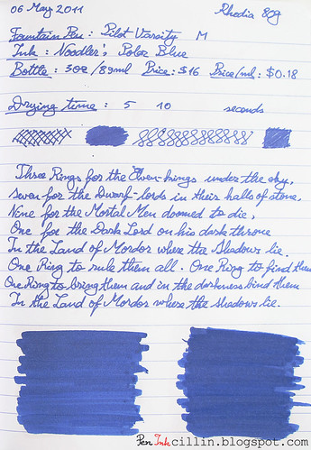
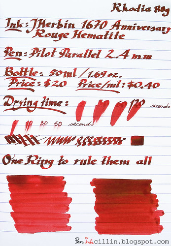
You have seen samples of how a 2.4mm Parallel writes in my reviews of J Herbin 1670 Rouge Hematite and 
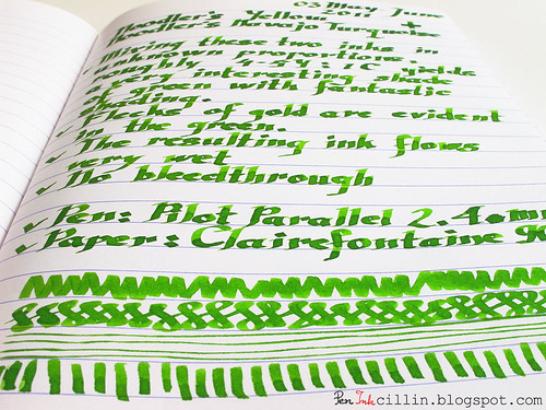
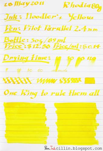
Noodler's Yellow as well as my Noodler's Yellow and Navajo Turquoise ink mix. I have tried my hand at some pseudo-calligraphy in fonts of my own devising but you can probably tell I'm a big noob at this sort of thing. Nonetheless, this is a fun pen to play with.

The Pilot Parallel could very well be the gateway drug into calligraphy because it is cheap (I got mine for $10), simple to operate and well-built.

There's some interesting stuff that comes in the box: the pen itself, two ink cartridges (red and black), a cleaning pump, a shim for cleaning between the plates and instructions on how to use the pen and how to get started in several calligraphy styles. There's plenty of value for only $10.

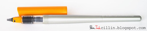
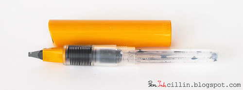
The Pilot Parallel was not designed to be carried in a shirt pocket. There is no clip on the screw-on cap, except for the fin which prevents the pen from rolling off your desk. I really like the way they did the cap: it's brightly colored, big and screws on and off very easily.

The barrel is made from a soft, silvery plastic which seems to be the only weak link in this pen. It looks rather cheap but personally I prefer soft plastic to the hard, brittle variety. One cool thing about the Parallel is that it can be easily converted to an eyedropper if you apply a little silicon grease to the threads. The barrel is airtight but since it isn't transparent, I decided not to convert mine.

Pilot Parallel 2.4mm uncapped

The Pilot Parallel takes Pilot's proprietary cartridges but that's not a bad thing because these cartridges are huge. I like to save mine, wash them and then refill them with the ink of my choice. One little documented fact is that you can also use Pilot's CON-50 converter in the Parallel if you so choose.

The pen comes with a converter-like pump which resembles a CON-20 converter but don't be deceived: it is not a converter. In fact it is meant to be used for cleaning the pen: to pump water in and out of it. Although some people have used this pump successfully as a converter, others have reported that it is very loose and won't stay attached. Mine, for example, is extremely loose.

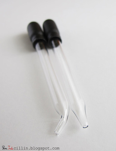
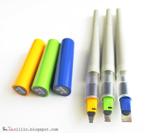
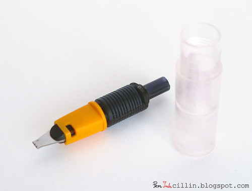
Thing is, you don't even need to use the pump to clean the pen. What I love about it is that you can easily take the pen apart for cleaning. First, the feed is friction-fitted to the section. It slides out easily.

Pilot Parallel 2.4mm feed + section

Pilot Parallel 2.4mm feed

Second, the nib (actually the two plates) can be grabbed and pulled out of the section. Here's how the plates look when pulled. The plates are much tighter than the feed, though, so I used a piece of cloth to grab them with.

Pilot Parallel nib, feed, section

I just love a fountain pen that can be taken apart easily. That's the best way to ensure that there's no gunk left after cleaning.

As mentioned before, I like to refill used cartridges with whatever ink I fancy, and I do that with a syringe. It's the least messy and cheapest way to fill up these pens. As a rule, I don't like to make eyedroppers out of opaque pens. I like to see the ink level and besides I'm always scared that the barrel might come unscrewed and spill all that ink over me.

Pilot Parallel 2.4mm cartridge

I'd like to mention one final thing about the 6.0mm Parallel. Many people have been using it as a highlighter. At 6mm, the line is very wide and can easily cover any handwritten text. If you can also load the pen with a special highlighting ink, you are bound to have endless fun highlighting stuff. Just a warning though: this could become addictive!

Pilot Parallel 2.4mm 3.8mm 6.0mm

I would highly recommend the Pilot Parallel pens to anyone interested in calligraphy. As to what size is the best, that's a hard question. I started with the 2.4mm because I considered it intermediary. You might want to start with the 1.5mm or with the wider nibs. Either way, before long you will probably end up craving the other sizes that you are missing.

Here are samples from my previous ink reviews using the Pilot Parallel 2.4mm.

J Herbin 1670 Anniversary on Rhodia 80g

Noodler's Yellow on photocopier paper

Noodler's Yellow + Navajo Turquoise mix

Sunday, June 12, 2011

3rd Goulet Pens haul

The past week has been the "week of the Noodler's flex pen" it seems. Goulet Pens, in particular, was assaulted by orders for the latest batch of Noodler's flex fountain pens and I was one of the lucky ones who managed to get their hands on a Noodler's flex in Lapis Inferno (aka blue with white swirls).

The title of this post is a bit dishonest because I've combined two orders into one post but that's only because the first order only contained ink samples plus a few notebooks (and this is not a blog for notebooks and paper), while the second order had another batch of ink samples, plus the 3 pens.

3rd Goulet Pens haul

Here's what this order contained:

Pens:
  • Noodler's Flex in Lapis Inferno
  • Pilot Parallel 3.8mm
  • Pilot Parallel 6.0mm
Ink samples:
  • Diamine China Blue
  • Diamine Coral
  • Diamine Prussian Blue
  • J. Herbin Bleu Azur
  • J. Herbin Diabolo Menthe
  • J. Herbin Vert Pre
  • Lamy Red
  • Noodler's Baystate Blue
  • Noodler's Bernanke Blue
  • Noodler's Fox Red
  • Noodler's Georgia Peach HL
  • Noodler's GI Green
  • Noodler's Kung Te-Cheng
  • Noodler's Mandalay Maroon
  • Noodler's Manjiro Nakahama Whaleman's Sepia
  • Noodler's Polar Green
  • Noodler's Shah's Rose
  • Noodler's Dragon's Napalm
  • Noodler's Firefly Yellow HL
  • Noodler's Hunter Green
  • Noodler's Year of the Golden Pig HL
  • Private Reserve Daphne Blue
  • Private Reserve Electric DC Blue
  • Private Reserve Invincible Aqua Blue
  • Private Reserve Invincible Black
  • Sailor Jentle Apricot
  • Sailor Jentle Grenade
Just a quick word about the Noodler's flex pen. I like the color and I'm glad I picked it instead of another. It also happened that the blue pens were the second most popular after the clear ones. I believe I have loaded the pen with the wrong ink because I used a very light gray which may not be the best option for a flex nib. Though I wasn't expecting much from this pen, at this point I'm not particularly impressed with its flexible nib. I'll have to play some more with it before I can review it though.

From the looks of it, I'll have enough ink samples to review for the next year. Can't wait to use them all!

Monday, June 6, 2011

Noodler's Yellow and Navajo Turquoise ink mix

The proverbial ink wasn't even dry on my review of Noodler's Yellow, that I decided to, what the heck, give ink mixing a try.

Though this was my first attempt at ink mixing, I knew what I could expect. When mixing dyes, the four primary colors used are CMYK (Cyan, Magenta, Yellow and blacK). From these, almost any shade can be obtained. For lighter colors, white can also be used.

Noodler's Navajo Turquoise is an excellent substitute for Cyan and Noodler's Yellow is, well, Yellow. Cyan + Yellow gives Green. It depends, of course, what proportion of each primary color is used. Yellow being a light color, requires just a little bit of cyan to turn into green.

I still had some Noodler's Yellow left in the cartridge fitted to my Pilot Parallel 2.4mm. All I had to do was put a couple of small drops of Navajo Turquoise (of which I have a whole bottle) into the cartridge with a syringe and then shake it well until the two colors mixed. Since this wasn't a scientific experiment in the least, I have no idea what the exact proportions were, but if I were to guess, I'd say 4-5 parts of Yellow to 1 part of Cyan.

Here's the result: a very nice shade of light green, bright and saturated.

Noodler's Yellow + Navajo Turquoise mix

It looks like the inks didn't mix that well after all, but since I'm a beginner at this, it's hard to tell. This, however, creates a very beautiful effect. Notice the awesome shading: grass green interspersed with flecks of gold. To me, this color is very cheerful and refreshing. I would almost drink it from a frosty glass.

Here's a closeup of the beautiful shading.

Noodler's Yellow + Navajo Turquoise mix

This has been my first experiment with ink mixing but I consider it highly successful. What do you think?

Friday, June 3, 2011

Noodler's Yellow ink review

How many of us fountain pen aficionados write in yellow ink? Not many I would guess. And yet, there are yellow inks out there and there are very valid reasons to use them.

First, let me get this right out of the way: I don't believe anyone will use a yellow ink in a fountain pen just for writing. On the other hand, yellow inks are very useful for art in general and also for highlighting. Another very popular use is for ink mixing.

Noodler's Yellow is the most basic shade of yellow from the Noodler's brand. They do have other yellows, including ones designed specifically for use in highlighter pens but this one seems to be particularly well suited for mixing. If ink mixing interests you, check out this link which shows a series of Noodler's inks used as CMYK primary colors. The article does an excellent job of illustrating the various shades which can be obtained by mixing these inks to different proportions.

I only bought a sample of Noodler's Yellow and I didn't plan on using it for mixing. As I started typing this article, I got it into my head that maybe I should try at least one combination, seeing that I already possess a whole bottle of Noodler's Navajo Turquoise, which acts as cyan.

I loaded Noodler's Yellow in my Pilot Parallel calligraphy pen with 2.4mm nib. That was the only pen in my collection suitable for such a light colored ink.

The price of a full bottle of Noodler's Yellow is the standard $12.50, or $0.14 per milliliter.

There isn't a lot to say about a yellow ink. This particular specimen is probably the most neutral yellow you can find. It is definitely a warm shade (whatever "warm" can mean in this context) and it doesn't show any shading. For some reason I wrote "Shading: good" in my written review. That should have been "Shading: none" because no matter how many layers of this ink I apply, the color stays flat.

Saturation is high, as it should be.

Drying times are long but that is obviously due to the very wet and wide swath drawn by the 2.4mm broad nib.

Water resistance is non-existent. A few seconds under running water managed to completely obfuscate the text. As a consequence, Noodler's Yellow isn't well suited for applications where water resistance is required.

I have tried using the Pilot Parallel loaded with Noodler's Yellow to highlight text and it depends on the water resistance of that text whether it will smear or not. Bulletproof inks, such as Noodler's Heart of Darkness, won't smear a lot (although it depends how dry the text is). Text from a laser printer or ballpoint pen didn't smear either. The bottom line is that you should think of Noodler's Yellow as being water. If water smears your text, so will this ink.

I'm sure there are a lot more applications for this ink when used for drawing and other types of artistic endeavors. I have used it for a sketch but unfortunately I lacked inspiration and the whole thing lacks punch, but, whatever...

I keep changing my mind whether I should buy a full bottle or not. The thing is, I've already sunk a lot of money in inks which will last me years so I'm a bit reluctant to buy more full bottles. Besides, I have a ton of ink samples that I need to review before diving into ink mixing, because that's the main use I would have for Noodler's Yellow: to experiment by combining it with other inks.

Following are two samples written on photocopier paper and Rhodia 80g paper. Notice that the photocopier paper sample is a bit contaminated at the beginning. It's my fault because previously to Noodler's Yellow I used J Herbin 1670 Rouge Hematite in the Pilot Parallel and it looks like I didn't manage to clean it thoroughly so the result is a little bit of orange.

Noodler's Yellow on photocopier paper

Noodler's Yellow on Rhodia 80g